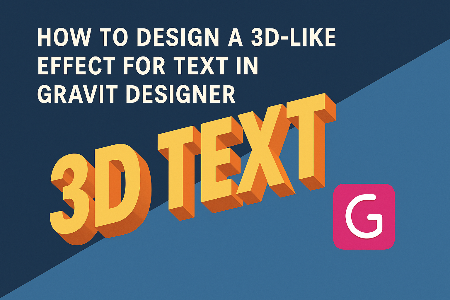
Designing eye-catching text can greatly enhance any project. With Gravit Designer, creating a 3D-like effect is simpler than it looks.
This article will guide readers through the steps to make their text pop with depth and dimension using accessible tools.
Many designers want to add that extra flair to their text but may feel unsure about how to achieve it. Gravit Designer offers a user-friendly platform that caters to both beginners and experienced artists.
By following the techniques shared here, anyone can transform basic text into striking visuals that stand out.
Whether crafting a logo or designing promotional material, having the right tools and methods at hand is crucial. Readers will discover how to harness layers, shadows, and styles to create impressive 3D text effects. This guide makes the process enjoyable and rewarding, encouraging creativity in every project.
Getting Started with Gravit Designer
Gravit Designer is a versatile design tool that offers many features, perfect for creating stunning graphics. Learning to navigate the interface and set up a document is essential for a smooth start.
Overview of Gravit Designer Interface
The Gravit Designer interface is user-friendly and intuitive.
On the left side, there is a toolbar with essential tools like the selection, shape, and text tools. These tools help create and manipulate objects effectively.
The right panel contains the Properties section, which lets users customize selected objects. Users will find options to change color, size, and effects here.
The center workspace is where users can see and edit their designs in real time.
At the top, a menu bar offers options for saving, exporting, and importing files. Familiarizing oneself with these features will make the design process quicker and more efficient.
Setting Up Your Document
To start a new design project, users need to set up a document.
First, they can select New Document from the menu. A dialog box appears, allowing them to choose from different sizes.
Users can opt for standard sizes like A4 or customize their dimensions. Once the size is set, selecting a background color can enhance the visual appeal.
Next, it’s important to determine the dpi (dots per inch) for better image quality. Higher dpi is ideal for print designs, while lower dpi works for web graphics.
After setting up the document, users can dive into creating their 3D-like text effects confidently.
Creating the Text Element
In this part, the focus is on how to start designing the text element effectively. This includes selecting the right font and placing the text onto the canvas.
Choosing the Right Font
Selecting the right font is crucial for achieving the desired 3D effect. A bold, clear font can enhance depth and visibility. Fonts with thickness, like sans-serifs, often work best.
Consider testing a few options. The font choice should match the design theme. For example, playful designs benefit from rounded fonts, while sleek designs may call for sharp, angular fonts.
To preview how fonts will look, use the font panel in Gravit Designer. Adjust settings like weight and style to refine the choice further. This careful selection will set a strong foundation for the 3D effect.
Adding Text to Your Canvas
Once the font is selected, it’s time to add the text to the canvas.
Start by selecting the Text Tool from the toolbar. Click anywhere on the canvas to create the text box.
Type the desired text. He or she can resize and reposition the text as needed. Using the alignment options can help center the text more effectively.
Next, adjust the font size. Ensure it’s prominent enough for depth effects. He or she can also change the color to make the text stand out. A contrasting color helps create the illusion of layers and depth in the 3D design.
Applying the 3D-Like Effect
Creating a 3D-like effect for text in Gravit Designer involves several key steps. These focus on layering, adding depth and shadows, and fine-tuning the perspective to enhance realism.
Working With Layers and Effects
To start, it’s important to organize layers effectively. In Gravit Designer, layers help separate elements and effects for easier editing.
-
Create a Base Layer: Begin with your text. Select an appropriate font and size for visibility.
-
Duplicate Layers: Make copies of your text layer. This allows for independent editing of each layer to create depth.
-
Apply Effects: Use the effects panel to add styles like gradients and bevels. These give the text a more 3D look.
By properly managing layers, the designer can create a structured and adaptable design.
Adding Depth and Shadows
Depth can make a big difference in how text is perceived. Using shadows adds a sense of dimension and realism.
-
Drop Shadows: Select your text layer and navigate to the effects menu. Here, you can add a drop shadow. Adjust the angle, distance, and blur to fit your design.
-
Inner Shadows: Consider using inner shadows for a layered effect. This makes text appear nestled within a background.
-
Color Choices: Pick shadow colors that complement or contrast with the text color. This choice impacts visibility and appeal.
These steps will enhance the visual interest of the text while maintaining clarity.
Adjusting Perspective for Realism
Perspective is crucial for a realistic 3D effect. By adjusting angles and sizes, the designer can create an illusion of depth.
-
Skewing Text: Use the skew tool to tilt the text slightly. This shift makes it look like it’s receding into the background.
-
Resize Layers: Slightly increase or decrease the size of duplicated layers. Make those further away smaller.
-
Alignment: Ensure all layers have consistent alignment. Check that shadows and effects match the perceived light source.
These adjustments can significantly improve the believability of the 3D effect.
Final Touches
Making the final adjustments to a 3D-like text design is crucial. This ensures the design looks polished and professional. Key areas to focus on include refining edges and colors, as well as exporting the design for use.
Refining Edges and Colors
Refining edges can greatly enhance the overall look of the text.
It’s important to zoom in closely and examine the edges for any rough spots. Utilizing the smoothing tool helps create cleaner lines.
Next, colors play a vital role. Adjusting the brightness and contrast can make the text pop. Artists can also apply gradients for a more dynamic effect. This adds depth and makes the text visually appealing.
Finally, consider using complementary colors to ensure harmony in the design. This can help the text stand out against the background while maintaining an attractive aesthetic.
Exporting Your Design
Once satisfied with the design, it’s time to export.
Gravit Designer offers various export options, including PNG, SVG, and PDF. Each format serves different purposes, so choosing wisely is key.
For web use, PNG is often the best choice due to its transparency options.
SVG is ideal for scalable graphics, while PDF works well for printing.
Before exporting, double-check the dimensions and resolution.
It’s advisable to export at a high resolution to ensure clarity.
Utilizing the export settings properly will help maintain the integrity of the design.