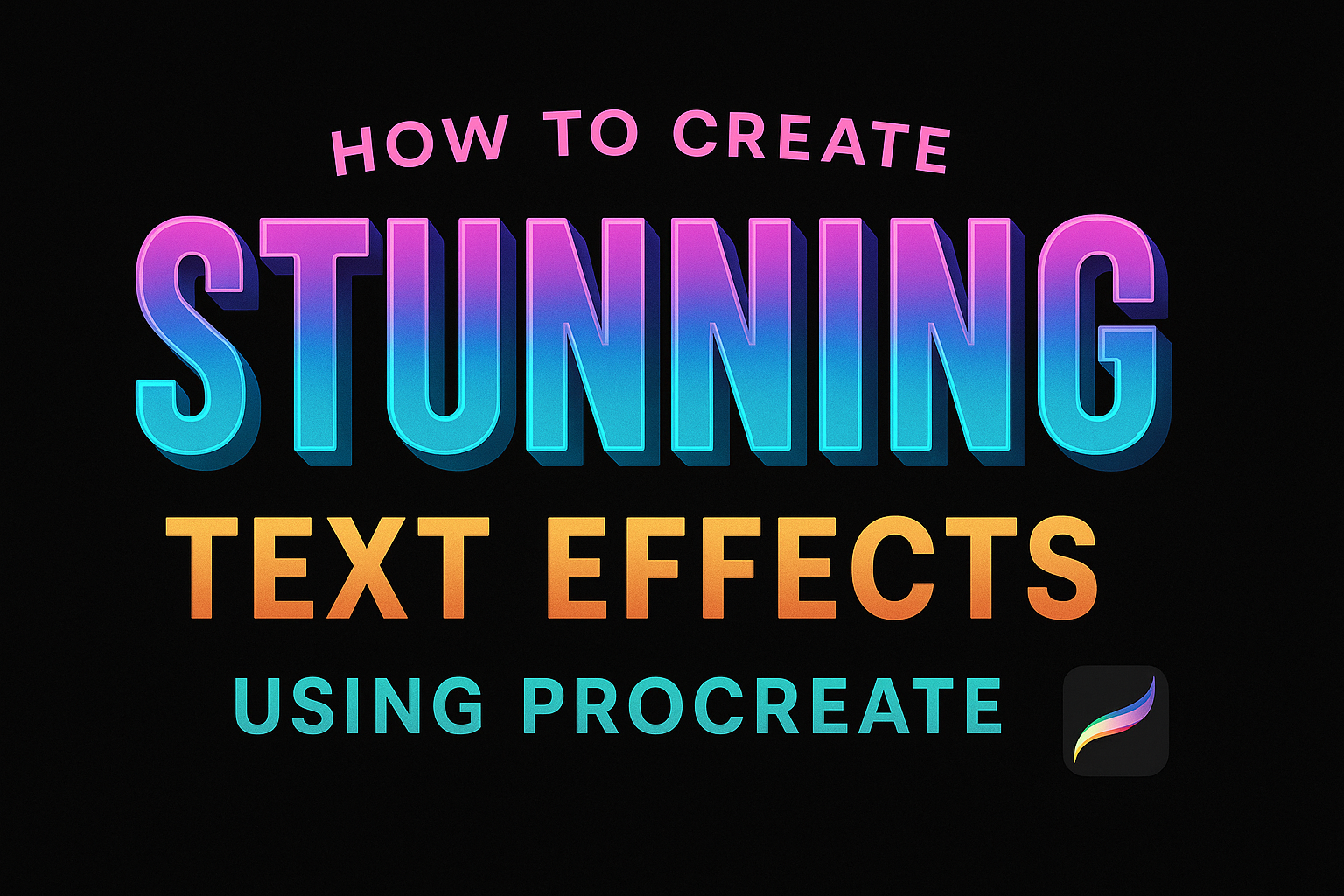
Creating stunning text effects in Procreate can transform any design project into something truly memorable. By mastering a few simple techniques, anyone can turn plain letters into eye-catching art. This digital art tool offers an array of features perfect for achieving creative text designs.
Text effects in Procreate range from basic to complex, allowing artists to explore creativity without limits. Users can learn how to curve text around different shapes or even create bold 3D lettering. These skills enable users to add depth and personality to their artwork.
Procreate’s powerful tools allow for endless possibilities in designing unique text effects. Whether it’s through tutorials or experimenting with the platform’s features, artists are equipped to craft designs that captivate viewers. Getting started with easy text effects can open the doors to a world of creativity in digital design.
Getting Started with Procreate
Procreate is a powerful app for digital artists, making it easy to create vibrant artworks. To begin, it’s important to know how to download the app, get comfortable with the interface, and set up your workspace.
Downloading and Installing Procreate
Procreate is available on the App Store, exclusively for iPad. To get started, head to the App Store and search for “Procreate”. Check the compatibility of your device, as Procreate requires a certain iOS version and storage space. Once confirmed, purchase and download the app. Ensure you have a stable internet connection to avoid interruptions.
Installing Procreate is straightforward. After downloading, the app icon will appear on your home screen. Tap the icon to open Procreate for the first time. It’s always a good idea to check for any updates in the App Store to ensure you have the latest version with new features and bug fixes.
Exploring the User Interface
Procreate’s user interface is designed to be intuitive, but it can feel overwhelming at first glance. The top of the screen houses the toolbar with options like the brush tool, selection, and transformation tools. On the left side, you will find the color wheel and layers panel. Familiarize yourself with these tools through short practice sessions.
Experimenting with the interface is key. Try out different brushes, change colors, and use layers to see how they affect your artwork. Procreate’s QuickMenu and gestures also help speed up your workflow. New users can explore tutorials offered directly within the app, providing guided walkthroughs and tips.
Setting Up Your Canvas
Setting up the canvas is crucial before starting any artwork. Tap the “+” icon in the gallery to create a new canvas. Choose from preset sizes or customize your own dimensions. Consider the aspect ratio and resolution based on your project needs. The higher the DPI (dots per inch), the better the print quality.
Layers are essential for organizing artwork. Use them to separate elements or apply effects without altering the main design. Remember to name layers for easy identification. As you set up your canvas, think about the background color and grid options that can act as guides while drawing.
Basic Text Tools
Procreate offers a range of text tools to enhance digital artwork. These tools let artists add and adjust text, manipulate its properties, and choose from diverse fonts to create impactful designs.
Adding Text to Your Artwork
To add text in Procreate, users should click the Wrench icon. This opens various options, and selecting the Add Text option creates a text box. After typing the desired text, it can be positioned anywhere on the canvas.
The user can adjust the size of the text box by dragging its corners. This helps fit the text into the desired space, ensuring it complements the artwork. By experimenting with placement and size, artists can find the perfect balance for their design.
Editing Text Properties
Procreate makes it easy to edit text properties for creative effects. By using the blue Edit Style button, users gain access to various options. They can adjust the text size, spacing, alignment, and color.
In the alignment settings, artists can choose between left, right, or centered text. This flexibility makes it possible to create visually balanced compositions. Adjustments to the line and letter spacing can further enhance the appearance, allowing for more dynamic and appealing designs.
Understanding Fonts and Typography
Choosing the right font is crucial for creating the desired impact in digital designs. Procreate gives users a selection of system and imported fonts to choose from. Each font offers a unique aesthetic, making it important to pick one that matches the artwork’s style.
In addition to selecting a font, Procreate makes it possible to manipulate typography by adjusting size and style. Bolding, italicizing, or underlining text can emphasize specific points. By playing with these elements, artists can breathe life into their text, ensuring it stands out and complements their artwork.
Layering Techniques
Exploring layering techniques in Procreate can elevate your text design by adding depth and style. This section will cover working with layers, using layer masks for unique text effects, and understanding blending modes to enhance artwork.
Working with Layers
Layers are fundamental in Procreate for organizing elements of your design. They allow for easy adjustments without affecting other parts of your work. Users can create new layers for different text elements or effects, making it easier to tweak or remove them later.
Naming layers can help keep designs organized. To name a layer, open the layer panel and select “Rename.” Efficient layer management can save time and streamline the creative process.
Using Layer Masks for Text Effects
Layer masks are powerful tools for creating non-destructive edits. They allow users to hide or reveal parts of a layer without permanently deleting anything. Masks can be used to create dynamic text effects, such as gradients or patterns, by controlling the visibility of specific areas.
To add a layer mask, tap on the “Add” button in the layer options. Painting on the mask with black will hide parts of the layer, while white will reveal them. This technique lets users experiment freely with designs.
Blending Modes Explained
Blending modes in Procreate determine how layers interact with each other. They can change the appearance of text by combining colors and brightness from different layers. This can add shadows, highlights, or a textured look to your text.
Some common blending modes include Multiply, Screen, and Overlay. Multiply darkens the base layer, useful for creating shadows. Screen lightens the layer, great for adding highlights. Overlay enhances contrast, boosting vividness in your design. Experimenting with different modes can help find the perfect effect for your project.
Creating Text Effects
Creating stunning text effects in Procreate involves mastering a few key techniques. By focusing on 3D effects, shadows, highlights, and neon glow, designers can transform simple text into eye-catching works of art.
3D Text Techniques
For 3D text in Procreate, adding depth is essential. Start by typing your desired text. Duplicate the text layer to begin creating the 3D effect. Using the duplicate layer, offset it slightly below the original text. Change the color of the lower layer to create the illusion of shadow or depth.
You can enhance the effect by repeating the duplication and offsetting process a few more times. This stacking will create a 3D appearance. Consider using the “Gaussian Blur” to blend the edges of the shadow layers for a smoother look. This technique helps create a convincing 3D effect, perfect for adding depth to designs.
Adding Shadows and Highlights
Shadows and highlights can make text pop. Begin by duplicating the text layer. For shadows, use a dark color and offset the duplicated layer to mimic the way light falls. Shadows can be blurred slightly using the “Gaussian Blur” to add realism.
For highlights, add a new layer above the text. Use a lighter shade or white, focusing on the areas where light would naturally strike. Soft brushes can be used to apply highlights with gradual transitions. Remember to adjust the opacity of the highlight layer to ensure they are subtle, maintaining balance with the overall text design to enhance readability.
Neon Glow Effects
Neon glow effects bring vibrancy to text designs. Start by creating a basic text layer, choosing a bright color as the base. Set the text layer to “Alpha Lock” and fill it with a bright hue. Then, create a new layer below and add the same text, slightly spreading it around the edges to mimic neon light diffusion.
Create another layer for the glow. Use a soft brush with a larger size and select a lighter version of the base color. Paint gently around the text, emphasizing the glow. Adjust the “Gaussian Blur” to smooth out the glow and make it realistic. This technique makes text look like it’s emitting neon light, giving it a striking appearance.
Advanced Text Manipulations
Advanced text manipulations in Procreate allow artists to push the boundaries of digital typography. Users can warp text into unique shapes, attach text to a drawn path, or use clipping masks to merge text creatively with imagery. These techniques enhance the versatility and visual appeal of designs.
Warping and Distorting Text
Warping and distorting text in Procreate gives users control over the shape and flow of their lettering. By using the Warp Tool, artists can create dynamic effects that follow the curves and contours they desire. This tool is accessible through the Move tool options.
To begin, the user selects their text layer and chooses the Warp tool. They can then adjust the mesh points to stretch, pull, or twist text into various forms. The Snapping feature is helpful here as it provides precision. Activating Distort and Magnetics ensures that the text remains aligned while transforming.
These manipulations often come in handy when integrating text into backgrounds or when a specific artistic flair is required. The results can be both striking and subtle, depending on the extent of distortion.
Text on a Path
Text on a path is a technique that lets artists align text along a curve or shape. This feature is particularly useful when working on logos or custom graphics that require text to blend seamlessly with design elements.
To create text on a path, artists start by drawing the intended path with a brush or pen tool. Afterward, they select the text layer and engage either the Move or Warp tool to position the text along the drawn lines.
Snapping the text to the path is crucial to maintain balance and proportions. This technique provides creative latitude, allowing text to blend naturally with other design elements. Customizing path text gives depth and sophistication to digital artworks.
Creating Text Clipping Masks
Creating text clipping masks in Procreate involves using text as a mask to reveal or hide parts of an image beneath it. This method is ideal for incorporating textures and images within text outlines, adding layers of meaning and visual intrigue to designs.
To create a clipping mask, place the text layer above the image you wish to mask. Then, tap the layer menu and select “Clipping Mask.” This action creates a mask using the text’s shape, showing only the part of the image within the text outline.
Adjusting the mask allows for endless possibilities, perfect for posters or detailed compositions. The interaction of text with imagery can create a powerful storytelling tool and elevate the design’s impact.
Embellishing Your Text
Adding unique textures, graphics, and color gradients can make text in Procreate more captivating. These enhancements can transform plain letters into compelling designs by adding depth and sophistication. Explore brushes, creative elements, and vibrant overlays to make your text stand out.
Using Brushes for Texturing
Procreate offers a wide variety of brushes that can be used to add textures to your text. By using the different textures available, users can create effects like a rough stone surface, a smooth metallic sheen, or even a fabric-like appearance.
To begin, select a brush from the “Brush Library” that suits your desired texture. Adjusting the opacity and size of the brush can help fine-tune the textural effect. Experimenting with the pressure sensitivity of the Apple Pencil can also add varying densities to the texture, creating a more dynamic look. Practice is key to achieving the desired effect, so don’t hesitate to try different combinations until the text looks just right.
Incorporating Graphics and Embellishments
Incorporating graphics and other decorative elements can greatly enhance your text. Procreate allows users to import images or draw their own embellishments to layer around or within their text.
To add graphics, use the “Insert a Photo” option or draw directly onto your canvas. Consider using small icons, floral designs, or abstract shapes to give the text an enhanced visual appeal. Align these elements carefully to maintain balance in the design. Additionally, using the “Layers” feature can help keep different elements organized, making it easier to edit or reposition them when needed.
Adding Gradients and Overlays
Adding gradients and overlays introduces color depth and interest to your text. Gradients can make your text look vibrant and three-dimensional, while overlays can blend colors to create unique hues.
Start by selecting the “Gradient Map” tool, accessible through the “Adjustments” menu. Choose a color palette that complements your design. Soft transitions between colors work well for a subtle effect, while bold contrasts can create more striking visuals. For overlays, try using a soft brush with low opacity and layer multiple colors to build a complex effect. Adjust layer blending modes to see how different settings change the outcome, allowing for a variety of artistic styles.
Exporting Your Artwork
Exporting your artwork in Procreate involves saving it in the right format and sharing it with others effortlessly. Whether you’re preserving your work for personal use or showcasing it to an audience, knowing how to export properly is key.
Saving Your Design
When it comes to saving your work, Procreate gives you several options. The choice of file format is crucial because different formats serve different purposes. Selecting JPEG or PNG is common for simple image sharing and online uploads.
For projects requiring further editing, opting for a layered file format like PSD is wise. This keeps all your layers intact for future edits. To save your design, tap the Action menu (wrench icon), select Share, and pick your desired format.
Always ensure your design is saved under a descriptive name. This organization helps find files easily later. It’s also smart to occasionally back up your files to a cloud service or external drive to avoid unexpected data loss.
Sharing Your Creation
Sharing your Procreate designs is straightforward. The app supports direct sharing to social media platforms and other apps. To begin, navigate to the Actions menu, choose Share, and select your preferred format. For collaborations, PSD files are ideal due to their editable layers.
If you wish to showcase your work to a broader audience, consider converting it to a high-resolution image. This ensures quality when uploading to websites or printing. Additionally, sharing directly via email or uploading to cloud storage services are simple tasks within Procreate. Visit Procreate Tips for guidance on selecting the right export settings.