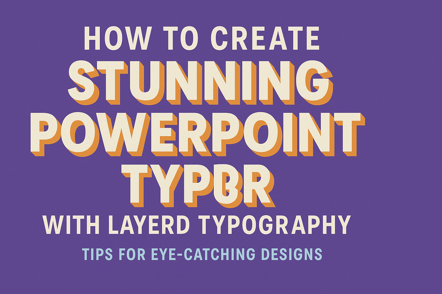
Creating visually appealing PowerPoint slides can transform a presentation from basic to brilliant.
Layered typography is a powerful way to add depth and interest to slide designs.
By using different font sizes, weights, and colors, presenters can guide their audience’s attention and emphasize key points effectively.
Understanding how to balance text and visuals is crucial.
Simple adjustments, like spacing and alignment, can significantly enhance readability and engagement.
With the right techniques, anyone can make their slides not only informative but also captivating.
This article will explore practical tips and tricks to harness the art of layered typography in PowerPoint. Discover how to create stunning slides that resonate with audiences and leave a lasting impression.
The Basics of Typography in PowerPoint
Typography plays a crucial role in how presentations are perceived.
Understanding the right font types, maintaining contrast, and balancing text with visuals can greatly enhance a PowerPoint presentation.
Understanding Font Types and Selection
Choosing the right font is essential for effective communication. Fonts can be broadly categorized into serif, sans-serif, and display types.
- Serif Fonts: These fonts have small lines or decorations at the ends of strokes. They are often viewed as traditional. Examples include Times New Roman and Georgia.
- Sans-Serif Fonts: These do not have small lines. They offer a clean and modern appearance. Examples are Arial and Helvetica.
- Display Fonts: These are decorative and meant for headlines or titles. Their use should be limited due to their unique styles.
When selecting a font, it is crucial to prioritize readability. Using one or two fonts throughout ensures a cohesive look. Mixing too many fonts can create confusion.
The Role of Contrast and Hierarchical Ordering
Contrast is vital in making text stand out against the background. A strong contrast helps draw attention to key ideas.
This can be achieved through the use of different font colors, weights, and sizes.
- Use bold fonts for headings to make them stand out.
- Keep body text in a lighter weight for easy reading.
Hierarchical ordering organizes information logically.
Larger fonts signal titles, while smaller ones indicate sub-points. This structure guides the viewer’s understanding and engagement with the content.
Balancing Text with Visuals
Visuals like images, graphs, and icons complement text and add interest.
Striking a balance between text and visuals is essential to avoid overwhelming the audience.
- Use visuals to support key points, not distract from them.
- Ensure there is enough white space around elements to maintain clarity.
Selective use of visuals helps maintain focus. Overloading slides with text can lead to disengagement. The ideal combination keeps the audience attentive and emphasizes important information.
Getting Started with Layered Typography
Creating layered typography can enhance a PowerPoint presentation by adding depth and interest to the slides. Key steps include selecting a clear message and carefully planning the layout to guide the viewer’s eyes effectively.
Choosing Your Main Message
The first step is to define the main message of the slide. It should be clear and convey the central idea without confusion.
Questions to consider:
- What is the key point?
- How can it be expressed simply?
Once the message is chosen, it is helpful to write it in a large font size. This ensures it stands out.
Consider using bold or italic styles to highlight important words. A striking contrast in colors can also draw attention.
Choosing a concise message helps in avoiding clutter. Each layered text should support the main theme without overwhelming the viewer.
Planning Your Slide Layout
A well-planned layout is crucial for layered typography to shine. First, sketch a rough design of where different text elements will go.
Things to consider:
- Where will the main message sit?
- How should secondary points be arranged?
Using a grid can help in organizing the text. Each layer of text should have its own space so that they don’t compete for attention.
It is also vital to balance text with visuals. For example, images or shapes can provide context while supporting the typography.
Remember to leave ample white space. This makes the design cleaner and allows the layered text to breathe, improving readability.
Design Techniques for Layering Text
Layering text in PowerPoint can enhance visibility and create a unique visual experience. Various techniques such as adjusting transparency, manipulating size, and adding motion can significantly improve the design of slides.
Using Transparency and Overlays
Transparency can be an effective tool in creating depth in PowerPoint slides.
When layering text, using semi-transparent backgrounds for text boxes allows the text to stand out without overwhelming the slide.
To apply transparency, right-click on the text box or shape, select “Format Shape,” and adjust the transparency slider.
This method helps in blending text with background images or colors, creating a more cohesive look.
Overlays can be used to add texture or color underneath the text.
Choose patterns or gradient backgrounds that complement the main elements. This technique emphasizes the layered effect while maintaining readability.
Playing with Size and Scale
Varying the size of text helps guide the viewer’s attention effectively.
Larger fonts can be used for headings, while smaller text can give details. This contrast between different sizes makes the information easier to digest.
To enhance the design, try stacking text in different sizes. For instance, a large title can be placed above smaller subtitles or body text.
Also, adjusting the spacing between letters (kerning) can add a modern touch. Tightening or widening letter spacing can impact the overall feel of the slide, allowing for creativity in presentation.
Incorporating Motion and Transitions
Motion can bring slides to life and keep the audience engaged.
Subtle animations, such as fading in text, can add a dynamic touch without being distracting.
PowerPoint offers various animation options.
For layered text, consider using entrance effects like “Fade” or “Appear.” These can be set to occur on click or automatically after a certain time.
Transitions between slides can also enhance the layered effect. Using smooth transitions helps maintain the flow of the presentation.
It can create anticipation as the audience sees new layers of information come into view.
Advanced Layering Concepts
Layering in PowerPoint not only enhances the visual appeal but also adds depth and intrigue to slides. Understanding techniques like shadows and 3D effects can take presentations to the next level.
Working with Shadows and Depth
Shadows can create a sense of dimension and make elements stand out. By applying shadows to text and images, the slides can feel more dynamic.
To add a shadow, select the object and navigate to the Format Shape options. Here, users can choose different shadow styles, including Inner, Outer, or Perspective shadows.
Adjusting the shadow’s transparency, blur, and angle will refine the effect further.
It’s essential to keep shadows subtle. Overly harsh shadows can distract from the message.
A well-placed shadow can guide the viewer’s eye without overwhelming the content.
Implementing 3D Effects
3D effects offer unique ways to present objects and text. They can make slides more engaging and professional. PowerPoint provides simple tools to incorporate these effects.
To implement 3D effects, click on the object and find the 3D Format options in the Format Shape menu. Here, users can choose different styles like Bevel and 3D Rotation.
Utilizing the 3D Rotation presets can help create a more vivid presentation. It’s effective for charts and diagrams, adding depth to the visual elements.
Remember that clear 3D effects work best when they do not distract from the overall message. Balancing these elements can lead to impressive, layered typography.
Optimizing Readability
To create stunning PowerPoint slides, one must focus on the clarity of text, especially when layering it over images or graphics. Readability ensures the audience easily understands the message being conveyed.
Ensuring Clear Text Underlayers
One effective way to enhance readability is by using a clear text underlayer.
Adding a transparent shape behind the text can make words pop against busy backgrounds.
This method can be a simple rectangle or circle in a contrasting color.
Additionally, using a dark or light overlay can reduce the distraction of background images.
It is important to choose a color that matches the theme while ensuring the text stands out. A high contrast between the text and its background can significantly improve visibility.
Spacing and Alignment Tricks
Spacing is crucial in presenting layered typography nicely.
Proper line spacing helps to separate lines of text, making them easier to read. Aim for 1.5 to 2 line spacing, which provides enough breathing room.
Alignment also plays a vital role.
Using left-alignment is often best for overall readability in English, as it leads to easier scanning.
Moreover, ensuring uniform margins can create a clean look.
Consider using bullet points to break up text into digestible pieces. Lists capture attention and convey information clearly.
Balancing alignment, spacing, and layout leads to visually appealing slides that enhance comprehension.
Applying Color Theory
Color plays a critical role in creating visually engaging PowerPoint slides. By carefully selecting a color palette and ensuring good contrast, one can effectively communicate ideas and keep the audience’s attention.
Choosing a Color Palette
When creating a PowerPoint presentation, choosing a color palette is a key step. A good palette sets the mood and connects with the audience.
To start, consider complementary colors from the color wheel, like red and green. These colors can enhance the visual impact.
Another option is using analogous colors, which sit next to each other, such as blue, green, and teal. This creates harmony.
Using a limited palette, around three to five colors, keeps the slides cohesive. Use one or two main colors for backgrounds and bold accents for key points.
Tools like Adobe Color can help find stylish combinations.
Remember, the colors should align with the presentation’s purpose and audience preferences.
Color Contrast and Legibility
Color contrast is vital for readability. High contrast between text and background makes information easier to absorb.
For instance, dark text on a light background, or vice versa, ensures clarity. Avoid using colors that clash or make text hard to read, like yellow on white.
Using tools like contrast checkers can help achieve effective combinations.
Legibility is further enhanced by font choice and size. Keep fonts simple and easily readable, preferably sans-serif.
Test the slides in different lighting conditions to check visibility. Ensuring that the text stands out will keep the audience engaged and focused on the content.
Final Touches
To achieve a polished presentation, making final adjustments is crucial. Careful review and testing can enhance the overall impact of the slides, ensuring that they communicate effectively and engage the audience.
Reviewing Your Slides for Consistency
Consistency is key in any presentation. It helps create a cohesive look that keeps the audience focused.
Review each slide for uniformity in fonts, colors, and layouts.
Make sure that the same fonts are used throughout. For instance, if one slide uses a bold title font, all titles should match.
Use a limited color palette to maintain harmony.
Check the alignment of text and images. Everything should be neatly placed. Tables and lists should have equal spacing to avoid clutter.
Finally, ensure that transitions and animations are consistent. If one slide uses a fade effect, others should do the same for a seamless flow.
Testing Your Design with an Audience
Before finalizing the presentation, it’s beneficial to test it with a small audience.
Feedback can reveal areas for improvement that the creator might overlook.
Presenting the slides to a friend or colleague allows for observations on clarity and engagement.
It’s helpful to ask specific questions about which slides held their attention or if any information seemed confusing.
Pay attention to body language and reactions during the presentation. This provides hints about what works and what doesn’t.
Adjust the slides based on this feedback.
Sometimes, a simple tweak in text size or adding an image can significantly enhance audience engagement.