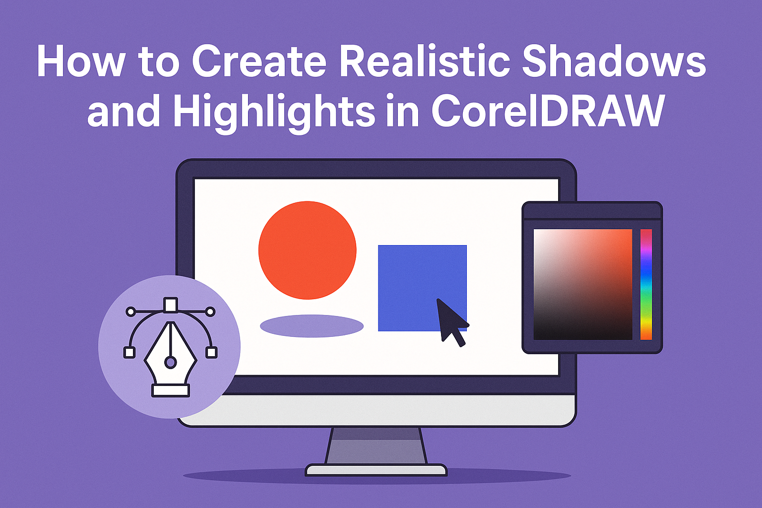
Creating realistic shadows and highlights in CorelDRAW can transform your artwork, adding depth and dimension. The key is to use layers and blend modes effectively to craft shadows that interact with other elements. Mastering this skill helps make designs look more lifelike and professional.
In CorelDRAW, there are various tools that can help achieve this effect, like the Multiply layer for shadows. For highlights, using lighter colors with soft edging can define details and make them pop. Adding shadows can enhance forms such as muscles or other intricate details.
For those looking to dive deeper, exploring how tools like the Blur Tool and Bitmaps enhance shadow effects is beneficial. CorelDRAW’s vector tools offer flexibility and precision, enabling users to create unique designs effortlessly.
Understanding Shadows and Highlights
Creating realistic shadows and highlights in CorelDRAW begins with understanding the effect of light on objects. The intensity, angle, and color of the light all play a crucial role in forming shadows and highlights. By grasping these elements, artists can deepen their work, making it more lifelike and striking.
The Role of Light in Art
Light is a key element in art because it reveals form and creates depth. It can be from a natural source like sunlight or artificial ones like lamps. When light hits an object, it creates areas of brightness and shadow.
In CorelDRAW, artists can simulate light effects by adjusting the transparency and gradient. This helps in showing how light falls on an object, creating different tones. Pay attention to how light changes the color of an object and how shadows are formed. This attention to detail makes a huge difference in the overall effect of the artwork.
Shadow and Highlight Basics
Shadows and highlights are vital for showing dimension and depth. The darkest part of an object is its shadow, while the brightest part is the highlight. There are form shadows and cast shadows. Form shadows are on the object itself, while cast shadows are those that fall on the surrounding surface.
In CorelDRAW, understanding these elements can help in layering and defining objects. Fine-tuning shadows with transparency layers and using the gradient fill tool can help in achieving realistic effects. It’s important to soften the edges of shadows and highlights to avoid harsh lines. This technique leads to a more natural appearance.
Color Theory Basics for Shading
Color is essential in making shadows and highlights look natural. Shadows aren’t just black or gray; they can be influenced by the object’s color and the light source. Different lighting can change an object’s colors dramatically. Warm light might cast warmer shadows, while cool light can create cooler tones.
In CorelDRAW, artists can use color palettes to match and blend colors effectively. By using the color picker and adjusting saturation and brightness, realistic shading can be achieved. This practice not only enhances realism but also complements the artwork’s mood and setting. Remember, this careful choice of color contributes significantly to how viewers experience the artwork.
Setting Up Your CorelDRAW Workspace
Setting up your CorelDRAW workspace effectively is crucial for creating realistic shadows and highlights. This involves selecting the appropriate canvas size and configuring toolbars for ease of use.
Choosing the Right Canvas
Selecting the right canvas size is the first step. It determines how much space is available for your design. For print projects, it’s important to match the canvas size to the paper dimensions. This ensures that the design will print correctly without scaling issues.
Designers often start with a standard letter size (8.5×11 inches). However, CorelDRAW offers various preset sizes that can be adjusted under the Document Properties menu. Use dpi settings of 300 for prints to maintain high image quality.
For digital designs, screen resolution is key. Choosing a canvas that fits common screen resolutions like 1920×1080 pixels can make your design more adaptable. Always check the resolution settings to ensure designs look good on multiple devices.
Customizing Toolbars and Shortcuts
Customizing toolbars and shortcuts makes workflow smoother and faster. CorelDRAW’s interface allows for adding, removing, and organizing toolbar items, which can save time by keeping frequently used tools accessible. Users can right-click on any toolbar to access the Customize Toolbar option.
Shortcuts are another critical aspect. Keyboard shortcuts speed up tasks by reducing the need for mouse clicks. Users can customize these by going to Tools > Customization > Commands and then selecting Shortcut Keys.
Consider creating custom shortcuts for tools like the Drop Shadow and Blur tools. This helps in adding effects like realistic shadows and highlights more efficiently. Tailoring these settings to personal preferences can make a significant difference in productivity.
Vector Shapes and Fills
Creating realistic graphics in CorelDRAW involves skilled use of vector shapes and fills. By mastering the drawing tools and applying various fill techniques, users can produce detailed and visually appealing designs.
Mastering Vector Drawing Tools
Understanding vector drawing tools is crucial for creating smooth and precise shapes. CorelDRAW offers various tools like the Pen, Bezier, and Freehand tools, which each allow users to draw different types of curves and lines.
The Pen tool offers controlled line drawing by setting anchor points and curves. The Bezier and Freehand tools add flexibility, allowing creative freedom. Regular practice with these tools leads to improved accuracy and efficiency in designing.
Applying Gradient Fills
Gradient fills add depth and dimension to vector shapes. They blend multiple colors seamlessly across an object. In CorelDRAW, users can specify colors and the direction of the gradient, such as linear or radial.
Users can access the Gradient Fill tool from the fill dialog. Once selected, colors and positions are adjusted to suit the design needs. This creates smooth transitions that enhance the realism of an object, achieving a lifelike appearance.
Using Interactive Fill Tool
The Interactive Fill Tool in CorelDRAW lets users apply and modify fills directly on the object. It works similarly to a paintbrush, allowing real-time adjustments. Users can select and drag the fill handles to change colors, positions, and gradients on the shape.
This tool is perfect for fine-tuning fills on complex shapes. By manipulating the fill on the object itself, designers can see immediate results, making it easier to achieve the desired visual effect. Adjusting these details helps in crafting realistic and appealing designs.
For more on creating specific effects using these tools, visit CorelDRAW’s tutorials on creating realistic objects with mesh fill.
Creating Realistic Shadows
In CorelDRAW, making shadows look real involves adjusting shadow depth, considering direction and perspective, and using various techniques to create soft or hard edges. By mastering these elements, artists can enhance the lifelike quality of their drawings.
Shadow Depth and Opacity
Adjusting shadow depth and opacity is crucial to creating natural-looking shadows. Shadows should mimic how light interacts with surfaces. Heavier objects may cast darker shadows, while lighter objects might have softer ones. Using CorelDRAW, artists can easily adjust shadow opacity to achieve the desired effect.
When blending shadows, it’s handy to use gradient tools to smoothly transition the shadow’s edge. Highlighting areas where light fades can make a shadow look softer. Keeping an eye on how opacity affects other colors in a design is also important, to avoid overly dark areas.
Directional and Perspective Shadows
Directional and perspective shadows add depth and context to a scene. Shadows change based on the light source’s position. In CorelDRAW, artists can alter shadow angles and length to match different light directions, enhancing realism.
To create these shadows, it’s helpful to imagine the light source angle and where it will cast the shadow. Artists use tools like the Shadow tool to adjust the shadow’s length and angle to fit the perspective in their art. This attention to direction ensures that shadows complement the overall composition.
Soft and Hard Shadow Techniques
Soft and hard shadow techniques give contrast and texture to artwork. Soft shadows usually occur when light diffuses over a broad area. Hard shadows form when light comes from a small source. In CorelDRAW, artists can experiment with blur settings to achieve both.
By adjusting blur levels, artists can decide where shadows should appear more pronounced or softer. Using layering methods also helps create a range of textures within a shadow. Observing how shadows naturally fall in different environments can guide artists to replicate them in digital art, making the shadows feel authentic.
Crafting Highlights and Glows
Crafting highlights and glows in CorelDRAW involves understanding how light behaves. This includes identifying where light comes from, how strong it is, and how to use specific tools like the Mesh Fill Tool to create realistic effects. Each topic highlights different aspects essential for achieving a realistic look.
Identifying Light Sources
Identifying light sources is the first step. Knowing where the light is coming from helps determine where highlights should be placed. The light direction decides which parts of an object will be the brightest.
There are two main types of light sources: natural and artificial. Natural light, like sunlight, is consistent but can vary in intensity and direction throughout the day. Artificial light, such as lamps or spotlights, offers more control.
Understanding these differences is crucial. By observing the light source’s angle and strength, designers can accurately place highlights, enhancing depth and dimension in their work. Noticing reflections or secondary light sources can add even more realism.
Highlight Intensity and Spread
The intensity and spread of highlights depend on the light source’s strength and proximity. A strong, nearby light source will create intense, small highlights, while a softer, distant light results in wider, more diffused highlights.
Experimenting with different strengths can be helpful. In CorelDRAW, adjusting the brightness and gradient can achieve the desired effect. A bright spot can be softened by gradually decreasing the light’s intensity outward from the center.
Use contrast wisely. A stark difference between highlights and shadows creates more drama. Meanwhile, less contrast can result in subtler transitions. Consider the object’s material, too, as some surfaces reflect light differently.
Using the Mesh Fill Tool for Highlights
The Mesh Fill Tool in CorelDRAW is powerful for creating detailed highlights. It allows for precise control over color and light placement on different parts of an object.
Users can set multiple points on the mesh to tweak colors individually. This feature is especially useful for creating soft gradients that mimic how lights naturally fade. By manipulating these points, one can create seamless transitions between light and dark areas.
When using this tool, it’s helpful to experiment with different shapes and sizes. The ability to adjust each mesh point makes it less challenging to match the highlight’s contour to the object’s surface, maintaining its realistic appearance.
Applying Textures and Effects
Incorporating textures and effects in CorelDRAW can elevate the realism of shadows and highlights. By using overlays, blending, and distortion, artists can create depth and interest.
Texture Overlay for Added Realism
Textures can enhance the appearance of shadows and highlights by adding depth. In CorelDRAW, artists can apply texture overlays to their work without altering the original shapes. This involves layering a texture over an object and adjusting its opacity.
Common textures include paper, fabric, or even natural surfaces like stone. The key is to select a texture that complements the artwork. After choosing a texture, it can be imported into the software and positioned over the desired area. Adjusting transparency levels can help the texture blend seamlessly with the underlying colors.
Using texture overlays not only adds interest but also gives a realistic touch. Shadows can appear more complex, mimicking how they naturally interact with textures in real life.
Blend and Distortion Effects
Blending and distortion effects in CorelDRAW can transform flat shapes. Blending involves smoothly merging colors or gradients, which can refine shadow edges and create softer transitions.
The blend tool allows users to create gradual transitions between objects. Adjusting node positions or colors changes how elements interact. Using this tool, artists can imitate light scattering, which affects how shadows are cast.
Distortion, on the other hand, adds an emotional or dynamic feel to elements like highlights. The distortion effect can warp or twist shapes, making highlights reflect more naturally on irregular surfaces.
By combining these effects, shadows and highlights in CorelDRAW can achieve a more realistic appearance.
Combining Multiple Light Sources
Creating realistic shadows and highlights in CorelDRAW involves understanding how to blend multiple light sources. This requires careful management of layered light effects and finding the right balance in color and intensity to add depth.
Managing Layered Light Effects
When working with CorelDRAW, it’s important to layer light sources to mimic real-world lighting. Each layer represents a different light source, and they can overlap to create complex shadows. Use layers to experiment with various positions and intensities of light.
Organizing layers helps in adjusting each light source separately. This can be achieved by naming and grouping them accordingly. Techniques like using transparency and blend modes can help soften or sharpen edges between layers, enhancing realism.
Balancing Color and Intensity
Adjusting the color and intensity of each light source can dramatically impact the overall look of an image. Multiple light sources may have different colors; think about natural conditions, such as sunset or artificial lighting. Using color palettes wisely can enhance the mood.
CorelDRAW’s color tools allow precise control over these factors. Remember, the intensity of light affects shadow sharpness and contrast. Softer light creates gentler transitions, while intense light results in sharper distinctions. Balance these elements for realistic compositions and pleasant visual effects.
Pitfalls to Avoid
Creating shadows and highlights in CorelDRAW can be tricky if not done carefully. It’s essential to avoid common mistakes like over-darkening, as they can lead to unrealistic finishes. By understanding these issues, users can improve their artwork’s realism and quality.
Common Shadow and Highlight Mistakes
One of the most frequent mistakes is over-darkening areas meant to be in shadow. This can cause them to lose detail and appear flat. Applying shadows with too much opacity can make elements look unnatural and separate from the rest of the image.
Another common issue is using consistent shapes for shadows and highlights. Natural light varies, meaning the same shadow shape repeatedly can look artificial. It’s important to match shapes and gradients to the image’s context and source of light.
Over-using highlights can also be a problem. Too much white or bright areas can make objects look glossy or plastic-like, ruining the intended effect. It’s crucial to apply highlights selectively and ensure they’re consistent with the image’s light source.
How to Correct Overdone Effects
To fix overdone shadows, users should adjust the opacity and transition smoothly into areas of light. This gives a more cohesive look. Adjusting these levels in small increments can help find the right balance without losing details.
For highlights that seem too intense or misplaced, reducing brightness and softening edges can make them appear more realistic. Applying highlights gradually and blending their edges ensures they don’t overpower the shadowed areas.
Utilizing layers effectively in CorelDRAW can aid in these adjustments.
Practice Projects for Mastery
Creating realistic shadows and highlights in CorelDRAW requires practice and experimentation. These projects focus on different areas: a still life illustration, portrait lighting techniques, and abstract design play. Each project helps develop a specific skill while enhancing overall mastery of light and shadow effects.
Still Life Illustration
In this project, artists can set up a simple still life scene with objects like fruit, bottles, or books. This setup helps them practice observing and recreating shadows and highlights. By changing the light source, they learn how different angles create varying shadow lengths and tones. CorelDRAW tools like the Gradient Fill and Mesh Fill are useful for mimicking realistic textures and shadows.
Working with layers can help manage the elements in the scene. For example, keeping objects, shadows, and highlights on separate layers makes adjustments easier. This focus on observation and tool mastery builds a strong foundation in rendering realistic still life scenes.
Portrait Lighting Techniques
Portrait lighting can be challenging, yet it offers great opportunities for mastering light and shadow in CorelDRAW. Artists can begin by studying different lighting setups, such as Rembrandt lighting or butterfly lighting. These techniques highlight features with a mix of light and shadow to create depth and interest.
Using tools like the Transparency tool assists in softening the edges of shadows on the face. Practicing with different brush settings can help artists simulate the gradual blend of light and dark necessary for realistic portraits. This exploration enhances their understanding of light direction and intensity as it shapes the face.
Abstract Design Play
Abstract design allows artists to explore shadows and highlights without the constraints of realism. This project encourages creativity by playing with geometric shapes, patterns, and vibrant colors. By experimenting with CorelDRAW’s Interactive Fill and Blend tools, artists can create dynamic effects.
With abstract designs, there’s freedom to push boundaries in ways not always possible in realistic depictions. This flexibility helps develop an intuitive grasp of how light interacts with forms, even when they’re not rooted in reality. Regular experimentation can reveal new methods and inspire fresh ideas.