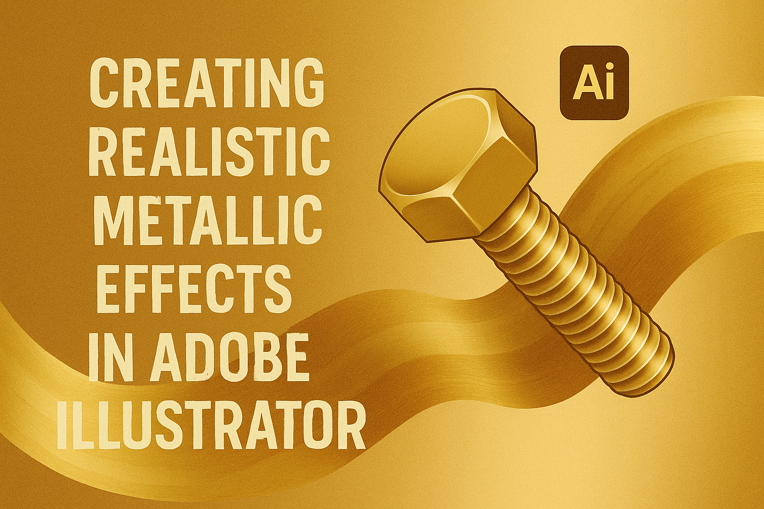
Creating metallic effects in Adobe Illustrator can bring a vibrant, realistic touch to your designs, making them stand out. Many artists look for ways to master this technique as it adds an appealing shine and depth to digital artwork. By mastering these effects, designers can transform ordinary text and objects into eye-catching metallic masterpieces.
Adobe Illustrator provides versatile tools that allow users to create stunning metallic effects with ease. These techniques can be applied to create textures like brushed metal or silver text. Such metallic effects can enhance illustrations, giving them a more professional and polished look, and make artwork visually striking.
Learning to craft these metallic effects not only enhances design skills but also broadens creative possibilities. Designers have access to various tutorials and resources, such as detailed steps from Envato Tuts+. These guides break down the process, making it accessible for both beginners and experienced users.
Understanding Metal Textures and Properties
Metal textures add a unique and realistic look to designs. They can make digital artwork appear polished and professional. Shiny, matte, and brushed patterns are some popular metallic effects in digital graphics. These textures often include elements like shine and shading to mimic the way light interacts with metal surfaces.
Creating a realistic metal effect involves understanding how light reflects off metal. Metals have reflective surfaces that produce highlights. Artists need to capture these reflections accurately. Using highlights and shadows helps give depth to the metallic look.
Different metals have their own unique characteristics. Steel is often portrayed with cool, gray tones, while gold uses warm, yellow hues. Texture and color choices can change the perception of the metal type. Designers should choose colors that reflect the mood they want to convey. These choices affect the overall impact of the metallic texture.
Using gradients is important to create a smooth transition between the highlights and shadows on metal surfaces. A gradient helps simulate the shiny, polished quality of metal. Designers often use blended colors to achieve this effect.
Textures can enhance the overall realism of the metal effect. Adding a pattern, such as horizontal or vertical lines, can create a brushed metal look. These patterns mimic the appearance of fine scratches found on real brushed metals. Artists can experiment with these elements to find what works best for their design.
Setting Up Your Document
Creating a stunning metallic effect in Adobe Illustrator starts with setting up your document correctly. This involves choosing the right canvas size and organizing layers for an efficient workflow. Both steps are crucial for achieving the best results.
Choosing the Right Canvas Size
Selecting an appropriate canvas size is essential for your metallic design. A good starting point is to consider the dimensions of the final product, like whether it’s for digital use or print. For instance, a digital banner might require different dimensions than a printed flyer.
In Adobe Illustrator, click File > New to open a new document. From here, you can choose Pixels for digital projects or Inches for print. It’s important to think ahead about where your design will be displayed to avoid resizing issues later. Opting for a larger size initially can help maintain quality if resizing is needed.
Setting Up Layers for Workflow Efficiency
Using layers helps in organizing your artwork, making it easier to edit specific parts without affecting others. Start by setting up multiple layers in Illustrator, which you can do by opening the Layers panel and clicking New Layer.
Assign meaningful names to each layer, like “Background,” “Metallic Text,” or “Effects.” This naming makes it simpler to find and edit content quickly. Group similar elements on the same layer to keep your project tidy. This organized approach not only saves time but also prevents mistakes as your metallic effect comes to life.
Basic Shapes and Gradient Techniques
Creating realistic metallic effects in Adobe Illustrator begins with mastering basic shapes and applying gradient techniques effectively. Understanding these tools helps bring a metallic look to designs, making them visually appealing and authentic.
Creating Shapes with the Pen Tool
In Illustrator, the Pen Tool is essential for crafting precise shapes. Users start by selecting the Pen Tool from the toolbar. By clicking on the canvas, anchor points are placed, which are connected by paths. This lets users draw straight or curved lines.
For metallic effects, users can create shapes like circles or rectangles, which will serve as the base. Adjusting the curves of the paths helps in designing more complex shapes.
While creating these shapes, it’s also important to consider symmetry and proportion. Shapes that are evenly balanced and proportioned can make the metallic effect more striking. Practice with the Pen Tool can greatly enhance control and precision.
Applying Gradients for a Metallic Look
Once the shapes are ready, applying the right gradients is key. In Illustrator, users can find the Gradient Tool and apply it to the selected shape.
For a metallic finish, gradients with gray tones or reflective colors like silvers and golds work best. Users may find tutorials like this one helpful to understand gradient applications.
Experimenting with gradient sliders allows adjustment of color transitions. This creates highlights and shadows, which mimic light reflection on metal surfaces. Paying attention to how lighting affects metal in real life can guide the gradient choice and placement.
Adding Depth and Realism
To create realistic metallic effects in Adobe Illustrator, it’s important to focus on adding depth and realism. Techniques like using the Gradient Mesh Tool, incorporating shadows and highlights, and utilizing blurs can transform flat designs into eye-catching artwork.
Using the Gradient Mesh Tool
The Gradient Mesh Tool is excellent for creating gradual color transitions. It allows designers to adjust colors at multiple points within a shape. This creates a more realistic look by simulating light reflection on metallic surfaces.
To start, they should select the object to apply the mesh. Next, they adjust the mesh points to fit the contours of the shape. Changing color stops along the mesh enables smooth transitions. For metals, this often means using grays or metallic hues.
This tool helps create highlights and shadows within an object without needing separate objects. By carefully manipulating the mesh points, the design gains the appearance of depth. Designers might highlight one side to mimic a light source or darken edges for shadowing.
Incorporating Shadows and Highlights
Shadows and highlights add realism by suggesting the direction of light and the contours of an object. Highlights can be added using lighter tones, while shadows require darker shades.
In Illustrator, the Pen Tool is useful for drawing custom shadow shapes. Applying a small blur to these shapes can make them look soft and natural. Shadows can fall away from the object or be cast underneath, depending on the desired effect.
Adding highlights involves selecting areas where light would naturally hit. Light gradients or gradients with white can be used to create shiny spots. This is particularly effective for enhancing curved or angled surfaces where light would naturally reflect.
Utilizing Blurs for Softness
Blur effects can create depth by softening edges, either mimicking focus or the way light diffuses across a surface. Gaussian Blur is a popular choice. It’s simple to apply and adjust to get the desired effect.
Designers should apply blurs subtly. Too much can make objects look out of place. Slight blurring on edges can enhance realism, hinting at metal’s reflective property. Often, mixing a blurred shadow with crisp highlights achieves a balanced metal feel.
Detail Enhancements for Realism
Creating realistic metallic effects in Adobe Illustrator involves paying attention to the small details that make a design stand out. Focus on using texture overlays, adding unique scratches, and incorporating embossing techniques to achieve a lifelike metallic finish.
Texture Overlays for Metal Grain
Texture overlays can give metal designs a grainy appearance, making them look more authentic. Using subtle gradient and noise effects can simulate different metal surfaces like brushed steel or polished aluminum. Designers should experiment with different textures to see how they interact with their metallic designs.
Blending modes like Overlay or Soft Light can add depth. Adjusting the opacity of these textures helps in maintaining a natural look. Changing the grain’s scale and orientation is also key to matching the metal’s appearance. It’s helpful to look at real metal objects when choosing the right grain texture.
Creating Scratches and Imperfections
Scratches and imperfections in metal design can add an extra layer of realism. By including small dents or wear marks, designs feel more dynamic and authentic. Using tools like the Pen Tool or Brush Tool allows for customized scratch effects.
Layering different shades and adjusting their transparency can create depth. A popular method is to use lighter and darker shades to suggest depth. Experimenting with irregular shapes makes the effect more convincing since real scratches aren’t uniform. It’s also useful to consider how light interacts with these imperfections to ensure they look natural.
Embossing for Raised Metal Effects
Embossing is a technique used to make parts of the design appear raised, contributing to a three-dimensional look. This can be achieved by using shadows and highlights effectively. Shadows are applied to emphasize depth, while highlights accentuate raised areas.
Using Adobe’s 3D Extrude & Bevel tool can help create convincing embossed effects. Applying layer styles like Bevel and Emboss enhances this further. Adjusting the angle and amount of emboss gives control over how pronounced the effect appears.
Testing different angles for the light source can help in achieving the desired effect. Once the embossing is aligned with the rest of the metallic elements, the design will have a cohesive and realistic finish.
Color and Reflectivity
Getting the right color and capturing the reflectivity of metals are key to creating realistic metallic effects in Adobe Illustrator. Readers will learn about using color theory to mimic metals and how to simulate reflective surfaces effectively.
Color Theory for Metals
Understanding color theory is essential for creating metallic effects. Metals like gold, silver, and copper each have distinct hues. Gold features warm tones, primarily deep yellow with hints of orange or brown. Silver leans more towards greys and blues, while copper has a rich reddish-brown.
For realistic metal colors, a suitable palette in Illustrator’s Swatches panel is important. Using gradient fills can help blend these hues smoothly. Each end of the gradient should be adjusted to match the metal’s shine and natural color variations, creating a sense of depth and richness.
Simulating Reflective Surfaces
Simulating reflectivity involves capturing how light interacts with different metals. Reflectivity varies with the texture and finish of the metal. To achieve this, applying gradients effectively is key. Gradients with multiple stops and reflective swatches can provide the illusion of shiny surfaces.
Experimenting with highlights and shadows improves realism. Adjusting the position of these elements to mimic the light source enhances the effect. Illustrator’s 3D effects can add depth and help mimic real-life shading. Using layers to overlap reflective surfaces with other elements often results in more convincing outcomes.
Final Touches and Exporting
Creating a realistic metallic effect in Adobe Illustrator involves refining details and ensuring your work looks great across various media. This involves applying finishing effects and then exporting in the appropriate format.
Applying Finishing Effects
Finishing touches can significantly impact how your metallic effect appears. Start by adjusting the highlight and shadow balance. This step enhances the metallic shine, making it more convincing. Experiment with gradient meshes to add depth and complexity to the surface.
Another effective technique is to use blending modes. Options like Overlay or Soft Light can give your design a more natural, metallic finish. Adjusting opacity can also help fine-tune the look.
Remember to zoom out frequently. This helps in viewing the design as a whole and spotting any uneven or awkward areas. Small adjustments can make a big difference in achieving a polished look.
Exporting for Different Media Types
Exporting correctly ensures your design looks consistent, whether it’s printed or displayed digitally. Adobe Illustrator offers various formats such as PNG, JPEG, and SVG. Choose PNG or JPEG for web use, ensuring the resolution is set to 72 DPI for fast loading times.
For print purposes, use a PDF format with CMYK colors. This preserves color integrity and ensures prints match on-screen visuals. If working with transparent elements, SVG might be a suitable alternative, especially for web and digital displays.
Always check the file size and adjust settings to optimize loading times without sacrificing quality. Ensure the right export settings maintain the metallic effect and visual impact across different platforms.