Creating professional business cards can be an exciting project for anyone wanting to make a great first impression. With CorelDRAW, designers have a powerful tool at their fingertips that combines versatility and ease of use. It provides step-by-step guidance to create eye-catching, professional business cards that stand out.
Designing a business card with CorelDRAW allows for endless creativity while maintaining a professional appearance. By focusing on essential elements like layout, typography, and color, users can craft precise and impressive designs. Tutorials available online, like those found on YouTube, are invaluable resources.
Whether you are a beginner or an experienced designer, CorelDRAW offers tools to make the job easier. Users can explore tutorial guides such as the Ultimate Guide by CorelDRAW to hone their skills and discover new design possibilities. These resources ensure anyone can learn to create stunning business cards that reflect their brand’s identity.
Understanding Business Card Basics
When creating business cards, it’s essential to focus on their purpose and layout. With the right design and size, a business card can effectively convey a brand’s message and identity.
Purpose and Importance of Business Cards
Business cards serve as a personal introduction and a quick way to share contact information. They are more than just paper; they represent the brand and professionalism of a person or company. A well-designed card can leave a lasting impression and encourage future communication.
Having a unique and clear design emphasizes the brand’s values and services. It shows that attention to detail is important, even in small things. For professionals, cards can be conversation starters, inspiring more detailed discussions about what they offer.
Standard Dimensions and Layout
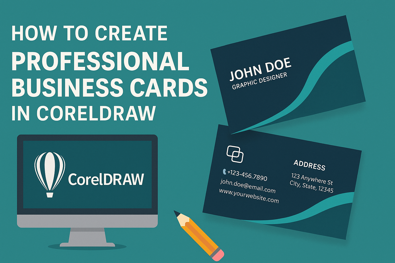
The typical size for business cards is 85 mm by 55 mm, but there are variations depending on regional preferences. This size easily fits in wallets and cardholders. When laying out a card, it’s crucial to organize the elements logically, ensuring the most important information stands out.
Core elements usually include the name, job title, contact details, and company logo, all aligned thoughtfully to maintain visual balance. Using high-quality materials can enhance the card’s feel and look. Tools like CorelDRAW make it simple to design cards that are both creative and professional, ensuring they look print-ready and aligned with brand standards.
Getting Started with CorelDRAW
To start creating professional business cards, first set up CorelDRAW on your computer. Open the program and go to the File menu. Click New to open a dialog box. This is where you start your design. Choose the name for your file and select card dimensions.
In the Size drop-down, you can select the standard business card size. Make sure to choose Landscape or Portrait layout according to your design preference. The Primary color model should be set to RGB for digital designs.
For precise designs, adjust the Grid and Guidelines. These help to align elements on the card. Use precise measurements and arrange your workspace to make the design process easier. This lets you focus on creativity without worrying about technical details.
The Toolbox on the left offers essential tools. Use the Text Tool to add your name and contact details to the card. The Shape Tool helps to modify geometrical figures for logos or decorative elements. These tools are crucial for personalizing your business card.
After setting up your basic design, explore the creative options within CorelDRAW’s interface. Check for design extras like shapes, colors, and lines. Experiment with these features to enhance your card, ensuring it’s both unique and professional.
By configuring these settings, anyone can jump into designing their business card with ease in CorelDRAW.
Designing Your Business Card
Creating eye-catching business cards in CorelDRAW involves several important steps. Designing involves setting up the document, choosing a template, and focusing on color schemes and branding elements. It also requires arranging text and graphics effectively and using visual hierarchy to enhance readability and aesthetics.
Setting Up the Document
In CorelDRAW, setting up the document correctly is crucial. The standard size for business cards is 3.5 x 2 inches. It’s important to also consider bleed areas, typically around 0.125 inches, to ensure that colors and design elements extend beyond the card’s edges.
Adjusting the resolution to at least 300 DPI will ensure high-quality printing. The color mode should be set to CMYK, which is ideal for print projects. These settings help maintain the quality and accuracy of your designs throughout the printing process.
Selecting a Template or Creating Your Own
When starting a design, you can choose from existing templates or create a custom layout. CorelDRAW offers a wide array of templates that can speed up the design process.
Using templates can be beneficial for ensuring standard formats. However, creating a custom design allows for more creativity and personalization, which is great for making your card stand out. Even if starting from scratch, experimenting with various layouts can provide inspiration for the final design.
Choosing Color Schemes
Colors play a significant role in the visual impact of your business card. It’s crucial to select a color scheme that aligns with the brand identity. CorelDRAW tools allow you to experiment with different color palettes.
Consider using contrasting colors for text and background to enhance readability. Also, it’s a good point to stick to a maximum of three main colors to maintain simplicity and elegance. This helps in creating a cohesive and professional look.
Incorporating Branding Elements
Branding elements like logos, taglines, and specific fonts are key to a recognizable card. Including a logo prominently helps in establishing identity. CorelDRAW allows you to import and resize these elements easily.
Fonts should be chosen to reflect the company’s style and should remain consistent with other branding materials. Incorporating your tagline can also reinforce brand messaging, creating a unified representation.
Arranging Text and Graphics
The placement of text and graphics requires careful planning. Essential information like name, title, company, and contact details should be displayed clearly. CorelDRAW’s text alignment tools help to arrange these elements neatly.
Graphics should complement rather than overshadow the text. Ensure text remains readable by keeping it separate from busy backgrounds or distracting images. A balanced layout enhances both function and appearance.
Using Visual Hierarchy to Organize Information
Visual hierarchy is vital in guiding the reader’s eye and making information easy to find. Use different font sizes, weights, and styles to emphasize the most critical details.
Consider bold fonts for names and titles, while using lighter styles for additional information. CorelDRAW makes it easy to adjust these elements, ensuring that key information stands out and is cohesive with the card’s overall design.
Working with Text and Typography
In creating professional business cards in CorelDRAW, selecting the right fonts, adjusting their sizes and styles, and ensuring proper text alignment are crucial steps. These elements impact the overall look and feel of your card and its readability.
Choosing the Right Fonts
Choosing fonts can set the tone for a business card. It’s important to select fonts that reflect a brand’s personality while remaining legible. Sans-serif fonts often offer modern and clean looks, suitable for tech or design companies. On the other hand, serif fonts might give a more classic and elegant feel, fitting for law firms or luxury brands.
Mixing fonts can add interest, but using more than two different ones may clutter the design. Bold fonts can highlight important information, like a company name or the cardholder’s name. Ensuring the fonts used stand out without overpowering other elements maintains balance.
Adjusting Font Sizes and Styles
Font size is important for readability and hierarchy. Key details, such as names, are typically larger. Contact info can be slightly smaller, but should still be clear. Standard business card fonts range from 8 to 12 points for most text.
Styling, like bold or italics, can emphasize parts of the text. Consistent styling keeps the design cohesive. Using styles sparingly makes sure the card remains professional. Too much stylization can make the card look messy. Keep the styles complementary to the card’s overall theme.
Text Alignment and Readability
Aligning text properly is essential for a neat layout. Options include left, center, and right alignment. Left alignment is commonly used, as it enhances readability, especially in text-heavy cards. Center alignment can create a balanced look, ideal for minimalist designs.
Ensuring enough spacing between lines and letters prevents clutter. White space around text contributes to a clearer presentation. The text color must contrast adequately with the background to ensure it’s legible. For instance, dark text on a light background usually works well.
Enhancing Your Design with Graphics and Images
Using graphics and images in your business card design can make it stand out and leave a strong impression. Choosing the right elements and ensuring their quality is vital. Here are some tips on using vector graphics, adding logos and icons, and optimizing image quality to enhance your business card design.
Using Vector Graphics
Vector graphics are ideal for business cards because they maintain quality at any size. Unlike raster images, which can become blurry when resized, vector graphics stay sharp and clear. This ensures that your design looks professional and crisp.
In CorelDRAW, users can create or import vector graphics easily. Utilizing layers helps in organizing elements without clutter. This program also offers a variety of tools to customize shapes and lines, allowing for unique and personalized designs.
Selecting vibrant colors can add life to the card. Users should stick to colors that align with their brand for consistency. Combining vector graphics with thoughtful color choice helps create a memorable business card.
Adding Logo and Icons
Logos and icons are vital to making your business card easily recognizable. They should represent the brand and convey key messages. Placing them in strategic locations, like the top corner or center, ensures they catch the viewer’s eye.
When adding a logo, ensure it is in a high-quality format to avoid blurriness. CorelDRAW supports various file types, making it easy to import logos. Users can adjust the size and position of the logo to fit the card’s layout.
Icons can be used to illustrate contact information or services. Using simple and universally recognized icons ensures clear communication. Balancing the size and space between elements keeps the card visually appealing and not overcrowded.
Optimizing Image Quality
Ensuring high image quality is crucial for a polished look. Low-quality images can appear unprofessional and distract from the message. CorelDRAW provides tools for enhancing image quality, including adjusting brightness, contrast, and saturation.
It’s important to use images that are appropriate for print. Resolutions of at least 300 dpi ensure clarity. Checking the color mode is also important; using CMYK allows for better color reproduction in printing compared to RGB.
Images should complement the design, not overwhelm it. Small enhancements can make a significant difference in maintaining a clean and professional appearance.
Finishing Touches and Details
Adding the right finishing touches can make a business card stand out. Consider using effects, maintain consistent colors, and incorporate borders to give a polished look.
Applying Effects and Transparency
Using effects and transparency in a design can add depth and interest. CorelDRAW offers a variety of effects such as drop shadows, gradients, and transparency settings. These can highlight important areas or create a sense of layering.
When applying transparency, it is essential to ensure that text and key details remain readable. Adjust the transparency levels carefully. Using effects sparingly can enhance the card’s visual appeal without making it too busy. Combining subtle effects with clean design elements can create a sophisticated look.
Checking Color Consistency
Color consistency is crucial in maintaining a professional appearance. Ensure that the colors used in the business card match the brand’s color scheme. CorelDRAW provides tools to manage and check color profiles to ensure consistency across all design elements.
Using Pantone colors or CMYK color settings can help maintain consistency during printing. Regularly compare colors on the screen to those in print for precise results. It is important to remember that screen colors might differ from printed colors, so printing a test card might be useful.
Using Borders and Lines
Borders and lines can help define areas on a business card, but they must be used with care. A simple border can provide structure and highlight essential details. CorelDRAW allows for the customization of border thickness, color, and style.
Keeping borders clean and minimal is generally preferred to ensure they contribute to the design. Lines can be used to separate different sections like contact information and logo. Avoid using heavy or excessive lines as they can clutter the design, taking away from its professional feel.
Preparing for Print
Creating professional business cards in CorelDRAW involves understanding important details that ensure your design is print-ready. This includes knowing about bleeds, selecting paper stock, exporting correctly, and performing a thorough review of your work.
Understanding Bleeds and Safe Zones
Bleeds and safe zones are crucial aspects of preparing a business card for print. Bleed refers to the extra space around the edges of a design that is trimmed off. It is essential to extend background colors or images beyond the card’s final size to prevent white edges after trimming. Typically, a bleed size of 0.125 inches is recommended.
Safe zones are areas within the card where important text and images should be kept to avoid trimming. They should be at least 0.125 inches inside the card’s edge. Keeping key elements within these zones ensures they remain intact once the card is cut. Using guides can help designers maintain these boundaries effectively.
Choosing the Right Paper Stock
Picking the proper paper stock affects both the look and feel of the business card. Cardstock options range in weight, with heavier weights often providing a more premium feel. Common choices include 12pt, 14pt, and 16pt, with higher points representing thicker paper.
The finish is another aspect to consider. Options like matte, glossy, and uncoated finishes offer different textures and appearances. Glossy finishes provide shine and vibrancy, ideal for colorful designs, while matte offers a more subtle and professional appearance. Uncoated paper is useful for simpler or environmentally friendly designs. Selecting the right combination of weight and finish helps convey the desired impression.
Exporting Your Design
Exporting the design correctly ensures the business card prints as intended. CorelDRAW offers various formats for exporting, but for printing, formats like PDF or TIFF are generally recommended. To export a PDF, choose File > Export, name your file, and select the PDF option.
It’s essential to include bleeds during export. In the settings, check the option to include bleed, typically set earlier, so it’s part of the final file. Make sure color profiles, such as CMYK, align with print standards to maintain accurate colors. This step avoids unexpected results and ensures a smooth transition from design to print.
Conducting a Final Review
A final review is vital before sending a design to print. This step involves checking all text for errors or typos and ensuring all images are clear and at the proper resolution (usually 300 DPI for printing). Verify that the color mode is set to CMYK, which is standard for printing.
It’s also wise to print a test page on a regular printer to check layout and color approximation. Confirm cuts, bleeds, and safe zones are correct and review details one last time. This careful inspection prevents costly errors and ensures the business card meets expectations upon completion.
Printing and Distribution Strategies
Creating professional business cards is only part of the process. Ensuring your cards are printed well and distributed effectively is just as crucial. This guide covers strategies for selecting a good printing service, considering print volume and costs, and planning for successful distribution.
Selecting a Printing Service
Choosing the right printing service can make a significant difference in the quality of your business cards. It’s important to research and compare different services. Look for providers with good reviews and a reputation for high-quality print materials. Checking sample prints can help assess quality firsthand.
Consider the variety of options a service offers, such as paper types, finishes, and printing techniques. Some might offer specialty finishes like embossing, foil stamping, or UV coating, which can make a card stand out. It’s also worthwhile to inquire about turnaround times and whether they meet your deadline.
Lastly, consider if the service offers eco-friendly printing options. Many providers now use recycled paper or soy-based inks, which can be appealing for businesses focused on sustainability.
Considering Print Volume and Costs
Planning your print volume is essential to manage costs and meet your needs. Before placing an order, estimate how many business cards you need over a specific period. Factor in the number of networking events, meetings, and promotional activities you anticipate. It’s often cheaper to order business cards in bulk, thanks to economies of scale.
However, be mindful of potential changes to contact information or branding. Ordering too many cards may lead to waste if updates are needed. It’s wise to find a balance between cost savings and the risk of obsolescence.
Finally, compare quotes from multiple services to find the best price without sacrificing quality. Many printing services may offer discounts or have specials, especially for first-time customers or large orders.
Planning for Effective Distribution
Effective distribution of your business cards involves strategic thinking. Consider the environments where your target audience spends time. Networking events, conferences, and professional gatherings are prime opportunities. Prepare by packing enough cards and ensuring they’re in pristine condition.
Additionally, display your business cards in high-traffic areas related to your field, such as coworking spaces or industry-specific stores. Partnering with related businesses for cross-promotion can extend your reach. They might be willing to display your cards in exchange for a similar favor.
Always keep a stack of cards readily available, whether in your bag, car, or workplace. This readiness ensures you never miss an opportunity to connect with a potential client or partner.
Tips for Maintaining Brand Consistency
Keeping a brand consistent is key for any business. Consistency helps customers recognize and trust the brand. By using the same design elements across different platforms, companies create a cohesive look that people remember.
Use a Brand Style Guide
A brand style guide is a helpful tool. It includes guidelines for colors, fonts, logos, and other visual elements. This ensures that anyone designing business cards or other materials sticks to the same rules, keeping everything aligned.
Consistency in Visual Identity
Every piece of design should align with the brand’s visual identity. Colors, logos, and fonts should match across all materials. CorelDRAW makes it easy to use consistent branding elements by allowing users to store and use the same elements in different projects.
Communication is Key
Clear communication between design and marketing teams keeps brand messaging on track. Regular check-ins make sure that everyone is using the brand elements in the same way. This avoids confusion and keeps the brand message strong.
Design Elements
Business cards should reflect the brand’s personality. Choosing design elements that showcase the brand’s tone and style helps in maintaining a strong identity. This includes using the right color palette and typography.