Creating interactive buttons with hover effects can greatly enhance a design’s appeal and usability.
Designers can easily achieve this in Gravit Designer by using its built-in effects and settings. With the right techniques, buttons not only look attractive but also provide instant feedback to users.
In this blog post, readers will learn step-by-step how to design a button that responds to user actions. By mastering these skills, anyone can make their projects stand out and improve user engagement.
Gravit Designer’s features make it simple to create a polished and professional look.
Whether one is a beginner or looking to refine their skills, understanding button design is essential in today’s digital world. Follow along to transform basic ideas into interactive designs that users will love to click.
Getting Started with Gravit Designer
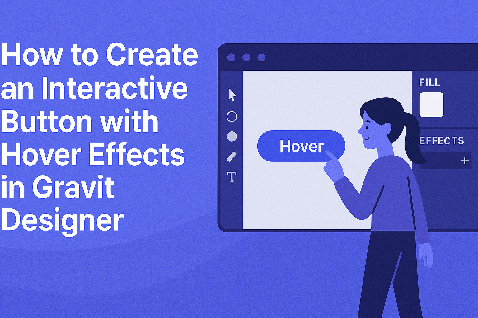
To begin creating an interactive button with hover effects, it’s crucial to start with the right tools.
Gravit Designer is a powerful vector graphic design application that is easy to use, making it a great choice for both beginners and experienced designers.
Downloading and Installing Gravit Designer
First, users need to download Gravit Designer. It is available for multiple platforms, including Windows, Mac, Linux, and ChromeOS.
- Visit the website: Go to the Gravit Designer homepage to download the application.
- Select your version: Choose the right version for your operating system.
- Follow installation steps: After downloading, open the installer and follow the prompts. It’s simple and takes just a few minutes.
Once it’s installed, users can launch the application. They can also use it directly in a web browser without any installation required.
Familiarizing with the Gravit Designer Interface
After installation, users should get to know the Gravit Designer interface.
The layout is clean and intuitive.
Key components of the interface include:
- Toolbar: Located at the top, it contains tools for selection, shapes, text, and more.
- Layers Panel: On the left, this panel helps in organizing and managing design elements.
- Canvas: The central area where designs are created. Users can zoom in and out for detailed work.
Exploring the interface allows users to locate their tools quickly and efficiently. Familiarity with these elements will speed up the design process, making it easier to create buttons with hover effects.
Creating Your First Button
Creating a button in Gravit Designer is a straightforward process that involves setting up the canvas, drawing the button shape, and applying basic styles. Each step helps in establishing a solid foundation for adding interactivity later on.
Setting Up Your Canvas
To begin, open Gravit Designer and create a new project. Click on “Create New Design” and choose the appropriate size for your project. It’s helpful to select a standard size, like 800×600 pixels, to have ample space to work with.
Next, ensure your workspace is organized.
Use the grid and guides to align elements neatly. This will help maintain proper spacing for your button.
You should also enable snapping for precise placement when designing.
Finally, familiarize yourself with the toolbar and palette.
Knowing where to find shapes, colors, and styles simplifies the design process, making her creations smoother and faster.
Drawing the Button Shape
After the canvas is ready, it’s time to draw the button.
Select the rectangle tool from the toolbar. Click and drag on the canvas to create a rectangle in the desired size, such as 150×50 pixels. This will be the base shape for the button.
To give the button some personality, adjust the corner radius. A setting around 15-20 pixels adds a nice rounded look.
Next, choose a fill color from the color palette. Bright colors like blue or green are effective for buttons because they catch the eye.
Once the shape and color are chosen, he can move on to adding a border.
Select the stroke option and pick a slightly darker shade than the fill color for contrast. This small detail enhances visibility and appeal.
Applying Basic Styles
Now that the button shape is ready, it’s time to style it.
Start by selecting the button and exploring the “Styles” panel. Here, various options like shadows, gradients, and opacity can be adjusted.
Adding a drop shadow can create depth. Set the shadow’s opacity to around 30% to keep it subtle. This little effect makes the button feel more interactive.
Next, consider using a gradient fill. Choose two complementary colors to create a smooth transition. For example, a blue-to-light-blue gradient can make the button look more dynamic.
Text also plays a crucial role.
Use the text tool to add a label, like “Click Me”, centered on the button. Choose a font size and style that are readable, and give it a color that stands out against the button.
Adjusting these elements ensures a well-crafted interactive button.
Adding Interactivity with Hover Effects
Creating hover effects in Gravit Designer can bring buttons to life. It makes them more engaging and enhances user interaction.
This section will explore understanding states, designing the hover state, and how to preview and adjust hover effects effectively.
Understanding States in Gravit Designer
In Gravit Designer, every button can have different states. The two main states are the normal state and the hover state.
- Normal State: This is how the button appears under regular conditions.
- Hover State: This is how the button will look when a user hovers over it.
Understanding these states helps in creating visual feedback. Feedback is important because it lets users know their actions are being recognized. Designers can easily switch between states to see how changes affect usability.
Designing the Hover State
Designing the hover state involves making visual changes that catch the user’s eye. A few key adjustments can enhance the button’s appeal:
- Color Change: Altering the button color can provide immediate visual feedback.
- Size Adjustment: Slightly increasing the button’s size can signal interactivity.
- Shadow Effects: Adding a shadow can create a sense of depth.
These changes should align with the overall design of the project. They should also maintain readability and accessibility. Simple is often better. Keeping it clean prevents distraction from the main content.
Previewing and Adjusting Hover Effects
Once the hover state is designed, previewing is essential.
Gravit Designer allows users to see changes in real-time. This feature helps in tweaking the effects as needed.
- Test on Different Screens: Check how the hover effects appear on various devices.
- Make Adjustments: Consider visibility and response time.
Adjust color brightness, size, or shadow depth to improve functionality.
Regularly previewing helps ensure that effects are intuitive and appealing.
Knowing how users interact with buttons helps create an optimal experience.
Gravit Designer’s tools make this process straightforward and user-friendly.