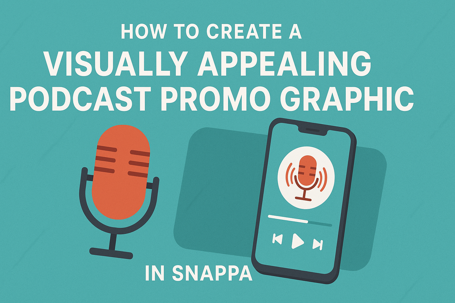
Creating a podcast promo graphic is an essential step in attracting listeners. A visually appealing graphic can capture attention, convey the podcast’s theme, and encourage people to tune in.
Using Snappa, anyone can design stunning graphics quickly and easily, even without design experience.
With a variety of templates and tools, Snappa allows users to customize their graphics to fit their podcast’s unique style. Engaging visuals can help a podcast stand out in a crowded market, making it more likely that potential listeners will click and engage.
In this article, readers will discover practical tips and step-by-step instructions on how to create eye-catching podcast promotional graphics using Snappa. This will not only enhance their promotion efforts but also make their podcast more memorable to audiences.
Getting Started with Snappa
Snappa is a user-friendly graphic design tool perfect for creating stunning podcast promo graphics. To make the most of the platform, it’s important for users to understand its interface and set up their accounts properly.
Understanding Snappa’s Interface
When users first log into Snappa, they will notice a clean and simple layout. The main dashboard features helpful options to create, manage, and organize designs.
On the left side, users can explore templates, which cover various categories including podcast graphics. The editor in the center allows for easy customization, where users can drag and drop elements like images, icons, and text.
Additionally, the top menu provides tools to adjust colors, fonts, and effects.
Setting Up Your Account
To start using Snappa, users need to set up an account. They can visit the Snappa website and choose to sign up for a free account or explore paid options based on their needs.
The free tier is great for beginners wanting to test the features. After signing up, users confirm their email, which allows full access to templates and design tools.
Once logged in, users can explore their dashboard, where they can keep track of projects and saved designs. Understanding these initial steps will empower them to jump right into creating graphics for their podcast.
Designing Your Podcast Promo Graphic
Creating a podcast promo graphic involves several critical steps. Each part plays a significant role in making the graphic eye-catching and effective at grabbing attention.
Choosing the Right Template
Selecting the right template is the first step in designing a podcast promo graphic. Snappa offers various templates tailored for podcast promotions. They can help users find a layout that suits their podcast’s theme and style.
A good template will have a balanced design, allowing space for images, text, and branding elements. It’s important to choose one that can easily be customized to reflect the podcast’s personality and message.
Templates ensure consistency between episodes and make it easier to create promotional graphics quickly.
Selecting a Color Scheme
Color plays a key role in how a graphic is perceived. When choosing a color scheme, it’s important to pick colors that match the podcast’s branding and evoke the right emotions.
Popular approaches include using a monochromatic scheme for a clean look or a complementary color scheme for more vibrancy. Tools like color wheel charts can help in selecting colors that work well together.
Keeping the color palette limited to two or three main colors can help maintain focus and clarity. Consistent colors enhance brand recognition over time.
Adding Text and Typography Best Practices
Text is vital for conveying the message quickly. When adding text, it’s crucial to choose a clear, readable typeface. Sans-serif fonts often work well for modern looks, while serif fonts can add a touch of elegance.
It’s also important to consider font size and hierarchy. The podcast title should be the most prominent, followed by the episode name or tagline.
Using bold or italic styles can help emphasize key points, but they should be used sparingly to avoid clutter. Keeping text to a minimum allows the graphic to remain visually appealing.
Incorporating Visual Elements
Visual elements like images and icons can capture attention and tell a story. When selecting images, they should be high quality and relevant to the podcast’s theme.
Icons can also add flair and help break up text, making the graphic easier to digest. It’s important that all visual elements align with the overall style and message of the podcast.
Using plenty of white space around these elements will improve readability. This approach helps ensure the graphic is not overcrowded, keeping the focus on the key information.
Customizing Your Design
Customizing the design is a crucial step in making a podcast promo graphic stand out. By using custom images and applying unique filters and effects, one can create an eye-catching piece that resonates with the audience’s interests.
Uploading Custom Images
When designing a podcast promo graphic, uploading custom images can add a personal touch. This allows for unique visuals that reflect the podcast’s theme. Snappa offers an easy way to upload images directly from your computer.
To upload, the user simply clicks the upload button and selects the desired file. Images should be high quality and relevant to the podcast content.
It’s important to consider the dimensions of the graphic. Keeping the size consistent ensures a professional look. For example, Facebook and Twitter graphics should be 1280 x 720 pixels, while Instagram should use a square format of 1080 x 1080 pixels.
Using Filters and Effects
Applying filters and effects can enhance the visual appeal of the podcast graphic. Filters can change the mood of an image in seconds. Snappa features a variety of filters to help achieve the desired look.
Users should experiment with different options to see which ones best match their podcast style. For example, a vintage filter could suit a history podcast, while bright, bold effects might be better for a comedy show.
Adding effects like shadows or outlines can also make important elements pop. These design choices draw the viewer’s eye and emphasize key details. Keeping effects subtle is crucial to maintain a clean, professional appearance for the graphic.
Finalizing and Exporting Your Graphic
Before finalizing a podcast promo graphic, it is essential to ensure everything looks perfect. This includes checking the design’s overall appearance and preparing it for sharing. The next steps involve previewing the work and exporting it in the best format.
Previewing Your Work
Previewing the graphic allows the creator to spot any mistakes or areas for improvement. It is advisable to zoom in on different sections to ensure clarity and proper alignment.
Checking color contrast is vital, especially for text readability. A common mistake is using colors that are too similar, making it hard for viewers to read important information.
Using the preview function in Snappa helps to simulate how the graphic will appear on various platforms. This step ensures that the design will stand out in social media feeds or podcast directories.
Exporting the Final Design
Once satisfied with the preview, it’s time to export the graphic. Snappa offers different formats, but JPG and PNG are the most common for podcasts.
JPG files are great for online use, while PNG is better for images with transparent backgrounds.
When exporting, select the highest resolution for the clearest image quality. It’s helpful to choose the recommended podcast cover art size, which is generally 3000 x 3000 pixels.
This ensures that the graphic maintains its quality across various platforms.
Before clicking export, double-check the design again to make sure everything appears as intended.
After the final checks, exporting the graphic will prepare it for distribution.