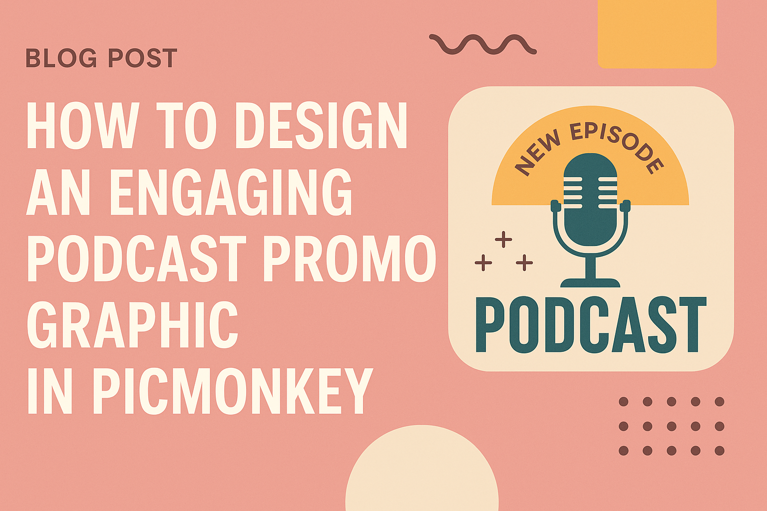
Designing an engaging podcast promo graphic in PicMonkey can make a real difference in attracting listeners. Creating eye-catching visuals is essential for standing out in a crowded space and capturing the interest of potential fans.
With the right techniques and tools, anyone can make professional-looking graphics, even without prior design experience.
In this article, readers will discover tips for using PicMonkey effectively to create stunning promo graphics.
From selecting the right colors to choosing the perfect fonts, each step plays a key role in crafting a memorable image. This guide will empower podcasters to express their brand and engage their audience visually.
Whether launching a new podcast or promoting an existing one, a compelling promo graphic can enhance visibility. By applying the insights shared here, anyone can elevate their promotional efforts and connect with listeners on a deeper level.
Getting Started with PicMonkey
PicMonkey is an easy-to-use design tool that helps podcasters create eye-catching graphics. It offers various templates and features that make designing simple and fun.
Setting Up Your Account
To get started with PicMonkey, users need to create an account. This can be done easily by visiting the PicMonkey website.
They can sign up using an email address or a social media account.
Once registered, it’s important for users to explore the different subscription options. The free version offers basic features, while the paid plans provide additional tools and assets.
After signing up, users can access their dashboard to start designing right away.
Understanding the PicMonkey Interface
The PicMonkey interface is user-friendly and intuitive. On the left, there is a menu that allows users to access different design features like photos, text, and graphics.
At the center, the main design workspace shows the active project. Users can zoom in or out for better visibility.
The right side of the screen provides options for editing, like filters and adjustments. This layout makes it easy to navigate and find tools quickly.
Selecting the Right Template
PicMonkey offers a wide range of templates tailored for various needs. Users can search for podcast promo graphics specifically, which saves time and effort.
When selecting a template, it’s helpful to consider the size and format that best suits the platform where the graphic will be shared. For example, social media may need different dimensions than a website.
After choosing a template, users can customize it by changing colors, fonts, and images. This personalization helps create a unique look that represents their podcast effectively.
Design Essentials for Podcast Graphics
Creating an engaging podcast promo graphic involves several key design choices. Color, brand elements, and typography all play important roles in making a graphic appealing and effective.
Choosing a Color Palette
A well-chosen color palette can set the mood and tone for a podcast. It’s important to select colors that reflect the podcast’s theme. For instance, bright colors can convey excitement, while muted tones can suggest a more serious topic.
Aim for 2 to 4 main colors for consistency. Tools like Adobe Color or Canva’s color palette generator can help find complementary shades.
Consider the psychology of colors as well. Blue typically represents calm and trust, while red signifies passion and energy. Using these insights can help capture the essence of the podcast.
Incorporating Your Brand Elements
Incorporating brand elements is crucial for creating recognition. This includes logos, specific graphics, and colors that are consistent with a podcast’s identity.
Positioning the logo prominently ensures listeners can easily associate the graphic with the podcast. Use established brand colors to maintain a cohesive look across different platforms.
Consistency in style is key. Keeping imagery and graphics similar throughout all promotional materials helps build a recognizable brand. This makes it easier for existing and new listeners alike to identify the podcast at a glance.
Using Typography Wisely
Typography is a powerful tool in graphic design. It affects readability and can convey emotions.
Choosing the right fonts is essential. A fun, casual podcast may use playful fonts, while a serious one might choose strong, classic typefaces.
Limit the number of different fonts to maintain a clean look. Typically, using one font for headings and another for body text works well.
Size also matters. The title should be large and eye-catching, while any additional information should be smaller but still legible. Keep in mind that simple typography often makes the strongest impact in graphic design.
Creating Your Promo Graphic
Designing an engaging podcast promo graphic involves several key steps. The focus is on selecting the right images, incorporating effective text, and applying filters for a polished finish. Each step is crucial for capturing the attention of potential listeners.
Adding and Editing Images
Start by selecting images that represent the podcast’s theme. It’s important to use clear, high-quality visuals to make a strong impression.
PicMonkey offers a variety of tools for adding images easily.
Users can drag and drop images directly into the design. They can also resize and crop images to fit the layout perfectly. Adjust the brightness and contrast to enhance clarity and appeal.
Using images relevant to the episode can help engage the audience. This ensures the visuals connect with the content, capturing interest immediately.
Including Text and Call-to-Actions
Text is vital in conveying the podcast’s message. When adding text, choose fonts that are easy to read and reflect the podcast’s tone. Using a mix of bold and regular styles can enhance readability.
Incorporate a strong call-to-action (CTA) to encourage listeners. Phrases like “Listen Now” or “Join Us” are effective. Position the text to stand out, ensuring it’s legible against the background.
Using contrasting colors can draw attention to the text. Keeping the message concise will help maintain clarity and impact on the viewer.
Applying Filters and Textures
Filters can dramatically change the graphic’s look and feel. PicMonkey provides various filter options to customize images.
Using these can add depth and character to the design.
Textures can create an inviting atmosphere. Choose textures that align with the podcast’s theme, such as a vintage look for storytelling podcasts.
Experimenting with layering textures over images can provide a unique touch. Balancing filters and textures will help the graphic feel professional without being overwhelming.