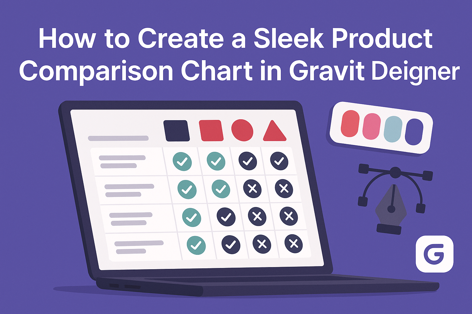
Creating a product comparison chart can seem overwhelming, but it’s a valuable tool for helping customers make informed decisions. With Gravit Designer, anyone can craft a sleek and visually appealing comparison chart that highlights key features and benefits of products.
This user-friendly design tool offers a variety of features that simplify the process, even for those with limited design experience.
In this article, readers will discover step-by-step techniques for effectively showcasing product differences using Gravit Designer. From selecting the right layout to utilizing custom colors and styles, each tip will enhance the chart’s clarity and attractiveness.
By the end, they will have the knowledge to create charts that not only inform but also engage their audience.
Getting Started with Gravit Designer
Gravit Designer is a user-friendly tool perfect for creating stunning product comparison charts. Understanding its features and setting up the workspace is essential for beginners.
Overview of Gravit Designer
Gravit Designer is a powerful design application that works on various platforms, making it accessible to everyone. It offers a range of tools for vector graphics, enabling users to create everything from simple charts to complex illustrations.
Key features include:
- Vector Editing: Allows precise control over shapes and lines.
- Responsive Design Tools: Adapt designs for different screen sizes.
- Library Resources: Access to shared assets to speed up projects.
These features help users streamline their workflow and enhance creativity while designing.
Setting Up Your Workspace
Setting up the workspace in Gravit Designer is straightforward. When launching the software for the first time, users are greeted with a clean interface. The main components include the toolbar, canvas, and layers panel.
To customize the workspace:
- Arrange Panels: Drag panels like the layers panel to a preferred location.
- Use Shortcuts: Familiarize with keyboard shortcuts to speed up tasks.
- Set Preferences: Go to the settings to adjust units, grid, and snapping options to suit personal needs.
Taking a moment to set everything up can lead to a much smoother design process. This configuration will ensure efficiency as they work on their product comparison chart.
Designing the Chart Structure
Creating a product comparison chart involves careful planning of its structure. This ensures clarity and effectiveness. The chart should reflect essential information in an easy-to-read format.
Choosing the Right Chart Type
Selecting the appropriate chart type is crucial. A common choice for product comparisons is a table, which allows for straightforward side-by-side comparisons. Alternatively, bar graphs can visually represent differences in features or prices effectively.
It’s important to consider the audience as well. If they want quick insights, tables work well. If they appreciate visuals, graphs might be more engaging. Make sure to pick a style that matches the data being presented and resonates with the intended viewers.
Creating a Grid for Comparison
A well-structured grid is vital for an organized comparison. Start by determining the rows and columns. Each row should represent a product, while columns can list features, prices, or ratings.
Using tools in Gravit Designer, he can easily create a grid layout. It’s beneficial to keep spacing uniform for a neat appearance.
Utilizing lines or borders can help separate each section and enhance readability. Color-coding different products or features also adds clarity to the visual presentation.
Adding Product Descriptions
Product descriptions give context to the comparison. Each product should have a brief explanation of its main features. He can use bullet points for clarity, making it easy for readers to scan through.
While keeping descriptions concise, he should highlight unique selling points. Perhaps one product has exceptional durability or another offers customizable options. Always ensure the text is clear and avoids jargon, so all users can easily understand the content. This thoughtful detail makes the comparison not just informative but engaging.
Customizing the Chart Design
Customizing a product comparison chart is essential for making it visually appealing and easy to read. The right design choices can enhance clarity and help present information effectively. Here are key areas to focus on when customizing the chart design.
Selecting a Color Scheme
Choosing the right color scheme is crucial for visual impact. Colors not only attract attention but also convey meaning. A good approach is to use a limited color palette of 2-4 colors.
Start with contrasting colors for text and background to ensure readability. For example, dark text on a light background works well. If representing different products, assign each one a distinct color. This helps users quickly identify each option.
Utilizing tools like Adobe Color can help generate suitable palettes. Consistency in color usage across the chart maintains professionalism and coherence.
Styling Text and Fonts
Text style and font selection play an important role in readability.
It’s ideal to select fonts that are clean and simple, such as Arial or Helvetica. These fonts enhance clarity and are easy to read at various sizes.
Using bold text for headings draws attention to key areas. Standardizing font size helps maintain visual balance throughout the chart. A typical recommendation is to keep body text between 10-12 points.
Additionally, avoid using too many different fonts, which can make the chart look cluttered. Stick to one or two fonts to create a cohesive appearance. Ensuring ample spacing between lines and sections also increases readability.
Incorporating Visual Elements
Visual elements can make a chart more engaging. Consider adding icons or images that represent products. These elements can help illustrate features and create a stronger connection for viewers.
Graphs or small charts can also be included for quick data visualization. To maintain a clean look, it’s crucial not to overcrowd the chart with visuals. Space these elements thoughtfully, ensuring they enhance rather than distract from the information.
Using consistent styles for icons and images will unify the overall design. Tools like Canva can assist in sourcing and customizing these visual components, adding an appealing touch to the chart.
Final Touches
After creating the product comparison chart, the last steps involve aligning elements for a polished look and exporting the final design. This ensures that the chart not only looks good but is also ready for presentation or sharing.
Aligning and Distributing Elements
To achieve a clean layout, aligning and distributing elements is essential. Gravit Designer has tools that make this easier.
First, he should select all the elements of the chart. This includes text boxes, icons, and any shapes.
Then, using the alignment tools in the top menu, he can choose options like “Align Center” or “Align Top” to ensure everything lines up perfectly.
For distribution, he might want to use the “Distribute Horizontally” or “Distribute Vertically” options. This will guarantee even spacing between items.
Lastly, it’s helpful to zoom in and inspect the design closely. Adjust any misaligned elements for that final professional touch.
Exporting Your Chart
Once the alignment is complete, it’s time to export the chart.
Gravit Designer allows for multiple formats, so choosing the right one is crucial. He should go to the “File” menu and select “Export.”
There, options like PNG, JPG, and PDF will appear. If he needs high quality for printing, a PDF option is ideal. For online use, a PNG is often suitable.
Before exporting, checking the resolution settings is important. Higher resolutions result in better quality but larger file sizes.
After adjusting these settings, he can click “Export” and choose his save location. This ensures the chart is ready for sharing or presentation!