Creating a responsive testimonial layout can enhance the way a website communicates with its audience.
Using Gravit Designer, a versatile and user-friendly design tool, anyone can craft an engaging section that showcases customer experiences effectively. This not only improves the visual appeal of a site but also builds trust with potential clients.
Many designers struggle with layout issues that arise when working across different screen sizes.
By focusing on responsive design principles within Gravit Designer, it is possible to create a layout that looks great on both desktop and mobile devices.
This blog post will guide readers through the steps needed to make a polished testimonial section that adapts seamlessly to any screen.
Whether starting from scratch or refining an existing design, the tips shared in this article will make the process smoother.
With the right techniques, designers can highlight testimonials in a way that is both attractive and functional. Readers will discover how easy it is to transform testimonials into powerful tools for connection and credibility.
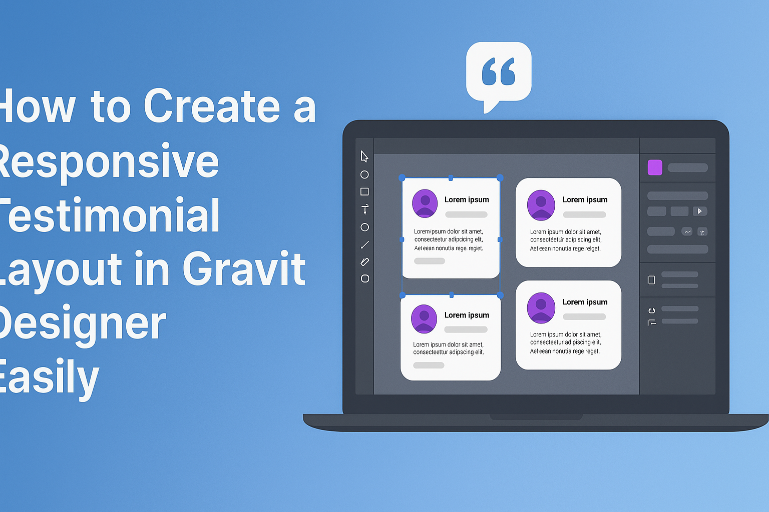
Getting Started with Gravit Designer
Gravit Designer is a versatile tool that allows users to create high-quality vector graphics.
Understanding its interface and setting up a canvas are crucial first steps for effective design.
Exploring the Interface
When a user opens Gravit Designer, they will see a clean interface. The main workspace includes a toolbar on the left, where they can find tools for shapes, text, and more.
At the top, there’s a menu bar with options for opening files, exporting designs, and adjusting settings.
On the right side, panels provide access to properties such as layers and styles. This organization makes it easy to navigate through different tools and options, allowing for a smooth design experience. Familiarizing oneself with these areas can greatly enhance productivity.
Setting Up Your Canvas
To start a project, the user needs to set up their canvas. This can be done by selecting the “New Document” option from the menu.
Users should consider the project type, as there are various presets for web design, print, and more.
After selecting a preset, they can adjust the canvas size and orientation.
Once the canvas is ready, it becomes the playground for creativity. Users can zoom in and out to see details clearly, making adjustments as needed.
Setting the right dimensions ensures that designs fit the intended platform. Having a properly sized canvas simplifies the design process and can lead to better results.
Designing the Testimonial Layout
Creating a responsive testimonial layout involves careful choices in color scheme, typography, and text styling. These elements work together to ensure that the testimonials are visually appealing and easy to read across different devices.
Choosing a Color Scheme
Picking the right color scheme is crucial for any testimonial layout. Colors should align with the brand’s identity and evoke the right emotions.
- Primary Color: Choose a primary color that reflects the brand’s personality.
- Accent Colors: Use 1-2 accent colors to highlight key elements, like quotes or customer names.
- Contrast: Ensure there is enough contrast between the text and background colors for readability. Dark text on a light background or vice versa usually works best.
Tools like Adobe Color can help visualize color combinations. A well-thought-out color scheme enhances the overall design and draws attention to important messages.
Selecting Fonts and Typography
Fonts play a key role in conveying the brand’s voice. The choice of typography can significantly affect the user’s perception of the testimonials.
- Font Style: Opt for clean and professional fonts. Sans-serif fonts like Arial or Helvetica offer modern appeal, while serif fonts can add a touch of elegance.
- Hierarchy: Establish a clear hierarchy by using different font sizes for names, quotes, and job titles. For instance, use larger fonts for customer names and smaller ones for testimonial text.
- Readability: Aim for a minimum font size of 16px for body text to ensure readability on all devices. Choosing line spacing of 1.5 can improve overall clarity.
Testing font combinations is a great way to find the best fit for your layout.
Adding and Styling Text
Once the color scheme and fonts are in place, it’s time to focus on the text itself. Proper styling makes the testimonial stand out without overwhelming the reader.
- Quotes: Use quotation marks or a different style (like italics) to distinguish testimonials from other text.
- Text Blocks: Break text into manageable chunks to avoid large blocks. Short sentences and clear points keep the reader engaged.
- Emphasis: Highlight key phrases in bold to draw attention. Using bullet points can also help present information clearly.
Combining these methods ensures that each testimonial is visually appealing and easy to read, enhancing the user’s experience.
Creating Responsive Elements
To create effective responsive elements in Gravit Designer, it’s important to focus on the layout and design features. This includes working with grids, utilizing smart guides, and implementing vector illustrations to ensure the design adapts seamlessly across different screen sizes.
Working with Grids and Alignment
Using grids is essential for creating a structured layout. Gravit Designer allows users to set up a grid that serves as a guide for alignment.
When placing testimonial boxes, using grids ensures that each element is evenly spaced and aligned.
Grid settings can be adjusted to fit the design needs. For instance, setting a 12-column grid can help in creating a responsive layout. This allows for flexibility across various devices.
Aligning elements accurately helps maintain a clean look. Utilizing the snap-to-grid feature aids in proper placement, making adjustments quick and efficient.
Using Smart Guides and Anchors
Smart guides help users align elements easily. When moving objects around, these guides show horizontal and vertical lines that appear when elements are in line. This feature makes it easier to ensure that testimonials are visually balanced.
Anchors also play a crucial role. By anchoring elements, they remain fixed relative to the grid when resizing. This ensures that as the design changes, the elements maintain their intended positions, enhancing the overall flow of the layout.
Using these tools reduces the time spent on tedious adjustments. The end result is a layout that is visually appealing and functional.
Implementing Vector Illustrations
Incorporating vector illustrations enhances the look of testimonials. Gravit Designer allows for easy import and manipulation of vector graphics.
These illustrations can be resized without losing quality, which is perfect for responsive designs.
When selecting vector illustrations, it’s important to choose ones that complement the text. Simple graphics often work best, as they won’t overcrowd the layout. This helps keep the focus on the testimonials while adding visual interest.
Grouping illustrations with text elements can also aid in alignment. Keeping components together ensures that they move as one unit, maintaining the overall design integrity during resizing. This technique enhances responsiveness while providing a polished look.
Exporting the Design
Exporting a design in Gravit Designer is an important step to ensure the final product looks great on various platforms. Understanding the right file formats and how to optimize for different devices will help maintain quality and usability.
Choosing the Right File Format
When exporting designs, it’s essential to select the right file format. Common formats include PNG, JPEG, and SVG.
- PNG is ideal for images with transparency and sharp details. It works well for graphics needing high quality.
- JPEG is suitable for photographs or images with many colors. It reduces file size but may lose some quality.
- SVG is perfect for vector graphics, which can scale without losing clarity. This format is great for logos or icons.
He should always consider where the design will be used. Choosing the right format can make a big difference in the appearance of the final product.
Optimization for Different Devices
Optimizing file sizes and resolutions is crucial for responsive designs.
Different devices have various screen sizes, which affects how images load and appear.
- Use media queries to serve specific images for different screen sizes. This ensures that users on mobile see optimized graphics.
- Adjust resolution based on device. For instance, high-resolution images may be necessary for desktops, while lower resolutions suffice for smartphones.
He should also consider compressing images to improve loading times.
Tools such as TinyPNG or ImageOptim can help maintain quality while reducing file size.
By doing this, the design will look sharp and load quickly across all devices.