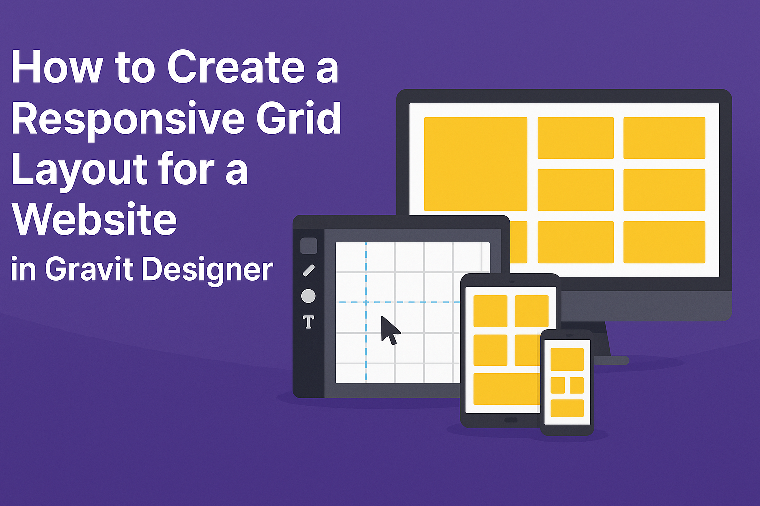
Creating a responsive grid layout is essential for modern web design. It allows a website to look great on any device, ensuring that content adapts seamlessly to different screen sizes.
Gravit Designer provides tools that make this process straightforward and effective for both beginners and experienced designers.
To start, selecting the right canvas size is crucial. Designers can easily set up margins, columns, and rows to build a balanced and visually appealing layout.
By understanding how to utilize these features, they can create a design that functions well across tablets, smartphones, and desktops.
With the right approach and techniques, anyone can master responsive design. This guide will outline the steps needed to create a responsive grid layout using Gravit Designer, enabling designers to improve their web projects and enhance user experience.
Understanding Grid Layouts in Web Design
Grid layouts are essential in web design, helping to organize content in a visually appealing way. They provide structure and consistency, making it easier for users to navigate a website.
The Basics of Grid Theory
Grid theory involves dividing a webpage into manageable sections. Typically, a grid is made up of rows and columns. Designers often use frameworks like a 12-column grid system. This common structure ensures that elements align properly and fit well across different screen sizes.
A grid aids in maintaining balance. It allows elements to be positioned harmoniously, leading to an organized appearance.
By using guidelines, designers can ensure proper spacing and alignment. This strategy helps to avoid clutter and improves the overall flow of information on the page.
Benefits of Using a Grid
Using a grid layout offers several key benefits. It enhances the visual hierarchy, making important elements stand out. This method also speeds up the design process because designers can reuse grid templates across different pages.
A grid layout improves responsiveness, allowing designs to adapt seamlessly to various device sizes. With grids, it is easier to create consistent layouts, ensuring that design elements align properly. This alignment provides a better user experience and keeps visitors on the site longer.
Incorporating grid layouts can also facilitate collaboration among team members. Since grid systems are standardized, they make it simpler for designers and developers to communicate about layout decisions. This clarity can lead to faster project completions and more effective teamwork.
Getting Started with Gravit Designer
Gravit Designer is a user-friendly tool for creating beautiful designs. Knowing how to navigate its interface and set up your canvas is essential for making a responsive grid layout.
Navigating the Interface
When working in Gravit Designer, the interface is straightforward and intuitive. On the left side, there is a tool panel that provides essential tools for selecting, drawing, and transforming shapes.
The properties panel on the right side shows options based on the selected object. Users can customize colors, sizes, and more here.
At the top, the menu bar contains helpful dropdown menus for file operations, editing options, and view settings. This layout makes it easy for designers to find what they need quickly.
Setting Up Your Canvas
To set up a canvas, users should start by selecting the canvas size. Gravit Designer offers multiple sizes, like A4 or web layout, depending on the intended project.
Next, they can adjust the grid settings. This includes specifying the number of columns. A common choice is a 12-column layout, which allows flexibility in design.
After that, users can enable the grid view to ensure items align well on the canvas. It helps to keep the design organized and clean.
Finally, once the canvas is ready, users can begin adding elements and creating their responsive grid layout.
Building Your Grid Layout
Creating a responsive grid layout involves carefully defining rows and columns, aligning elements, and managing margins and gutters. Each part contributes to a balanced and functional design that adapts to different screen sizes.
Defining Columns and Rows
To start, it’s important to decide how many columns and rows will structure the grid. A common approach is to use a 12-column layout, as it provides flexibility for various screen sizes.
In Gravit Designer, use the grid settings to create your layout.
- Set the number of columns. This could be 2, 4, or even 6 depending on your design.
- Determine row heights. They can be fixed or flexible based on content.
Make sure to consider the proportions. For example, if the first column is wider, it may affect the entire layout balance. Testing different configurations can lead to the perfect setup.
Aligning Elements within the Grid
Once the grid structure is in place, aligning elements becomes the next key task. It’s essential that each component fits neatly into the grid.
In Gravit Designer, objects can be aligned easily.
- Use alignment tools to center or distribute elements evenly within columns and rows.
- Group elements that need to move together, ensuring they stay aligned.
Additionally, pay attention to font sizes and image scales. Keeping a consistent design helps maintain visual harmony. A well-aligned grid enhances readability and user experience.
Adjusting Margins and Gutters
Margins and gutters are vital for spacing within the grid. Margins refer to the space around the grid, while gutters are the spaces between columns and rows.
It’s important to set these correctly for a clean look.
- Use consistent gutter widths. Common measurements are 10px or 20px depending on the design.
- Adjust margins based on the layout type—more margin can give breathing room, while less creates a compact look.
In Gravit Designer, margins and gutters can be visually adjusted and previewed. This immediate feedback helps designers make quick decisions that will improve the final layout.
Making the Grid Responsive
Creating a responsive grid layout is crucial for ensuring that designs look great on all devices. By using flexible units and regularly testing designs, one can achieve an adaptable and user-friendly layout.
Utilizing Flexible Units
Flexible units, such as percentages and viewport units, allow elements to resize based on the browser window. For example, using percentages for widths lets the grid items adjust smoothly, maintaining their proportions as the screen size changes.
Additionally, employing CSS Grid’s fr units is effective for dividing space. The fr unit stands for “fractional unit” and allows grid items to take up a fraction of the available space.
By defining grid columns with a combination of fr, percentages, and fixed units, designers can create versatile layouts that respond effectively to various screen sizes and resolutions.
Testing and Tweaking for Different Devices
Testing the layout across multiple devices is essential.
Designers should check how the grid looks on desktops, tablets, and smartphones.
Browser developer tools allow easy resizing of the window, which helps visualize changes quickly.
After testing, adjustments can be made to improve the layout.
For example, if a grid item overlaps on smaller screens, margin or padding adjustments can help.
Media queries are also useful here. They enable the designer to apply different styles based on screen size.
Regular testing and tweaking ensure a seamless experience for users on all devices, making the grid not only responsive but also functional.