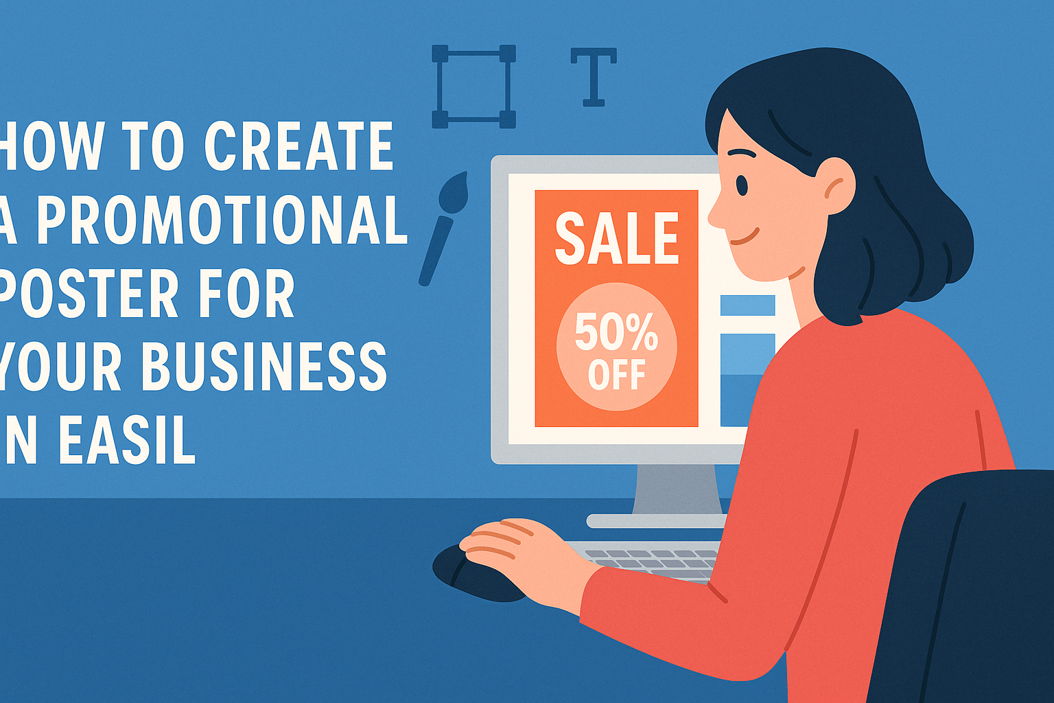
Creating a promotional poster for a business can be an exciting way to engage customers and drive interest.
Easil offers simple, user-friendly tools that allow anyone to design eye-catching posters in just a few minutes.
With a variety of templates and design options, it’s easy to customize a poster that showcases what makes a business unique.
Using Easil, one can access features like drag-and-drop design and a large library of stock photos. These tools not only simplify the design process but also help bring creative visions to life.
Whether it’s for an event, a sale, or general promotion, designing a poster that stands out has never been easier.
The right promotional poster can make a significant difference in attracting attention. By exploring the options Easil provides, businesses can create materials that communicate their message clearly and effectively.
With a little creativity and the right guidance, anyone can design a stunning poster that captivates potential customers.
Understanding the Basics of Poster Design
Creating an effective promotional poster requires a clear understanding of its purpose and the audience it aims to attract.
Defining Your Poster’s Purpose
A poster’s purpose can vary widely. It may promote a product, advertise an event, or share an important message.
To define the purpose, ask key questions:
- What is the main message?
- What action should viewers take?
- How will this poster be used?
Clearly outlining these points helps in making design choices.
For instance, if promoting a sale, the poster should feature bold text to highlight discounts. Similarly, if advertising an event, it should include details like date and location prominently.
This focus ensures that every element of the poster, from images to colors, aligns with its primary objective.
Target Audience Analysis
Understanding the target audience is crucial for a successful poster. Knowing who will see the poster helps tailor the design to their preferences and needs.
Consider these factors:
- Age group
- Interests
- Location
For example, a poster aimed at teenagers might use bright colors and trendy fonts. In contrast, a business event poster may require a more professional look with subdued tones.
Incorporating elements that resonate with the audience increases the chances of engagement. It also encourages viewers to take the desired action, whether it’s visiting a website, attending an event, or making a purchase.
Gathering Your Materials
Before starting the creation of a promotional poster, it is essential to gather the right materials. Selecting appropriate images, fonts, and colors will impact how effectively the poster communicates its message.
Choosing the Right Images
Images grab attention and convey messages quickly. They should be high quality and relevant to the theme of the poster.
When selecting images, consider the following:
- Resolution: Use images with at least 300 DPI for clarity.
- Style: Choose images that fit the tone of the content, whether it’s professional, playful, or artistic.
- Licensing: Ensure that images are free to use or properly licensed. Websites like Canva provide options for this.
Incorporating a mix of images, such as illustrations and photographs, can create visual interest. It’s also important to be consistent in style to avoid distracting viewers.
Selecting Fonts and Colors
Fonts and colors work together to create emotional impact. They need to reflect the brand’s identity and ensure readability.
Font Selection Tips:
- Limit Styles: Use a maximum of two to three different fonts. This helps maintain a clean look.
- Hierarchy: Use larger, bolder fonts for headlines and smaller ones for details to create a flow.
Color Choices:
- Brand Colors: Include brand-specific colors to enhance recognition.
- Contrast: Ensure text colors stand out against the background. Use tools like color contrast checkers for help.
By thoughtfully combining fonts and colors, the poster will not only look appealing but also convey the message clearly.
Designing Your Promotional Poster
Creating an effective promotional poster involves careful attention to layout, branding, and design tools. Each of these aspects plays a vital role in ensuring the poster stands out and effectively communicates the intended message.
Layout and Composition Tips
Good layout is essential for capturing attention. Start with a clear focal point, such as a catchy headline or eye-catching image. This helps guide the viewer’s eye to the most important information.
It’s important to use the rule of thirds. Divide your poster into a 3×3 grid, and place key elements along the lines or at their intersections. This creates balance and visual interest.
Use white space wisely. Avoid cluttering the poster with too much text or images. A clean design helps communicate the message clearly while making it easier for viewers to absorb information.
Incorporating Branding Elements
Including brand elements reinforces recognition. Your logo should be visible and placed strategically, preferably in a corner or at the top.
Color is a powerful tool for branding. Use your brand colors consistently throughout the poster. This creates a cohesive look that aligns with other marketing materials.
Typography also matters. Choose fonts that reflect the brand’s personality. Limit the number of different fonts to two or three to maintain readability and aesthetic harmony.
Using Easil’s Design Tools
Easil offers a variety of design tools to streamline the poster creation process.
Users can access thousands of templates tailored to various needs, making it easy to find the perfect starting point.
Customizing elements is straightforward. It allows for easy adjustments to colors, fonts, and layouts to suit personal preferences or branding requirements.
Easil also features drag-and-drop functionality, simplifying the addition of images and graphics. This user-friendly interface makes it easy for anyone to create professional-looking posters without prior design experience.
Printing and Distribution Strategies
When printing promotional posters, choosing the right materials is essential. Businesses should consider factors like paper type, size, and finish.
Common options include:
- Paper Types: Cardstock, glossy paper, or matte paper
- Sizes: Standard sizes like 11×17 inches or custom dimensions
- Finishes: Glossy for vibrant colors or matte for a subtle look
Proofreading is crucial before printing. Missing typos can affect a brand’s image. It’s a good idea for businesses to have someone review the poster.
For large print runs, using a professional printing service can save money. These services often provide better quality and more options for finishes. They can also handle large batches quickly.
After printing, distribution is key. Placing posters in high-traffic areas can greatly increase visibility.
Here are some effective places to consider:
- Community centers
- Coffee shops
- Universities or schools
To maximize reach, think about timing too. Launching a poster campaign when foot traffic is high can lead to better results.
A well-placed poster can capture attention and drive engagement. This approach helps businesses connect with their target audience effectively.