Creating a standout magazine cover can be both exciting and challenging. For those ready to dive into the world of design, CorelDRAW offers a fantastic suite of tools to help make your vision a reality. Mastering the basics of layout, typography, and imagery is key to producing a professional magazine cover in CorelDRAW.
New users and seasoned designers alike will appreciate how CorelDRAW simplifies complex design tasks. With features like vector illustration and photo editing, the software allows designers to seamlessly blend text and graphics. These tools enable users to craft covers that not only grab attention but also convey the magazine’s message effectively.
Incorporating elements such as shapes, colors, and typography can enhance the overall appeal of the cover. Achieving the right balance between text, images, and white space is critical to drawing in readers. Those interested in learning more can find practical guidance from tutorials available on the Corel Discovery Center.
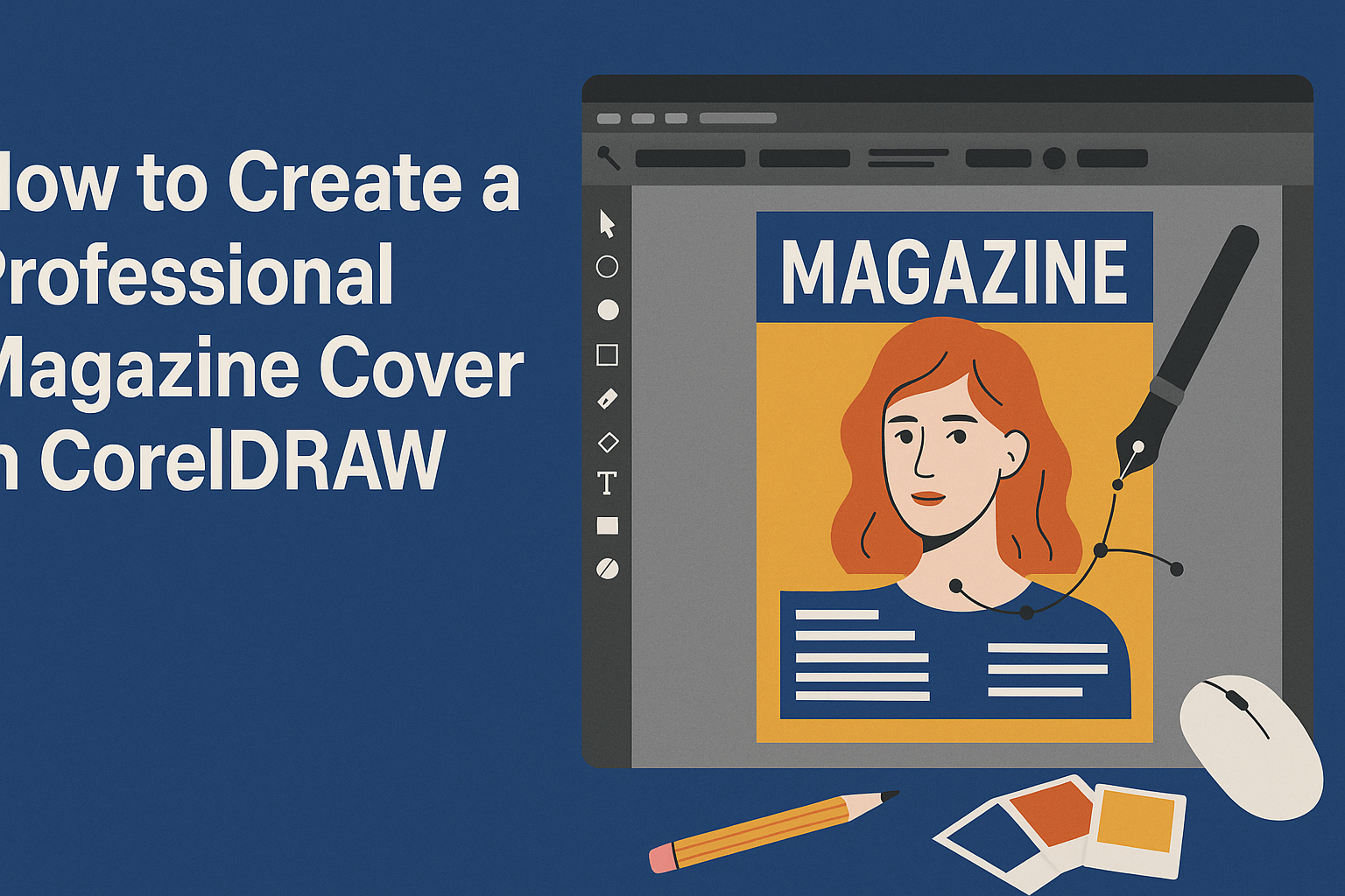
Understanding CorelDRAW
CorelDRAW is a versatile graphic design program that offers powerful tools for creating professional magazine covers. It provides users with a rich array of features such as vector illustration and layout design, essential for anyone looking to craft engaging magazine covers.
Core Concepts and Interface Overview
CorelDRAW’s interface is user-friendly. It consists of a workspace where users can access main tools on the toolbar, like the Pick Tool, Shape Tools, and more. The interface allows easy customization, enabling designers to adjust panels and toolbars according to their needs. Layers, a key concept in CorelDRAW, help organize different elements. Users can lock or hide layers for better control over complex designs, making intricate designs more manageable. The Properties Bar offers a dynamic way to access options for selected items, providing quick customization options. Mastering navigation in CorelDRAW is vital for efficient design work, from using zoom to panning across the canvas smoothly.
Key Features for Magazine Design
CorelDRAW offers many features tailored for printed media. Typography tools in CorelDRAW are robust, allowing designers to modify fonts, styles, and spacing, crucial for creating compelling titles and headings on magazine covers. The software supports color management to ensure accurate and vivid print colors. Utilizing the Font Manager simplifies selecting and managing fonts, enhancing the text layout process. CorelDRAW also provides powerful image editing tools for adjusting photos or artworks, essential for a striking magazine cover. The program’s integration with other design tools and formats facilitates easy workflows for importing and exporting assets, making it seamless to incorporate external graphics or photos into the cover design.
Setting Up Your Workspace
To create a stunning magazine cover in CorelDRAW, it’s crucial to set up your workspace efficiently. This means choosing the correct document settings and organizing your layers properly. With the right setup, designing becomes more productive and enjoyable.
Choosing the Right Document Settings
Getting the document settings right sets the foundation for your design. Start by opening a new document in CorelDRAW. Select the right paper size for your magazine, which could be A4 or another standard size you prefer.
Next, set the resolution. For print magazines, a resolution of 300 DPI ensures clear and crisp images. Decide whether your design needs a landscape or portrait orientation, based on your magazine’s style.
Color settings are vital. Ensure you work in CMYK mode since it’s best for print designs. Adjust the margins to provide a safe space around your text and images. This helps prevent any important details from being cut off when printed. Lastly, save your settings or create a template for future projects to maintain consistency.
Organizing Layers and Guidelines
Effectively organizing layers helps manage complex designs. In CorelDRAW, you can add layers to separate different elements of your cover, such as images, text, and backgrounds.
Use descriptive names for each layer so you can quickly identify them. This organization saves time and prevents mistakes. To maintain alignment, make use of guidelines. These visual aids ensure your elements are precisely placed and not floating around.
Creating snap-to guides helps with alignment too. These assist in automatically snapping your elements into place. Use them to keep your titles and images aligned perfectly with the rest of the layout. By setting up layers and guidelines carefully, the design process becomes much smoother and enjoyable.
Magazine Cover Basics
Creating a magazine cover in CorelDRAW involves a few critical elements. These include setting the right cover dimensions, choosing accurate typography, and selecting appropriate color schemes. Each element plays a vital role in making the cover stand out.
Cover Dimensions and Bleeds
Setting correct cover dimensions is crucial for a professional magazine cover. Standard magazine sizes can vary, but popular choices include 8.5″ x 11″. In each case, a bleed area should be added. This bleed usually extends 0.125 inches beyond the document edge. It helps prevent white borders after trimming.
Proper alignment of elements is important. CorelDRAW offers alignment tools that help position text and images. Ensuring images and graphics are high-resolution will prevent any blurring during printing. This attention to detail enhances the visual appeal.
Typography and Font Selection
Typography plays a big role in creating an eye-catching magazine cover. Picking the right fonts can set the tone of the magazine. Usually, a combination of a bold font for the title and a simpler font for other text works well.
CorelDRAW offers a wide range of font options. It’s important to ensure the font sizes are readable. Titles should be large enough to attract attention, while subtitles and body text can be smaller. Fonts should match the theme and not overpower images.
Color Schemes and Themes
Choosing the right color scheme helps establish the magazine’s identity. Bright colors may indicate a fun and lively topic, while muted tones might suggest something serious. Using color-blocking techniques can create a striking contrast.
CorelDRAW provides tools to experiment with different color palettes. It’s useful to pick two or three main colors and some secondary ones to complement them. Balancing these colors with images and text ensures the cover is cohesive and attractive.
Working with Images and Illustrations
In CorelDRAW, enhancing a magazine cover with images and illustrations adds a visual appeal that can captivate readers. This section will guide users through the processes of importing and editing images, elucidate the differences between vector and bitmap graphics, and detail how to effectively use clipart and symbols.
Importing and Editing Images
Importing images into CorelDRAW is straightforward. Users need to click on the File menu and select Import to bring images into their design. This allows for easy placement and adjustment within the cover layout. Editing is done using tools in the software like cropping, resizing, and adjusting brightness. It is crucial to maintain a high resolution for print quality, so images should be checked for clarity and sharpness.
In addition, CorelDRAW provides filters for adjusting colors, contrast, and levels which can enhance the visual appeal. Users should experiment with different filters to achieve the desired effect. Keeping images relevant to the magazine’s theme while ensuring they do not overpower the text is essential in creating a balanced design.
Vector Vs. Bitmap Graphics
Vector graphics in CorelDRAW are created from lines and curves that can be scaled without losing quality. This makes them ideal for illustrations and logos. Bitmaps, however, are made from pixels and can become pixelated when resized. Understanding these differences helps in deciding the best format for different elements on the cover.
For those new to design, opting for vector graphics can be beneficial as these are more flexible and maintain quality across various sizes. CorelDRAW offers a wide range of vector tools for creating original designs or modifying existing ones. Using vector graphics ensures that the cover maintains a crisp and professional appearance, particularly in print.
Using Clipart and Symbols
CorelDRAW includes a library of clipart and symbols that can easily be incorporated into a magazine cover. These elements add creativity and variety without requiring advanced design skills. Users can search the library based on themes or categories to find suitable items to enhance their layouts.
When selecting clipart, it is important to match the tone and style of the magazine to maintain coherence. Customizing symbols by changing colors or combining elements with other graphics can create unique and cohesive designs. Clipart should complement rather than compete with the main images and text, creating a harmonious and aesthetically pleasing cover.
Layout Composition Techniques
Creating a professional magazine cover involves using key layout techniques to ensure the design is visually appealing and organized. These methods help arrange text, images, and other elements harmoniously.
Balancing Visual Elements
Balancing visual elements is crucial for a magazine cover. This means distributing elements like text, images, and colors evenly across the page. Designers often place the most important image or headline slightly off-center to draw attention without overwhelming the reader.
Using symmetry can also help. For example, placing text on one side and an image on the other can create a pleasing effect. Designers may adjust the size and weight of fonts to balance with larger images. Color is another factor; using complementary colors can enhance balance and make the cover pop.
Effective Use of White Space
White space, or negative space, is the empty space around elements on the page. It helps the design breathe and improves readability. This space can be used to highlight certain parts of the cover, like a key headline or important image.
Designers should avoid cluttering the cover with too much text or too many images. Instead, they can strategically leave some areas empty to guide the reader’s eye. It’s about creating focus and making the content stand out. Effective use of white space can make a design look modern and professional.
Grids and Alignment Tricks
Grids act as invisible guides that help position text and images. They ensure consistent spacing and alignment throughout the design. Using grids can simplify the complex task of layout design by keeping everything in order.
Designers can align text and images to grid lines for a clean, organized look. Proper alignment makes a cover appear cohesive, even with varying elements. Margins and gutters can also be adjusted to fit the overall aesthetic. By following these alignment tricks, designers create a polished and professional magazine cover that draws readers in.
Creating Impactful Headlines
A professional magazine cover grabs attention with eye-catching headlines. Focusing on typography and how text interacts with the images can make the cover stand out. These elements help convey the magazine’s theme and draw readers in.
Headline Typography Tricks
Typography is crucial for creating a powerful headline. Selecting a bold, readable font ensures the text stands out. Mixing font styles can add variety and emphasize the main message. For example, using a combination of serif and sans-serif fonts can provide a modern yet professional look.
Color choices also play an important role. Bright colors attract attention, while tone contrast maintains the balance. It is vital to keep the text legible against the background to prevent visual clutter. Aligning text elements with other design features keeps the layout clean and organized.
Layering Text with Images
Creating an impactful headline involves skillful text layering over images. It adds depth and dimension to the design. Adjust the transparency of the text to achieve harmony with the background. This can highlight the headline while making sure it seamlessly blends with the image.
Placement is equally critical. Positioning text strategically around the focal points of an image can enhance readability. Wrapping text around key elements in a photograph can prevent distraction. Using CorelDRAW tools, designers can easily move, resize, and rotate text layers to create appealing compositions. By keeping the overall design cohesive, the magazine cover will effectively capture the reader’s attention.
Incorporating Graphic Elements
Creating a sleek magazine cover often involves adding graphic elements like borders, frames, custom shapes, and lines. These components can enhance the overall look, making it more visually appealing and engaging for readers.
Borders and Frames
Borders and frames add structure and definition to a magazine cover. They can help in focusing attention on key elements such as headlines or images. When using CorelDRAW, it’s easy to create borders by selecting the desired shape tool and adjusting its thickness and style.
Frames can be decorative or simple. A sleek black border can lend a professional touch, while a colorful or patterned one might suit entertainment or lifestyle magazines. It’s important to ensure that the borders complement the overall design without overpowering other elements.
Aligning frames with the cover content is vital for a cohesive look. Adjusting frame colors to match or contrast with the dominant colors of the cover can make these elements stand out. Utilizing asymmetrical frames can add a modern twist, keeping the reader’s eye engaged and interested.
Custom Shapes and Lines
Custom shapes and lines are instrumental in adding unique touches to a magazine cover. They serve to highlight specific areas or create a thematic design that aligns with the magazine’s content.
CorelDRAW provides tools to craft personalized shapes and lines. By using these tools, designers can experiment with different styles—whether it’s wavy lines for a dynamic feel or geometric shapes for a structured appearance.
Lines can guide the reader’s gaze. For example, diagonal lines may create movement, while horizontal lines can divide sections or add depth. It’s essential to balance the use of these elements to maintain harmony in the cover’s design, avoiding clutter that can distract from the main visuals or text.
Advanced Effects and Filters
Creating a professional magazine cover in CorelDRAW involves using advanced effects like textures, overlays, shadows, glow, and transparency. These techniques add depth and style to your cover design.
Applying Textures and Overlays
Textures and overlays provide depth and interest to a magazine cover. In CorelDRAW, you can easily apply textures by using the Fill tool. Experiment with different patterns, such as grunge or paper textures, to match the theme of your magazine.
Overlays are another way to add artistic flair. Use semi-transparent images or patterns on top of your main design elements. Adjust the transparency to control how much of the underlying image shows through. This technique can give your cover a unique and layered appearance.
Consistency is important when using textures and overlays. Stick to a color scheme that complements your main design. This creates a cohesive look that enhances the overall impact of your magazine cover.
Shadow, Glow, and Transparency Effects
Shadows and glows can make text and images stand out on a magazine cover. In CorelDRAW, use the Drop Shadow tool to cast realistic shadows behind text or objects. Adjust the angle and distance to match the light source in your design.
Glows, applied using the Glow feature in CorelDRAW, can add a soft highlight around elements. This is useful for drawing attention to key text or images. Adjust the intensity and color of the glow to fit the mood of your cover.
Transparency effects allow for blending images and text seamlessly. Use the Transparency tool to layer elements subtly, creating an elegant design. Play with different levels and types of transparency to add sophistication to your magazine cover.
Finalizing the Magazine Cover
Ensuring a professional finish for your magazine cover involves careful proofreading and checking for any pre-press issues. After that, it’s all about exporting your work correctly to ensure it prints perfectly.
Proofreading and Pre-Press Checks
Before sending the magazine cover to print, meticulous proofreading is crucial. Check all text for spelling and grammatical errors. It’s wise to have a second pair of eyes look over the work because fresh perspectives can catch mistakes that might have been overlooked.
Next, align the text and images properly. Ensure the alignment keeps the design looking balanced. Consider creating a checklist to confirm that all design elements, such as logos and titles, are properly positioned and sized.
In addition, checking color modes is essential. RGB colors look different in print compared to screen. They should convert the design to CMYK to match print standards. Review bleeds and crop marks to prevent edges from being cut off.
Exporting Your Work for Print
Once the design is polished, exporting in the correct format is the next step. CorelDRAW offers different file formats suitable for printing. Professionals often choose PDF format, as it maintains image quality and layout settings.
Selecting the right resolution is also important. A resolution of 300 DPI (dots per inch) is standard for high-quality print. Double-check if images are at least this resolution to avoid blurry results.
Embedding fonts ensures that text appears correctly. When exporting, enable this option to prevent font issues when the file is opened on another system. Also, confirm that all images are embedded for consistency.
Finally, a test print may reveal any overlooked issues. This step helps guarantee that the magazine cover looks just as intended once it reaches the printer.