Creating a product feature banner for a website can significantly enhance its visual appeal and engage visitors.
By using Easil, anyone can design an eye-catching banner that effectively showcases products and captures attention. This user-friendly tool provides numerous templates and design options, making the process simple and enjoyable.
With Easil, designers can easily customize templates to fit their brand style. They can adjust colors, fonts, and images, ensuring that each banner looks professional.
The flexibility of Easil allows for creative expression while maintaining a cohesive look across the website.
This guide will walk through the steps to create an impressive product feature banner that not only stands out but also communicates key product details effectively. Readers will discover how to utilize Easil’s features to bring their banner ideas to life with ease.
Understanding Product Feature Banners
Product feature banners serve a crucial role in showcasing new features on a website. These banners not only capture attention but also inform users about important updates that enhance their experience.
Purpose and Impact
The main purpose of product feature banners is to highlight significant updates. They inform users about new capabilities that may improve their experience with the product. An effective banner can drive user engagement and increase usage rates.
Additionally, these banners create excitement and anticipation. By showcasing a new feature, businesses can motivate users to explore it, leading to higher interaction levels. This, in turn, boosts the website’s overall effectiveness and user satisfaction.
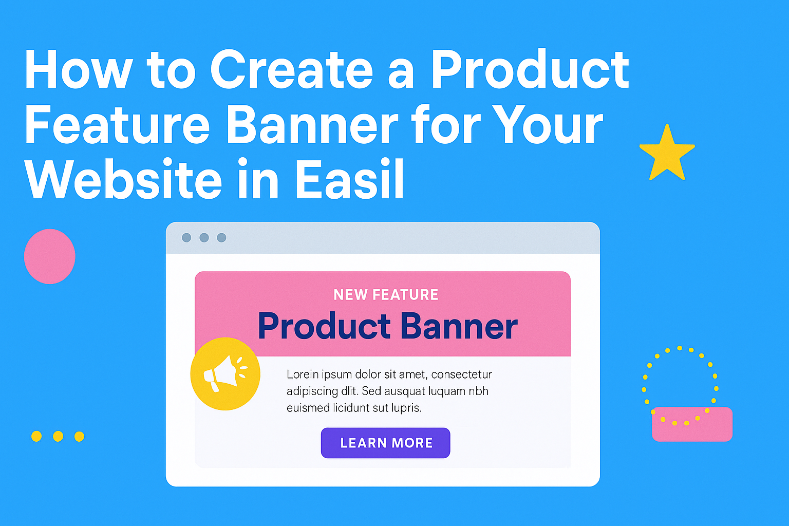
Components of a Compelling Banner
A compelling product feature banner usually consists of several key components.
First, it should feature bold visuals that attract attention. Utilizing colors that contrast with the website’s background can help in making the banner stand out.
Next, clear and concise text is vital. This should explain the new feature in simple terms. Including a call-to-action (CTA) button encourages users to engage right away.
Lastly, it is helpful to incorporate icons or images related to the feature. This provides a visual representation, making it easier for users to understand what is being offered. By combining these elements, a banner can effectively communicate its message.
Designing Your Banner
Creating an effective product feature banner involves several key elements. Selecting the right design tool, arranging layout and composition, choosing an appealing color scheme, and ensuring readable typography are all essential steps in this process.
Selecting the Right Tool: Introduction to Easil
Easil is a powerful design tool that simplifies the banner creation process. It offers various templates and features tailored for different needs. Users can begin with a pre-made template that fits their brand style.
The drag-and-drop interface allows for easy customization, making it user-friendly for anyone, regardless of their design skills. Easil also provides access to stock images and graphic elements, which can enhance the design.
Taking time to explore Easil’s functionalities can lead to a more polished and attractive banner. Familiarizing oneself with the tool ensures that users can create something unique on their first try.
Layout and Composition
A well-structured layout is vital for capturing attention. When designing a banner, organizing the elements clearly helps convey the intended message. Key components should include product images, a catchy headline, and a call to action.
Using grids or guides can assist in achieving balance and alignment. Placing the most important information in prime locations, such as the center or top of the banner, draws the viewer’s focus.
Additionally, incorporating white space is essential. It prevents the banner from appearing cluttered and ensures that each component stands out. This balanced composition fosters clarity and enhances visual appeal.
Choosing Your Color Scheme
Color selection significantly impacts the banner’s effectiveness.
It’s important to choose colors that align with the brand’s identity while also being visually appealing. Colors can evoke emotions, so selecting a scheme that reflects the product’s essence is crucial.
Using a limited color palette, typically 2-3 main colors, helps maintain consistency. Tools like color wheels can aid in finding complementary colors that work well together.
Testing different combinations can lead to discovering the perfect match. Keeping the target audience in mind will guide color choices to create a harmonious and inviting aesthetic.
Typography and Readability
Clear typography is essential for effective communication. The font should reflect the brand’s personality while remaining legible. It’s advisable to use no more than two different fonts to avoid confusion.
Headlines should be bold and attention-grabbing, making it easy for viewers to understand the message at a glance. Body text must be smaller but readable from a distance.
Consider factors like line spacing and contrast against the background color. High contrast enhances readability, while appropriate spacing makes the text easier to read. Prioritizing these elements ensures that the banner conveys information efficiently.
Crafting Your Message
An effective product feature banner communicates essential information clearly and grabs attention. Crafting a compelling message involves writing engaging headlines, highlighting important features, and creating a convincing call-to-action. Each element plays a key role in guiding potential customers through their decision-making process.
Writing Engaging Headlines
A strong headline is crucial for capturing attention. It should be clear, concise, and relevant to the product being featured. Using action words can encourage users to continue reading.
For example, phrases like “Discover the Benefits of Our New Product” or “Transform Your Experience Today” can spark interest.
Adding numbers or statistics often draws readers in too—think “5 Key Ways Our Product Helps You Succeed.” Remember, the headline sets the tone and should reflect the main message of the banner.
Highlighting Key Features
Highlighting key features helps customers understand why the product stands out. Focus on the most important benefits instead of overwhelming details.
Using bullet points is an effective way to present these features clearly. For instance:
- User-Friendly Design: Easy to navigate for all ages.
- Durability: Built to last with high-quality materials.
- Energy Efficient: Saves on power bills.
Presenting benefits in a simple format makes it easy for readers to grasp what makes the product special.
Call-to-Action: Convincing and Effective
A solid call-to-action (CTA) encourages customers to take the next step. It should be direct and leave no doubt about what to do next.
Phrases like “Buy Now,” “Sign Up Today,” or “Get Your Free Trial” create a sense of urgency.
Using contrasting colors for the CTA button can make it stand out on the banner. It’s important that the CTA matches the message of the banner and motivates potential customers to act.
Optimizing for User Experience
Creating a product feature banner involves careful consideration of user experience. To ensure the banner works well, it is crucial to focus on mobile responsiveness and loading times. These factors greatly impact how users interact with the website.
Mobile Responsiveness
A product feature banner should be visually appealing and functional on all devices. Most users access websites through smartphones and tablets, so it’s vital that the banner adjusts accordingly.
Using a responsive design allows the banner to resize and rearrange based on the screen size. This improves usability and keeps users engaged. Designers should use flexible images and CSS media queries to achieve this adaptation.
Testing the banner on different devices helps identify any display issues. A well-optimized mobile banner enhances user satisfaction and can lead to higher conversion rates.
Loading Times and Performance
Users expect quick loading times. A banner that takes too long to load can frustrate them and lead to higher bounce rates.
To optimize loading times, designers can compress images used in the banner. This ensures high-quality visuals without sacrificing speed.
Additionally, minimizing the use of heavy scripts can improve overall performance. Utilizing lazy loading for images can further enhance loading speed.
A fast-loading banner captures attention quickly and makes the browsing experience enjoyable. Focusing on these elements will foster a positive interaction with the website.