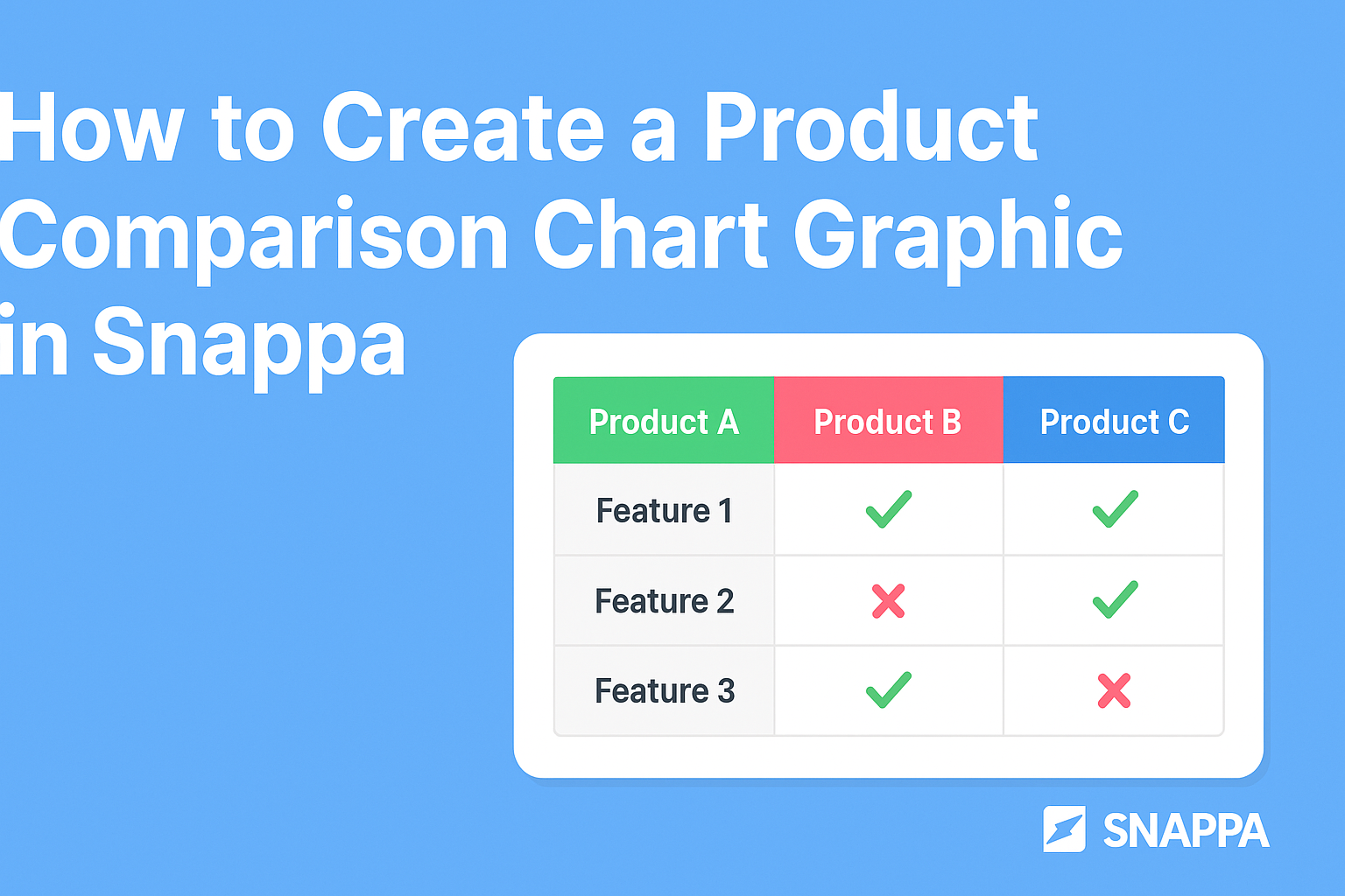
Creating a product comparison chart graphic can help users easily see the differences between options.
Using Snappa makes this process simple and efficient, allowing anyone to design a polished chart without needing advanced graphic design skills. This tool offers a variety of templates and customization options that cater to different business needs.
In today’s competitive market, having a clear visual representation of products can enhance decision-making for potential customers.
By incorporating key features, prices, and benefits into a chart, readers will find it easier to make informed choices. Snappa’s user-friendly interface allows anyone to quickly put together an appealing chart that can effectively attract attention.
Whether for a blog, social media, or marketing materials, a product comparison chart can significantly boost engagement.
Snappa provides all the necessary tools to create graphics that are not only informative but also eye-catching. Starting with Snappa can lead to professional-quality visuals that stand out.
Understanding Product Comparison Charts
Product comparison charts are essential tools in marketing. They help customers quickly see how products stack up against each other.
This section will cover the importance of these charts and the basic elements involved in creating them.
Importance of Comparison Charts in Marketing
Comparison charts play a key role in helping customers make informed choices. They simplify complex information and highlight differences between products.
A well-structured chart can show features, prices, and benefits clearly, making it easier for potential buyers to see value.
In the competitive marketplace, having a comparison chart can boost sales. It appeals to visual learners who prefer graphics over text. It also builds trust, as customers appreciate transparency in product offerings. Including honest reviews or ratings can further enhance credibility.
The Basics of a Comparison Chart
Creating a comparison chart involves a few fundamental steps.
First, identify the products to compare. It’s vital to select similar items, as this helps provide relevant insights.
Next, list important criteria for comparison. Common factors include features, pricing, specifications, and customer ratings.
Organizing this information in a table format can make the chart clear and easy to read.
Using visuals such as icons or images can improve the chart’s appeal. Simple colors and consistent layouts can also enhance readability.
Keeping the information concise is important to avoid overwhelming the reader.
Getting Started with Snappa
Starting with Snappa is simple and straightforward. With just a few steps, anyone can create stunning graphics. Users can learn how to create an account and navigate the tools available in the platform.
Creating an Account
To get started, users need to create an account on Snappa. This is easy and only takes a few minutes.
- Visit the Snappa Website: Go to Snappa’s website.
- Sign Up: Click on the “Sign Up” button.
- Fill in Details: Users can sign up using their email, Google, or Facebook accounts.
- Choose a Plan: Snappa offers free and paid plans. The free plan has some limits but is great for beginners.
After creating an account, users can explore the platform’s features. They will receive a confirmation email to verify their account.
Navigating the Interface
Once logged in, users will see a clean and user-friendly interface. The layout is designed to help users find what they need quickly.
- Dashboard: The dashboard displays recent designs and a button to create new graphics.
- Templates: Users can access a variety of templates tailored for different needs, like infographics or social media posts.
- Tools Menu: The left side includes tools for graphics, text, and backgrounds. Each tool is easy to click and explore.
Taking a tour of the interface can make the design process smoother. Users can find tutorials and tips right within the platform, helping them get the most out of Snappa.
Designing Your Chart
Creating an effective product comparison chart involves selecting a suitable template, customizing design elements, and ensuring the text is clear and well-formatted. Each step can enhance the chart’s clarity and impact, helping your audience easily understand the differences between products.
Selecting the Right Template
When designing a product comparison chart, choosing the right template is crucial. Snappa offers a variety of templates specifically for comparison charts.
It is important to select one that fits the purpose and audience. Options can range from simple layouts to more detailed designs.
Consider the key features you want to highlight. If comparing three or more products, choose a template with enough columns. For fewer products, a straightforward design may suffice.
Snappa allows for easy adjustments, so the template can be tailored to meet specific needs.
Customizing the Design Elements
After selecting a template, the next step is to customize the design elements. This includes colors, graphics, and overall layout.
Choosing a color scheme that aligns with your brand can create a cohesive look.
Snappa provides tools to adjust backgrounds and add images. Using visuals relevant to the products can enhance understanding. For instance, including logos or product photos makes the chart more appealing.
It’s also essential to ensure that the layout is clean and organized. Proper spacing between elements can make the chart easier to read.
Customize borders, shadows, and other details to draw attention to important comparisons.
Adding and Formatting Text
Text plays a vital role in a comparison chart, so adding and formatting it correctly is key.
Each product should have a clear title, making it easy for viewers to identify what they are looking at. Use consistent font sizes for headings and descriptions to maintain uniformity.
Important features, prices, and other comparisons should be in bold or highlighted. This helps the reader quickly locate essential information.
Snappa allows for easy text adjustment and formatting, making it simple to get the desired look.
Ensure that the text is concise. Using bullet points or short phrases can convey information quickly. A well-formatted chart with clear, engaging text will encourage users to draw meaningful insights.
Finalizing and Exporting
Before finishing the product comparison chart graphic, it’s essential to review the design and choose the right export options. This stage ensures that everything looks perfect and is set up for sharing or printing.
Reviewing the Design
In this step, checking the overall layout is crucial. The designer should zoom in and verify that all text is readable and free of typos.
It’s important to ensure that no elements overlap or are cut off. They can use Snappa’s preview feature to see how the graphic will appear in different formats.
Colors, fonts, and images should align with the brand’s style guide. Adjust any misaligned elements for a polished look.
Engaging with peers for feedback often provides fresh perspectives. Final adjustments based on this feedback can significantly enhance the design’s effectiveness.
Export Options in Snappa
Once the design is finalized, the next step is to export the graphic.
Snappa offers several formats, such as PNG, JPEG, and PDF. Each format serves different purposes. For online use, PNG is typically best due to its quality and transparency options.
Users should also choose the appropriate resolution.
For web graphics, 72 DPI is suitable, while print materials may require 300 DPI.
Snappa allows easy downloading by clicking the “Download” button and selecting the desired format. This ensures the final product looks great, no matter where it’s used.