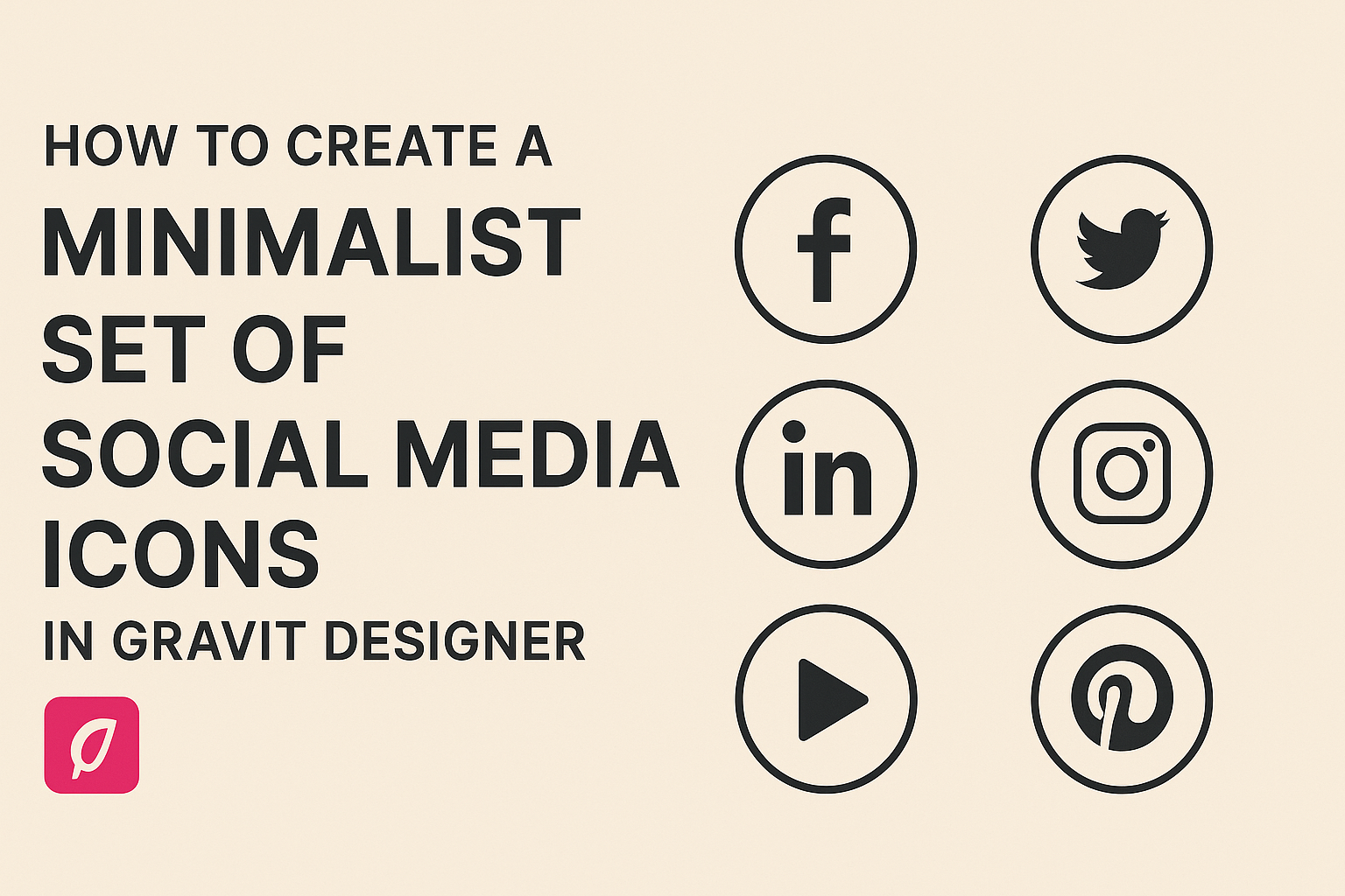
Creating a minimalist set of social media icons can enhance any project with a clean and modern aesthetic. With Gravit Designer, anyone can easily design stylish icons that stand out while staying simple. This approach not only captures attention but also makes navigation more user-friendly.
In this blog post, readers will learn step-by-step techniques for designing eye-catching icons. They will get tips on using grids, shapes, and color schemes that bring a fresh look to their social media presence. By the end, creators will have the tools they need to craft their own unique icon sets.
Whether starting from scratch or improving existing designs, this guide provides essential insights. Embracing minimalism can transform how users interact with your content, making it effective and memorable.
Getting Started with Gravit Designer
Gravit Designer offers a user-friendly interface and a variety of tools for creating high-quality designs. Understanding how to navigate the software and set up projects will help anyone start designing effectively.
Overview of Gravit Designer Interface
The interface of Gravit Designer is designed for ease of use. Users will notice a clean layout with essential tools easily accessible.
- Toolbar: Located on the left side, it contains tools for selection, shapes, text, and more.
- Inspector Panel: This is on the right side and allows users to adjust properties for selected objects, like colors and sizes.
- Canvas: The central area is where designs come to life. Users can zoom in and out, and reposition elements easily.
With these components, users can effectively create and manage their design projects without feeling overwhelmed.
Setting Up a New Project
Creating a new project in Gravit Designer is straightforward.
- Launch the App: Open Gravit Designer and select “New Design” from the main menu.
- Choose Document Settings: A dialog will appear for users to specify settings like width, height, and units. Common sizes include social media post dimensions.
- Select Background Color: Users can set a transparent or solid background to kick off their design.
Once the project is set up, the canvas is ready for drawing shapes, adding text, and incorporating images. This setup provides a solid foundation for designing minimalist social media icons.
Designing Your Icons
Creating a minimalist set of social media icons requires careful thought about style, shape, and details. Each choice helps convey the brand’s identity while maintaining simplicity and clarity.
Choosing a Style for Your Icons
Selecting a style is one of the most important steps in designing social media icons. It sets the tone for the entire set.
Popular styles include:
- Flat Design: Clean, simple shapes with no gradients.
- Outline: Thin lines that define the icon without filling.
- Filled Icons: Solid shapes that add a bold look.
Designers should consider the platform where these icons will be used. For example, flat design might work better on websites, while filled icons are great for apps. Keeping the style consistent across all icons helps with recognition.
Creating the Icon Base Shape
Once the style is chosen, it’s time to create the base shapes of the icons.
Using Gravit Designer, individuals can start with basic geometric forms like circles or squares.
For a rounded look:
- Use circles for social media platforms like Facebook and Instagram.
For more angular designs:
- Rectangles might serve well for platforms like YouTube.
Creating a solid base shape allows for easier modification later. Maintaining consistent proportions in size and spacing ensures all icons feel cohesive and professional.
Adding Details and Visual Elements
After establishing the base shape, the next step is to add details that make each icon unique. This can include simple elements like logos or initials.
Tips for adding details:
- Keep elements minimal: Avoid clutter by limiting additional shapes.
- Use a limited color palette: Stick to one or two colors to maintain a minimalist feel.
- Test visibility: Ensure icons are clear and legible at smaller sizes.
Attention to detail can elevate the design. Adjust line thickness, explore color contrasts, and incorporate small accents to enhance recognition. This careful balancing act keeps the icons functional and appealing.
Customizing and Styling
Customizing social media icons in Gravit Designer allows for a unique touch that reflects personal or brand aesthetics. This section covers color schemes and the use of effects to enhance visual appeal.
Applying Color Schemes
Choosing the right color scheme is crucial for minimalist social media icons. Colors should match the overall theme of the website or brand.
- Identify Brand Colors: Start by using existing brand colors or choose a palette that conveys the desired emotion.
- Use a Color Wheel: Utilize a color wheel to find complementary colors. This can help create a balanced look.
- Test Different Combinations: Experiment with light and dark shades. Light colors can provide a fresh, clean appearance, while darker colors may offer a bold look.
He or she can apply colors through the Fill Tool in Gravit Designer. This allows for easy adjustment and previewing of different shades.
Using Effects and Filters
Effects and filters add depth and interest to the icons. This can help them stand out without overwhelming the minimalist design.
-
Shadows: Adding a subtle shadow can create a three-dimensional effect, helping the icons pop on the screen. It should be soft and not too dark.
-
Gradients: A light gradient can add elegance. It’s essential to keep it simple to maintain minimalism.
-
Hover Effects: Applying a slight scale or color change when hovering engages users. This interaction invites them to click on the icons.
Experimenting with these elements can lead to beautiful results. Each adjustment should be tested to see how it looks before finalizing the design.