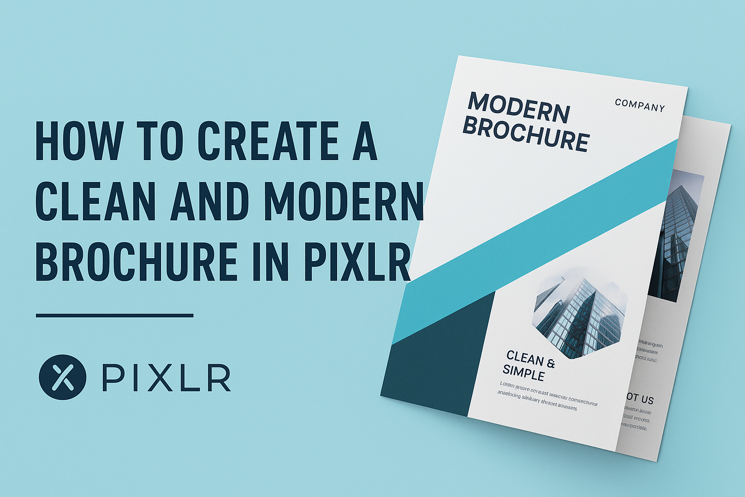
Creating a brochure can seem daunting, but with the right tools, it can be an enjoyable process.
Using Pixlr, anyone can design a clean and modern brochure that effectively captures attention and communicates important information.
This article will guide readers through the steps to make a standout brochure, ensuring a polished final product.
Many people overlook the importance of a well-designed brochure in promoting their business or event. A good brochure not only grabs attention but also provides essential details clearly.
By utilizing Pixlr’s simple interface and customizable templates, they can create a brochure that reflects their unique style and goals.
With a bit of creativity and some key design tips, crafting a brochure becomes much easier.
This post will cover everything from selecting the right template to adding personal touches that make a real impact. Readers are invited to dive in and discover how to transform their ideas into an impressive brochure using Pixlr.
Getting Started with Pixlr
Getting started with Pixlr is simple and straightforward.
Users can easily navigate the interface and set up their projects to create stunning graphics. Below are key details on how to understand Pixlr’s interface and how to set up a new project effectively.
Understanding Pixlr Interface
The Pixlr interface is designed with user-friendliness in mind. At the top, you will find the menu bar, which offers options like File, Edit, and View. This makes accessing tools seamless.
On the left side, the toolbar contains essential tools like Select, Brush, and Text. A wide range of features allows users to edit images and create designs effortlessly.
The right side shows the layers panel, which helps manage different elements in a project. Users can easily add, remove, or adjust layers. Familiarizing oneself with these sections is key for a smooth editing experience.
Setting Up a New Project
To begin a new project, users should first click on “Create New” from the homepage. A dialog box will appear for setting project dimensions.
Users can choose from preset sizes or enter custom dimensions. For brochures, a typical size is A4 or Letter. After setting these, users can select a background color or transparency.
Once a new canvas is open, they can import images or graphics. This is easily done through the File menu by choosing “Open Image”.
By setting up the canvas correctly, users position themselves for a successful design workflow.
Designing Your Brochure
When creating a brochure, several key aspects come into play. Choosing the right template or designing from scratch helps set the tone. Next, managing layers and objects ensures a clean layout. Text, images, and colors enhance the overall appeal and effectiveness of the brochure.
Selecting a Template or Creating from Scratch
Choosing the right template is essential for a professional look. Pixlr offers a variety of fully customizable templates. Users can select one that aligns with their brochure’s purpose.
If a unique approach is desired, creating a brochure from scratch is a great option. This allows complete control over design elements. Start by determining the size and orientation. Then, sketch a rough layout before moving to digital design.
Working with Layers and Objects
Layers are crucial in design for keeping elements organized. Each item like text, images, and shapes should be on separate layers. This makes editing easier and improves workflow.
Use the features in Pixlr to manage layers effectively. Renaming layers helps keep track of elements. Locking layers that don’t need changes avoids accidental edits. Grouping similar objects can also streamline the design process.
Adding Text and Typography Best Practices
Text is a vital part of a brochure. Clear and concise text grabs attention and conveys the message.
Choose fonts that reflect the brand’s personality. Limit the number of different fonts to two or three for a clean look.
When adding text, think about hierarchy. Use headings, subheadings, and body text to guide readers. Ensure there’s enough contrast between text and background for readability.
Incorporating Images and Graphics
Images and graphics can make a brochure visually appealing. Select high-quality images that relate to the content. Pixlr offers tools for resizing and editing to fit the design.
Consider using graphics like icons or logos to communicate ideas quickly. These elements can break up text and create visual interest. Balance images with text to avoid clutter and maintain focus.
Using Color Schemes Effectively
Colors play a significant role in design. They can evoke emotions and create a visual identity.
Choose a color scheme that reflects the brand and message.
Stick to a limited palette, typically two to four main colors. This brings harmony to the design. Use color contrast to make important information stand out. Be mindful of color meanings to enhance the brochure’s effectiveness.
Enhancing Your Brochure
To make a brochure stand out, using the right filters, effects, and adjustments is key. This can elevate the visual appeal and ensure the design feels modern and clean.
Applying Filters and Effects
Pixlr offers a variety of filters and effects to enhance any brochure design. Users can easily apply these to create a unique look.
- Choose a Filter: They can select from options like vintage, blur, or focus effects. Each filter can change the mood of the design.
- Customize Strength: Adjust the strength of the filter. A subtle touch often enhances the design without overwhelming it.
- Experiment: Mixing different filters can lead to interesting results. This helps create a distinctive style that catches the eye.
Encourage manipulating these settings until the desired look is achieved.
Adjusting Opacity and Blending Modes
Opacity adjustments are essential for layering visuals in a brochure. Pixlr allows users to change the opacity of different elements easily.
- Select an Element: Choose the graphic or text to modify.
- Adjust Opacity: Lowering the opacity can create a soft background effect. It emphasizes the main content without distraction.
- Explore Blending Modes: Using blending modes can produce various outcomes, such as overlay or multiply. These modes blend colors and textures to create depth.
By playing with these options, the brochure can achieve a professional and polished finish.
Finalizing and Exporting
Finalizing a brochure involves careful proofreading and saving your design in the right format. This ensures a polished look and prepares it for distribution. Below are key steps to complete the process.
Proofreading and Reviewing
Before exporting the brochure, it’s essential to proofread the text thoroughly. This means checking for spelling and grammar errors. A simple typo can make a brochure appear unprofessional.
It helps to read the content out loud. This technique allows for better flow and clarity. It’s also a good idea to ask a friend or colleague to review it. They might catch errors that were overlooked.
Additionally, check the design elements. Make sure all images align well and the colors are consistent. Consider whether the overall layout is visually appealing and clear for the reader.
Saving Your Design
Once the brochure content looks great, it’s time to save the design properly. In Pixlr, saving the project allows for future edits.
Use the “Save” function and choose a descriptive file name. This makes it easy to identify later.
Select the file format you want while saving. A popular choice for editing is the Pixlr format. This keeps all layers intact. For sharing, saving as a high-resolution JPEG is ideal. This option keeps quality high and file size manageable.
Always save a backup copy as well. This can prevent loss in case of an unexpected issue. Quick steps like these ensure peace of mind when working on designs.
Exporting for Print and Web
When ready to share the brochure, exporting it correctly is crucial.
For print, the PDF format is highly recommended. It preserves the design and colors accurately, especially in CMYK mode.
Ensure that the resolution is set to at least 300 DPI (dots per inch) to maintain quality. This helps avoid blurred images or text in printed copies.
For online use, a high-resolution JPEG or PNG works well.
These formats load quickly on websites and social media. Make sure to optimize the file size without sacrificing quality. This makes sharing easy and keeps loading times fast.