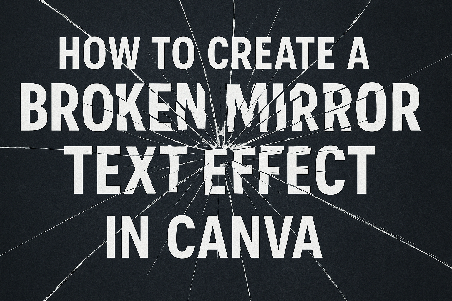
Creating a broken mirror text effect in Canva adds a dramatic and engaging touch to any design.
This effect can be achieved by creating a text reflection, adding distortion, and applying the mirror effect. By mastering these steps, anyone can make their designs stand out with a unique and eye-catching appearance.
For those familiar with Canva’s interface, the process begins with simple text duplication and transformation. This creative technique is easy to learn and can significantly elevate a design’s impact.
Whether for personal projects or professional use, this effect offers great versatility.
Anyone interested in adding flair to their visuals will find that learning this effect opens up new avenues for creativity. It’s a fun way to experiment with text and create something memorable for any audience.
Getting Started with Canva
Canva is a versatile design tool that’s accessible to everyone, whether you’re a beginner or a seasoned designer.
This section will guide you through setting up an account and navigating the platform.
Signing Up for Canva
To start using Canva, visit their official website. You’ll see an option to sign up with an email address, Google account, or Facebook account. This flexibility makes setting up an account quick and easy.
After signing up, you can opt for a free plan or explore their premium features with a trial. Free accounts provide access to a wide range of design tools and templates. It’s perfect for most casual projects.
For those needing advanced tools and more resources, the premium option adds value. Remember to verify your email after registration to secure your account.
Understanding the Canva Interface
Canva’s interface is user-friendly and designed for easy navigation.
Once logged in, you land on the homepage. Here you’ll find design suggestions based on popular formats like social media posts and presentations.
The left sidebar is where you access tabs for Templates, Elements, and Uploads. This simplifies finding what you need without sifting through excess options.
In the middle of the screen, you’ll see your project canvas. On the right, the toolbar provides customization options for colors, fonts, and effects. Familiarizing yourself with these tools enhances efficiency and creativity.
Selecting the Right Template
Choosing the right template sets the foundation for your design.
On the homepage, navigate to the Templates tab in the sidebar. Templates are organized by type, such as flyers, social media, and cards.
Use the search bar if you have a specific design in mind. Typing “poster,” for example, will present a wide array of poster templates.
Each template can be customized to fit individual needs. You can modify colors, text, and images to match your project’s style. Taking the time to explore and test different templates can inspire creativity and ensure your designs stand out.
Fundamentals of Text Editing
Text editing is a key skill when working with design tools like Canva. Understanding how to add text boxes, choose the right fonts and sizes, and properly align and space text can greatly enhance the readability and visual appeal of your design.
Adding Text Boxes
Adding text boxes is the first step in including text elements in any design.
In Canva, you can find text options on the left side panel. Users have the choice of basic text boxes or preset styles. A simple click allows them to add these elements to their canvas.
Each text box can hold unique content. Users can type directly into the box to replace existing placeholder text with their desired message.
It’s important to carefully decide where to place text boxes so they don’t crowd the design. This helps maintain a neat and organized look, ensuring that the message is clear and easy to read.
Choosing Fonts and Sizes
Choosing the right font and size can set the tone for the entire design.
Canva offers a wide variety of font styles. Whether users prefer bold and striking fonts or something more subtle, options are available in the text tab.
Selecting a font that matches the theme or feeling of the project is important.
Sizes should be picked based on readability. Headlines typically require larger fonts, while smaller text might use smaller sizes to fit more information into a limited space. Users can easily adjust font size using the size menu at the top of the canvas. Ensuring that all text is legible is essential to effective communication.
Text Alignment and Spacing
Text alignment and spacing can significantly affect how information is perceived by an audience.
Canva allows users to align text left, right, or center. The alignment tools are located in the top settings bar when a text box is selected. Choosing the right alignment can help to balance the layout and emphasize specific areas.
Spacing between lines and letters can be customized to fit the design. Proper spacing increases readability and gives the design a polished look. Users can adjust spacing by selecting the text and accessing the spacing option in the toolbar. Being mindful of alignment and spacing ensures that text flows well and the design looks professional.
Creating the Broken Mirror Effect
To achieve the broken mirror text effect in Canva, one must skillfully manipulate text with reflections, distortions, and layered transparency changes. This involves carefully applying initial text effects, then creatively distorting the text to mimic a mirror-like shattering, and finally adjusting the transparency and layers to achieve the desired illusion.
Applying the Initial Text Effects
Begin by adding text to your Canva project. Navigate to the ‘Text’ tab, choose a style, and input your desired words. Picking a bold font can enhance the visual impact. Ensure the text is large enough to make the effects noticeable.
Next, duplicate the text to create a reflection. This is crucial in making the text look mirrored. Rotate the duplicate text slightly at an angle for a realistic effect. This setup helps in creating a base for the broken mirror appearance. Ensure all text remains legible and does not overlap excessively.
Using Canva’s effects, apply a slight shadow to add depth. This step is important to differentiate the text layers and add dimension to the overall look. Finally, lock the background layer to prevent accidental movements while adjusting other elements.
Distorting the Text for the Mirror Effect
Distortion is key in creating the broken mirror appearance.
Select the duplicated text layer, and use the ‘Liquify’ or ‘Wobble’ effect to skew the text. This creates an illusion of shattered glass.
It’s crucial to maintain a balance between distortion and readability. Excessive distortion may make the text hard to read. Adjust the distortion levels gradually to keep words recognizable.
Also, rotate some text elements at varied angles to mimic random breaks and shards typical of broken mirrors.
Experiment with duplicating even more layers of the distorted text. Alter their sizes slightly to add more complexity and variance to the effect. Keeping these layers aligned differently helps simulate an actual shattered mirror outcome.
Adjusting Transparency and Layering
Transparency control is essential in this effect.
Begin by adjusting the opacity of the distorted text layers. Lowering opacity can make text appear like a shadowy reflection, enhancing the broken mirror illusion.
Layer the text elements over each other carefully. Alter opacity differently for each layer to achieve a mix of bold and faded text sections. This layering mimics the varying reflections one might see in broken glass.
Finally, adjust each text layer’s position to overlap selectively with the others. This layering effect should create a cohesive, eye-catching broken mirror design. Remember to view the layout from different angles for an optimal arrangement.
Enhancing the Visual Appeal
To make your text pop and grab attention, you can play around with graphics, colors, shadows, and reflections. These tools help in making the design look engaging and eye-catching.
Adding Graphics and Elements
Including graphics and elements can bring life to your broken mirror text effect.
Bold geometric shapes, like triangles and circles, can add contrast and focus. Icons can also match the tone of your text. Decorative lines or borders can further enhance the overall look.
Use these elements to guide the viewer’s eyes. Keep the layout balanced and avoid clutter. Group elements to create a cohesive design that complements the text. This helps in making the reader linger on the design.
Incorporating Color Schemes
Colors are powerful tools in design. Choosing the right color scheme can transform a simple broken mirror text effect into something striking.
A monochromatic scheme can emphasize elegance. On the other hand, complementary colors create contrast and highlight text features.
Consider color psychology to influence emotions. Blues may feel calming, while reds are attention-grabbing. Use gradients for depth or interest in the design. Be mindful of readability; use contrasting text and background colors to ensure clarity.
Utilizing Shadows and Reflections
Adding shadows can create depth and a three-dimensional look for your text.
Drop shadows add a subtle lift, making elements pop. Cast shadows mimic real-world lighting, providing a realistic touch.
Reflections, like duplicating the text with reduced opacity, can suggest a shiny, glassy effect. Experiment with shadow angles and blur levels to achieve the desired look. They guide the viewer’s attention, enhancing the broken mirror effect more effectively.
Saving and Exporting Your Design
Once you’ve created your broken mirror text effect in Canva, it’s important to save and export your design properly. This ensures you have the best quality file for printing, sharing, or uploading online. This section provides guidance on choosing the right file format and downloading your design.
Choosing the Correct File Format
Selecting the right file format is key for different uses of your design.
If you plan to print your design, it’s best to use a high-quality format like PDF Print. This ensures the text and images are sharp.
For online use, PNG is a great choice. It supports transparency and maintains good quality.
If the file size is a concern and you want quick loading times, consider using the JPEG format, although it offers less quality than PNG.
If your design includes moving elements, Canva allows you to download it as a MP4 video or GIF. Think about where you’ll use the design to make the best choice. Ensure you know the requirements of your design’s destination, like social media platforms or print shops. This helps to pick the format that suits your needs.
Downloading Your Design
Once you’ve decided on the file format, downloading the design is straightforward.
Click on the Share button at the top right of Canva’s interface.
Next, select Download to open the download options.
Choose the file type you need from the drop-down menu.
If you’re downloading a PDF for print, look for options like crop marks or bleed if necessary. These options are important if you’re sending the file to a printer.
Remember that larger files may take longer to download. Ensure you have a stable internet connection to avoid issues.
It’s also a good idea to save the design to your Canva account for future edits. This way, you can revisit and tweak your design anytime.