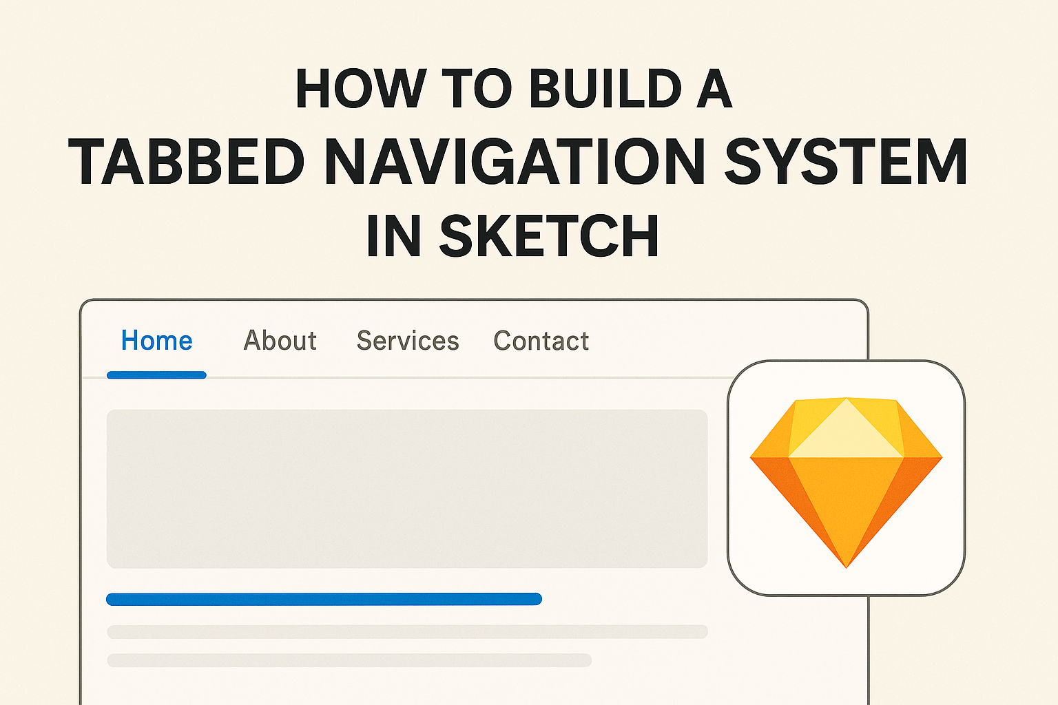
Creating a tabbed navigation system in Sketch can greatly improve the usability of a design. This type of navigation allows users to switch between different sections smoothly, keeping their experience organized and efficient.
With just a few simple steps, anyone can build an effective tabbed interface that enhances any project.
Sketch offers various tools and features that make designing a tabbed navigation system straightforward. By using symbols and smart layouts, designers can easily create tabs that are both functional and visually appealing.
This article will guide readers through the process, providing helpful tips and tricks along the way.
Whether someone is a beginner or has some design experience, understanding how to build a tab navigation system is beneficial. Readers will find that implementing tabs not only streamlines their design but also improves user interaction.
Preparing to unlock the full potential of their design toolkit could be the next step in their creative journey.
Getting Started with Sketch
Before diving into building a tabbed navigation system, it’s crucial to familiarize oneself with Sketch and its interface.
This section will guide the reader in understanding the Sketch environment and in setting up the first artboard.
Understanding the Sketch Interface
The Sketch interface is intuitive and user-friendly. It includes several essential components:
- Toolbar: Contains tools for creating shapes, text, and symbols.
- Layers Panel: Displays all layers and objects in the document, allowing easy selection and arrangement.
- Inspector: Provides options for adjusting properties such as color, size, and style for selected items.
Navigating this interface is key to designing effectively. Users can customize the workspace to fit their needs, making it more efficient.
Exploring the different options in the toolbar and the layers panel will enhance the design experience.
Setting Up Your First Artboard
Creating your first artboard is straightforward. Here’s how to do it step by step:
- Select the Artboard Tool: Find it in the toolbar. It allows users to define the canvas size.
- Choose a Preset Size: Sketch offers various presets like iPhone or Web design. This helps in starting with the correct dimensions.
- Draw the Artboard: Click and drag on the canvas to create it.
It’s important to remember that you can always adjust the size later. Once the artboard is set up, users can begin adding layers, symbols, and other design elements.
This initial setup is a vital step toward building effective design structures, including a tabbed navigation system.
Designing the Tab Structure
Creating an effective tab structure is essential for user experience. A well-designed tab bar helps users navigate easily and find the information they need. Attention to detail in both the layout and visual elements is key.
Creating the Tab Bar Component
First, start by setting up the tab bar component. This can be done by creating a rectangle shape for the background. The tab bar should be wide enough to accommodate all tabs without crowding.
Next, divide the rectangle into sections, each representing a tab. Using a grid layout can help in this step. You can opt for even spacing or vary the widths based on the importance of each tab. Consider using rounded corners for a softer look.
Lastly, prototype simple interactions, like highlighting the active tab. This feedback is crucial for guiding users as they click through.
Adding Text and Icons to Tabs
Text and icons play a significant role in making tabs informative.
Choose short, clear labels for each tab, ideally one or two words. Short labels help users quickly grasp the content for each tab.
Incorporating icons is beneficial as they add visual interest. Select icons that match the meaning of each tab label, enhancing recognition. It may be helpful to use a consistent style for all icons, whether outlined or filled, to maintain a cohesive look.
Finally, use contrasting colors for the text and icons to make them stand out against the tab background. This improves usability and ensures that users can navigate the interface effortlessly.
Implementing Interactivity
Adding interactivity to a tabbed navigation system makes it dynamic and user-friendly. It allows users to seamlessly navigate through different sections.
This can be easily achieved using Sketch’s prototyping tools and linking the tabs to specific artboards.
Using Sketch Prototyping Tools
Sketch provides several prototyping tools for adding interactivity. Users can create links or hotspots to navigate between artboards.
To do this, click on an element, open the Prototype tab, and select “Create an Interaction.”
Hotspots can cover larger areas, giving more flexibility than standard links. This feature is particularly useful for creating active states for tabs.
Make sure that your interactions are clear and intuitive for a smooth user experience.
Linking Tabs to Artboards
Linking each tab to its respective artboard is essential for navigation. Users can create a distinct artboard for each tab’s content.
When a tab is selected, it should direct the user to its corresponding artboard.
To link a tab, select it and then choose the target artboard in the Prototype tab. This allows for quick navigation between different screens.
Remember, each tab should have a clear label, making it easy to identify its function. Proper organization enhances the overall effectiveness of the navigation system.
Best Practices
When creating a tabbed navigation system in Sketch, it is vital to maintain a responsive layout and ensure accessibility. These practices help improve user experience and make navigation seamless.
Maintaining a Responsive Layout
A responsive layout is essential for usability across different devices. Tabs should resize and reposition for optimal viewing on desktops, tablets, and phones.
To achieve this, use relative sizing rather than fixed widths. For example, employ percentages to adjust tab widths based on the browser window size. This helps prevent overflow issues and keeps the design tidy.
Also, consider stacking tabs vertically on smaller screens. This adjustment allows for easy access without compromising readability.
Employ a grid system for alignment to ensure tabs remain consistently spaced.
Using clear, short titles is also beneficial. According to best practices, a single-word title or a brief two-word title works best for tabs. This keeps the interface clean and easy to navigate.
Ensuring Accessibility
Accessibility is a key factor in web design.
A well-designed tab system should be usable by everyone, including people with disabilities.
To improve accessibility, all tabs must be keyboard navigable.
This means users should be able to switch between tabs using the keyboard, without relying solely on a mouse.
Adding clear, descriptive labels to tabs allows screen readers to interpret their function accurately.
Use semantic HTML for the tab components so they are recognized correctly by assistive technologies.
Color contrast is another critical aspect.
Ensure that the tab text and background colors provide enough contrast for readability.
A contrast ratio of at least 4.5:1 is recommended for normal text.
Following these guidelines creates a user-friendly environment that enhances the experience for all users.