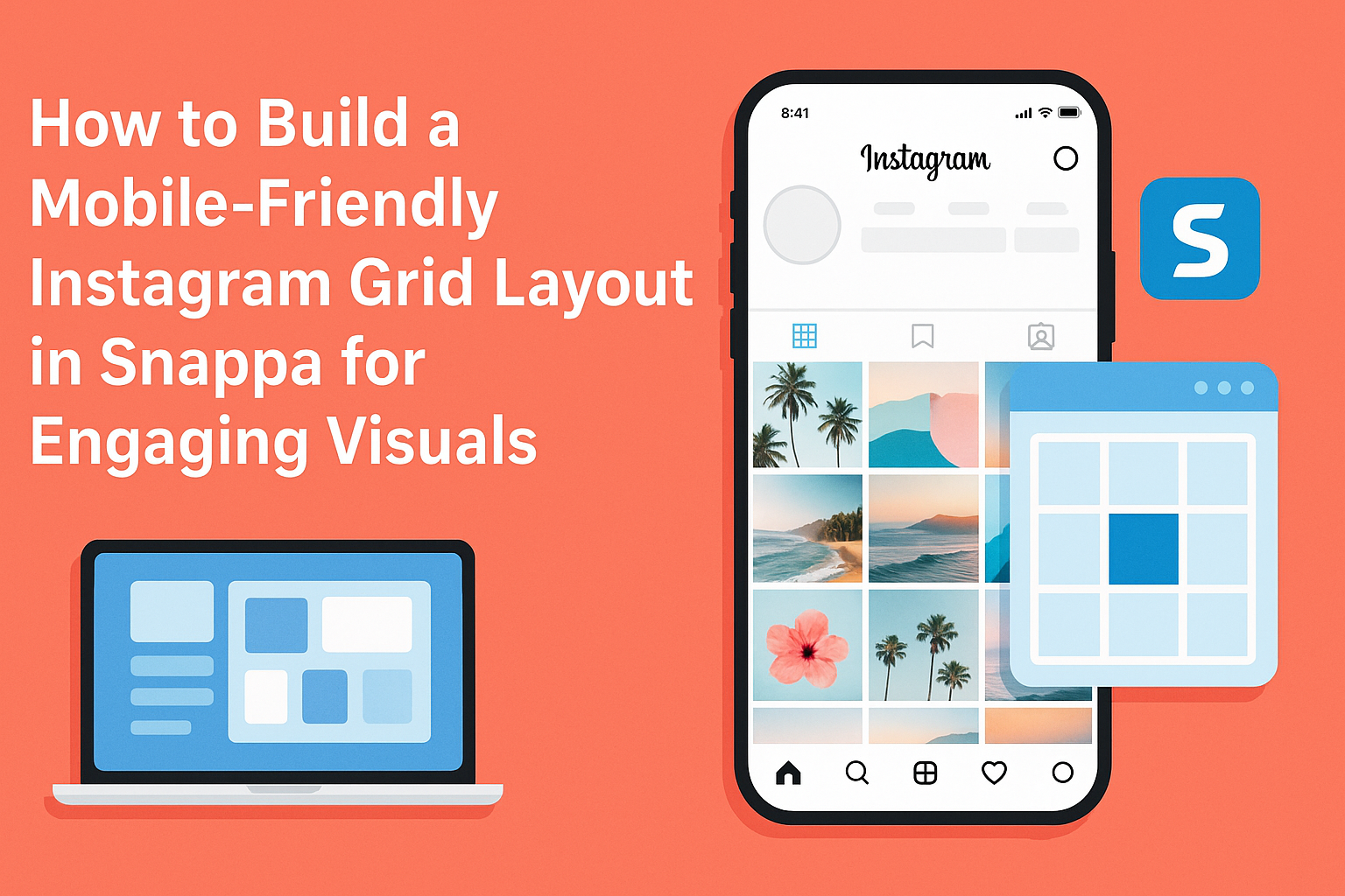
Creating an eye-catching Instagram grid can enhance any profile and attract more followers.
To build a mobile-friendly Instagram grid layout in Snappa, it is essential to use a combination of cohesive colors, clear visuals, and a well-thought-out posting plan. This ensures that every post contributes to the overall aesthetic, making it appealing on mobile devices where most users engage with the app.
Using Snappa makes the design process straightforward and fun.
Users can take advantage of its tools to craft images that fit perfectly within the grid format while keeping the overall look unified. This not only boosts visual appeal but also helps establish a recognizable brand identity.
In today’s busy social media landscape, standing out is crucial.
By following some simple strategies while creating posts in Snappa, anyone can achieve a visually pleasing and mobile-friendly Instagram grid layout that resonates with their audience.
Getting Started with Snappa
For anyone looking to create stunning graphics, Snappa offers a user-friendly platform.
Knowing how to navigate the interface and set up an account makes the process smooth and efficient.
Understanding Snappa’s Interface
Snappa’s interface is designed to be intuitive and easy to use. When users first log in, they will see a clean workspace with an array of tools on the left side.
Key features include:
- Templates: A selection of professional templates for various platforms, including Instagram.
- Graphics and Images: Access to a large library of stock photos and graphics, making it easy to find the right visuals.
- Text Tool: Allows users to add text with different fonts, colors, and styles.
Navigating through these options helps users find what they need quickly. The drag-and-drop functionality simplifies placing elements anywhere on the canvas, making design a breeze.
Setting Up Your Snappa Account
Creating an account on Snappa is straightforward.
Users need to visit the Snappa website and click on the “Get Started Free” button.
From there, they can choose to sign up with an email address or through a social media account. Once the account is created, users can explore the features available in the free tier.
It is important to note that the free version allows access to many templates and images, which is perfect for beginners. Advanced options, such as increased storage and premium templates, can be unlocked with paid plans.
Users should take a moment to explore their account settings to customize their experience. This includes adjusting notification preferences and profile details, ensuring they get the most out of Snappa.
Designing Your Instagram Grid
Creating an attractive Instagram grid involves careful planning and design. A well-thought-out layout can enhance your brand’s identity and engage your audience effectively. This section explores selecting the right templates, customizing them, and creating eye-catching visual content that stands out.
Choosing the Right Templates
Choosing the right templates sets the foundation for a successful Instagram grid. Snappa offers a variety of templates that cater to different aesthetics and brand identities.
It’s important to pick templates that align with your vision and theme.
While browsing, consider templates that utilize a classic 3×3 grid layout. This layout creates a balanced appearance. Users can easily distinguish your brand when they scroll. Look for designs that complement your color scheme and overall identity.
Customizing Templates for Your Brand
Once the right template is selected, customizing it is crucial. Tailoring the template to fit the brand’s voice helps maintain consistency.
Adjust colors, fonts, and graphics to match brand guidelines.
In Snappa, users can also import their logos or unique images. This addition creates a personal touch. Consider how each post will look alongside others in the grid. Ensure that each customization reflects the brand’s personality while remaining visually appealing.
Creating Engaging Visual Content
Creating engaging visual content is key to attracting followers.
High-quality images and clear graphics capture attention quickly. Aim for a mix of different types of posts, such as product showcases, behind-the-scenes shots, or user-generated content.
Using tools like filters consistently can enhance visual appeal.
Users should also consider the story each post tells within the grid. Engaging captions can provide context and encourage interaction, further enhancing the overall aesthetic of the Instagram feed.
Optimizing Your Layout for Mobile
Creating a mobile-friendly Instagram grid is essential for engaging users on their devices. Ensuring the layout looks great and functions well can boost interaction and make the content more appealing.
Best Practices for Mobile-Friendly Designs
To design effectively for mobile, it’s crucial to prioritize visuals. Use high-quality images that are clear and vibrant, as smaller screens can make details hard to see. He should also consider balancing colors to create a visually appealing grid.
Simplicity is key. A clean layout without too many distractions keeps the focus on the content. He can use larger text sizes for captions and clear fonts so they remain easy to read on mobile screens.
Consistent filters across the grid create harmony. Applying the same filter to every post maintains a unified look, making it easier for viewers to recognize the brand. This can increase user engagement and boost follower count.
Testing Your Grid Layout on Different Devices
Testing the layout on various devices is essential in ensuring it performs well.
He should check how the grid looks on different screen sizes, from smartphones to tablets. Each device may display images and text differently.
To do this, he can use tools like browser developer options or responsive design testing tools. This helps in identifying any issues with image scaling or text legibility.
Encourage others to review the design on their devices. Getting feedback can uncover problems that may not be immediately obvious.
It’s also important to consider various operating systems, as they can impact how the layout appears.
Publishing and Updating Your Grid
Maintaining a vibrant Instagram grid requires careful planning and consistent updates. This section focuses on scheduling posts to ensure regularity and how to keep visual elements cohesive over time.
Scheduling Posts for Consistency
To keep an Instagram grid lively, scheduling posts is key.
Using a content calendar can help streamline the process. It allows creators to visualize their upcoming posts and align them with special dates or themes.
Tools like Planable or Hootsuite enable users to schedule posts in advance. They can select specific times and dates to publish content automatically. This practice not only saves time but also ensures that the grid remains active, attracting more engagement.
Setting a consistent posting frequency, such as three times a week, can create anticipation among followers.
By planning ahead, individuals can avoid gaps and keep their audience engaged and interested.
Maintaining Visual Cohesion Over Time
Visual cohesion is crucial for a professional-looking grid.
It’s important to maintain a consistent theme that reflects a brand’s identity or personal style.
Choosing a specific color palette can help unify different posts.
Additionally, applying the same filter across images ensures a harmonious look.
Users can experiment with filters until they find the right one that complements their content.
Regularly assessing the grid layout will also help.
Creators should review how the new posts fit into their existing aesthetic.
Adjusting the layout by rearranging posts can ensure that the overall grid stays appealing and organized, reflecting the brand’s message clearly.