Creating consistent brand designs in Canva doesn’t have to mean manually changing every color on each template. With Canva’s Brand Kit feature, users can apply their brand colors to any template with just one click, instantly transforming designs to match their brand identity. This powerful tool saves hours of design work and ensures every graphic maintains professional consistency.
Many designers struggle with keeping their visual content on-brand, especially when working with multiple templates or team members. The challenge becomes even greater when trying to maintain color consistency across different design projects. Fortunately, Canva offers several methods to streamline this process, from the premium Brand Kit feature to free alternatives that still deliver impressive results.
Understanding how to set up and use these branding tools can transform anyone’s design workflow. Whether someone needs to create social media posts, marketing materials, or presentations, mastering brand color application in Canva makes the entire process faster and more professional.
Understanding Brand Colors for Canva Templates
Brand colors form the foundation of visual identity and help businesses create memorable experiences for their audience. These carefully chosen color palettes work together with color theory principles to build strong brand recognition and maintain consistency across all marketing materials.
The Role of Brand Colors in Branding
Brand colors serve as visual shortcuts that help customers instantly recognize a company or product. When people see McDonald’s golden arches or Coca-Cola’s signature red, they immediately know which brand they’re looking at.
These colors trigger emotional responses and create connections between businesses and their target audience. Red often conveys energy and excitement, while blue suggests trust and reliability.
Key benefits of strategic brand colors include:
- Increased brand recognition by up to 80%
- Stronger emotional connections with customers
- Clear differentiation from competitors
- Enhanced brand memorability
Companies invest heavily in color psychology and brand identity research to select the most effective colors. The right color choices can influence purchasing decisions and build customer loyalty over time.
Brand colors also help maintain professionalism across all marketing materials. They create a cohesive look that makes businesses appear more established and trustworthy.
Color Schemes and Color Theory Essentials
Understanding basic color theory helps designers create effective color palettes that work well together. The color wheel provides a foundation for choosing harmonious combinations that look professional and appealing.
Primary color scheme types include:
| Scheme Type | Description | Example |
|---|---|---|
| Monochromatic | Different shades of one color | Light blue, medium blue, dark blue |
| Complementary | Colors opposite on the color wheel | Blue and orange |
| Analogous | Colors next to each other | Blue, blue-green, green |
| Triadic | Three evenly spaced colors | Red, yellow, blue |
Choosing effective color combinations requires considering how colors interact with each other. Complementary colors create high contrast and grab attention, while analogous colors feel more harmonious and calming.
Most successful brands use 2-4 primary colors in their main palette. This keeps designs clean and prevents visual confusion while providing enough variety for different applications.
Importance of Consistent Branding
Consistent branding builds trust and helps customers develop strong associations with a company’s products or services. When brands use the same colors across all platforms, they create a unified experience that feels professional and reliable.
Benefits of consistent brand colors include:
- Improved brand recall – Customers remember brands that look the same everywhere
- Professional appearance – Consistent colors make businesses look more established
- Streamlined design process – Teams work faster when they know which colors to use
Maintaining brand consistency across all templates prevents confusion and strengthens brand identity. This applies to social media posts, marketing materials, presentations, and website designs.
Inconsistent color use can damage brand recognition and make companies appear disorganized. Customers may not realize they’re looking at materials from the same business if colors vary significantly.
Digital tools like Canva make it easier to maintain consistency by storing brand colors in one central location. Teams can access the same color palettes for every project, ensuring uniformity across all designs.
Setting Up Your Brand Kit in Canva
The Brand Kit in Canva stores all your brand elements like colors, fonts, and logos in one place. Once set up, users can apply these brand elements to any template with just one click.
Accessing the Brand Kit
Getting to the Brand Kit in Canva is simple and straightforward. Users can find it by clicking on the Brand tab in the left navigation menu from their Canva dashboard.
For Canva Pro users, the Brand Kit feature appears as a dedicated section. Free users have limited access to brand kit features.
Once inside the Brand Kit area, users will see sections for logos, colors, and fonts. The interface shows empty tiles where they can add their brand elements.
New users should start by clicking on the Brand Kit option from their home screen. This takes them directly to the setup area where they can begin adding their brand materials.
Adding Brand Colors and Fonts
Adding brand colors starts with clicking the + tile under the Brand Colors section. Users can enter their hex codes directly or use the color picker tool to select colors.
Each brand color gets its own tile in the palette. Users can add up to 100 colors to their brand kit depending on their plan.
For fonts, users click on the font section and can upload custom fonts or choose from Canva’s library. Brand fonts help maintain consistency across all designs.
The system accepts common color formats including hex codes like #FF5733. Users should have their brand guidelines ready with exact color codes for accurate setup.
Teams can share brand kits across members. This ensures everyone uses the same brand color palette and fonts for all projects.
Organizing Brand Color Palettes
Smart organization of brand colors makes designing faster and more efficient. Users should arrange colors by priority with primary colors first, then secondary options.
Creating different color groups helps with organization. Main brand colors go in one section, while accent colors can be grouped separately.
Users can update existing color tiles by selecting them and entering new hex codes. This is useful when brand guidelines change or evolve over time.
The Canva brand kit allows users to name their color palettes for easy identification. Descriptive names like “Primary Blues” or “Accent Colors” work best.
Regular maintenance keeps the brand kit organized. Users should remove unused colors and add new ones as their brand develops and grows.
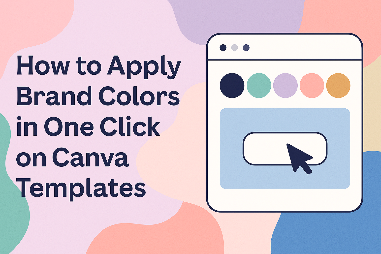
How to Apply Brand Colors in One Click
Canva Pro users can transform any template to match their brand identity instantly using the Brand Kit feature. The one-click application process updates colors across entire designs and multiple pages simultaneously.
Using the Brand Kit to Update Templates
The Brand Kit in Canva serves as the foundation for quick color changes across templates. Users must first create their brand kit by uploading their logo and defining their color palette in the brand settings.
To access the Brand Kit, they click on the “Designs” tab in the left panel. Next, they select “Styles” to view their available brand kits.
The interface displays brand colors as clickable thumbnails. Each thumbnail represents different color combinations from their brand palette. Users can switch between multiple brand kits if they have created several for different projects.
Key Brand Kit Elements:
- Primary colors from uploaded logos
- Custom color palettes
- Secondary color combinations
- Font pairings that complement the colors
The brand kit setup process allows users to add up to 100 colors to their palette. This gives them flexibility when applying colors to different template elements.
One-Click Color Application Workflow
The actual color application happens through a simple click process. Users select either “Primary Colors” or “Secondary Colors” from their brand kit thumbnails.
Canva instantly updates all design elements to match the selected color scheme. This includes backgrounds, shapes, icons, and decorative elements throughout the template.
The system maintains design harmony by applying complementary colors from the brand palette. Text colors automatically adjust to ensure readability against new background colors.
One-Click Process Steps:
- Open any Canva template
- Navigate to Designs > Styles
- Choose your brand kit
- Click on desired color combination
- Watch instant transformation
Users can apply color palettes in just two clicks even without using the full Brand Kit feature. This alternative method works well for quick color updates.
Applying Brand Colors to Multiple Pages
Multi-page designs benefit from consistent color application across all pages. The “Apply to all pages” button appears when templates contain multiple pages.
Users click this purple button after selecting their brand colors. Canva then updates every page in the design to match the chosen color scheme.
This feature ensures brand consistency throughout presentations, social media carousels, and marketing materials. Each page maintains the same color relationships while preserving individual design elements.
Multi-Page Benefits:
- Consistent brand appearance
- Time-saving bulk updates
- Professional design cohesion
- Reduced manual editing work
The system shows a confirmation message reading “Style applied across all pages” once the process completes. Users can then review each page to ensure the color application meets their needs.
Customizing Canva Templates Without Canva Pro
Canva Free users face limitations with only one color palette and three colors maximum, but they can still customize templates effectively through manual color changes and hex codes.
Manual Color Changes
Users can change colors on any element by selecting it and clicking the color tile in the toolbar. This opens the color picker where they can choose from Canva’s default palette or enter custom colors.
The process works for text, shapes, backgrounds, and other design elements. Each color change happens one element at a time since Canva Free doesn’t include the bulk update features.
Steps for manual changes:
- Click on the element to select it
- Select the color tile from the toolbar
- Choose a new color from the picker
- Repeat for each element that needs updating
This method takes more time but gives users complete control over their design colors. It works well for smaller projects or when only a few elements need color adjustments.
Using Eyedropper and Hex Codes
The eyedropper tool helps users match colors precisely across different elements in their design. Users can click the eyedropper icon and select any color already present in their template.
Hex codes provide the most accurate way to apply brand colors in Canva Free. Users can enter the exact hex code for their brand colors in the color picker field.
To use hex codes effectively:
- Find your brand’s hex codes from your style guide
- Select an element in the Canva editor
- Click the color tile and enter the hex code
- Save frequently used hex codes in a note for quick reference
This method ensures color consistency across all Canva templates without needing paid features. The hex code approach works particularly well for maintaining brand standards.
Workarounds for Canva Free Users
Canva Free users can create multiple designs with different color schemes to simulate having multiple palettes. This involves creating separate template files for different color variations.
Another effective workaround involves using the eyedropper tool and hex codes to maintain consistency. Users can create a master color reference document with their brand colors.
Practical workarounds include:
- Creating color swatches within your design as reference
- Copying and pasting elements between designs to maintain colors
- Using browser bookmarks to save hex codes
- Creating template variations with different color schemes
Choosing and Managing Brand Color Palettes
A well-planned brand color palette forms the foundation for consistent design work in Canva. The right color combinations help create visual harmony while making designs more professional and memorable.
Selecting Primary and Secondary Colors
Primary colors serve as the main colors that represent a brand’s identity. Most successful brands choose one to two primary colors that appear in logos, headers, and key design elements.
Secondary colors support the primary colors and add depth to designs. These colors should complement the main brand colors without competing for attention.
When setting up brand colors in Canva, users can add up to three colors with Canva Free. Pro users get access to 100 color palettes with up to 100 colors each.
Color selection tips:
- Choose colors that match your brand’s personality
- Test colors across different design types
- Consider how colors look on both light and dark backgrounds
- Save hex codes for consistent color matching
Primary colors should work well in large areas like backgrounds. Secondary colors work better as accent colors for buttons, borders, and highlights.
Exploring Color Combinations
Color combinations determine how well design elements work together visually. The best brand color palettes use colors that create clear contrast and visual interest.
Effective combination strategies include:
- Monochromatic: Different shades of the same color
- Neutral base: Adding grays, whites, or blacks to any color palette
- Warm and cool balance: Mixing warmer colors with cooler tones
Testing color combinations helps designers see which palettes work best for different projects. Colors that look good together in a logo might not work as well in social media templates.
Canva allows users to apply color palettes to templates with just one click. This feature makes it easy to test different color combinations quickly.
Popular combination types:
| Combination Type | Best For | Example Colors |
|---|---|---|
| High Contrast | Text and buttons | Black and white |
| Low Contrast | Background elements | Light gray and white |
| Accent Colors | Call-to-action items | Bright blue with neutral gray |
Analogous and Complementary Schemes
Analogous color schemes use colors that sit next to each other on the color wheel. These combinations create calm, peaceful designs that feel natural and harmonious.
Examples of analogous schemes include blue-green-purple or red-orange-yellow combinations. These color schemes work well for brands that want to appear trustworthy and stable.
Complementary color schemes use colors from opposite sides of the color wheel. These combinations create high contrast and grab attention quickly.
Popular complementary pairs include blue and orange, red and green, or purple and yellow. These bold combinations work well for brands that want to stand out and appear energetic.
Choosing between schemes:
- Use analogous schemes for professional, calming brands
- Choose complementary schemes for bold, attention-grabbing designs
- Mix both approaches by using analogous colors as primary colors and complementary colors as accents
Brand color psychology plays a big role in how audiences react to different color schemes. Warm colors feel more energetic while cool colors appear more professional and calm.
Expert Tips for Consistent Branding in Canva
Professional designers rely on specific brand guidelines and advanced tools to maintain visual consistency across all their marketing materials. Social media graphics benefit from systematic color application and accessibility considerations that ensure brand recognition.
Maintaining Brand Guidelines
Brand guidelines serve as the foundation for all design decisions in Canva. They include specific color codes, font choices, and logo usage rules that keep designs consistent.
Creating a brand kit in Canva allows designers to store these essential elements in one place. The brand kit should include primary and secondary colors with their exact hex codes. This prevents color variations that can weaken brand recognition.
Brand consistency across platforms becomes easier when teams follow documented guidelines. These rules should specify which colors work for backgrounds versus text. They should also outline when to use different logo variations.
Smart designers create templates for common design types like social posts or presentations. This saves time and ensures every piece follows the same visual standards. Team members can then focus on content instead of design decisions.
Advanced Style Tools and Accessibility Checks
Canva’s advanced features help maintain professional standards while ensuring designs reach all audiences. Color contrast tools check if text remains readable against different backgrounds.
The platform includes accessibility features that test color combinations for people with visual impairments. Designers should use these tools to verify that brand colors meet contrast requirements. This is especially important for text-heavy designs.
Canva tutorials for design consistency show how to use style tools effectively. The magic resize feature maintains brand colors when adapting designs for different formats. This prevents manual color matching across multiple sizes.
Advanced users can create custom color palettes beyond the basic brand kit. These palettes can include seasonal variations or campaign-specific colors. The key is organizing them clearly so team members choose the right colors every time.
Templates for Social Media Graphics
Social media platforms require different design approaches while maintaining brand consistency. Each platform has unique size requirements and visual best practices.
Creating consistent social media graphics starts with platform-specific templates. Instagram posts need different proportions than Facebook covers or Twitter headers. Smart designers create master templates for each format.
Brand colors should adapt to each platform’s culture and audience expectations. Professional LinkedIn posts might use more conservative color combinations. Instagram stories can feature brighter, more playful variations of the same brand palette.
Batch creation tools in Canva help maintain consistency across multiple social posts. Designers can apply the same color scheme to entire content series.