Canva is a fantastic tool for both beginner and experienced designers looking to create visually appealing graphics. A crucial feature in Canva that can elevate your designs is adjusting the opacity of elements, which controls how transparent or opaque they appear.
Adjusting opacity allows users to effectively layer images and text, enhance readability, and create visually interesting effects.
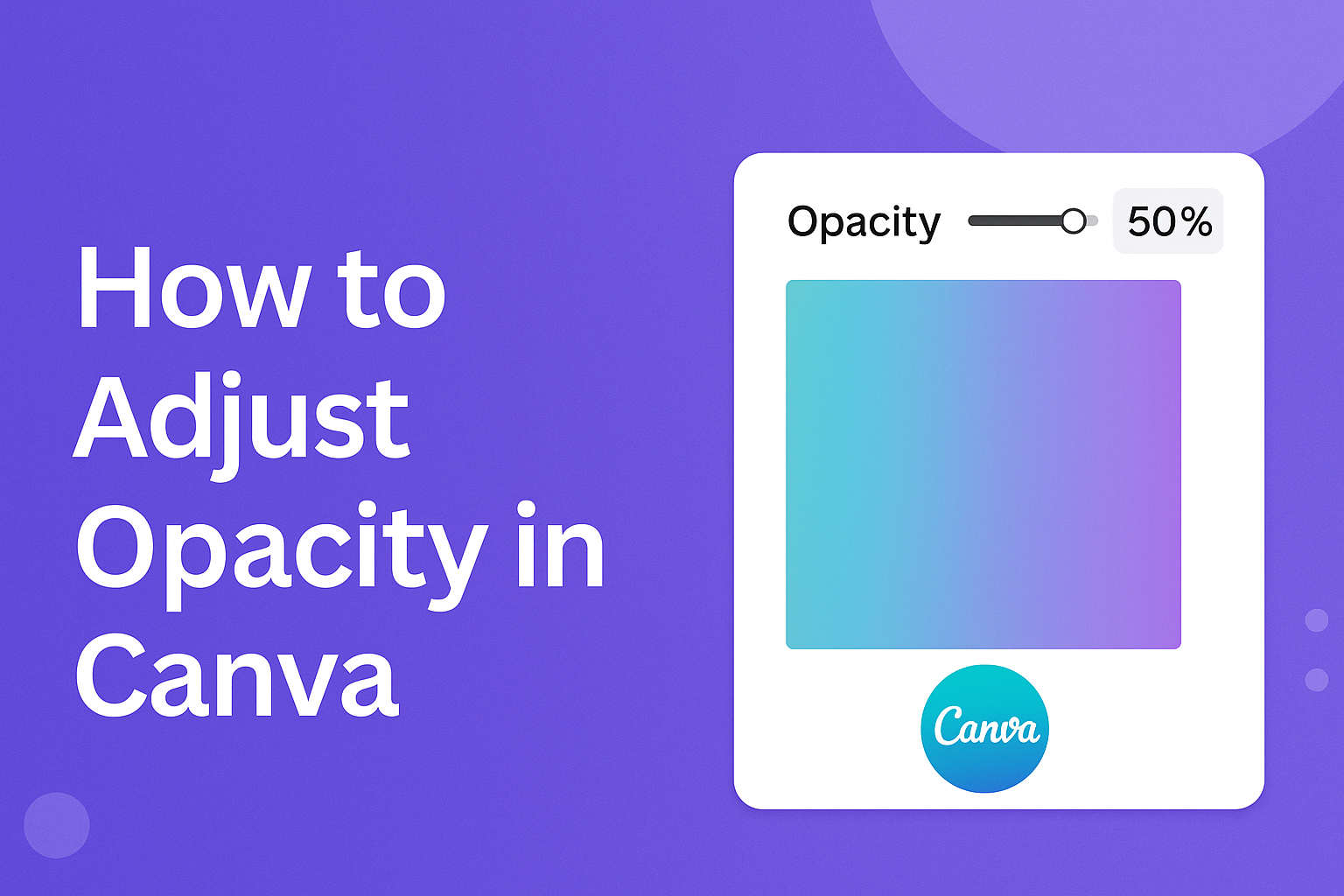
To adjust the opacity in Canva, users first need to select the element they wish to modify. Once selected, the toolbar provides an option to change the transparency level.
This can be done using a slider for precise control, or by entering a specific percentage for those who want exact settings.
Understanding how to manipulate opacity can transform the way designs are perceived. Whether blending images seamlessly or ensuring text stands out against a busy background, mastering this feature opens up a range of creative possibilities.
For more detailed steps, you might want to check resources like the Canva Help Center to get started.
Understanding Opacity in Canva
In Canva, adjusting opacity allows users to control how see-through an element is, letting other designs or backgrounds appear through it. This feature can enhance design depth, making it more dynamic and engaging.
What Is Opacity?
Opacity refers to how transparent or solid an object is. In graphic design, an object with 100% opacity blocks anything behind it, while 0% opacity makes it invisible.
Adjusting opacity can help create layered designs, add subtlety, or make text more readable over a busy background. This feature is crucial for designers looking to balance visibility and style in their work.
Experimenting with different opacity levels helps achieve a perfect look and feel for any project.
Opacity vs. Transparency
Though used interchangeably, opacity and transparency have distinct meanings. Opacity measures how opaque an object is, meaning its ability to obscure everything behind it. Transparency, on the other hand, describes the clarity or see-through nature of an object.
In Canva, these terms help users adjust design elements to achieve desired visibility. For example, having higher opacity means less transparency.
Understanding the balance between these two aspects is key to mastering the visual aspects in Canva, allowing for more creative and effective designs.
Getting Started with Canva
Canva is a user-friendly design platform that allows individuals to create stunning visuals with ease. By understanding the process of starting a new design and how to navigate its interface, users can quickly dive into their creative projects.
Creating a New Design
To begin a new design in Canva, users need to first visit the Canva website or open the app on their devices. Upon logging in, they will see a homepage filled with various design templates.
This page presents options like social media posts, presentations, flyers, and more. Choosing the appropriate template is the first step.
Once a template is selected, it opens in the Canva editor. Users can then customize elements such as images, text, and colors to match their vision.
Canva provides a range of tools for adding new elements, such as uploading images or selecting from Canva’s image library. The drag-and-drop feature makes it easy to move elements around the design.
The design can be saved automatically with Canva’s cloud storage. When finished, users can download their creation in different formats, such as PDF, PNG, or JPG.
Navigating the Canva Interface
The Canva interface is intuitive and designed to assist users in their creative processes. At the top of the Canva editor, there is a toolbar with options for undoing actions, altering text, and adjusting the transparency of elements. These tools help refine and polish designs.
On the left side, users will find the element panel, which includes various resources like photos, text, and shapes. This panel is where users can explore and choose elements to add to their design.
In the center is the workspace where the actual design takes shape. Here, users can see their project in progress and adjust elements as needed. Finally, the menu bar is located at the top of the page, offering options to share, download, or collaborate on the current design.
Adjusting Opacity of Elements
Adjusting the opacity of elements in Canva involves selecting the element you want and then using the opacity slider to achieve the desired level of transparency. This process can help create layers and depth in your designs.
Selecting Your Element
To adjust opacity in Canva, start by selecting the element. It’s easy to do. Click on the element you want to change. If you have multiple elements to edit, hold Shift and click each one.
Whether it’s text, images, or shapes, selecting the right element ensures you can adjust its transparency effectively. Selecting precise elements also helps maintain the design’s overall visual impact.
Using the Opacity Slider
Once your element is selected, locate the opacity option in Canva’s toolbar. It’s represented by a small sun icon. Clicking on this icon opens the opacity slider.
Adjust the slider to the left to make the element more transparent, or to the right for more opacity. You can click and drag or enter a specific value. This feature lets users fine-tune their design and plays a key role in achieving a professional look.
Working with Text and Opacity
Opacity can change how text appears in a design, making it more interesting and visually appealing. This section will discuss how to add text to your design and how to adjust its transparency to get the results you want.
Adding Text to Your Design
To start, users need to open their Canva design and choose the text they wish to add. This can be done by clicking the “Text” option in the side menu. From there, they can either add a heading, subheading, or body text. Each option gives different styles and sizes.
Once the text is added, it can be customized. Users can adjust the font style, color, and size to suit their design needs. Canva offers many fonts, so there are many options.
Exploring these different styles can help match the tone of the design.
Additionally, users can move the text around the design. By clicking and dragging the text box, it can be placed anywhere on the canvas. This flexibility allows the arrangement to fit the design’s overall layout and theme.
Adjusting Text Transparency
To change the opacity of the text, select the text box by clicking on it. On the top toolbar, look for the Transparency option, which might look like a checkered square or a sun depending on the update level.
After selecting the transparency tool, a slider will appear. Dragging it to the left will make the text more see-through, while dragging it to the right will make it more solid.
This allows for fine-tuning the text’s appearance, making it blend seamlessly with the background.
This function is great for creating layered effects. Lowering the opacity can help text become a subtle part of the design, merging nicely with photos or other elements. Adjustments can be made until the right look is achieved.
Opacity Tips and Tricks
Adjusting opacity in Canva can enhance your design by blending elements together or creating distinct layers. These tips help users achieve professional-looking designs.
Layering Multiple Elements
When working with multiple layers, adjusting opacity can help elements interact harmoniously. By lowering the opacity of a top layer, users can see what’s beneath it. This assists in creating depth and focus.
For detailed designs, start by choosing which element is the most important. Make this layer solid and vibrant. Reduce the opacity of other elements to avoid distraction and overload.
For example, using a semi-transparent shape over a busy background can highlight text without overwhelming the viewer.
Visual balance is key. Users should test different opacity levels until the design feels cohesive.
Achieving Blending Effects
Blending effects can make designs look professional. By adjusting opacity in Canva, users can smooth transitions between elements. For instance, a photo might seamlessly combine with a colored background when its opacity is reduced.
To blend text with an image, try lowering the image’s opacity slightly. This ensures the text stands out while still incorporating the image’s colors and textures.
A soft overlay can also unify diverse elements, making a design appear integrated and polished.
Experimenting with different opacities can reveal new creative possibilities. Small adjustments can transform the overall aesthetic, providing users with fresh and unique designs.
Advanced Opacity Techniques
Advanced opacity techniques in Canva help elevate design projects by using transparency creatively. This can enhance visual interest, maintain brand consistency, and improve readability.
Working with Background Opacity
Adjusting the background opacity can transform a design’s feel. By making a background more transparent, other elements, like text or images, stand out better.
Start by selecting the background you want to change. Use the opacity slider in the toolbar to find the perfect transparency level.
This helps in making text more legible while keeping the design attractive.
For example, if a background is too busy, reducing its opacity can make overlaying text much clearer. This technique is particularly useful for presentations or posters where readability is crucial.
Using Opacity for Branding
Opacity can play an important role in branding.
Brands often have a specific color palette, and using transparency helps incorporate these colors subtly.
Adjusting the opacity of brand elements, like logos or icons, can create a layered effect that still aligns with brand guidelines.
Transparent layers can be added over images to apply brand colors without overpowering the photo.
This maintains brand consistency while keeping the design visually appealing.
For instance, using a semi-transparent brand color layer ensures that images match the overall brand aesthetic.
Adjusting the transparency in this way can make designs more cohesive and professional.