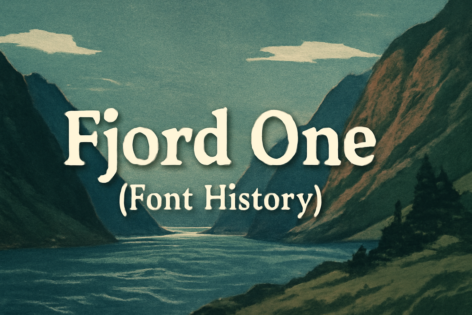
Fjord One is a serif typeface designed with a classic and elegant style in mind. Created by Sorkin Type in 2011, it draws inspiration from the handwritten charm of old manuscripts, aiming to capture the essence of a bygone era. Its sharp, angular serifs and high contrast between thick and thin strokes make it stand out.
Fjord One is perfect for printed books, especially for long texts in small sizes, due to its sturdy construction and prominent serifs. The font is available for free on Google Fonts, offering practicality and elegance for both personal and professional use.
Despite being designed for text, only a single style is readily available, which is more suited for display uses as noted by Typewolf. This makes Fjord One an intriguing choice for designers looking to blend traditional and modern aesthetics.
History of Fjord One
Fjord One is a serif typeface known for its elegant and classic design, inspired by traditional calligraphy. It captures the timeless feel of old manuscripts. This font was created by Viktoriya Grabowska and has evolved to fit modern typography needs while staying true to its roots.
Origins and Design Inspiration
Fjord One was designed with printed books in mind. It draws inspiration from old calligraphy and manuscripts, aiming to bring a classic and refined style to digital text. The typeface features prominent serifs, a sturdy construction, and sharp contrasts between thick and thin strokes. These elements give it a traditional yet contemporary look, making it suitable for long texts and small print sizes.
The serifs in Fjord One are angular and distinct. This gives the font a sharpness that enhances readability. It was crafted to work well in environments where text clarity is important. The elongated ascenders and descenders contribute to its aesthetic appeal and readability.
Creator of Fjord One
Viktoriya Grabowska is the designer behind Fjord One. Her work on this font began in 2011. She has been known for her ability to blend historical influences with modern needs in type design. By drawing on old calligraphy styles, she managed to create a typeface that serves both aesthetic and functional purposes.
Grabowska’s approach focuses on bringing a personal touch to her typefaces. Fjord One is no exception, reflecting her dedication to capturing timeless elegance. Under her direction, the font manages to stay relevant in both digital and print media, marking her as an influential figure in modern type design.
Evolution Over Time
Since its debut, Fjord One has become popular in various projects, especially in book publications and text-heavy designs. Over time, it has been adapted to suit both digital and print needs. The font was adapted to be more versatile, ensuring that it could be used effectively for more than just its original purpose.
Initially available with only a single style and no italics on platforms like Google Fonts, its use expanded beyond its initial design. The lack of variations may limit its use in some contexts, but its strengths as a reliable text font remain clear. This allows it to find a place in many typographic designs today.
Characteristics of Fjord One
Fjord One is known for its classic serif design and suitability for long texts. It combines elegance with readability, making it a favorite for printed material. The font offers a specific weight and style, focusing on maintaining character and legibility.
Typography and Readability
Fjord One features sharp serifs and high contrast between thick and thin strokes. This serif typeface was inspired by old manuscripts, giving it a traditional and elegant appearance. It is designed to perform well in printed materials, especially in small sizes, where its clear and sturdy construction helps reduce eye strain. Its long ascenders and descenders add grace while making letters easily distinguishable. This makes Fjord One ideal for lengthy texts and promotes easy reading without sacrificing style.
Font Family and Weight Variations
The Fjord One typeface offers a single weight, 400, which can be accessed for free. It is available for download via Fontsource, making it straightforward to implement in digital formats. Although it lacks italics and additional weights, Fjord One remains versatile for both display and body text in various projects. This singular focus emphasizes its unique serif aesthetics while maintaining a balance between elegance and simplicity. The availability of Fjord One on Google Fonts further enhances its accessibility for online use.
Usage of Fjord One
Fjord One is a versatile serif typeface popular in both media and publishing. Known for its elegant feel, it sees frequent adoption by various brands.
Popularity in Media and Publishing
Fjord One is often chosen for its classic and elegant appearance. Media publications particularly appreciate its ability to maintain legibility, making it ideal for small print sizes. This sleek and sophisticated typeface fits perfectly in long-form texts, where clarity and style are paramount. Designers in the publishing world frequently use it for books and magazines, where the sharp, angular serifs and high contrast strokes can captivate readers. Its unique design elements, inspired by historical calligraphy, make it a favored choice for projects that aim to convey a timeless appeal.
Notable Brand Adoptions
Several notable brands have adopted Fjord One for its refined aesthetics. Despite having only a single style available on Google Fonts, Fjord One’s open-source nature makes it easily accessible for diverse applications. Brands value it for display uses where a contemporary serif typeface can enhance visual identity. For example, companies looking to project an image of elegance and readability in their printed materials often favor Fjord One. Its design inspired by old manuscripts helps brands stand out by blending tradition with modern design trends. The font’s ability to balance style with functionality makes it a popular choice for both logos and promotional materials.
Technical Aspects of Fjord One
Fjord One is a versatile serif typeface known for its elegant style and practical design elements. It is widely used in digital and print media due to its compatibility with multiple file formats and focus on accessibility.
File Format and Compatibility
Fjord One is available in a variety of file formats, making it adaptable for various types of projects. Common formats include TTF and OTF, which are supported by most design and word processing software. This font is also accessible through web services like Google Fonts, ensuring that it is easy to integrate into websites. Designers appreciate Fjord One because its design ensures that it looks crisp across different screen resolutions, enhancing readability.
Accessibility Considerations
Accessibility is a crucial factor in Fjord One’s design. Its clean serifs and clear letterforms mean that text remains legible, even at smaller sizes. This is especially beneficial for users with visual impairments or dyslexia, allowing for longer reading sessions without strain. Designers use Fjord One not only for its aesthetic appeal but also for the ease with which it meets various accessibility guidelines. It is an excellent choice for content that aims to be inclusive and user-friendly.
Licensing and Distribution
Fjord One is an open-source serif font designed for versatility. It offers flexible use through its open licensing, catering to both personal and commercial projects.
Open Source Licensing
Fjord One is distributed under the SIL Open Font License (OFL). This open-source license allows the font to be used freely by the public. Users are granted the ability to modify and redistribute the font, making it highly versatile for various projects. This includes embedding the font in documents, websites, and software applications.
The SIL OFL also permits the creation of derivative works. However, any distribution of the modified fonts must adhere to the same license. This ensures that all versions remain accessible to the community.
Commercial Use and Restrictions
For commercial applications, Fjord One can be used without the need for purchasing a separate license. Its distribution under the SIL OFL means no additional fees are required for business use. This makes it ideal for companies looking for budget-friendly typography solutions that still offer professional quality.
However, while the font can be freely used and distributed, compliance with the OFL is essential. This means ensuring that any modifications of the font remain under the same open license. More details on Fjord’s usage can be found on websites like Font Forge.