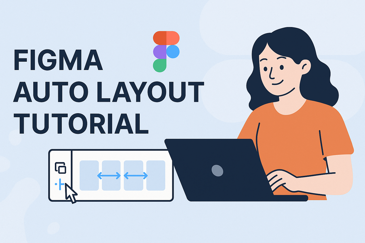
Figma’s Auto Layout feature is a game-changer for UI designers who want to create seamless and flexible designs. With Auto Layout, designers can arrange and resize elements automatically, allowing their projects to adapt effortlessly to changes in content or screen size. Mastering Figma Auto Layout equips designers with the ability to create stunning, responsive interfaces that enhance user experience.
Engaging with Auto Layout tutorials can elevate a designer’s skill set by showing how to make the most out of this powerful tool. From simple layouts to complex interfaces, the potential applications of Auto Layout are vast.
For those eager to dive into practical examples, resources such as dynamic layouts and UI elements become incredibly handy. Exploring various techniques ensures that designers not only understand the fundamentals but also learn advanced approaches for creating adaptable designs that work on any platform.
Understanding Auto Layout
Auto Layout in Figma helps designers create flexible and dynamic designs. It simplifies how elements are placed, moved, and resized. This guide explores how Auto Layout works and its advantages.
What Is Auto Layout?
Auto Layout is a feature in Figma that allows designers to automatically organize elements within a frame. When items are added, removed, or resized, the layout adjusts without the need for manual repositioning. It helps in maintaining consistency across different designs.
With Auto Layout, you can group elements, which then behave as a single unit. This makes it easier to manage padding and spacing. The layout can be horizontal or vertical, aligning items based on the set rules. This saves time and effort, especially in complex projects.
Auto Layout Versus Traditional Layout
Traditional layout requires designers to manually adjust each element. This can be time-consuming and prone to errors, especially when updates or changes happen. Auto Layout offers a more efficient alternative by handling these adjustments automatically.
In traditional methods, alignment and spacing changes often lead to inconsistencies in design. With Auto Layout, spacing and alignment are consistently maintained according to the defined rules. This is particularly helpful when designing responsive interfaces that need to adapt to different screen sizes.
Benefits of Using Auto Layout
Using Auto Layout provides several notable benefits. One major advantage is its ability to create designs that are easily adjustable and responsive. This is critical when working on interfaces that need to look good on both large and small screens.
Auto Layout also enhances consistency. Designers can ensure elements remain aligned and spaced properly, reducing the risks of mistakes during revisions. Furthermore, it supports quicker prototyping by automatically arranging elements, allowing designers to focus more on creative aspects rather than repetitive tasks.
Setting Up Your First Auto Layout
Starting with Auto Layout in Figma can greatly enhance the flexibility and responsiveness of your designs. This section covers how to create a frame, add elements inside it, and apply Auto Layout to transform your design process.
Creating a Frame
To begin, you need to create a frame. In Figma, a frame acts like a container for your design elements. You can do this by selecting the Frame Tool from the toolbar or pressing the “F” key. After activating the tool, click and drag on the canvas to create a frame of your desired size.
Frames in Figma serve a practical purpose. They can act as artboards for organizing elements. For example, frames can be used to set boundaries for pages or components in your UI design.
When setting up your frame, name it appropriately. This helps in keeping the design organized. You can double-click the frame’s title in the layers panel to rename it to something meaningful, such as “Header” or “Footer.”
Adding Elements Inside the Frame
Once your frame is ready, it’s time to add elements. You can place items like text, images, or buttons within the frame. Use the Shape Tool and Text Tool from the toolbar to place and customize elements according to your design needs.
Think of how these elements will interact. For example, if you are designing a navigation bar, you might include buttons and text links aligned in a horizontal fashion. Simply drag and drop these elements into your frame.
It’s important to arrange and align elements precisely. Use Figma’s alignment tools to evenly distribute and align items within the frame for a cleaner layout. Editing the layer settings in the right-hand panel can also help in perfecting the spacing between each item.
Applying Auto Layout to Containers
With your elements in place, you can apply Auto Layout to the frame. Select the frame, and click on Add Auto Layout in the right-hand panel. This feature allows you to adjust the layout dynamically by spacing and resizing elements automatically.
Auto Layout is essential for maintaining a neat and structured design. It supports functions like Spacing Mode, which adjusts spacing between components. Whether you choose “Packed” or “Space Between,” it changes how elements use available space.
Once Auto Layout is applied, you can easily adjust padding, margins, and alignment options. This makes it simple to create consistent and responsive designs that adapt seamlessly to different screens and resolutions. You can experiment with these settings until you find the perfect fit for your layout.
Working with Properties
In Figma, working with properties like spacing, alignment, and resizing is crucial for creating efficient designs. Using these features helps designers ensure elements are placed correctly and components respond well on different screens.
Spacing and Padding
Spacing and padding are vital for creating clean and organized layouts. Designers can set uniform spacing between elements or specify unique distances for different parts of a design. This ensures clarity in layout and content readability. For example, a button might need 16px of padding around text to maintain a consistent appearance. Figma provides easy controls to adjust these values in the panel, letting designers create harmonious designs without manually adjusting elements each time.
Alignment and Positioning
Alignment and positioning determine how elements sit in relation to each other within a design. Consistent alignment gives a design a professional look. Designers can use alignment tools to center elements, align them to one edge, or distribute them evenly in a frame. Figma offers tools like alignment grids and snap-to features, which help ensure elements are properly aligned. Using these features, elements can be quickly adjusted without the need for precise manual placement.
Resizing and Constraints
Resizing and constraints are especially useful for creating responsive designs. Designers can set constraints to dictate how elements resize when the frame changes. For example, a button may be set to stretch horizontally while keeping vertical size fixed. Figma allows setting constraints directly, so elements adapt smoothly to different screen sizes. This way, designers can maintain design integrity across devices without having to redo layouts for each screen size.
Designing Responsive Components
Using Figma’s Auto Layout, designers can create components that adjust smoothly to different screen sizes. This section covers how to design buttons, navigation bars, and cards to maintain consistency across devices.
Creating Buttons
Buttons are a key element in any interface. With Auto Layout in Figma, designers can ensure buttons resize properly as text within them changes. To start, select the text and right-click to add Auto Layout.
Set padding around the text for consistent spacing. Experiment with different padding values to see what fits best. Adjust the alignment options to center the text vertically and horizontally within the button.
Using Auto Layout, a text layer can be wrapped in a frame, allowing the button to expand naturally. Color, border-radius, and shadow can further define the button’s appearance.
Building Navigation Bars
Navigation bars guide users through applications and should be flexible. Begin by placing menu items inside an Auto Layout frame. This ensures each item adjusts as the bar resizes.
Setting the direction of items as horizontal aligns them in a row. Adjust the spacing between items to maintain balance. Designers can add padding within the frame to give the navbar a pleasing margin on each side.
Adding icons, like a menu button or logo, is also possible. Align these within the Auto Layout so they move smoothly with other elements.
More tips can be found on aligning navigation items.
Formulating Cards and Modals
Cards and modals display key information and allow interactivity. Use Auto Layout to ensure these components adapt to varied content. Select the text and images, then group them with Auto Layout.
Padding can be added around each element to create space within the card. Set the elements’ alignment to keep them centered when resized.
When working with modals, maintain consistent width and height, adding Auto Layout to text and buttons inside for seamless expansion.
Consider using rounded corners and shadows to give depth, remembering that responsiveness is key. This ensures that whether on a phone or desktop, the modal looks appealing.
Advanced Auto Layout Techniques
In the world of UI design, mastering advanced Auto Layout techniques can significantly enhance design efficiency and responsiveness. Key techniques focus on nesting frames, creating responsive grids, and working with variants.
Nesting Auto Layout Frames
Nesting Auto Layout frames lets designers create complex layouts by embedding frames within each other. This creates a flexible design that adapts to content changes easily.
By using nested frames, designers can manage different sections with unique layouts without starting from scratch each time. For example, a designer might use nested frames to organize a header, main content area, and a footer, each with its own style. Adjustments made to individual sections automatically adjust the overall layout, saving time and effort.
Responsive Grids and Layouts
Responsive grids are essential for designs that must work across various devices. Auto Layout in Figma helps create these adaptable grids by distributing elements evenly, regardless of screen size.
Using features like the Packed and Space between options, designers can control spacing for different devices. Packed spacing maintains a fixed space between elements, while Space between adjusts it dynamically. This is useful for designs that need to fill available space in a balanced way.
Auto Layout with Variants
Variants in Auto Layout are powerful for managing related design elements. They allow designers to switch between different states or styles while keeping them linked.
For instance, components like buttons can have multiple appearances, such as a default, hover, and disabled state. By setting up these states as variants, designers can quickly apply changes across the board. This method fosters consistency and speeds up the design process, crucial for efficient UI development.
Understanding the combination of variants and Auto Layout layers enhances flexibility, offering more control over complex interfaces.
Real-World Examples
Figma’s Auto Layout feature allows designers to create responsive and adaptable designs with ease. Through practical applications, such as designing a web page or creating a mobile app interface, it becomes clear how dynamic and versatile this tool can be.
Designing a Complete Web Page
In web design, Figma’s Auto Layout helps in efficiently managing content and maintaining consistency across a site. Designers can set up a navigation bar using Auto Layout by creating a flexible horizontal layout with evenly spaced menu items. This feature ensures that even when more links are added, the layout adapts smoothly. By applying Auto Layout to the main content area, elements like images, text, and buttons can adjust automatically when resizing the browser window, creating a seamless user experience. Implementing fixed widths or fill container settings further allows components to behave responsively across different device sizes.
Mobile App Interface Design
For mobile app design, Auto Layout is crucial for building interfaces that work on various device dimensions. Start by designing a button with Auto Layout by grouping a text layer with an icon and setting padding and spacing. This technique creates a consistent and scalable button style throughout the app. Using stacked Auto Layout frames, designers can construct menus or form screens where components move and resize together. The feature supports vertical lists, ensuring that any added items or text changes don’t disrupt the overall layout. This flexibility helps in maintaining design integrity across different screen sizes, making the development process smoother and more efficient.
Dashboard UI Components
Designing dashboard interfaces involves managing complex layouts with numerous data visualization elements. Auto Layout helps in organizing these components, such as charts and tables, into grids that automatically align and space themselves appropriately. This capability allows users to quickly rearrange or update dashboard widgets while keeping the design coherent. Designers can use auto layouts in Figma to create cards with dynamic resizing, accommodating content changes without manual adjustments. By applying consistent padding and margins, Auto Layout maintains uniformity and a clean aesthetic, crucial for dashboards with frequent data updates and varying content lengths.
Tips and Best Practices
These tips focus on organizing layers and frames for clarity, optimizing performance to enhance workflow, and ensuring seamless collaboration with developers. Each section provides practical advice to improve your efficiency with Figma’s Auto Layout.
Organizing Layers and Frames
Keeping layers and frames organized is key to a clean and efficient design. Designers should label each layer clearly. Use grouping for related elements, which makes navigation easier. For instance, similar buttons or text fields can be grouped under a common frame name.
It’s helpful to use consistent naming conventions. This makes it easier to find elements later. Layers that are neatly organized allow designers to work more effectively and enable team members to understand the layout quickly.
Using color coding can also assist in identifying different sections of a project. This visual guide can reduce the time spent searching for particular components.
Performance Considerations
When using Auto Layout, performance can be influenced by how complex the designs are. Keeping the layer count minimal can help maintain smooth performance. Too many nested layers might slow down the software.
Ensuring that images and assets are optimized helps. Large file sizes can burden the application and slow down the loading times of your design. By using appropriate file formats and reducing image resolutions, performance can be enhanced.
Keeping an eye on updates can also make a difference. New versions of Figma often come with performance improvements, which can further benefit the design process.
Collaborating with Developers
Smooth collaboration with developers ensures that designs are implemented accurately. Providing detailed documentation is crucial. It helps in translating designs into code. Designers should include specifications like padding, margins, and any specific alignment rules.
Sharing a live prototype with developers can be highly beneficial. This allows developers to see the design in action and understand how elements should behave responsively. Utilizing Figma’s Auto Layout features can show how components adapt across different screen sizes.
Maintaining open communication is important. Regularly updating developers on any design changes can prevent misunderstandings and ensure that implementation matches the design vision.
Resources and Further Learning
Learning Auto Layout in Figma can enhance a designer’s skills significantly. There are many resources available for those who want to improve their knowledge.
Online Tutorials
One great option is the self-guided tutorial on Auto Layout, which covers its functionality and helps designers create fully responsive interfaces. This tutorial is perfect for those who prefer to learn at their own pace.
Guides and Articles
For step-by-step guidance, check out this ultimate guide to using Auto Layout in Figma. It offers basic steps and tips for beginners looking to get started quickly. This resource is straightforward and easy to follow.
Video Content
Visual learners might enjoy this comprehensive video guide that shows how to streamline the design process with Auto Layout, making it ideal for those working on larger projects. It provides detailed instructions and demonstrations.
Community Files
Exploring community files like the Auto Layout Masterclass can be helpful. These files often include examples, tips, and shortcuts that can boost efficiency and skill level.