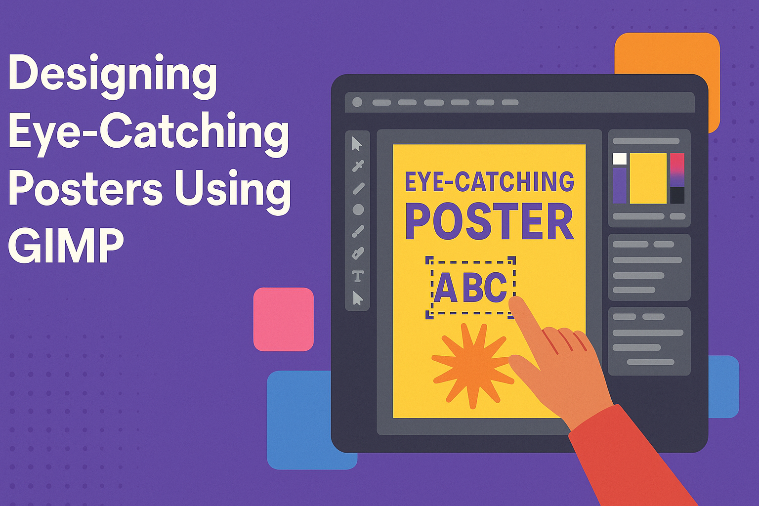
Creating a poster that stands out can seem challenging, but with the right tools and guidance, it becomes a fun and rewarding process. GIMP, a free and powerful graphic design program, offers a range of features perfect for this task. By using GIMP’s text effects and layout tools, anyone can design eye-catching posters that capture attention.
GIMP provides options like shape and selection tools, which are essential for crafting unique designs. These features allow for the use of various techniques to enhance visuals and highlight key information. Users can explore different styles and layouts to create compelling compositions.
Making the most of GIMP means experimenting with its capabilities, like creating text effects and designing with themes. By trying out tutorials and exploring new methods, designers can develop their skills and produce stunning works of art. With practice, anyone can become adept at making professional-level posters.
Getting Started With GIMP
GIMP is a powerful tool for creating stunning posters. This section will guide readers through the initial steps from downloading the software, familiarizing themselves with its layout, to adjusting settings for a personalized experience.
Downloading and Installing
To get started with GIMP, users need to download it from the official GIMP website. The site provides downloads for Windows, macOS, and Linux. Selecting the right version for your operating system is crucial.
Once downloaded, follow the installation prompts. It’s a straightforward process: open the installer, agree to the terms, and choose a destination folder. This should take just a few minutes. After installation, run the program to ensure it’s operating properly.
Understanding the GIMP Interface
The GIMP interface might appear complex initially, but it’s user-friendly once you spend some time with it. The main window consists of the toolbox on the left, the image window in the center, and docks on the right.
The toolbox contains essential tools like the brush, eraser, and selection tools. The image window is where all editing happens. Docks have tabs for layers, history, and brushes. Users can customize this layout to their liking, which helps streamline the design process.
Configuring Preferences and Settings
Configuring preferences and settings in GIMP allows users to tailor the software to their needs. Access these by navigating to ‘Edit’ and then ‘Preferences.’ Here, users can adjust the theme, tool settings, and grid sizes.
Changing the theme might help reduce eye strain while working on long projects. Tool settings allow customization of default brush sizes or colors, enhancing efficiency. It’s also important to set up autosave to prevent data loss. These adjustments improve user experience and workflow, making poster design smoother.
Setting Up Your Poster Project
To start designing a poster using GIMP, it’s important to set up the project correctly. This involves creating a new document, choosing suitable dimensions, and understanding how to work with layers. Each step is crucial for achieving a professional-looking result.
Creating a New Document
Begin by launching GIMP and creating a new document. Click on File and select New. A dialog box will appear for setting up your canvas. Here, it’s essential to define the size of your poster.
You can input specific dimensions based on your needs. Common poster sizes include A4, A3, or even custom dimensions for digital use. Ensure the resolution is set appropriately, ideally at 300 DPI for print or 72 DPI for digital posters.
Additionally, select a color mode. RGB is standard for digital, while CMYK is preferred for print. Keep in mind GIMP does initial work in RGB, which can be later converted if needed. After setting these options, click OK to start your project.
Choosing the Right Dimensions
Choosing the right dimensions is vital. Poster sizes can vary based on their purpose. For small events, an A4 size might suffice, but for bigger gatherings, you might opt for A2 or A1.
Consider where the poster will be placed. For digital spaces, ensure dimensions fit typical social media or web formats, like 1080×1080 or 1920×1080 pixels. It’s also useful to add bleed areas if the poster will be printed, providing extra space around the edges to avoid cutting mistakes.
Ask yourself who the audience is. A poster meant for close inspection differs from one viewed at a distance. These considerations help tailor measurements to meet needs effectively.
Working with Layers
Layers in GIMP are essential for managing various elements of your poster. Each component, whether text or image, should be in its own layer. This separation allows for easy edits and adjustments without altering the entire design.
To create a new layer, navigate to Layer > New Layer. Name your layers to keep the workspace organized. Using multiple layers lets you experiment with different layouts, transparency, and effects.
Consider the hierarchy of elements. Important text can be placed on top layers for visibility, while background elements can be on lower layers. Utilizing layer modes like overlay or multiply can add depth and richness to your design. Layers provide flexibility and control, enabling creative exploration.
Designing With Text
Creating eye-catching posters with GIMP involves choosing the right font, arranging text properly, and adding visual effects. These elements can help make your poster stand out and effectively communicate your message.
Selecting Fonts and Typefaces
Choosing the right font is crucial in poster design. Fonts convey the tone and theme of your message. For a vibrant, modern look, sans-serif fonts like Helvetica or Arial work well. For something traditional, serif fonts like Times New Roman can give a classic appeal. GIMP offers a variety of fonts, and users can also import additional ones.
Mixing different typefaces can create contrast, but it’s best to stick to two or three to avoid clutter. Each selected font should complement the overall design and fit the purpose of the poster.
Text Layout and Alignment
The layout and alignment of text influence how easily information is absorbed. Center alignment works well for titles and draws attention to important text. Left-aligned text creates a natural reading flow, ideal for body content. Experimenting with spacing and line height can improve readability and visual appeal.
GIMP’s text tool allows for precise control over these elements. To make text pop, consider using bullet points or numbered lists to break up information. These features help deliver the message clearly and effectively.
Adding Effects to Text
Text effects can make a poster more lively and attractive. GIMP provides tools for adding shadows, outlines, and gradients to text, enhancing depth and interest. Techniques like the Waves Text Effect in GIMP create a 3D appearance that’s eye-catching.
Users can also animate text to engage viewers with dynamic content. While adding effects, it’s important to keep them subtle. Overdoing effects can distract from the main message. Instead, they should enhance the overall design aesthetic and draw attention to key elements without overwhelming the viewer.
Incorporating Graphics and Images
Incorporating graphics and images in a poster design can greatly enhance its visual appeal. Using tools in GIMP, designers can easily insert, manipulate, and edit images to create dynamic compositions that capture attention.
Inserting Images
Inserting images in GIMP is straightforward and can transform your poster design. Users can open images directly or drag and drop them into the workspace. Aligning images is key to maintaining balance and harmony in the design.
The Move Tool enables precise placement by allowing easy adjustments. Utilizing the Snap to Guides feature can help align images perfectly. Additionally, users can resize images using the Scale Tool. Adjustments ensure that the images fit seamlessly within the poster’s layout without distortion or loss of quality.
Manipulating and Editing Images
GIMP offers a robust suite of editing tools that are invaluable for customizing images. The Crop Tool is ideal for trimming unwanted parts and highlighting important elements. For color correction and enhancement, features like Curves and Levels are perfect for adjusting brightness and contrast.
Furthermore, the Clone Tool is useful for removing blemishes or duplicating image sections. Applying filters and effects can also add depth or create a specific mood. Since layers can be adjusted individually, users have control over every element for a polished and professional look.
Using Brushes and Patterns
Brushes and patterns in GIMP provide creative options for enhancing a poster’s design. The variety of brushes allows for creating textures, borders, and artistic elements. Users can select from GIMP’s built-in brushes or create custom ones to fit the design needs.
Patterns are another way to add interesting details, such as backgrounds or fills. These can be managed using the Bucket Fill Tool to apply patterns over selected areas. This flexibility encourages experimentation with different styles and textures, resulting in engaging, eye-catching posters that stand out with unique graphic appeal.
Color Theory and Utilization
Using color effectively in poster design can help create contrast and communicate emotion. This section will cover how to choose the right color schemes and how to apply colors to different elements in a design.
Understanding Color Schemes
Color schemes are essential in design as they set the mood and enhance readability. There are several types of color schemes, including complementary, analogous, and triadic. Complementary colors, like red and green, are opposite on the color wheel and provide a strong contrast that can emphasize key elements.
Analogous schemes use colors next to each other, like blue and green, creating a harmonious and calming effect. Triadic schemes feature three spaced-out colors, offering vibrant and balanced visuals. Choosing the right scheme in poster design can draw attention to important sections and improve visual flow. More on how to effectively utilize complementary colors can be found on this guide.
Applying Colors to Design Elements
When applying colors, it’s important to consider the hierarchy. Contrast plays a key role in making text legible and in highlighting crucial parts. For example, a bright title against a dark background makes the text pop and draws the viewer’s eyes instantly.
Scale is also vital. Larger elements often draw more attention, so using bolder colors for these can enhance their impact. Additionally, using color consistently across similar elements helps maintain a cohesive look throughout the poster. Red, known for its energy and urgency, can be effectively used in call-to-action sections, particularly in marketing. For more insights, explore this article.
In GIMP, designers can experiment with different color palettes and apply them using layers and blending modes, adjusting them until they achieve the desired effect.
Advanced Tools and Techniques
Exploring advanced tools in GIMP enhances creative possibilities when designing posters. These tools include paths and masks for intricate selections, advanced blending techniques for depth, and creating custom filters for unique effects.
Working with Paths and Masks
Paths and masks are powerful features in GIMP, essential for crafting detailed designs. Paths allow users to create precise shapes and lines, crucial for tasks requiring accuracy. By converting selections into paths, designers gain greater control over their work.
Masks add another layer of flexibility. They enable non-destructive editing by allowing parts of an image to be hidden or revealed without permanently altering the original image. Using masks with paths can enhance complex designs, offering intricate control over how different layers look.
Advanced Blending and Layering
Blending and layering in GIMP create depth and texture in poster design. Multiple layers, each with different elements and styles, can be combined using various blending modes like Multiply, Overlay, or Screen. These modes change how colors and layers interact, leading to richer designs.
Effective use of layering is vital for managing complex projects. Grouping layers helps in organizing different sections of a poster, making it easier to apply global changes to similar elements. Thoughtful use of opacity settings also allows for subtle transitions between elements, adding a professional touch.
Creating Custom Filters and Effects
Creating custom filters in GIMP can make posters stand out with unique visual effects. GIMP’s GEGL filters allow real-time previews, enabling designers to experiment with adjustments like brightness, contrast, and saturation.
Scripting in GIMP provides the ability to develop new filters. Using specific tools, designers can script actions to automate repetitive tasks, saving time and maintaining consistency across designs. This process allows for the creation of a personalized set of effects that contribute to a signature style in poster design.
Finishing Touches
Finishing a poster design in GIMP involves adding small details, checking for errors, and getting your file ready to share. These steps ensure your design is complete and polished.
Adding Details and Embellishments
After the main elements are in place, it’s time to consider extra details that can enhance the design. These might include subtle textures, shadows, or gradients.
Adding a thin border or decorative elements can make the poster stand out even more. Be careful not to clutter the design with too many embellishments. Balance is key, and everything should contribute positively to the visual appeal.
Using layers in GIMP can help manage these details. Try to keep each embellishment on its own layer, making it easy to adjust or remove if needed.
Proofing and Final Adjustments
Before finalizing the poster, it is important to proof the entire design. Check for any spelling mistakes and ensure that all images and text align properly.
Zoom in to look at the fine details and fix any pixelation or misalignment. It’s helpful to ask someone else to review it as they may spot mistakes that were missed.
Consider the overall color balance. Try testing different brightness and contrast settings to see what looks best. Small tweaks can often make a big difference in how a poster is perceived.
Exporting the Final Poster
Once the design is polished, exporting is the final step. In GIMP, use the “Export As” option to save the file in the desired format. For high-quality prints, formats like PNG or TIFF are recommended due to their lossless quality.
For digital sharing, JPEG is often sufficient and reduces file size for easier uploading. Remember to save a copy of the design in GIMP’s native format, XCF, to keep all layers intact for future edits.
Adjust resolution settings during export to match the intended use, ensuring clarity whether it’s printed or viewed on screens.