Are you ready to create your own business card without spending a fortune? Using Inkscape, a free graphic design tool, anyone can design a professional and modern business card. Inkscape offers all the tools you need to create a print-ready business card with ease.
This blog post will guide you through the process of designing a business card that captures attention. With Inkscape, you can choose from many design elements, making your card uniquely yours. Whether you want to explore creating complex designs or start with a simple layout, Inkscape has you covered.
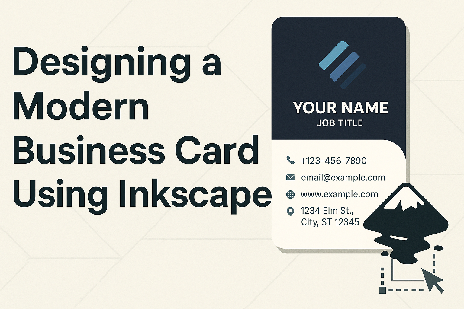
Explore how to design the front and back of your card, ensuring it meets industry standards and looks sleek. Learn about incorporating design features, such as the golden ratio or wavy blue backgrounds, to make your card stand out.
Getting Started with Inkscape
Getting started with Inkscape involves installing the software, getting comfortable with the interface, and setting up your document for a smooth design process. Each step ensures that you are ready to create an impressive business card using this powerful tool.
Installing Inkscape
To begin designing with Inkscape, one first needs to install the software. Inkscape is available for free download on its official website. Users can select the version compatible with their operating system—Windows, Mac, or Linux. Once downloaded, follow the installation prompts, which are straightforward and user-friendly.
The program requires basic system requirements, which are generally met by most computers. After installation, it’s a good idea to ensure the software is up-to-date by checking for any available updates. This ensures that all features and tools work seamlessly.
Familiarizing Yourself with the Interface
After installation, open Inkscape to start exploring its interface. The layout is designed to be intuitive, even for beginners. Users will find the toolbox on the left side, which includes tools for creating and editing shapes, lines, and text. At the top, the menu bar offers access to more advanced commands and features.
The large canvas occupies the main area where designs are created, and objects can be arranged using the layers panel on the right. Users should spend some time clicking through these tools to see what each one does. This exploration helps in understanding the functions and speeds up the design process later on.
Setting Up Your Document
Setting up the document correctly is crucial once one feels comfortable with the interface. Start by going to File > Document Properties. This area allows users to set the document size to standard business card dimensions, usually 3.5 x 2 inches. Here, users can also adjust the units and orientation to match their design needs.
It’s helpful to enable guides or a grid for precise alignment when arranging different design elements. These settings create a solid foundation for your design, ensuring that everything is in place for printing. Setting up the document properly helps avoid common printing issues later.
Design Elements of a Business Card
Creating a visually appealing business card is key to making a strong impression. Important design elements include dimensions, color scheme, typography, and graphics. Each part works together to convey professionalism and style.
Understanding Business Card Dimensions
Most business cards have a standard size of 3.5 inches by 2 inches. This size is familiar and fits easily into wallets. Ensuring the card fits this size helps it integrate well with other cards.
When designing, it’s crucial to include bleed areas. This is the extra space beyond the card’s edges where background elements can extend. It prevents unprinted edges when the card is trimmed. Typically, a bleed area is about 0.125 inches beyond the trim edge.
Safe zones are also important. Keep all text and crucial elements within this area, around 0.125 inches inside the edge, to avoid being cut off. This consideration ensures that all details on the card remain intact and readable.
Choosing a Color Scheme
A business card’s color scheme can communicate the brand’s identity. Bold and vibrant hues suggest creativity, while softer tones can imply professionalism and calmness. It’s vital to select colors that align with the brand’s image.
A limited palette—usually two or three main colors—keeps the design clean and cohesive. This avoids overwhelming the viewer. Complementary colors are a safe choice, providing contrast while maintaining harmony.
Consistency is key. Colors used in the card should match those in other branding materials. It creates a unified and professional appearance across all platforms.
Selecting Fonts and Typography
Fonts play a big role in the readability and impact of a business card. Sans-serif fonts often provide a modern look, making them a popular choice for clean and straightforward designs.
It’s best to use no more than two different fonts on a card. This keeps the design simple and avoids confusion. One font for the name and a different one for contact details can create a pleasing visual hierarchy.
Font size should ensure text is readable. Important information, like a person’s name, should be slightly larger, around 11-12 points. Contact details can be a bit smaller, around 9-10 points, to fit neatly into the design.
Using Logos and Graphics
Logos are essential to brand recognition. They should be prominently displayed, often at the top of the card. It’s important to ensure the logo is high resolution for sharp printing. A blurry logo can diminish the card’s professional look.
Graphics, when used, should enhance the design without cluttering it. They need to complement, not compete with, the text. Simple, minimalist graphics can add flair and style while keeping the focus on the important information.
It’s helpful to align graphics with the overall theme of the card. They should be used sparingly to maintain a clean, professional appearance. This helps ensure the card leaves a memorable impression.
Creating the Layout
When designing a business card in Inkscape, arranging elements like text and graphics ensures a professional look. Understanding margins and bleed is crucial for print accuracy, while incorporating white space enhances readability.
Arranging Text and Graphics
Inkscape offers many tools to place text and graphics effectively. Users should start with a clear plan of where each element will go. Aligning text correctly makes a card easy to read. Using the Align and Distribute feature can help center text or images perfectly.
Graphics should complement, not overpower, the text. It’s wise to choose simple graphics that match the business tone. Consider using bullet points for listing services or contact details neatly. Proper font size and style also play a significant role. A readable font at around 10-12 points is usually a good choice for contact details.
Understanding Margins and Bleed
Margins and bleed ensure nothing important gets cut off during printing. Inkscape doesn’t show margins by default, so setting guides manually is useful. A safe margin is typically 0.125 inches from each side.
Bleed extends the design beyond the trim edge, preventing white lines on the paper’s edge. Inkscape users should set a bleed area of at least 0.125 inches beyond the trim line. This way, any background colors or images extend past the card’s edge, ensuring they cover thoroughly when trimmed. Ensure these guidelines are set before starting your design to prevent later adjustments.
Incorporating White Space
White space, or negative space, is the empty area around design elements. It’s essential for keeping the card looking clean and professional.
Inkscape allows designers to adjust and experiment with white space easily. Placing elements with ample space in between each helps the reader focus on individual pieces of information better. A crowded card can feel overwhelming, so it’s important to find a balance. Remember, more white space often improves the design’s overall effectiveness.
Advanced Inkscape Techniques
Inkscape offers a range of advanced tools that can enhance business card design. These tools include creating custom shapes, applying a variety of filters and effects, and managing layers and groups efficiently.
Creating Custom Shapes
Custom shapes are a great way to make designs stand out. In Inkscape, users can use the Bezier tool to draw freeform curves and lines. This tool helps create unique shapes not available in the default toolbar.
Another approach is combining simple shapes using the Path operations. This feature allows users to unite, subtract, or intersect shapes to craft complex designs. The Node tool provides detailed editing, letting designers adjust points on shapes for further customization. These techniques enable the creation of distinctive and memorable business cards.
Applying Filters and Effects
Filters and effects in Inkscape can transform basic designs into eye-catching visuals. Users can start by exploring the Filters menu, which includes options like blurs, shadows, and color adjustments. The Gaussian Blur filter, for instance, gives a soft, diffuse look to elements, adding an elegant touch.
To add texture, the Noise filter is useful. It introduces a random pattern to the design, creating a tactile feel. Gradient effects offer smooth transitions between colors for depth and dimension. These tools can enhance the aesthetic of business cards, ensuring they grab attention.
Working with Layers and Groups
Efficiently organizing design elements is crucial for creating complex compositions. Inkscape’s Layer dialog allows users to add, rename, or hide layers, keeping the workspace tidy. Layers make it easier to focus on specific parts without affecting others.
For related design elements, using Groups is beneficial. Grouping items allow them to be moved or edited as one, maintaining consistency. Combined with layers, this tool streamlines the design process, making modifications straightforward. Mastering layers and groups aids in building a professional-looking business card.
Finalizing Your Design
Completing a business card design involves double-checking details and ensuring everything is polished and ready. Proofreading helps catch errors, while exporting ensures the card is saved in the right format.
Proofreading and Feedback
Proofreading is a crucial step in creating a business card. It’s essential to check for any spelling errors, incorrect contact details, or inconsistencies in the design. Even small mistakes can leave a poor impression on potential clients or partners.
Getting feedback from others can be incredibly helpful. Colleagues or friends might notice issues that were missed. Providing them with a draft version of the card allows for constructive comments. Consider this feedback carefully, as multiple viewpoints can improve the final outcome.
Making these checks ensures the card is professional and error-free, reflecting well on the creator and their business.
Exporting Your Business Card
Exporting the business card involves saving it in suitable formats for printing and digital use. Inkscape offers options to save the design as a PDF, SVG, or PNG, among others. Choose the format wisely, depending on whether it’s for high-quality print or online sharing.
Resolution is another key factor. For printing, a high DPI (dots per inch) setting is preferred to maintain sharpness. Inkscape allows users to specify this during export. Adjust the settings to match the intended use, whether it’s a simple printout or a professional print job.
Keeping file sizes manageable without losing quality is vital. Saving a version in each format ensures flexibility for future use, whether printing another batch or sharing the design digitally.