Creating professional logos using GIMP’s vector tools can seem challenging at first, especially since GIMP is primarily known as a raster graphics editor. However, it is fully capable of producing high-quality logos with the right techniques and tools. With features like the Paths tool, users can create sleek vector paths that form the basis of their logo designs.
GIMP offers a flexible platform for both beginners and those experienced in graphic design to explore creative possibilities. By learning how to use the shape and text tools efficiently, users can design logos that capture the essence of their brand. For those curious about transforming ideas into polished designs, GIMP provides a cost-effective solution.
The blog will explore some effective strategies and tips to help readers master logo design with GIMP. Readers will discover techniques to enhance their logos, such as using the Paintbrush tool for adding details. This guide aims to empower creators to confidently design professional logos using GIMP’s features.
Understanding Vector Graphics
Vector graphics are essential in design for creating images that scale without losing quality. They use mathematical calculations instead of pixels, making them perfect for logos and illustrations.
The Basics of Vector Imaging
Vector graphics use paths, which are defined by a start and end point, along with curves and angles. These paths are made up of thousands of small lines and curves, known as vectors. Each vector is scalable, meaning no matter how much you enlarge the image, it will remain sharp and clear. This is why logos, icons, and fonts often use vectors, ensuring images consistently appear crisp across different mediums, such as print or digital.
Vectors are also versatile because they allow easy editing of the image’s components, such as reshaping or color changes. This flexibility is key in professional design work, enabling designers to quickly adjust images based on the project needs.
Comparing Vector and Raster Graphics
Vector and raster graphics serve different purposes in digital design. Vectors, as mentioned, are resolution-independent and perfect for scalable images like logos. Raster graphics, on the other hand, are composed of pixels. They are ideal for detailed and complex images like photographs where color depth and fine detail are needed.
The main downside of raster images is that scaling up can result in a loss of quality, commonly leading to pixelation. This is where vector graphics outshine them. Despite this, raster images are still widely used because of their detailed texture and color gradations. Designers often choose the format based on the specific needs of the project they are working on.
Getting Started with GIMP
GIMP is a powerful tool for creating professional logos. To begin, users need to download and install the software, familiarize themselves with its interface, and set up the workspace tailored for logo design.
Installing GIMP
Installing GIMP is straightforward and easy. First, visit the official GIMP website to download the latest version compatible with your operating system.
Once downloaded, open the installer and follow the prompts. On Windows and macOS, this usually involves agreeing to terms and selecting an installation location. Installing on Linux might require using package managers or specific commands, which can vary by distribution. After installation, open GIMP to ensure it runs smoothly.
Exploring the GIMP Interface
The GIMP interface might look overwhelming at first, but it’s user-friendly with a bit of exploration. The main window contains the toolbox on the left and the layers panel on the right.
The center is your canvas where designs take shape. Menus at the top provide access to a wide array of tools for editing and design. Tooltips appear when you hover over icons, explaining their functions. This feature can help users understand GIMP’s capabilities efficiently.
Setting Up for Logo Design
Before starting a logo, it’s critical to tailor the workspace. Begin by setting the canvas size according to your project’s needs. A typical logo size is 500×500 pixels, but this can be adjusted.
Use the grid option from the “View” menu to align elements precisely. Consider adjusting the default color swatches and tool preferences to match your design palette. Saving these settings as a template can save time for future projects, making it easier to begin your next logo design quickly.
Navigating GIMP’s Vector Tools
GIMP, primarily known for raster graphics, provides vector tools that help create professional logos. By mastering the Paths tool and understanding layers and groups, users can enhance their logo design skills in GIMP.
Using Paths Tool
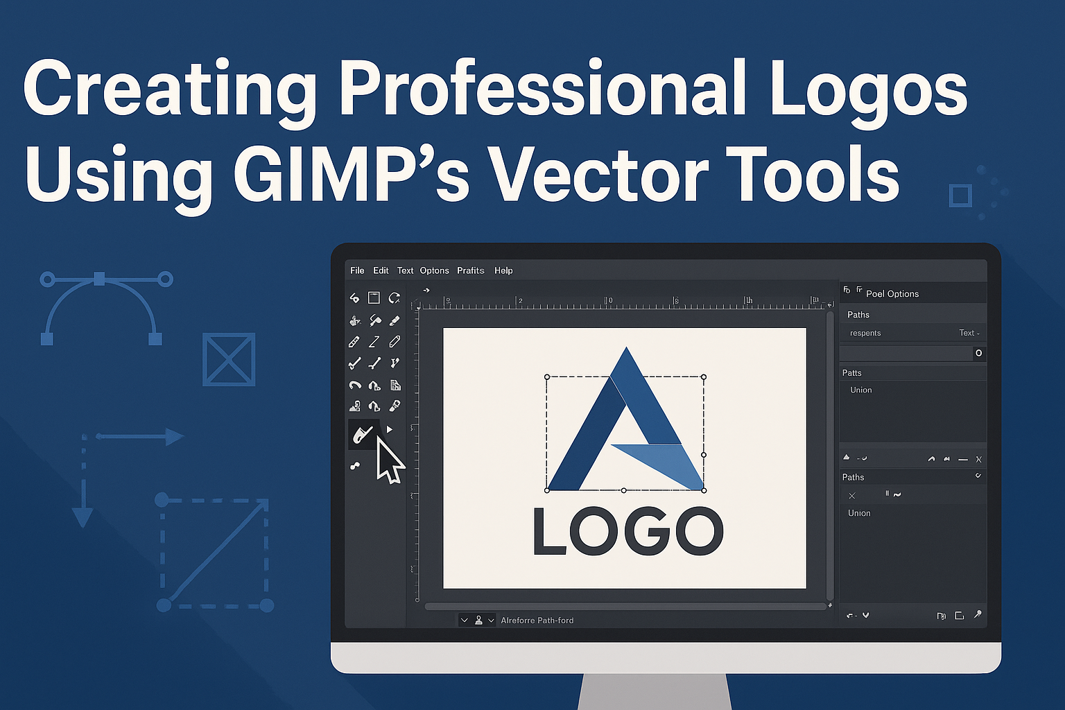
The Paths tool in GIMP is essential for creating vector paths. It enables users to create precise shapes and outlines, which are vital for logo design. To use it, one should first select the Paths tool from the toolbox or use the keyboard shortcut ‘B’. Clicking on the canvas creates anchor points, connected by straight or curved lines.
These paths can be edited by moving anchor points or adjusting curve handles. This flexibility makes it possible to craft complex shapes. It’s like drawing with greater control, allowing the user to adjust each point for perfection. Once a path is complete, it can be stroked or filled with color, transforming it into a part of the design.
Understanding Layers and Groups
Layers are crucial in GIMP for organizing different parts of a design. Each element of a logo can reside on its layer, making adjustments easy without altering other parts of the design. Users can create a new layer through the layers panel, ensuring they work non-destructively.
Groups are like folders for layers, allowing users to organize related layers together. This feature is especially useful in complex designs, where many layers might be present. By grouping, one can apply effects or move several elements simultaneously. It simplifies the workflow and helps keep everything organized and manageable.
Logo Design Basics
Creating a logo with GIMP involves understanding key design principles. This includes the basics of design, using colors wisely, and choosing the right typography to ensure the logo stands out and communicates effectively.
Fundamentals of Logo Design
The core of logo design focuses on simplicity and memorability. A good logo should be easy to recognize and reflect the brand’s identity. Designers often use geometric shapes due to their clean and simple nature.
Creating balance in a logo involves arranging elements harmoniously. Symmetry and proportion help achieve this. It’s essential for the design to maintain scalability, ensuring it looks good on various platforms and sizes. Using GIMP’s vector tools can aid in preserving these qualities during resizing.
Color Theory in Logo Creation
Colors play a crucial role in conveying emotions and messages. Using color theory, designers can choose hues that fit the brand’s personality. For instance, blue often represents trust, while red can signify passion or energy.
Combining colors is an art. Designers should aim for harmony, ensuring that colors complement each other. GIMP offers a color palette tool that assists in trying different combinations. It’s advisable to limit the number of colors to maintain simplicity and avoid overwhelming the viewer.
Typography and Logo Design
Typography can significantly influence the perception of a logo. Choosing the right font ensures the logo is readable and aligns with the brand image. Serif fonts may suggest a classic look, while sans-serif fonts can imply modernity and simplicity.
It’s important to consider spacing when working with text in a logo. Proper kerning and leading help in achieving a clean and polished look. GIMP provides tools to adjust these settings, allowing designers to experiment with different styles.
Designers should also consider how the typography works with other elements of the logo. The goal is to create a cohesive design where text and imagery support one another.
Creating Your First Vector Logo
Crafting a vector logo in GIMP involves sketching your concept, digitizing it, and refining the final design. Each step plays a crucial role in developing a polished, professional logo.
Sketching Your Design
The first step in creating a vector logo is to sketch your ideas on paper. This allows you to experiment with different shapes and layouts without being restricted by digital tools. It’s helpful to consider the message you want your logo to convey and how it will represent your brand.
Start with simple shapes and lines. Using basic geometric shapes can help form a foundation for more complex designs. Once satisfied with a concept, darken the lines to create a clear outline that can be easily followed when digitizing your sketch.
Sketching by hand gives you flexibility and can inspire creativity. It lets you make quick changes, try new ideas, and focus on visual storytelling before transferring the design to a digital platform.
Digitalizing Your Sketch
Once your sketch is ready, it’s time to bring it into GIMP. Start by scanning your paper sketch or taking a high-resolution photo. This will ensure your digital version maintains the original design’s integrity.
Open the scanned or photographed sketch in GIMP. Use GIMP’s vector tools like the Paths Tool to trace over your design. The Paths Tool allows precise control over curves and lines, which is essential for vector graphics. Make sure each line is smooth and follows the contours of your original sketch for accuracy.
Converting sketches to a digital format is a transformative step. It enables further modification and color application, bringing hand-drawn ideas into the realm of vector precision.
Refining Your Vector Logo
After digitalizing, refining your vector logo is the final step. This involves adjusting lines and shapes using GIMP’s editing tools. You can alter paths to refine curves and make necessary adjustments to perfect your logo’s appearance.
Consider experimenting with colors and gradients. These elements can add depth and dimension to your logo. Choose a color palette that aligns with your brand’s image, while ensuring the logo remains versatile across various media.
Refining your logo is about bringing cohesion and polish to your design, ensuring it looks professional in any situation. This stage allows you to finalize the visuals, ensuring the logo is ready for branding use.
Advanced Techniques
When creating professional logos with GIMP, mastering advanced techniques can greatly enhance the design. This includes using intricate path operations, creatively applying gradients and patterns, and incorporating various effects and filters to achieve unique results.
Using Advanced Path Operations
GIMP’s path tool is not just for creating simple shapes. It can be used for advanced techniques like combining paths to create complex designs. Users can create a base path and then add new paths that intersect or follow along the original.
For precise control, the path tool options allow conversion of text to paths for custom text effects. Paths can be transformed with operations such as union, difference, and intersection. These operations can merge or separate paths, enabling intricate designs that stand out. Working with paths also aids in creating clean edges and detailed logos.
Applying Gradients and Patterns
GIMP offers a wide range of gradient and pattern options. Applying gradients can give logos a dynamic look by creating smooth transitions between colors. Users can choose from linear, radial, and other gradient types to complement the logo’s theme.
Patterns can be used to fill shapes or backgrounds, adding depth and texture. Designers can also import custom patterns to fit specific brand needs. By adjusting the scale and orientation, patterns and gradients become versatile tools in a logo designer’s toolkit. This capability allows subtle or bold designs that can effectively convey the brand message.
Adding Effects and Filters
Applying effects and filters in GIMP can transform a logo from simple to striking. There are many filters such as blurring, sharpening, and distorting that can add the desired touch to enhance the logo’s features.
Special effects, like drop shadows and glows, give an added depth to design elements. These can be adjusted for intensity and position, creating a sense of three-dimensionality. By layering different effects, users can achieve a professional finish. It’s important to experiment with these options to discover unique styles that engage and attract attention.
Saving and Exporting Your Logo
When you have finished designing your logo in GIMP, it’s crucial to save and export it correctly. Choosing the right file format is essential for different uses, such as digital display or print. It’s also important to optimize your file to ensure the best quality for both web and print.
Export Options for Different Uses
Different uses demand different file formats when saving your logo. For web use, exporting your logo as a PNG is a solid option because it supports transparency and offers good quality. When optimal scaling and quality are important, SVG files are recommended. They are vector-based, meaning they can scale without losing quality. Users aiming to Save SVG Files in GIMP can follow straightforward steps to ensure their paths export correctly.
For print, TIFF or PDF formats work well because they preserve high-resolution details. It’s advisable to maintain a copy of your source file in GIMP’s native XCF format for future edits. This ensures you have a master file that can be adapted for any format or use.
Optimizing Files for Web and Print
For web use, it’s important to minimize file size to ensure fast loading times without sacrificing quality. Compress JPEGs and use PNGs with care, choosing appropriate compression settings. Specific tools can help in reducing the file size, enhancing performance online.
In print, focus on maintaining high resolution. DPI (Dots Per Inch) is a key factor here; a minimum of 300 DPI is recommended for print quality. Exporting to formats such as TIFF or PDF often meets printing standards and ensures vibrant results and sharp details. Taking these steps guarantees that the logo looks professional in many formats.
Best Practices for Logo Design in GIMP
Creating a professional logo in GIMP involves understanding how to handle client feedback, ensuring designs are scalable, and considering legal aspects. Each of these areas plays a crucial role in developing logos that are both effective and compliant.
Working with Client Feedback
When working on logo designs in GIMP, it’s important to listen carefully to what the client wants. They might have specific ideas regarding colors, shapes, or themes. Designers should ask questions to clarify these preferences.
Using GIMP’s tools, designers can quickly make tweaks such as changing colors or adjusting shapes. It’s helpful to create multiple drafts to give the client options. This helps in aligning the design with the client’s vision.
Communication is key. Designers should regularly update clients on progress and invite feedback at various stages. This ensures the final logo meets expectations and reduces the need for major revisions later.
Maintaining Scalability
Logos need to look great at any size. This means designs should be simple and clean so they can be resized without losing quality. GIMP, being a raster graphics editor, requires careful handling to maintain image clarity.
To achieve scalability, designers could start with high-resolution designs. Vector-like techniques can be used by combining paths and shapes efficiently. This helps in maintaining sharp lines and edges even when the logo is scaled up or down.
It’s beneficial to test the logo at different scales within GIMP. This practice ensures it remains readable and impactful, whether it’s on a business card or a billboard.
Legal Considerations for Your Design
Legal aspects are crucial when designing logos. Designers must ensure they do not use copyrighted images or fonts without proper permission. This can avoid legal complications down the line.
Using open-source or licensed resources within GIMP ensures the design complies with legal standards. It’s also helpful to keep records of all design elements, including licenses for fonts and images.
Additionally, trademarking the logo is a step clients might consider. This gives them legal rights and protects the brand identity. Designers can advise clients on the importance of securing these rights.