For those looking to impress future employers, a modern resume stands out as a crucial tool. Adobe InDesign offers a fantastic platform to create a sleek and professional layout that captures attention. By leveraging InDesign’s graphic design capabilities, anyone can craft a personalized resume to effectively showcase their skills and experience.
Crafting a resume with InDesign allows for creativity and customization that traditional word processors might lack. The software’s features, such as customizable templates and grid systems, make it easy to organize content and ensure readability. Exploring these tools can transform a simple resume into a polished and visually appealing document.
InDesign users can take advantage of detailed guides and tutorials to master the basics. These resources can be particularly helpful for those eager to learn how to build and arrange text boxes and align elements. With practice, creating a standout resume with InDesign becomes not just possible but enjoyable.
Getting Started with Adobe InDesign
Adobe InDesign is a powerful tool used for creating visually appealing resumes. Users can benefit from understanding its workspace, setting up a new document, and learning basic navigation to optimize their designs effectively.
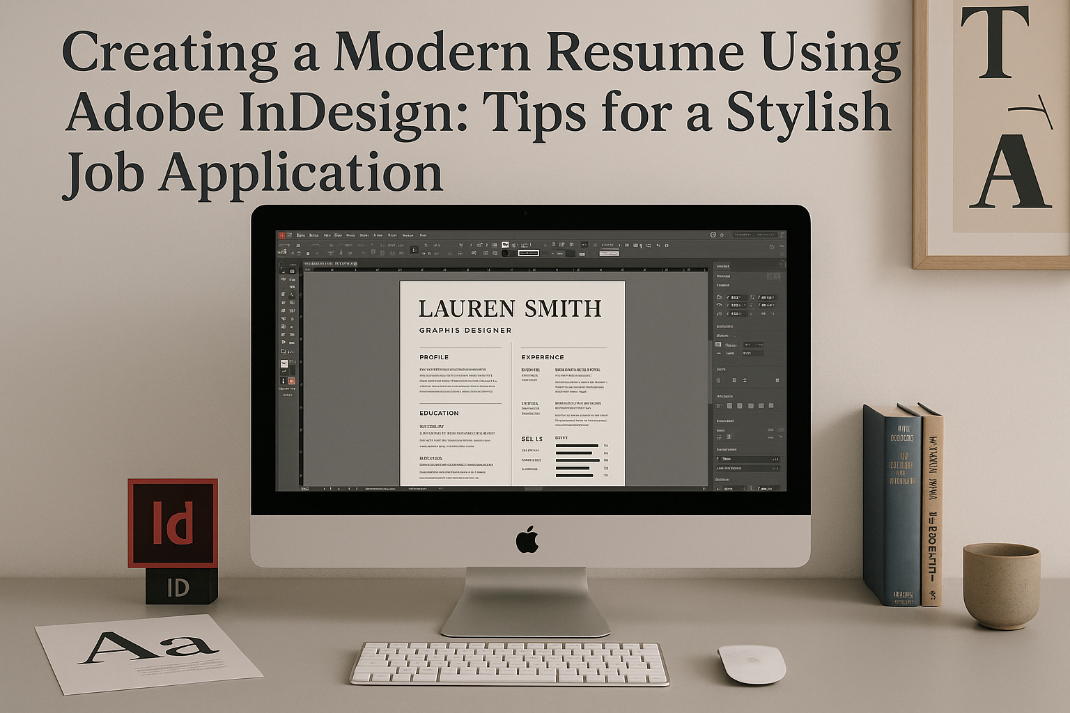
Understanding the Workspace
The Adobe InDesign workspace consists of several panels and tools that are easy to customize for any project. The main sections include the Tools panel on the left, the Control panel at the top, and various other panels like Pages and Layers on the right.
These panels help users make necessary adjustments to their documents. The workspace can be adjusted by resizing and moving panels to create a personalized environment. Learning where each panel is located and how to access different tools quickly allows users to work more efficiently, focusing on the design and layout of their resumes without getting lost in the interface.
Setting Up a New Document
To set up a new document in Adobe InDesign, users start by selecting “File” and then “New” from the menu. They should choose the correct page size and orientation based on their resume requirements. Commonly, a letter size document with a portrait orientation is used.
Next, users can set margins and bleeds. Margins determine the non-printing area around the content, which can enhance readability, while bleeds are essential for designs that extend to the edges of the page. Setting these properly before starting ensures the layout remains clean and professional. If preferred, users can also save their custom document settings as a preset for future use.
Learning Basic Navigation
Navigating Adobe InDesign is made easier by familiarizing oneself with shortcuts and essential functions. The Hand tool helps move around the document quickly, while the Zoom tool enables users to focus on specific details.
Keyboard shortcuts like pressing spacebar for the hand tool or Ctrl + “+” to zoom in increase productivity. Mastering these navigation basics allows the user to switch between different parts of the document smoothly, helping to streamline the design process and make quick edits. Becoming adept at navigating the workspace not only saves time but also makes the designing experience more enjoyable.
Design Principles for Resumes
Creating a resume with Adobe InDesign involves focusing on various design elements that make a resume stand out. Key aspects include font selection, the use of white space, color incorporation, and organizing information clearly. Each of these plays a vital role in crafting a professional and appealing resume.
Choosing the Right Fonts
Selecting the right fonts is essential in making a resume attractive and legible. A good resume often combines two fonts: one for headings and another for body text. Fonts like Arial, Helvetica, or Times New Roman are classic choices that provide readability.
Additionally, consider using a slightly larger size for headings to establish a visual hierarchy. Ensure the fonts are not overly decorative, as this may appear unprofessional. Consistency is critical, so stick to the chosen fonts throughout the document. This approach provides a clean and organized look, helping potential employers focus on the resume’s content rather than getting distracted by unusual designs.
Utilizing White Space Effectively
White space, or negative space, refers to the empty or blank areas of the resume. It helps make the document more readable and less cluttered. White space can highlight important information and allows the resume to breathe, preventing text from overwhelming the reader.
This can be achieved by keeping margins wide and leaving space between sections. Avoid cramming too much information into a small area, which can be visually overwhelming. A balance of white space makes a resume look polished and helps guide the reader’s eye smoothly from one section to the next.
Incorporating Color
Using color in a resume can add personality and draw attention to key areas. Muted or neutral shades are often best in professional settings as they appear elegant and sophisticated. Colors like navy, dark green, and burgundy can add a touch of flair without being too bold.
It’s important to use color sparingly. Highlight headers or section dividers rather than filling entire sections. Consistency in color choice throughout the document creates a cohesive look. Using colors to create emphasis can also assist in highlighting specific achievements or skills, enhancing the overall layout and readability.
Understanding the Hierarchy of Information
Organizing information logically on a resume is crucial for effective communication. Start by listing the most relevant experience and skills first. This allows employers to see important information quickly. Use headings and subheadings to break up sections such as Education, Experience, and Skills.
Bullet points are effective for listing duties or achievements concisely. Ensure that each section is clearly labeled and follows a logical order. Consistent formatting aids in maintaining this hierarchy, making navigation and comprehension easier for anyone reviewing the resume. This clarity ensures that the reader can rapidly assess the qualifications and strengths of the applicant.
Structuring Your Resume
Organizing a resume well is important to help potential employers quickly see the most relevant information. Each part of the resume should be clear and easy to read, focusing on your strengths and achievements.
Crafting a Headline and Summary
The headline and summary give a first impression to the reader. The headline includes your name and contact information at the top of the document, using a legible and professional font. Make sure it stands out and is easy to identify.
The summary follows the headline. It is a short paragraph that highlights your key qualifications and career goals. This section is your chance to showcase your strongest attributes and make the reader interested in learning more about you. Use action words and keep it concise, focusing on achievements that align with the job you’re applying for.
Detailing Work Experience
This section highlights your professional history and accomplishments. Begin with your most recent job and work backward, listing job titles, company names, and dates of employment. Bullet points can help make each role and responsibility clear and distinguishable.
Focus on specific achievements and responsibilities that demonstrate your skills. Use action verbs to describe these tasks and achievements, and quantify results where possible. This gives employers a clearer picture of your contributions and the impact you’ve made in past positions.
Outlining Education
Education should include the schools attended, degrees earned, and dates of attendance. If you have relevant coursework or academic honors, include them to show expertise in your field. Start with the most recent education first and work backward.
For recent graduates, it’s important to highlight relevant courses, projects, or internships that align with the job requirements. Professionals with more experience can give less detail in this section and focus more on work history instead, unless the education directly supports the desired job.
Listing Skills and Certifications
This section allows you to showcase specific skills that align with the job requirements. Use bullet points to list each skill to make them stand out. Common skills include technical abilities, software proficiency, and language fluency.
Adding certifications can enhance this section, especially if they are recognized in your industry. Be sure to include the name of the certification, the issuing organization, and the date awarded. These details add credibility and show your commitment to continued learning and professional development.
Including Additional Information
Depending on the job, other sections may add value. Consider including volunteer work, professional affiliations, or hobbies that relate directly to your career. This information can highlight your personality and show employers you are well-rounded.
When listing volunteer work, include your role, the organization, and time served. For professional affiliations, mention the organizations you are a part of, especially if you hold a leadership position. Hobbies should be relevant and can show unique skills such as teamwork, creativity, or leadership.
Graphic Elements and Aesthetics
Design plays a crucial role in making a resume stand out. Using graphic elements like lines, borders, icons, illustrations, photographs, and logos can enhance visual appeal while maintaining professionalism.
Using Lines and Borders
Lines and borders can add structure to a resume. They help in separating sections such as experience, education, and skills, making the content clear and easy to read. Simple horizontal lines between sections or borders around the entire page can make the resume look organized. It’s essential to choose colors wisely—stick to black, gray, or subtle shades that don’t overshadow the text. Using consistent line thicknesses across the document will also ensure a cohesive look. Adobe InDesign offers tools for adjusting line weights and styles, providing flexibility to achieve the desired design.
Adding Icons and Illustrations
Icons can effectively highlight important sections of a resume. For instance, using a small phone icon next to contact information or a book icon near educational details can enhance readability. Icons should be minimalistic, keeping the focus on text. Illustrations can also be included for creative roles, but they should be relevant and not distract from the main content. Adobe InDesign’s vector tools allow easy integration of icons and illustrations. If necessary, there are numerous resources for downloading professional icon packs. Choosing icons that complement the resume’s overall style will harmonize the visuals.
Incorporating Photographs and Logos
Adding a photograph is optional but can create a personal connection. A professional headshot can be placed at the top or within a sidebar. It’s important that the image is high-quality and not oversized. Logos are useful if the applicant has a personal brand or past employers with recognizable logos. When including logos, ensure they are small and don’t clutter the layout. InDesign’s image handling capabilities allow for proper scaling and positioning of photographs and logos. Always make sure that any added visual elements match the theme and color scheme of the resume to maintain a cohesive design.
Working with Text and Typography
Creating a modern resume in Adobe InDesign involves careful attention to text and typography. By applying text styles, managing paragraph and character styles, and fine-tuning kerning and leading, one can craft a visually appealing and professional-looking document. Each of these elements plays a crucial role in enhancing readability and overall design.
Applying Text Styles
Applying text styles in InDesign helps maintain a consistent look throughout the document. Users can choose from predefined styles or customize their own. Styles dictate font type, size, color, and more. It’s beneficial to set up Heading, Subheading, and Body Text styles early.
Text styles save time, especially during revisions. Changes to a style automatically update all text using that style. This feature ensures coherence and quick adjustments. For those new to InDesign, relying on templates that incorporate ready-to-use text styles can be a great starting point. Templates often offer a professional look without much hassle.
Managing Paragraph and Character Styles
Paragraph styles control the format of entire paragraphs, covering spacing, alignment, and indents. Character styles, on the other hand, focus on smaller sections or words. They cover fonts, sizes, and other attributes. By defining paragraph styles first, users can create a solid foundation for their resume’s design.
Character styles should be used for highlights or specific needs, like bolding a name. InDesign allows these styles to layer over paragraph styles, offering more flexibility. This approach ensures uniformity while allowing for individuality in the document’s highlight sections. Setting these styles thoughtfully leads to a neat and professional appearance.
Fine-Tuning Kerning and Leading
Kerning and Leading are crucial for text appearance. Kerning adjusts the space between individual letters, enhancing readability. Leading, the space between lines, dictates how dense or airy the text appears. Proper adjustments here ensure the text is easy to scan.
Using InDesign’s precise controls can make a big difference. A resume should be easy to read at a glance. Tweaking kerning and leading helps achieve this, ensuring titles and paragraphs are clear and not cramped. Experimenting with these settings can provide a modern, elegant feel to the resume, making it stand out.
Proofreading and Editing
Thorough proofreading is key to making your resume professional. First, check for typos. Spelling and grammar mistakes can leave a bad impression. Reading your resume aloud can help catch awkward phrasing. Use online tools like Grammarly for an extra check.
It’s also important to ensure consistency in font style, size, and color. Double-check that all contact information is accurate. If possible, have someone else review your resume. A fresh set of eyes might catch errors you missed.
Finally, evaluate the overall appearance. Make sure it looks balanced and aligned. Adjust spacing and margins to improve readability.
Exporting Your Document
Exporting your resume from InDesign as a PDF is crucial. This preserves the layout and ensures it appears the same on any device. To do this, go to “File” > “Export…” and select “Adobe PDF (Print)” for the best quality.
Choose high-quality settings. Use the “High Quality Print” preset in the export options to ensure crisp text and images. If you’re emailing your resume, check the file size. Large files can be problematic, so use compression if needed.
Remember to review the PDF before sending. Open it on different devices to confirm it displays correctly. Consider naming your file clearly, like “JohnDoe_Resume2024.pdf,” for easy identification.
Tips for Printing
When printing your resume, quality matters. It’s best to use high-quality paper, like a bright white or cream sheet, to create a professional impression. Standard 8.5×11 inch size is preferred.
Check your printer settings for optimal results. Set the quality to high for sharp text and images. Align the layout correctly to avoid unwanted cropping.
If using color in your design, make sure your printer can accurately reproduce it. For crucial applications, consider professional printing services, especially if your resume uses complex design elements. They can offer guidance on the best paper and finishes to enhance your resume’s appearance.
Advanced Techniques
InDesign offers powerful tools to make resumes both interactive and visually appealing. Using features like interactive PDFs and integrating with other Adobe apps, users can enhance their resumes and make them stand out.
Creating Interactive PDFs
Creating an interactive PDF can make a resume more engaging. By adding links, buttons, or even forms, the document becomes user-friendly and dynamic. For instance, adding clickable email links or portfolio buttons lets employers easily access more information about the candidate.
InDesign provides options to include multimedia elements such as videos or slideshows. These can demonstrate skills or highlight achievements. Interactive PDFs work best for online submissions because they maintain their features across screens. This makes them versatile for various employers.
Integrating with Other Adobe Apps
InDesign can work seamlessly with other Adobe apps, making the design process smoother. For instance, Adobe Illustrator can be used to create unique graphics or icons, which are then imported into the resume design. This allows for more creativity and originality.
Photoshop is great for editing images or enhancing backgrounds. These images can be easily integrated into the InDesign project. Moreover, Adobe Fonts offers a range of typefaces that can be used to reflect the candidate’s style or profession. Using complementary tools enhances the overall design quality.