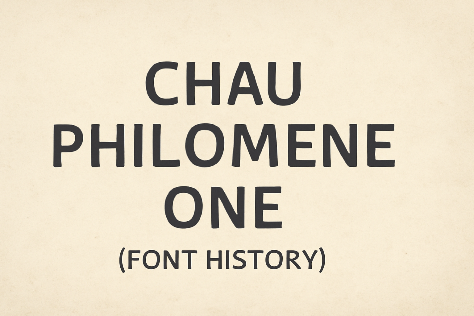
Chau Philomene One is a font known for its distinctive personality, combining narrow letters with sharp angles. Designed to stand out, it is ideal for headings and highlighted text. This unique typeface is part of the Chau superfamily, which offers a range of styles to fit various design needs.
The font was created by Vicente Lamonaca, and it’s become a favorite among designers for its versatility and modern look. It has been downloaded thousands of times, reflecting its popularity in digital and print media. Whether used in a logo or a headline, Chau Philomene One captures attention and adds a touch of elegance.
For those looking to explore typefaces that cater to specific projects, Chau Philomene One is available across several platforms. You can find more information about it on sites like Google Fonts and 1001 Fonts, where you can experience its potential for yourself.
Origin and Designer
Chau Philomene One is a unique font that stands out for its narrow letters and sharp angles. This section explores the inspiration behind the font and provides insight into its designer’s background.
Inspiration Behind Chau Philomene One
Chau Philomene One’s design is known for its bold and sharp style, making it ideal for headings. The inspiration stems from the desire to create a font that combines elegance with readability. Its narrow letters and strong angles reflect a modern approach, catering to both print and digital mediums. The font’s look is intended to capture attention, while still maintaining a clear and concise presentation. This makes it suitable for various layouts requiring a striking headline.
Designer’s Background
Chau Philomene One was designed by Vicente Lamonaca. His expertise in typography is well-regarded in the design community. Vicente’s background includes extensive work on various font families, with a focus on innovation and accessibility. His designs often resonate with a strong visual identity, catering to both traditional and modern elements. His commitment to creating fonts that serve multiple purposes is evident in the versatility seen in Chau Philomene One. This work highlights his skill in balancing aesthetic appeal with practical application.
Font Characteristics
Chau Philomene One is known for its unique style and clarity. The font’s sharp angles and narrow letters give it a distinct look while maintaining readability. The font is part of a larger typeface family and is designed to support various languages.
Typeface Family
Chau Philomene One is part of the Chau superfamily. It includes multiple styles that allow for versatile usage across different media. Being a sans-serif typeface, it maintains a modern, clean look. The typeface is part of the Google Fonts library, making it easily accessible. Its design emphasizes simplicity and elegance, which makes it suitable for both digital and print formats. The inclusion in Google Fonts underlines its adaptability and global reach, supporting languages based on the Latin script.
Distinctive Features
One of the standout aspects of Chau Philomene One is its narrow letters and sharp angles. These features attribute a bold yet refined look to the font. Its design is characterized by strong vertical lines and distinct geometric shapes. This gives the font a visual punch suitable for headings and highlighted text. Eduardo Tunni, the Argentine designer behind the font, created it with a focus on strong personality. These design elements help it stand out in graphic design projects. The font’s aesthetics are complemented by its functional aspects, providing a balance between style and practicality.
Legibility and Readability
Chau Philomene One offers excellent legibility, thanks to its straightforward design and clear letterforms. This makes it ideal for body text, ensuring that reading fatigue is minimized. The design’s aim for clarity and readability allows users to engage with it easily, which is crucial for both digital and print media. Its smooth flow of text is especially beneficial in environments where text needs to be read quickly and efficiently. Overall, its functional clarity makes it a go-to choice for designers seeking a balance between visual appeal and readability.
Technical Aspects
Chau Philomene One is a popular sans-serif typeface known for its readability and distinctive style. This section explores its formats, language support, and compatibility, which are crucial for both designers and developers.
Font Formats
Chau Philomene One is available in several font formats that make it versatile for different applications. The most common formats are TrueType (.ttf) and OpenType (.otf), which are widely supported on most platforms. These formats ensure that the font retains its high-quality appearance whether in print or digital form.
Additionally, it can be found in Web Open Font Format (.woff and .woff2), ideal for web use. These formats help in maintaining fast loading times and efficiency on websites. The availability of these formats makes Chau Philomene One a flexible choice for designers.
Language Support
Chau Philomene One supports multiple languages, catering to a global audience. It primarily covers languages that use the Latin script, which includes numerous European languages. This broad support makes it appealing for international projects.
There is potential for expansion to cover more scripts beyond Latin, allowing for even broader accessibility. As a Unicode typeface, it represents standardized international text, making it suitable for multilingual text. This wide language support enhances its usability across diverse projects.
Compatibility and Usage
Chau Philomene One is compatible with various tools and software. It integrates smoothly with design software like Adobe Illustrator and Photoshop, as well as word processors like Microsoft Word. This makes it a practical choice for designers and content creators.
For web usage, it is part of the Google Fonts library, meaning it can be easily embedded into websites. Its characteristics—narrow letters and sharp angles—make it ideal for headings and highlighted text. This compatibility ensures it can be used effectively in both web and print media.
Usage
Chau Philomene One serves well in various design projects, emphasizing readability and style. Its unique structure and sharp angles make it a favored choice for many creative applications.
Typical Applications
Chau Philomene One is often used in headings and highlighted text. Its narrow letters and sharp angles provide a distinctive look that stands out. This makes it ideal for posters, banners, and signage where attention is needed.
In web design, this font is appreciated for its clarity. It ensures that text is readable even at smaller sizes or on different screen resolutions. Its inclusion in the Google Fonts library makes it accessible for web designers aiming for both style and functionality.
Branding and Identity
Brands looking to convey modernity and clarity may choose Chau Philomene One. Its sans-serif design suggests a clean and professional appearance. Companies use it for logos and corporate materials to communicate a sleek, contemporary feel.
This typeface supports 41 languages, increasing its versatility in global branding efforts. Its ability to maintain readability and style across different languages is a key advantage. For businesses seeking a unique yet versatile font, Chau Philomene One is a strong candidate in their design arsenal.
Historical Context
Chau Philomene One emerged as a sans-serif typeface from the early 2010s. Created by Eduardo Tunni, this font is known for its narrow letters and sharp angles, which give it a distinct appearance.
Evolution of the Typeface
Chau Philomene One began as part of a larger superfamily known as Chau. This typeface drew inspiration from the need for a font that offered both readability and clarity. Eduardo Tunni, an Argentine designer, crafted it to meet the demands of modern digital and print media. It joined the Google Fonts library, making it widely available for those who wanted a professional but approachable typeface.
Initially designed as a sans-serif style, Chau Philomene One was meant to be versatile. It could be used in headings and highlighted text, thanks to its hardy structure. Its design allows it to fit in various contexts while still maintaining a unique look. The adaptive nature of Chau Philomene One has contributed to its steady growth in popularity since its introduction.
Notable Usage Examples
Chau Philomene One has been utilized in several creative projects. It is especially popular in digital platforms due to its compatibility and readability. Websites that emphasize content clarity often opt for this typeface. Because of its distinct appearance, it is also frequently chosen for branding elements like logos.
Educational materials sometimes use Chau Philomene One to ensure text is clear and easy to read. The font’s sharp angles and narrow letters make it appealing for displays where strong visual elements are crucial. This typeface continues to see increasing usage in various typography projects, reinforcing its status as a go-to choice for designers.
Reception and Critiques
Chau Philomene One has garnered attention for its clean and modern design. Users often praise its readability, which makes it ideal for both web and print media. Many designers appreciate its accessibility as part of the Google Fonts library.
Some graphic designers highlight the font’s narrow letters and sharp angles, describing them as striking and unique. These features give the font a bold personality, which suits headings and highlighted text well. It is a favorite for projects that require a standout look.
Despite its strengths, a few critiques focus on its limited use in varied design contexts. Some users note that the font’s distinct shape may not suit every project. But, its main strength remains in usability and access through platforms like Google Fonts.
Chau Philomene One supports language diversity, which opens up global use. Its compatibility with the Latin script and ability to expand further increase its versatility. The font remains a reliable choice for those seeking clarity with a touch of character.
Licensing and Access
Chau Philomene One is a versatile font available under a flexible licensing agreement, making it a popular choice for both personal and commercial projects. Acquiring this font is straightforward, offering ease of access for digital designers and publishers.
Licensing Requirements
Chau Philomene One is distributed under the SIL Open Font License (OFL) 1.1, which is known for its permissiveness. The OFL allows users to freely use, modify, and distribute the font. This makes it an excellent option for developers and graphic designers seeking adaptable typography.
The license permits both commercial and non-commercial use, which means businesses can incorporate it into their branding and design without additional fees. The main restrictions prohibit selling the font itself, but derivative works must acknowledge the original font.
How to Obtain Chau Philomene One
Getting Chau Philomene One is simple. It is available for download from several online platforms including Google Fonts, where it can be accessed for web use directly through their platform. This makes it easy to embed into websites with a few lines of code.
For those needing the font for offline projects, sites like Font Meme offer downloads in different file formats. These sites provide character maps and previews, allowing users to see its unique style before downloading. The process is user-friendly, with just a few clicks needed to add this font to your design toolkit.
Related Typefaces
When exploring Chau Philomene One, it’s interesting to look at other fonts that offer a similar feel or serve as alternatives. These typefaces can be used to achieve different design needs while maintaining a cohesive visual style.
Similar Fonts
Chau Philomene One is recognized for its sharp angles and narrow letters, making it a unique choice for headings. For those seeking similar styles, fonts like Roboto and Open Sans offer shared characteristics. These fonts are widely used due to their modern sans-serif design.
Other notable mentions include fonts like Montserrat and Raleway, which have clean lines and versatility. Such features make them excellent choices for those looking to complement designs including Chau Philomene One.
Design Alternatives
If one seeks alternatives with a slightly different design, Lato and Fira Sans offer a softer, rounded appearance. These fonts provide a friendlier look while still maintaining readability.
For projects needing a bolder approach, Oswald and Lobster might serve well. They bring a striking and impactful presence to any text, whether for headers or important highlights. These alternatives ensure variety while still allowing design coherence.