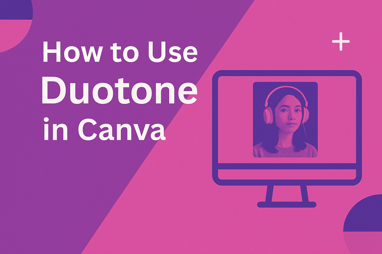
Designers often look for simple ways to make their projects stand out, and Canva’s duotone effect is one of the easiest tools to achieve that. Using duotone in Canva lets anyone transform a plain photo into a bold, eye-catching design with just two colors. This effect works well for social media graphics, posters, and even …
Graphic Design Tutorials
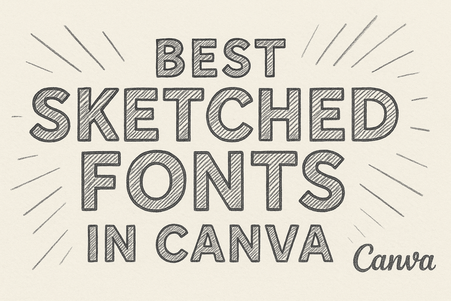
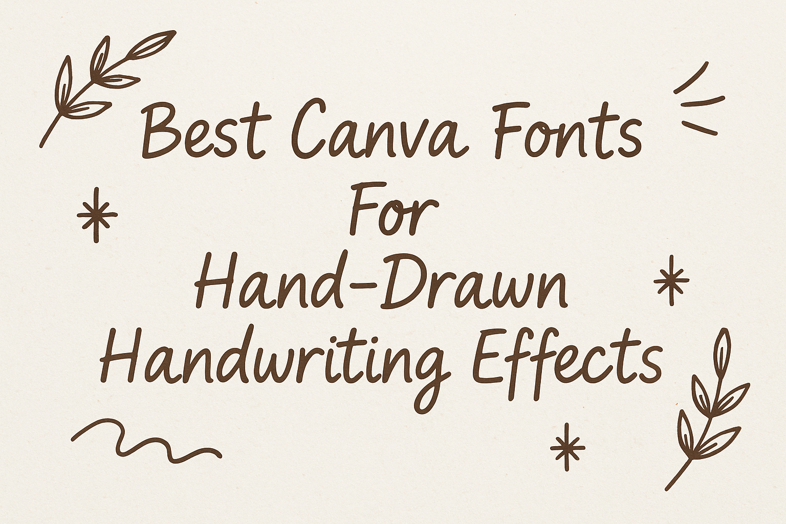
Sketched fonts bring a casual, hand-drawn style that makes designs feel more personal and creative. They often look like quick pencil or pen drawings, giving text a playful and artistic touch. The best sketched fonts in Canva help projects stand out by adding character and a handcrafted feel. These fonts work well in titles, headers, …
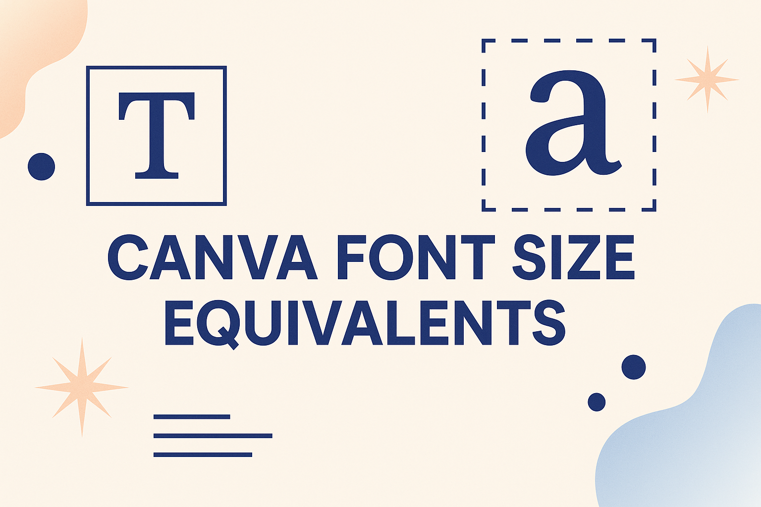
Designers often notice that font sizes in Canva don’t always match the sizes they are used to in other programs like Word or Google Docs. Canva uses pixels as its base unit, which means a 16px font in Canva equals about 12pt in standard text editors. Knowing these equivalents makes it easier to keep designs …
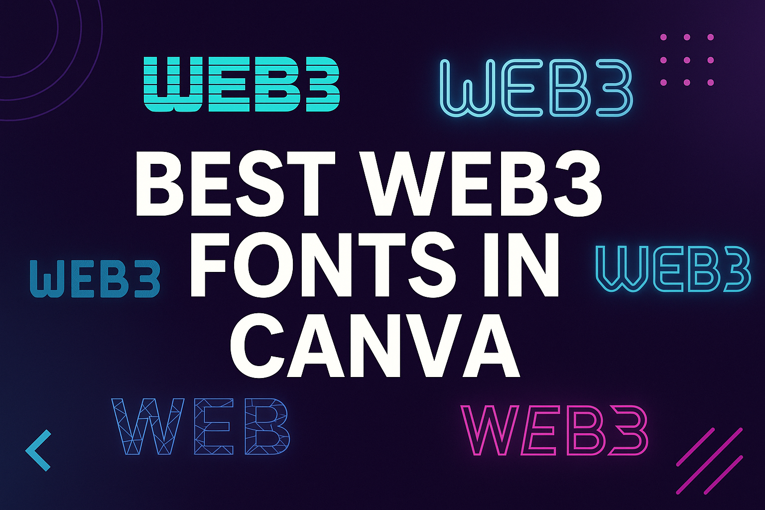
Choosing the right font can shape how a Web3 project looks and feels. Fonts in Canva that fit the Web3 style bring a modern, digital edge that matches blockchain, crypto, and decentralized platforms. The best Web3 fonts in Canva give designs a futuristic yet professional look while staying easy to read. With so many options …
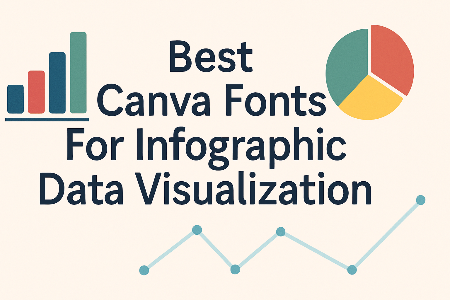
Choosing the right fonts in Canva can make a big difference when creating infographics for data visualization. The best Canva fonts for infographics are clear, easy to read, and help highlight the important information without distracting the viewer. These fonts make data look clean and professional while keeping the message simple. People often struggle to …
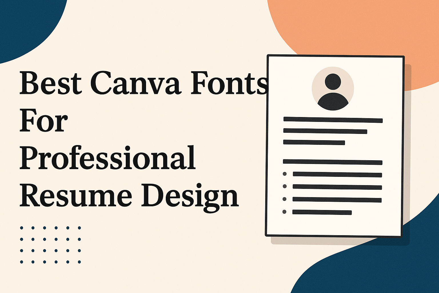
Choosing the right font for a resume can make a big difference in how professional and easy to read it looks. The best Canva fonts for a professional resume combine clarity with style, helping your resume stand out without being distracting. Using the right font ensures that a hiring manager can quickly scan your experience …
Choosing the right font for digital ads and banner campaigns is key to grabbing attention and making messages clear. Fonts like Montserrat, Open Sans, and Impact are popular because they are easy to read and stand out on screens of all sizes. The right choice can help an ad connect with viewers quickly and encourage …
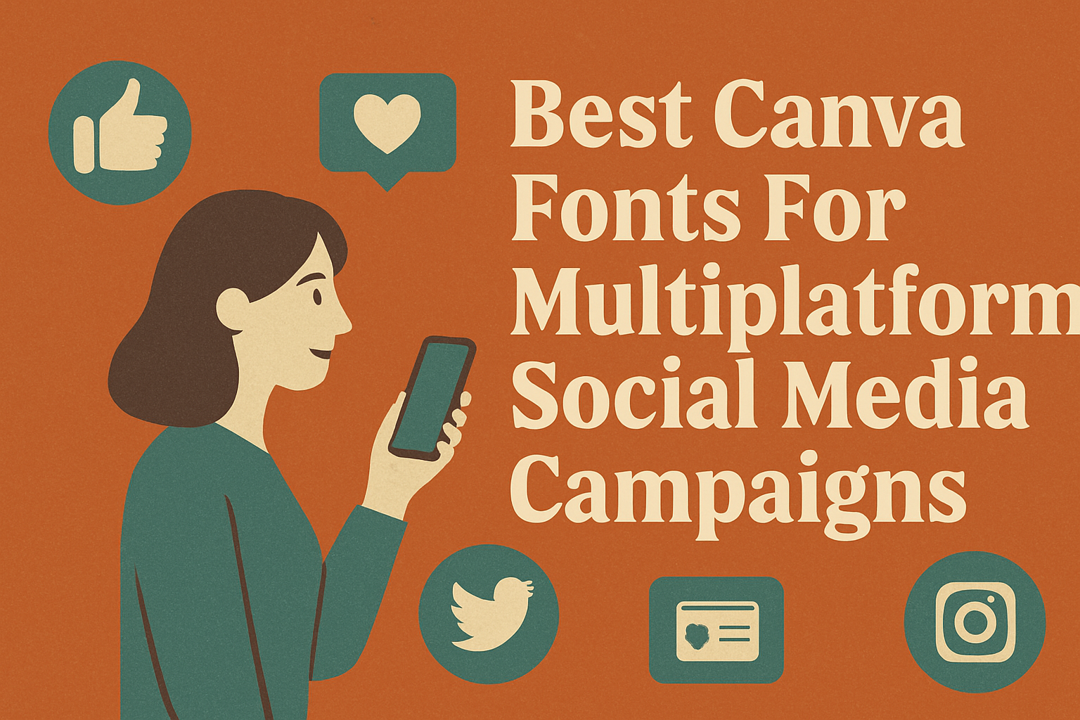
Choosing the right Canva fonts for multiplatform social media campaigns is key to making your graphics clear and engaging across all channels. The best fonts combine readability with style, like clean sans-serifs or elegant script options, to grab attention without overwhelming viewers. Using fonts that work well together helps create a consistent brand look whether …
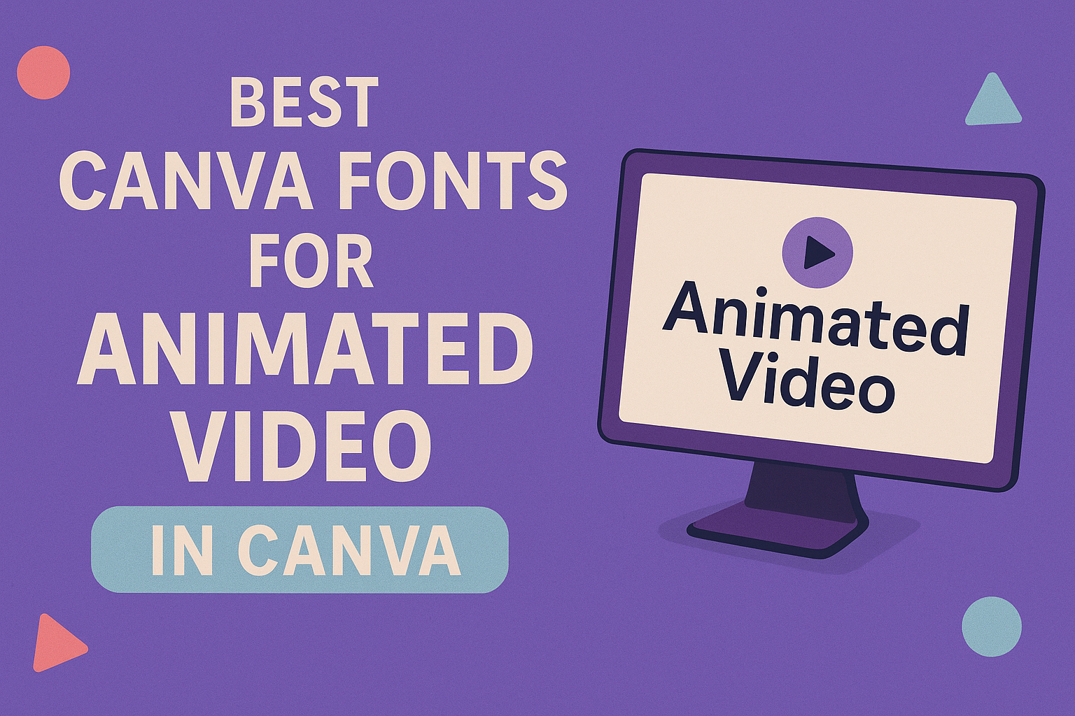
Choosing the best fonts for animated video text in Canva can make a big difference in how a message grabs attention. Fonts like Montserrat, Bebas Neue, and Poppins work very well because they are clear, bold, and easy to read even when moving on screen. These fonts help viewers focus on the words without distraction. …
Creating designs with a retro gaming or pixel art vibe needs the right fonts to capture that classic, nostalgic feel. The best Canva fonts for these themes are pixelated, blocky, and bold, perfectly matching the look of old-school video games and digital art. These fonts work great for titles, logos, and short text bursts where …