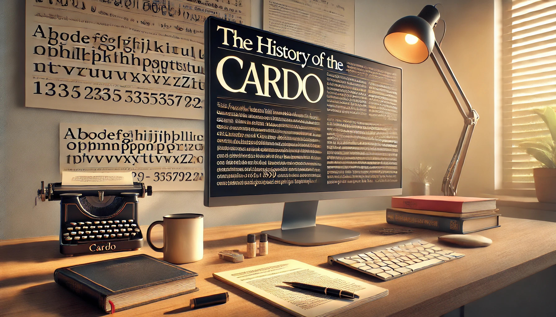
Cardo is a typeface that captures the elegance of history through its classic Old Style serif design. Created by David J. Perry, it is crafted to meet the needs of classicists, Biblical scholars, medievalists, and linguists. Its large Unicode character set is a particular highlight, supporting many modern languages and characters used in historical texts.
The font combines modern usability with the charm of historical typefaces. This makes it ideal not only for scholarly works but also for general typesetting. Whether you’re publishing a historical manuscript or designing a modern publication, Cardo serves as a bridge between past and present.
For those interested in typography, the history and features of Cardo demonstrate how typefaces evolve to meet both aesthetic and practical needs. Its availability through platforms like Google Fonts and Adobe Fonts ensures it is accessible to a wide range of users, further expanding its impact in the world of design.
Origins and Development
Cardo is a serif typeface created to cater to the specific needs of those in classical and historical studies. It has evolved over time to become a versatile font used in various academic fields. The following sections explore its creator, the design principles, and its early development.
Creator of Cardo
David J. Perry, an expert in fonts and typography, is the mind behind Cardo. His aim was to craft a typeface that met the intricate demands of scholars. Designed with precision, Cardo reflects his deep interest in classical studies. By focusing on aesthetics and functionality, Perry ensured the font could handle complex texts and symbols. His work makes Cardo an invaluable tool for students and academics alike.
Design Philosophy
The design of Cardo embraces the elegance of Old Style serif fonts. Its style prioritizes readability and includes features suited for scholarly work. This font supports many modern and historical languages. This wide selection allows users to employ accurate and authentic scripts in their writings. Cardo balances beauty and utility, making it perfect for publications that focus on history and linguistics.
Early Versions and Influences
Cardo’s development began with understanding the requirements of classicists and linguists. The first versions included essential characters and were later expanded under the Open Font License. Over time, updates brought new styles like bold and italic, enriching its versatility. The Cardo font drew inspiration from historical fonts and improved over the years to meet evolving scholarly demands.
Typography and Features
Cardo is a versatile typeface designed to meet the needs of scholars. It offers a comprehensive character set and employs advanced OpenType features that enhance its functionality, especially in academic and historical contexts.
Character Set and Glyphs
The Cardo font boasts an extensive character set, making it ideal for scholarly work. It is a large Unicode font, accommodating a wide range of characters and symbols. This flexibility is beneficial for classicists, biblical scholars, and linguists.
It covers a variety of glyphs, including ligatures, that facilitate complex typography. The inclusion of both text figures and true small capitals enriches the font, providing precision in presenting historical and academic texts.
OpenType Features
Cardo includes several advanced OpenType features. These are particularly valuable for producing high-quality typography. Features like ligatures and text figures, also known as old style numerals, improve readability and presentation.
True small capitals and diverse punctuation types are also part of the package. These features support precise text formatting, making Cardo a reliable choice for detailed scholarly work.
Usage and Applications
Cardo is particularly appreciated for its versatility and elegance. It is widely used in academic and scholarly settings as well as in popular design projects, given its classic style and extensive character set.
Academic and Scholarly Use
Cardo is a favorite among scholars and academics. This is due to its large Unicode character set, which supports many languages and special symbols. Classicists, linguists, and biblical scholars often choose Cardo for its ability to represent ancient scripts and complex notations. This makes it ideal for academic papers, research publications, and historical texts. Its elegant, old-style serif design helps convey a sense of tradition and authority, making it a perfect fit for scholarly works.
Popular Adoption
Beyond academia, Cardo is used in a variety of popular applications. Its timeless design makes it suitable for book covers, website headers, and branding materials. Designers appreciate its classic elegance, which adds a touch of sophistication to any project. Cardo is readily available from platforms such as Adobe Fonts and Google Fonts, making it accessible for both print and digital design purposes. Its adoption by these major platforms has helped increase its popularity among designers and typographers around the world.
Technical Aspects
The Cardo font is a versatile typeface designed to cater to the specific needs of scholars and linguists. It supports multiple languages and is compatible with various font file formats, ensuring broad usability.
Font File Formats
Cardo is offered in a range of widely used font file formats. These include TrueType (TTF) and OpenType (OTF), making it easy to install across different systems. The Open Font License allows for free use, modification, and sharing. This flexibility caters to scholars seeking a customizable typeface. OpenType is especially beneficial due to its advanced typographic features, like ligatures and alternate characters, enhancing text presentation.
Compatibility and Support
Cardo is compatible with numerous operating systems and software programs. It functions seamlessly on Windows, macOS, and Linux, thanks in part to its Open Font License. This license ensures broad accessibility and hassle-free integration with various platforms. Cardo also supports many commonly used languages and scripts, making it ideal for diverse scholarly work. This extensive compatibility benefits users who require a font that accommodates both modern and ancient languages, offering versatility in both academic and casual settings.
Updates and Iterations
Cardo has undergone numerous updates and revisions since its creation. These changes have enhanced its features, making it a favorite among scholars. The community has also played a role in its development, contributing to improvements and expansions.
Major and Minor Updates
Cardo’s update history shows a mix of major and minor changes that have refined its design. For instance, version 1.04, released on April 20, 2011, introduced significant updates to the Roman style and added a new boldface. Earlier, on February 25, 2011, the first italic version was posted. Before these, version .99 was released on May 25, 2010, under the Open Font License, allowing more flexibility and reach for users. Each update brought a unique enhancement, accommodating more characters and easing use for academic texts. This approach has kept the font relevant and widely used.
Community Contributions
The design and updates of Cardo have benefitted greatly from community input. Enthusiasts and scholars have frequently provided feedback, leading to continuous improvements. Whether it’s fine-tuning the typeface or expanding its Unicode character set, community contributions have been invaluable. The ability to input Latin, Greek, and Hebrew makes it versatile for various scholarly needs. Community involvement not only ensures the font’s functionality but also broadens its applications. By fostering an engaged user base, Cardo has evolved to meet the ever-growing demands of classicists and other scholars, keeping the font dynamic and responsive to user needs.
Visual Style and Aesthetics
Cardo is a serif typeface known for its timeless elegance and classical feel. It draws inspiration from Old Style typefaces, often appealing to scholars and those interested in historical texts.
Font Comparison and Contrast
Cardo stands out among serif typefaces because of its classic roots in Italian Renaissance typography. It is often compared to fonts like Garamond due to its humanist style and elegant curves.
Unlike modern serif fonts, which tend to have sharper and more uniform strokes, Cardo has a more organic feel. The letterforms show slight variations that add warmth and character. This makes it ideal for scholarly works and publications where a sense of tradition is important.
Its large Unicode character set supports many languages, distinguishing it from many other fonts that are more narrowly focused.
Notable Design Elements
Cardo’s design includes several important features that cater to the needs of editors and scholars. Ligatures, an essential part of historical typography, are present, allowing for seamless connection between letters for aesthetic appeal.
True small caps and old-style figures are other notable elements, giving the text a refined, classical appearance. These features help maintain authenticity and readability in printed works.
Another distinct element is the font’s ability to pair well with both modern and traditional layouts. Whether used in digital or print formats, Cardo’s elegant style and historical echoes make it a versatile choice for various design projects.
Cultural Impact
Cardo has played a significant role in the world of typography. It has influenced modern typeface design and gained recognition in scholarly circles.
Influence on Modern Typography
Cardo has left a mark on modern typography by blending historical accuracy with contemporary needs. Its design captures the essence of classical typefaces while accommodating the technical requirements of digital typesetting. This balance makes it popular among those who appreciate historical fonts and need digital accessibility. Many designers seeking a font that embodies both tradition and versatility turn to Cardo as a source of inspiration. You can see its impact in projects that require both a scholarly and modern touch.
Recognition and Awards
Cardo’s unique blend of scholarly precision and aesthetic appeal has earned it recognition in academic and design communities. It is appreciated by classicists, medievalists, and linguists for its extensive character set and high-quality design. The font is featured on platforms like Google Fonts where it is widely used and well-reviewed for its suitability in professional and academic work. This recognition highlights its role in bridging historical scholarship with modern design needs, making it a respected choice among scholars and designers alike. Cardo has not only been adopted by professionals but also celebrated as a valuable tool in preserving historical typography’s relevance today.