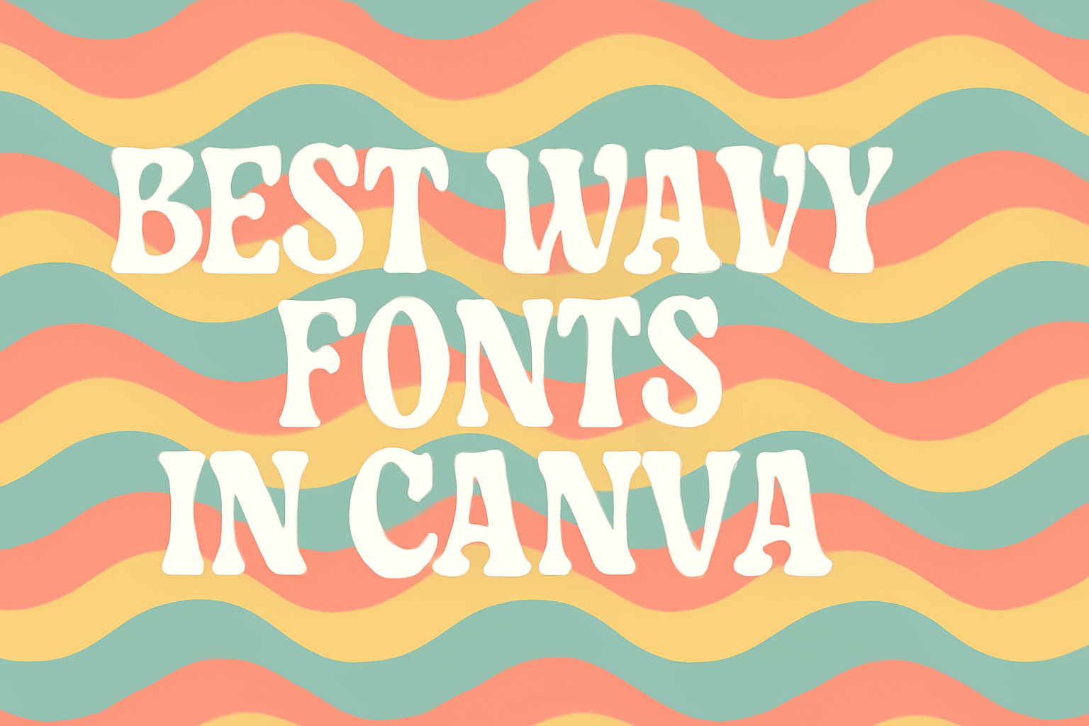
Wavy fonts add a playful and creative touch to designs, making them stand out in a crowded space.
Canva offers a variety of wavy fonts that can enhance projects, from social media graphics to presentations. Finding the perfect font can transform an ordinary design into something truly eye-catching.
In this blog post, readers will discover some of the best wavy fonts available in Canva. Each font brings its unique flair, ideal for those looking to express creativity and fun in their work.
Whether for personal projects or professional use, these fonts can help convey a specific mood or theme effectively.
Exploring wavy fonts is a great way to elevate designs and engage audiences. With the right choices, anyone can create stunning visuals that leave a lasting impression.
Why Wavy Fonts Are Popular
Wavy fonts are trending in design because they add a playful touch. Many graphic designers use these fonts to bring energy and movement to their projects.
These fonts create a sense of fun. They often remind people of waves or flowing water, which can evoke feelings of calmness and creativity.
Key Reasons for Popularity:
- Visual Appeal: Wavy fonts stand out and grab attention easily.
- Versatility: They work well in various design projects, from flyers to social media posts.
- Casual Feel: Their informal style makes them perfect for fun brands and events.
Wavy fonts can also enhance viewers’ connection to a design. The unique shapes and curves invite the eye to explore the text.
Many people appreciate the customization options these fonts offer. Designers can experiment with different styles, colors, and sizes to find the perfect fit for their work.
Overall, the use of wavy fonts helps create a dynamic experience. This makes them a popular choice for anyone looking to add a creative flair.
Where to Find Wavy Fonts in Canva
Canva provides a variety of wavy fonts for users to explore. He can easily access these fonts in a few simple steps.
First, he should open Canva and start a new design. In the sidebar, there is a text tool that allows him to add text to his project.
Next, by clicking on the text box, a menu appears. Here, he can see different font options.
To find wavy fonts, he can type terms like “wavy” or “curvy” into the font search bar.
Canva also features free and premium fonts. Some popular wavy fonts include:
- Oregano: This font has a playful, handwritten character. It’s great for casual designs.
- Pacifico: A bold script font that adds a fun vibe to projects.
- Lobster: Known for its elegant curves, perfect for eye-catching titles.
In addition to using the search bar, he can browse the “Text” area. There are categories that may showcase decorative and unique fonts.
For even more creative options, he can check out various font websites. Many offer free fonts that can be uploaded to Canva, expanding his choices.
Top Wavy Fonts Available in Canva
Canva offers a variety of wavy fonts that can bring a unique and playful touch to designs. Each font has its own style and character, making it suitable for different projects. Here are some of the top wavy fonts to consider for your next design.
Sailor’s Delight
Sailor’s Delight features curvy, flowing letterforms that capture the essence of ocean waves. This font is ideal for beach-themed projects, travel posters, or summer events. The letters have an inviting look, making them perfect for greeting cards or signage.
This font allows for effective use of color because its distinct shapes stand out. Designers often choose bright, cheerful hues to enhance its playful nature. It can easily capture attention, ensuring that messages are both seen and remembered.
Aloha
Aloha embodies a fun and cheerful vibe, reminiscent of tropical locations. The letters are bold with a slight wave that adds movement to the text. This font works great for promotional materials, party invitations, and social media graphics.
One of its strengths lies in its readability. Even with its unique style, it remains clear and engaging. Aloha is popular among those wanting to add a bit of personality to their design without sacrificing clarity.
Beach Resort
Beach Resort brings a relaxed and casual feel to any project. The smooth curves and elegant flow of the letters evoke thoughts of sun-soaked days and sandy shores. This font is perfect for vacation flyers, hotel brochures, and tourism websites.
Designers often pair it with tropical colors to create an inviting atmosphere. Its whimsical design invites creativity, making it a favorite for crafty projects. With Beach Resort, projects can convey a sense of leisure and enjoyment effortlessly.
How to Choose the Right Wavy Font
Choosing a wavy font can greatly influence the look and feel of a project. Attention to the project theme, font pairings, and readability will help in selecting the perfect fit.
Considering the Project Theme
The project theme plays a key role in selecting the right wavy font. For playful or casual designs, whimsical fonts with loose, flowing letters can work well. They give a fun vibe that matches lighter themes.
For more serious projects, a subtler wavy font might be better. Choosing fonts that reflect the mood of the project will create a cohesive design.
Before deciding, it’s helpful to envision how the font contributes to the overall message. This can make the final choice clearer and more effective for the intended audience.
Font Pairing Tips
Pairing wavy fonts with other fonts can enhance visual appeal. It’s best to keep the combinations simple.
For instance, a bold wavy font can be paired with a clean, sans-serif font for balance.
One effective method is to use contrasting styles. A decorative wavy font can be fun with a serious, straightforward font. This contrast can help each font stand out while complementing each other.
Limit the combination of fonts to two or three. This keeps the design from becoming too busy. The goal is to create harmony between fonts to ensure the message is clear.
Legibility and Readability
Legibility is crucial when choosing a wavy font. A font that is too ornate can be hard to read, especially from a distance. Look for fonts with clear lettering that maintain their shape.
Testing the font size is also important. Larger sizes can help maintain readability, especially in designs aimed at a broader audience.
Keep in mind the intended use of the design. If it’s for a flyer, the font must be easy to read quickly. For social media posts, bold wavy fonts can attract attention without sacrificing clarity.
Using Canva for Customizing Wavy Fonts
Canva offers great tools for creating and customizing wavy fonts. Users can modify size, color, and effects to enhance their designs and make them truly unique.
Adjusting Size and Spacing
To adjust the size of wavy fonts in Canva, select the text box and use the corner handles to resize. This allows for easy scaling to fit the design’s needs.
Spacing can also be modified. Click on the text box and use the “Spacing” option in the toolbar to adjust letter and line spacing.
Increasing letter spacing can make the text appear more airy, while reducing it can create a denser look. Finding the right balance is key to maintaining readability while achieving the desired design.
Color Customization Techniques
Canva allows for flexible color choices. After selecting the wavy text, users can choose colors from the toolbar.
This can be done by clicking on the color square and selecting from the palette or entering hex codes for specific shades.
To make a wavy font stand out, it’s helpful to consider contrast. For example, light text against a dark background or vice versa can improve visibility.
Users can also apply gradients by selecting the color option and choosing gradient styles.
Adding Text Effects
Adding effects can enhance wavy fonts in Canva. Users can select the text and navigate to the “Effects” option on the toolbar.
Here, options like “Shadow,” “Lift,” or “Outline” can give the text depth and dimension.
Each effect can be adjusted. For instance, the shadow effect can be altered by changing the offset, direction, and blur, which creates different visual styles.
It’s important to preview changes to see how they fit into the overall design. Using effects thoughtfully will add a polished touch to any project.
Licensing and Attribution for Fonts
When using fonts in Canva, licensing is an important aspect to consider. Fonts can have different licenses that dictate how they can be used.
Canva offers both Free and Pro content. Free fonts usually do not require attribution, while Pro fonts might need a license purchase for full use.
Users can check the licensing details for each font directly in Canva.
Here are some key points about font licensing:
- Free Fonts: Typically available for personal and commercial use without attribution.
- Pro Fonts: Require a paid license. Users will see a watermark on these fonts until they purchase the license.
- Attribution Requirements: Always check if attribution is required, especially for free fonts that might have specific conditions.
To avoid any issues, it’s best to refer to Canva’s Licensing Explained page. This resource provides detailed information on how to use fonts correctly, so users don’t face any legal troubles.
Understanding font licensing helps ensure that designs are created legally and ethically. This way, users can focus on creating beautiful projects without worry.
Best Practices for Wavy Font Typography
Using wavy fonts can add personality to designs. Proper techniques ensure that these fun fonts are effective and visually appealing. Here are some important considerations to keep in mind.
Hierarchy and Layout
Establishing a clear hierarchy is crucial when using wavy fonts. This helps guide the reader’s eye through the design.
Use larger sizes for headings and smaller sizes for body text.
For example, a large wavy font can serve as an eye-catching title. Pair it with a simpler font for the body text to maintain readability.
Consider the layout as well. Placing wavy text in the center can create a focal point. Alternatively, aligning it to one side can allow for other elements, like images or graphics, to balance the design.
Color and Contrast
Color plays a large role in how wavy fonts are perceived. High contrast between the font color and background improves readability.
For instance, white text against a dark background stands out well.
Using different shades of the same color can give a more cohesive look. However, ensure there’s enough contrast to maintain clarity.
Additionally, playful colors can enhance the joyful feel of wavy fonts. Bright or pastel colors may work well, depending on the overall theme.
Choosing the right color palette can make the text pop and attract attention.
Consistency Across Designs
Maintaining consistency across various designs is key.
When using wavy fonts, it is important to stick to specific styles. This includes size, color, and overall application.
For example, if a designer uses a specific wavy font in a flyer, they should keep the same font for related social media posts. This builds brand recognition.
Furthermore, using a limited number of wavy fonts in a single project helps avoid a cluttered look.
It’s best to choose one or two styles and use them consistently to create a harmonious design that feels unified.