Choosing the right font and customizing it in Canva can completely change the look of a design. The best typography hacks focus on pairing fonts, adjusting spacing, and using size to create clear and eye-catching text. These simple tricks help users make their projects look professional without needing advanced skills.
Many people struggle to make text stand out or look balanced, but small changes in Canva can solve that. From changing letter spacing to mixing font styles, these hacks give more control over how words appear on stickers, posters, or social media posts. Learning a few easy techniques will boost confidence and improve any design quickly.
Understanding how to customize Canva fonts means anyone can make their ideas pop. Using basic tools and smart tips lets people create better shapes, highlight important words, and keep their design clean and readable.
Getting Started With Canva Fonts
Choosing the right fonts in Canva is easy once you know how to find them and understand their types. Users can explore many styles and decide between free or paid options to improve their designs. Knowing these basics helps create clearer, more attractive text in any project.
Accessing and Searching Fonts
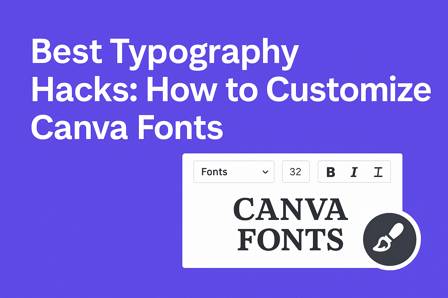
In Canva, fonts are available directly from the text toolbar when you add or select text on your design. Users can click on the font dropdown menu to see a long list of available fonts.
To find the perfect font, typing keywords in the search bar helps narrow options, such as “script,” “bold,” or “handwriting.” Applying filters like font style or popularity also speeds up the search.
For faster access, it’s useful to save favorite fonts. Canva allows users to mark certain fonts as favorites, so they can quickly use them in future projects without searching again.
Understanding Font Types in Canva
Canva offers various font types suited for different design needs. These include:
- Serif fonts: Have small lines at the ends of letters, good for formal and printed text.
- Sans-serif fonts: Simple and clean, ideal for digital work or headlines.
- Script fonts: Mimic handwriting or calligraphy for elegant or casual looks.
- Display fonts: Bold, decorative fonts used mainly for attention-grabbing titles.
Each font type serves a purpose, so selecting one that fits the message helps keep designs clear and eye-catching.
Exploring Free vs. Premium Fonts
Canva provides thousands of fonts, but not all are free. Free fonts cover most basic needs and work well for many projects.
Premium fonts require a Canva Pro subscription or a one-time purchase. They offer unique styles and more variety. These fonts can make designs stand out in competitive presentations or branding.
Users can also upload custom fonts with Canva Pro, which helps maintain brand consistency by using specific fonts not available in Canva’s library.
Choosing between free and premium fonts depends on budget and design goals. Knowing these options allows users to make smart choices for each project. For detailed steps on adding fonts, users can check guides like this How to Add Fonts to Canva.
Customizing Font Styles for Unique Designs
Customization of fonts in Canva plays a major role in making designs stand out. Adjusting font styles, weights, and blending different text types can give a personal touch and make messages clearer.
Changing Font Style and Weight
Changing font style means picking different fonts like serif, sans-serif, or script to fit the design’s tone. Weight refers to how thick or thin letters look, such as bold or light.
Using different weights creates contrast and highlights important text. For example, making a headline bold while keeping body text regular helps guide the reader’s eye.
Canva makes it easy to switch font styles and weights. Adjusting these elements adds variety without cluttering the design.
Using Handwritten and Decorative Fonts
Handwritten fonts add a personal, casual feel to designs. These fonts often look like natural handwriting or calligraphy, making the text feel friendly or artistic.
Decorative fonts include fun symbols, unique shapes, or playful designs. They work best for titles, invitations, or kid-friendly projects where more flair is welcome.
It’s important to use these fonts carefully. They can be hard to read in large blocks, so they work better in smaller doses like headings or logos. They bring personality but should not overpower the main message.
Combining Multiple Text Elements
Using several text elements in one design helps create hierarchy and interest. This can mean mixing font types, weights, and sizes in a balanced way.
For example, pairing a clean sans-serif font with a decorative or handwritten font can make titles pop while keeping the body text simple and readable.
Canva allows users to layer text boxes to control spacing and alignment. This technique helps craft eye-catching layouts that guide viewers through the design smoothly. Mixing text styles carefully improves both style and clarity.
For more tips, see how to customize fonts to improve your designs.
Mastering Font Sizes and Scaling
Choosing the right font size and scaling is key to making text clear and visually appealing. Size changes can guide the reader’s eye, create focus, and improve the overall flow of your design. It helps to know when to use big, bold fonts and when smaller sizes work better.
Adjusting Font Size for Headlines and Body Text
Headlines usually need larger and bolder fonts to grab attention. Using font sizes that stand out makes the main message clear right away. A common approach is a big size for headlines, such as 36-48 points, paired with a smaller size like 12-16 points for body text.
For body text, legibility is more important than style. Simple fonts at a comfortable size keep paragraphs easy to read. Consistent spacing between lines also helps maintain clarity. Balancing sizes prevents the design from feeling crowded or too empty.
Responsive Typography Techniques
Text should adapt well to different screens. On mobile or smaller devices, font sizes often need to be smaller but still readable. Designers can use tools to set font scaling rules that adjust size based on screen width.
This technique avoids tiny text on phones and overly large text on desktops. Using relative units like em or rem instead of fixed pixels helps maintain good scaling. Responsive typography ensures the design looks good everywhere without losing readability or style.
Optimizing Font Size for Readability
Clear, easy-to-read text keeps users engaged. Fonts that are too small strain the eyes, while fonts that are too large can feel overwhelming. A good size range for most reading is between 14 and 18 points for body text.
Adjusting font weight alongside size can improve clarity. For example, bolder fonts for important points and lighter fonts for less critical info create a visual hierarchy. Using these techniques prevents fatigue and encourages users to consume more content.
Discover more about adjusting fonts for better designs in this guide on how to customize fonts to improve your designs.
Advanced Typography Settings in Canva
Adjusting the spacing of letters and lines can make a big difference in how text looks and reads. Small changes improve clarity and style. These settings help make text neat and balanced, fitting well within a design.
Fine-Tuning Letter Spacing
Letter spacing controls the space between individual letters. Increasing spacing can make text look lighter and more open. Decreasing it tightens up letters, which works well for bold headlines.
In Canva, users adjust letter spacing using the “Spacing” option in the text toolbar. Sliding it right increases space, while sliding left makes letters closer. It’s useful when trying to balance text size and fit within shapes or boxes without changing the font.
Proper letter spacing helps avoid crowded or hard-to-read text. For example:
| Effect | When to Use |
|---|---|
| Wider spacing | For elegant headings or titles |
| Narrower spacing | For compact design or logos |
This tool is key to refining typography and making designs look polished.
Line Spacing for Improved Readability
Line spacing, or leading, is the amount of space between each line of text. Good line spacing prevents text from looking too cramped or too loose.
Canva users can change line spacing under the same “Spacing” menu where they find letter spacing. Increasing line spacing improves readability for long paragraphs or body text. It gives lines room to breathe.
For short text blocks or headings, smaller line spacing keeps the content tight and focused. Adjusting line spacing helps maintain balance in the design and guides the reader’s eye smoothly from line to line.
Both letter and line spacing settings are essential for making text easy to read and visually appealing in any project. For more on formatting text, check out Canva Advanced Formatting.
Elevating Designs With Font Effects and Enhancements
Using font effects smartly can make text stand out in Canva designs. Adjusting shadows, outlines, glows, and colors adds depth and personality. Simple text tweaks also improve readability and draw attention where it matters most.
Adding Shadows, Outlines, and Glows
Shadows add depth by creating a soft or sharp contrast behind the text. Canva lets users control shadow blur, direction, and transparency to create subtle or bold effects. Outlines frame the letters, making fonts more visible on busy backgrounds.
Glows give text a soft, luminous edge. This effect works well for headings or callouts. Combining shadows with glows can create layered looks that make fonts pop without overwhelming the rest of the design.
Creative Uses of Uppercase and Underline
Uppercase letters bring emphasis and uniformity. Using all caps on titles or short phrases can make messages clearer and visually striking. Lowercase text, by contrast, works better for longer reads and smaller text blocks.
Underlining in Canva can highlight key words or phrases but should be used sparingly to avoid clutter. Combining uppercase text with underline can create a bold statement if balanced well with spacing and font style.
Color Customization for Fonts
Color choice changes how text feels and how easy it is to read. Canva offers a palette to match fonts with backgrounds, ensuring contrast and harmony. Bold colors draw the eye, while muted tones create calmness.
Using gradients or dual colors within text is also possible, adding unique style. Adjusting transparency on colors can soften text, making it blend better with other design elements. Proper color use strengthens the message and guides the viewer’s focus.
For more on adding depth and dimension to fonts, explore Canva’s free text effects.
Best Practices for Pairing and Combining Fonts
Choosing the right fonts together can make a design clear and attractive. It’s important to create balance and keep the message easy to read. Combining fonts strategically helps guide the viewer’s eye and supports the tone of the design.
Font Pairing Techniques in Canva
In Canva, pairing fonts starts with picking one main font for headings and another for body text. A common technique is to combine a serif font with a sans-serif font to create contrast and interest. For example, a bold serif title with a clean sans-serif paragraph works well.
Using Canva’s font pairing suggestions can save time. Try to avoid using more than two or three fonts in one design. Mixing fonts that have similar x-heights and weights helps maintain harmony.
Maintaining Consistency Across Designs
Consistency means using the same font combinations throughout a project. It builds a professional look and makes content easier to follow. Using preset Canva styles or saved brand kits helps keep fonts uniform.
It’s best to choose fonts that work well in different sizes and formats. For example, a font should look good on both a website header and a small caption. This avoids awkward changes that distract viewers.
Choosing Fonts for Mood and Messaging
Fonts carry emotions and meanings. A playful script font can suggest creativity, while a clean sans-serif might feel modern and serious. Canva offers many font styles, so picking one that fits the design’s purpose is key.
Consider the audience and message when selecting fonts. For educational content, clear and simple fonts improve readability. For promotional material, fonts with personality can encourage engagement.
For more detailed tips on font combinations, check font pairing techniques on platforms like Canva.