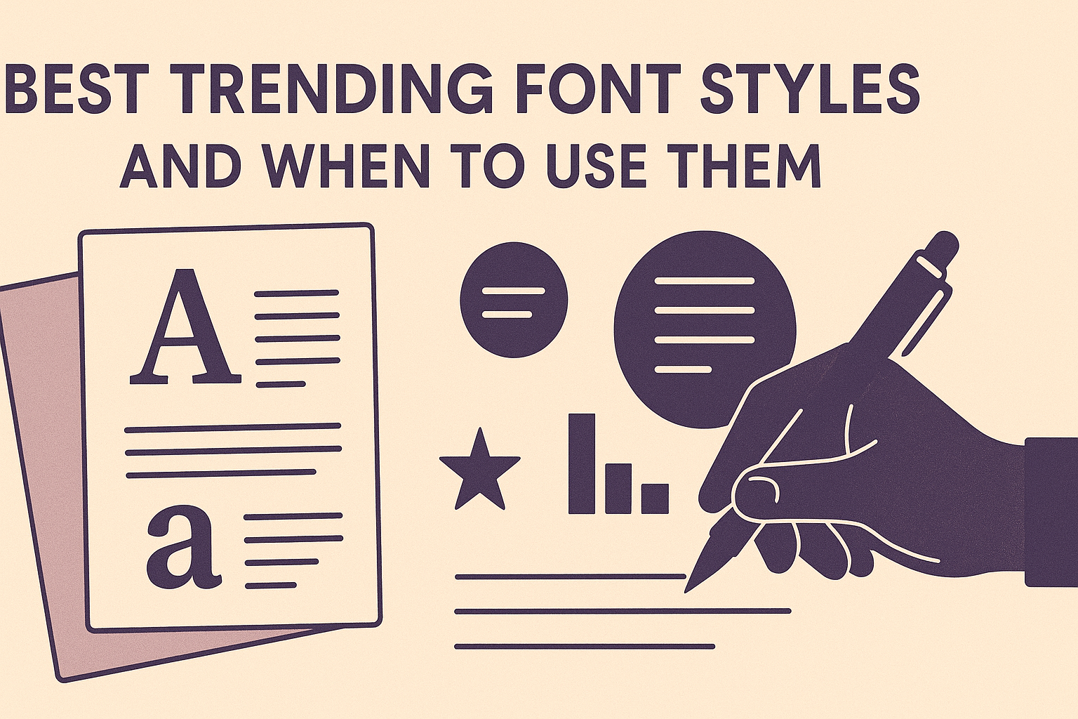
Choosing the right font style can make all the difference in how a message is received. The best trending font styles are those that match the purpose and tone of a project, whether it’s sleek and modern for tech brands, elegant serifs for luxury, or playful fonts for creative work. Knowing when to use these fonts helps designers create clear, effective, and attractive designs.
Fonts are more than just letters; they set the mood and guide the reader’s attention. From minimal sans-serifs for clean digital layouts to bold, expressive typefaces for eye-catching headlines, each style has a specific role. Staying updated on these trends means their work feels fresh and relevant.
Designers today balance classic looks with new tech, like variable fonts that adapt to different needs. This flexibility lets them craft unique brands while keeping text easy to read. For more details on top fonts and trends, check out popular typography guides from 2025.
Understanding Font Styles and Typography Trends
Fonts and typography change over time, shaped by how people use them and what looks fresh and useful. Trends in font styles are driven by creativity, technology, and the need to connect with different audiences. Designers play a big role in choosing which styles catch on and how they fit into modern design projects.
What Makes a Font Style Trendy
A font becomes trendy when it offers something new or fits the current cultural mood. Trends often start with unique features like variable weights, handcrafted looks, or tech-driven styles such as AI-generated fonts.
Fonts that combine style with function, like improving readability or adapting to different screens, tend to become popular. Also, nostalgia influences trends; retro or vintage fonts often resurface when people want a familiar or emotional feel.
Trendy fonts usually have a balance of creativity and usability. They must look good but also work well in digital or print forms, matching the brand’s personality or the project’s goal.
The Role of Typography in Modern Design
Typography shapes how people feel about what they read. It goes beyond just picking a pretty font—good typography guides the reader’s eyes and enhances the message clearly.
In modern design, typography is part of user experience (UX). Fonts that adjust to screen size, weight, and spacing improve usability on websites and apps. Trends like variable fonts help designers create flexible, efficient layouts.
Typography also builds brand identity. Choosing the right font creates a mood, sets tone, and helps make a design memorable. That’s why typography trends focus on balancing expression with clarity to meet audience needs.
How Designers Influence Font Trends
Designers are like trend spotters and creators. They experiment with new styles and tools, such as AI-driven font design or 3D type, pushing typography forward.
Their work in branding, advertising, and digital media often sparks new font trends. By mixing traditional styles with fresh ideas, designers shape what becomes popular.
Moreover, designers respond to user feedback and tech changes. They embrace fonts that improve accessibility and performance, like hyperlegible or low-impact digital fonts. This practical approach helps trends stay relevant while making design better for everyone.
For more on these topics, see top font design trends in 2025.
Serif Fonts: Classic Elegance for Modern Use
Serif fonts offer a timeless look that blends tradition with today’s design needs. They balance authority and style, making them a great choice for brands that want to feel both trusted and modern. Using serif fonts carefully can add sophistication without feeling old-fashioned.
When to Use Serif Fonts in 2025
In 2025, serif fonts work best in industries where trust and professionalism matter. Fields like law, finance, consulting, and fashion often use serifs to communicate credibility and class. Serif fonts are also favored for printed materials such as books, magazines, and formal reports.
Using serif fonts on digital screens requires care. They are not ideal for small or long-form text online because the tiny strokes can blur. However, serifs shine in logos, headlines, and branded print materials where clarity and style are key.
Popular Serif Font Examples: Garamond, Playfair Display
Garamond is a classic serif font known for its readability and elegance. It dates back to the 1500s and remains popular in books and editorial design. Garamond offers smooth curves and balanced proportions that work well in both print and screen layouts.
Playfair Display is a modern serif that feels both stylish and bold. It’s often used for website headlines, fashion branding, and editorial projects. The font’s high contrast between thick and thin strokes adds drama without losing readability.
Both fonts are favorites in graphic design for creating a sophisticated feel. Garamond is calm and traditional, while Playfair Display delivers more flair and impact.
Combining Serif Fonts for Impact
Pairing serif fonts with other types can boost your design’s appeal. A common practice is to use serif fonts for headings and pair them with sans serif fonts for body text. This mix balances tradition with a modern edge and improves readability on screens.
For example:
| Heading Font | Body Font | Use Case |
|---|---|---|
| Playfair Display | Helvetica | Fashion websites |
| Garamond | Arial | Print reports |
| Larken (serif) | Open Sans | Corporate branding |
Using two serif fonts together can also work if they have different styles—such as a classic serif with a more decorative one. This approach creates visual interest while keeping harmony in branding or editorial design.
Combining carefully helps carry the personality of a serif font into modern projects without losing clarity or style.
Sans-Serif Fonts and Minimalist Style
Sans-serif fonts are known for their clean, simple lines and lack of decorative strokes. They fit well with minimalist design, which focuses on clarity and easy reading. These fonts keep the look fresh and modern while adapting well across many digital and print platforms.
Benefits of Minimalist Sans-Serif Fonts
Minimalist sans-serif fonts improve readability by using clear, open characters without extra details. They reduce visual clutter, making text easier to scan on screens of all sizes. This simplicity helps people focus on the message without distractions.
These fonts are also highly versatile. Their neutral style suits many industries, from tech startups to fashion brands. Designers appreciate how minimalist sans-serif typefaces work well in logos, websites, and app interfaces, offering consistency and professionalism with a modern edge.
Top Sans-Serif Fonts in 2025: Roboto, Helvetica Now
Roboto is a standout minimalist sans-serif font designed for screens. Created by Google, it balances mechanical shapes with natural curves, making it friendly but precise. It supports many weights, which helps designers maintain hierarchy in text while keeping things clean.
Helvetica Now updates the classic Helvetica with better spacing and modern refinements. It is sharp and neutral, fitting luxury and corporate designs perfectly. Though premium, it continues to be popular because it handles both print and digital uses with clarity and style.
| Font | Style | Use Case | Availability |
|---|---|---|---|
| Roboto | Friendly, Clean | Apps, websites, digital media | Free (Google Fonts) |
| Helvetica Now | Sharp, Neutral | Branding, print, UI design | Premium |
Best Uses for Sans-Serif Typefaces
Sans-serif fonts excel in places where clarity matters most. They work great for body text on websites and apps since their clean shapes improve legibility at small sizes. Headings and logos also benefit from their bold, modern look.
Minimalist sans-serif typefaces are ideal for tech brands, startups, and minimalist portfolios. They create a professional, straightforward impression that feels contemporary. They also pair well with serif fonts when a design needs a mix of elegance and readability.
For designers aiming to keep communication tight and clear, sans-serif fonts provide a flexible foundation that adapts to many projects and screen sizes. Applying these fonts carefully can make any design feel current and easy to read.
For more on popular sans-serif fonts like Roboto and Helvetica Now, check out trending modern sans serif fonts in 2025.
Display and Retro Fonts: Making a Bold Statement
Bold fonts create strong visual impact and give designs personality. They help communicate mood and grab attention quickly. Using the right display or retro font can make a project stand out in branding, posters, or social media graphics.
When to Choose Display Fonts
Display fonts are perfect when a design needs to catch the viewer’s eye fast. They work best for headlines, logos, or short phrases where style matters more than reading long text. Their bold shapes and unique features add character without extra imagery.
Designers often use display fonts in places like:
- Website headers
- Event posters
- Brand logos
- Social media ads
Because they can lose clarity in small sizes, display fonts shouldn’t be used for body text. Instead, they shine when paired with clean, simple fonts that support readability.
Popular Display Fonts: Cooper Black, Pacifico
Cooper Black is a chunky serif font with a soft, rounded look. It feels friendly and retro, making it a favorite for brands wanting a warm, nostalgic vibe. Its thick strokes are great for attention-catching titles and packaging.
Pacifico is a cursive display font with a playful, casual style. It’s often used to add a handmade, vintage feel to designs. It works well for logos, invitations, or anywhere a stylish, flowing font suits the mood.
Both fonts bring personality without overwhelming the message and are popular choices in graphic design for their bold, expressive qualities.
Incorporating Retro Fonts in Design
Retro fonts tap into nostalgia by bringing styles from the 70s, 80s, and 90s. This makes them ideal for projects that want to evoke past decades or add vintage charm. Retro fonts often have bold shapes, unique curves, or pixel-inspired forms.
Designers use retro fonts to:
- Add warmth and personality
- Connect with audiences who appreciate vintage style
- Make products and ads feel classic yet fresh
When using retro fonts, pairing them with modern elements keeps designs balanced and avoids dated looks. Designers often choose retro fonts for fashion, music, or lifestyle brands wanting to make a statement with a bold past-inspired font.
More on effective display fonts can be found at The Return of Display Fonts: Bold Choices in Modern Design.
Variable Fonts: Flexibility for the Future
Variable fonts offer a smart way to use one font file for many styles. They give designers detailed control over weight, width, and slant without juggling multiple files. This saves space and speeds up website loading while keeping typography sharp and adaptable.
Overview of Variable Font Technology
Variable fonts combine many styles in a single file. Instead of separate fonts for Light, Bold, or Italic, one file adjusts these styles smoothly along axes like weight, width, and slant.
Browsers use CSS properties like font-variation-settings or standard ones such as font-weight and font-style to control these changes. This reduces page load times because fewer requests are needed.
This approach also supports responsive design. A font can get bolder on larger screens or lighter on small devices, improving readability everywhere.
Popular Variable Fonts: Roboto Flex
Roboto Flex is a popular choice in the variable font world. It flexibly covers a wide range of weights and widths, making it useful for many design needs.
Created by Google, Roboto Flex balances modern looks with readability. It works well for digital screens and print alike.
Because Roboto Flex supports different “axes,” designers can fine-tune text style with great precision. This helps brands maintain a consistent yet adaptable look across platforms.
Best Practices for Using Variable Fonts
Start by choosing a variable font that fits your project. Google Fonts offers many free options like Roboto Flex.
Use CSS properties like font-weight, font-stretch, and font-style to access variations easily. Always include fallback fonts for older browsers that don’t support variable fonts fully.
Test your font across devices and screen sizes to ensure it remains clear. Using variable fonts especially improves performance on mobile, where loading speed matters most.
Pairing variable fonts with good spacing and contrast helps keep text legible and attractive.
How to Choose the Right Font Style for Your Project
Choosing the right font style starts with understanding the message and the people the design aims to reach. Each font carries a tone that can either strengthen or weaken the overall impact. It’s important to consider the voice, audience, and how fonts work together to create a clear, attractive design.
Assessing Your Brand’s Voice
Designers begin by defining the brand’s personality. Fonts should reflect whether the brand feels formal, playful, modern, or traditional. For example, serif fonts often suggest trust and professionalism. On the other hand, sans-serif fonts give a clean, modern look.
A luxury brand might choose elegant scripts or refined serifs, while a tech startup may prefer bold, geometric sans-serifs. Sticking to a consistent style supports the brand identity across different materials and platforms.
Matching Fonts to Target Audiences
Fonts influence how people feel about a message. It is key to choose fonts that connect with the audience’s preferences and expectations. For children’s products, designers might use playful, rounded fonts for a fun, friendly vibe. Adults might respond better to clear, simple fonts that are easy to read and not distracting.
Audience age, culture, and reading habits all affect font choice. Accessibility matters too; fonts must be legible and comfortable for a wider range of users, including those with visual impairments. Designers often test fonts at different sizes and on various devices to ensure clarity and engagement.
Font Combinations and Pairings
Great designs usually use more than one font, but combining fonts takes skill. Good font pairings balance contrast and harmony. Typically, combining a serif font with a sans-serif creates a clear hierarchy and visual interest without clashing.
Designers limit font usage to two or three per project to keep the look clean. Display or decorative fonts work well for headers, while simple serif or sans-serif fonts serve best for body text. For examples of effective pairings, exploring font resources can help find tested matches.
Learn more about pairing and choosing fonts from this ultimate font guide.