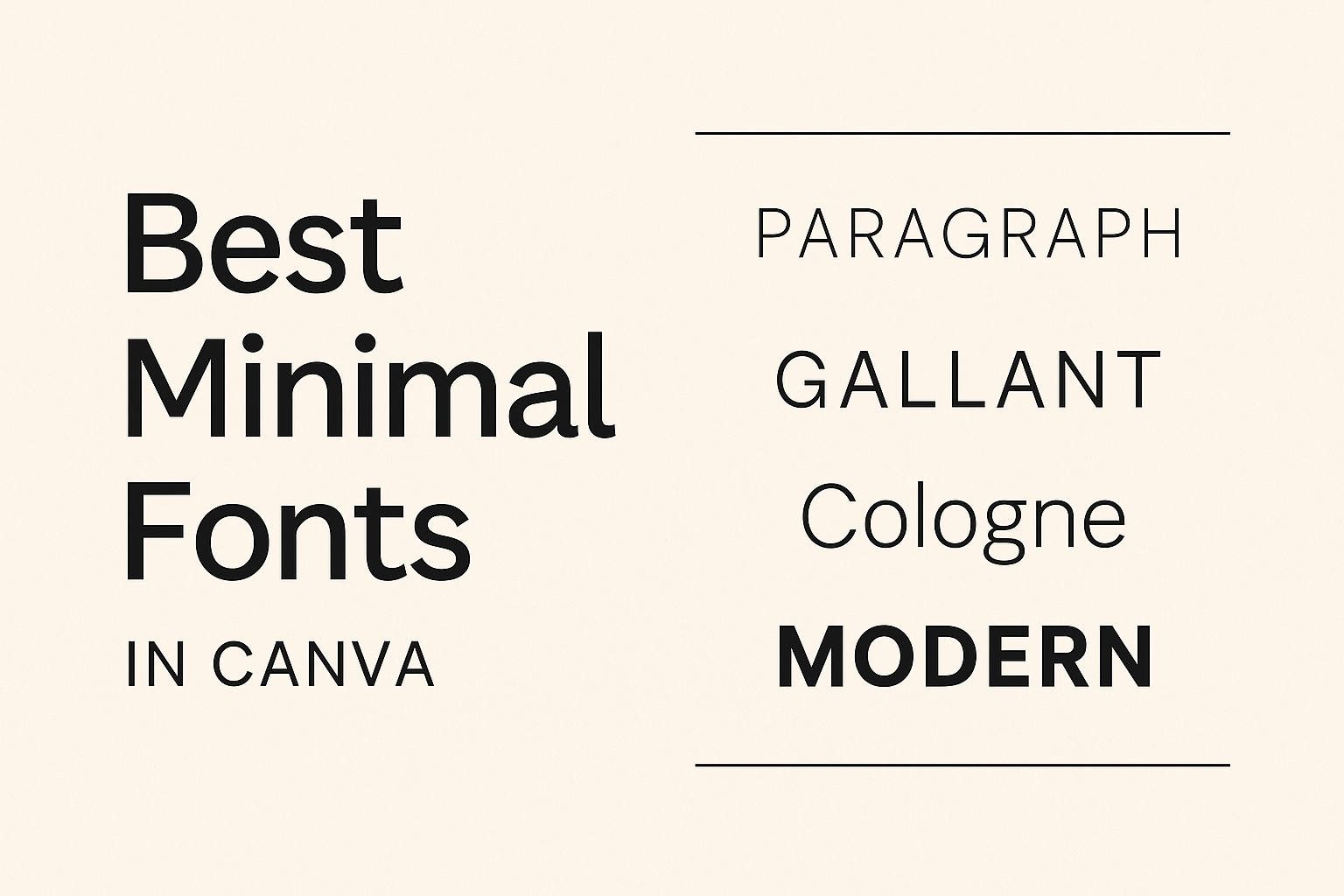
Designers love using minimalist fonts in Canva to make their projects look sleek and modern. These fonts are popular because they have clean lines, simple shapes, and a fresh look that fits almost any design need.
Whether crafting a logo or designing a webpage, these fonts offer versatility and style.
Some of the best minimalist fonts on Canva include options like Roboto and Nunito Sans, known for their readability and sophisticated look. Roboto is particularly favored for its easy readability on any background, while Nunito Sans is praised for its well-balanced, circular forms that are perfect for web content.
Exploring these font options can help make any design stand out. Whether someone is a professional designer or just getting started, Canva’s selection of minimalist fonts provides an excellent toolkit for creating eye-catching graphics.
Understanding Minimal Fonts
Minimal fonts focus on simplicity and clarity, making them ideal for clean and modern designs. They often feature straightforward, geometric shapes that enhance readability and maintain a balanced aesthetic.
History of Minimalist Typography
Minimalist typography started gaining attention in the early 20th century, influenced by movements like Bauhaus and Swiss design. These styles emphasized function over form and used typography to create clear, easy-to-read designs.
In the digital age, minimalism transformed into a staple of web and app design, focusing on user experience and accessibility. Sans-serif fonts became popular choices for their clean lines and simplicity.
Designers sought to reduce clutter and streamline visuals, leading to the widespread incorporation of minimal typography into branding and digital media.
Characteristics of Minimal Fonts
Minimal fonts are defined by their simplicity and efficiency. They typically have clean lines, uniform strokes, and balanced spacing. This creates a straightforward appearance that is easy on the eyes.
Several features stand out in minimal fonts. They often lack decorative elements, focusing instead on functionality.
Sans-serif fonts are a common choice due to their straightforward appearance. Additionally, minimal fonts often use geometric shapes and consistent weight, contributing to their balanced and modern look.
Benefits of Using Minimalist Fonts in Design
Minimalist fonts offer several advantages in design. Their clean, uncluttered look improves readability, making them ideal for various platforms, from websites to print media. This is important for maintaining user engagement and ensuring information is clear.
These fonts also provide versatility. Whether used in tech startups or editorial layouts, their simplicity complements many styles.
By creating a sharp, contemporary look, minimalist fonts help convey professionalism and modernity. Designers appreciate their ability to pair well with other design elements, creating cohesive and appealing compositions.
Selecting the Right Minimal Font for Your Canva Project
Picking the perfect minimal font for your Canva project involves balancing readability, effective font pairing, and aligning with your brand’s identity. Each factor plays a vital role in ensuring your design looks professional and communicates effectively.
Readability and Legibility
When selecting a font, readability and legibility are key. Fonts like Roboto and Quicksand have clean lines that remain easy to read in various sizes. Simple and straightforward designs make these fonts a great choice for both body text and headings.
Consider how the font will appear on different backgrounds and devices. Choosing a font that maintains its clarity across platforms ensures your message is communicated effectively to your audience. This is especially important for designs intended for web or mobile use.
Font Pairing Strategies
The right font pairing can elevate the visual appeal of your design. Combining a minimalist sans-serif font like Nunito Sans with a more decorative option adds contrast without overwhelming the viewer.
Mixing fonts with contrasting weights or styles can create a dynamic yet harmonious appearance. Canva provides a selection of pre-made pairings that serve as a helpful starting point. They can inspire new ideas and ensure a balanced design.
Considerations for Brand Identity
The font you choose should align with your brand’s identity. A brand focused on technology might prefer a modern, geometric font like Alata. In contrast, a hand-crafted brand might lean towards a warmer, rounded font such as Quicksand.
Think about the message and emotion each font conveys. Fonts play an essential role in branding as they visually communicate the personality and values of a business. Ensuring the chosen font supports your brand’s voice helps to reinforce recognition and brand loyalty.
Top Minimal Fonts in Canva
Canva offers a variety of minimalist fonts that cater to different design needs. From clean sans-serif choices to elegant serif selections, these fonts enhance clarity and style. Some are perfect for modern digital themes, while others add a touch of classic elegance.
Sans Serif Favorites
Sans-serif fonts are popular for their clean and modern look. In Canva, fonts like Code are ideal because of their straightforward, balanced design. This font is great for tech-focused or minimalist designs, offering clarity and simplicity in every project.
Roboto is another excellent choice. It’s a versatile option, fitting well on any background and known for its readability.
Nunito Sans is also worth mentioning. This typeface is friendly and approachable, making it suitable for web content and tech startups. Its circular design ensures easy readability while maintaining a sleek appearance.
Serif Selections
Serif fonts add a touch of elegance to minimalist designs. Though less common, they can provide a sophisticated flair. Joliet stands out despite not being a free option on Canva. Its delicate lines and broad shape give it a stylish yet understated presence.
Another notable serif font is Cormorant, known for its classic design. It offers a blend of tradition with modern minimalism, making it a favorite for designers looking to add a hint of sophistication. These serif selections balance tradition with simplicity, perfect for anyone seeking elegant minimalism.
Specialty Minimal Fonts
Specialty fonts often include unique features that set them apart while maintaining a minimalist ethos. Fonts like Kolikö are noted for their geometric structures. With three weights available, Kolikö offers flexibility in design without losing its minimalist appeal, making it a popular choice for creative projects.
Another specialty font, Open Sans, adapted from the classic sans-serif style, is widely appreciated for its neutrality and universality. Its legibility and simplicity make it a staple in minimalist design. Specialty fonts like these offer diversity in design while sticking to minimalistic principles.
Using Minimal Fonts Effectively
Minimal fonts can make designs look clean and modern. To use them effectively, consider hierarchy for emphasis, choose colors for contrast, and pay attention to spacing for proper alignment.
Hierarchy and Emphasis
Establishing a clear hierarchy helps guide the viewer through the content. Start by selecting a bold minimal font for headings to grab attention. This can be complemented by pairing it with a lighter font for body text.
Emphasis can be achieved by varying font sizes or using styles like bold or italic sparingly. Keep headings larger and more prominent to naturally lead the eye through the design. This approach ensures each section of text stands out and serves its purpose.
Color and Contrast
Choosing the right colors can make a big difference when working with minimal fonts. High contrast can make text clearer and easier to read.
For example, try using a dark font on a light background or vice versa. This helps improve readability and draws attention to key parts of the design.
Be mindful of the color scheme to ensure it reflects the message or feeling you want to convey. Soft, neutral colors often work well with minimal fonts, but don’t be afraid to use bright colors for emphasis. Testing different color combinations is a great way to see what stands out.
Spacing and Alignment
Proper spacing and alignment are crucial for minimal font designs. Use generous spacing between lines and letters to make text more legible and give designs a clean look. This makes the content feel more organized and easier on the eyes.
Pay attention to the alignment of text, ensuring consistency throughout the design. Left alignment often works best for readability, but centered or right alignment can be effective for specific design elements.
Uniform spacing and alignment add structure and prevent clutter, enhancing the minimalist aesthetic.
Customizing Fonts in Canva
Customizing fonts in Canva allows users to tailor text to fit specific design needs. This includes tweaking font weight and size, adding creative text effects, and establishing unique brand fonts. Each adjustment can significantly enhance the design’s aesthetic.
Adjusting Font Weight and Size
In Canva, adjusting the font weight and size is straightforward. Font weight determines the thickness of the letters, ranging from thin to bold.
Changing the weight can make text more prominent or subtle, depending on the design’s intent.
To adjust the size, users can simply click on the text box and select a size from the toolbar. This tool also allows for manual entry of specific sizes if a more precise adjustment is needed.
Through these settings, designers can make the text bigger for emphasis or smaller for subtlety.
Adding Text Effects
Canva offers a variety of text effects to enhance visual appeal. Users can apply shadows, outlines, or gradients to add depth.
To access these effects, click on the text box, select “Effects,” and choose from the available options.
The “Shadow” effect gives text a three-dimensional look, while “Outline” creates a border around the letters. Gradients can add dynamic color transitions, perfect for adding flair to a design.
These tools help make the text stand out or blend with the background, depending on what the project needs.
Creating Brand Fonts in Canva
Creating brand fonts in Canva helps maintain consistency in visual identity.
Users can upload custom fonts to the platform, ensuring their brand’s look stays unique. This option is available for Canva Pro users.
Designers can access this feature by navigating to the “Brand Kit” section.
Here, they can upload custom fonts and set specific styles, such as heading and subheading fonts.
Utilizing custom fonts ensures that all branded materials maintain a cohesive look, crucial for professional and recognizable branding.