Choosing the right font can make a big difference in design.
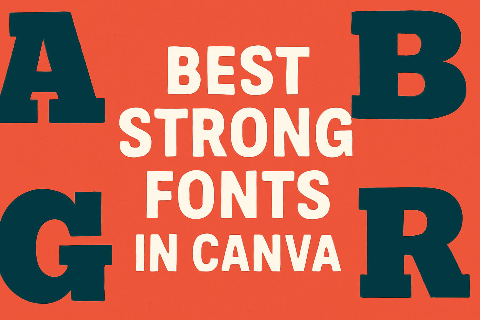
When it comes to creating eye-catching graphics in Canva, strong fonts can truly elevate any project. The best strong fonts in Canva help capture attention and convey messages effectively, making them perfect for social media posts, branding, and marketing materials.
Many designers turn to Canva for its wide selection of fonts that suit various styles and purposes.
From bold display fonts to more rugged options, these typefaces can help set the tone for any design.
By using strong fonts, one can create graphics that resonate with their audience and stand out in a crowded digital space.
This guide will explore some of the top strong fonts available in Canva. Whether designing a logo, social media graphic, or marketing material, discovering the right font can enhance any visual project.
Understanding Font Strength
Font strength plays a crucial role in design effectiveness. It influences how a message is perceived by the audience.
Strong fonts often convey confidence and clarity, making them ideal for various projects.
Defining ‘Strong’ in Typography
In typography, a ‘strong’ font typically refers to bold styles that stand out in text. These fonts often have thicker strokes, making them more visible.
Characteristics of Strong Fonts:
- Weight: Thicker typefaces are often considered bold or heavy.
- Shape: Geometric or sans-serif styles tend to have a modern, strong feel.
- Contrast: Fonts with high contrast between thick and thin strokes can draw attention.
This strength is important in applications like branding, where readability and presence are vital.
Visual Impact of Bold Fonts
Bold fonts create a noticeable visual impact. They grab attention and help communicate important information quickly.
Benefits of Using Bold Fonts:
- Readability: Bold type is easier to read from a distance, making it perfect for signs or posters.
- Emphasis: They help emphasize key points in text, guiding the reader’s focus.
- Brand Identity: Strong fonts contribute to a brand’s personality, helping to establish recognition.
Using bold fonts in design not only enhances aesthetics but also strengthens the overall message.
Best Practices for Using Strong Fonts
Using strong fonts effectively can greatly enhance designs. It is important to know how to pair them, ensure readability, and maintain brand consistency.
Pairing with Other Fonts
When using strong fonts, it’s important to choose complementary fonts. This can create a balanced and polished look.
A common approach is to pair a bold display font with a clean, simple sans-serif font for body text.
For example:
- Heading: Bebas Neue
- Body: Montserrat
This combination allows the heading to stand out while the body remains legible. Designers should avoid pairing two strong fonts together, as this can create visual chaos. It is best to focus on contrast for a harmonious design.
Considerations for Readability
Readability is crucial when using strong fonts. Designers should consider the size and spacing of the text.
Larger sizes can accentuate strong fonts, but they should not be oversized.
Line height also plays a role. A line height of 1.5 times the font size works well to prevent crowding.
Additionally, choosing the right color contrast between the text and background enhances readability.
For instance, a dark font on a light background is often easier to read.
Maintaining Brand Consistency
Strong fonts can greatly influence a brand’s identity. Designers should ensure that the font aligns with the brand’s message.
Using a limited font palette helps create unity across different mediums.
It is advisable to create a style guide that includes the chosen strong font along with complementary fonts. This guide helps maintain consistency in all communications.
Keeping fonts consistent supports brand recognition, making it easier for audiences to connect with the message.
Popular Strong Fonts in Canva
Canva offers a variety of strong fonts that can elevate design projects. These fonts not only grab attention but also convey a sense of modernity and importance.
Canva’s Champion Gothic
Champion Gothic is a bold sans-serif font that stands out in any design. Its geometric lines and thick stroke weights provide a robust appearance, making it ideal for headlines and logos.
This font works well for both digital and print mediums. It’s particularly useful in advertising materials, where grabbing the viewer’s attention is crucial.
Champion Gothic shines in vibrant colors but remains effective in monochrome designs as well.
For those creating modern interfaces or promotional graphics, this font helps to deliver messages clearly and attractively.
League Gothic and Its Uses
League Gothic is another powerful option that combines vintage flair with modern aesthetics. This sans-serif typeface features tall, narrow letters that create an elegant yet strong impression.
It is perfect for projects meant to evoke a sense of nostalgia or professionalism. The font is often used in posters and magazine headlines, adding a unique touch to visual content.
League Gothic pairs well with lighter fonts, making it versatile for various design needs. Designers appreciate its ability to maintain readability while standing out in crowded layouts.
Anton: The Modern Bold
Anton is a modern font with a bold character that truly commands attention. Its thick strokes and clean lines make it a go-to choice for contemporary projects needing a striking visual impact.
This font is particularly effective for web design, where clarity and boldness are essential.
Anton is often used in banners, logos, and promotional materials.
It combines well with more subtle fonts for effective contrast. With its modern vibe, Anton helps brands create a distinctive identity that resonates with audiences.
Using Strong Fonts for Different Purposes
Strong fonts can enhance any design by grabbing attention and making a statement. They serve various purposes, from drawing the eye to titles to encouraging action. Here are specific ways to use strong fonts effectively.
Effective Headers and Titles
Headers and titles are crucial for capturing attention in any document or design. A strong font helps convey the main message quickly.
For example, using bold fonts like Prisma can create an impactful header. This font’s unique design enhances visibility.
When designing a poster or an article, a strong header should stand out. Pairing a strong font with contrasting colors makes it even more eye-catching. This combination helps guide the reader’s focus right where it needs to be.
Emphasizing Calls to Action
Calls to action (CTAs) guide viewers on what to do next. Using strong fonts for CTAs is essential, as they need to stand out.
For instance, a bold sans-serif font commands attention, urging a quick response.
Employ phrases like “Sign Up Now” or “Get Started Today” in strong fonts. This encourages immediate action.
Choosing colors that contrast against the background will enhance the message.
In promotional materials, strong fonts make the CTA unforgettable. They drive the message home, prompting viewers to engage.
Creating Standout Social Media Graphics
Strong fonts play a vital role in social media graphics by catching the eye of passersby.
In platforms where many images compete for attention, a bold font can make a big difference.
For instance, using Open Sans Bold can provide clarity while remaining modern and appealing.
It’s essential to pair strong fonts with visual elements. Complementing images with striking typography creates a cohesive look.
In stories or posts, a strong font can convey mood and urgency.
When designing, remember that readability is crucial. The font should be legible even on small screens.
Combining strong fonts with vibrant colors will enhance engagement on social media.
Accessibility and Strong Fonts
When choosing strong fonts for design, it’s important to consider accessibility. This ensures that the text is easily read by everyone, including those with visual impairments. Two key areas to focus on are high contrast and legibility.
Best Fonts for High Contrast
High contrast between the text and background is crucial for readability.
Fonts such as Arial, Helvetica, and Verdana are known for their clear lines and simplicity. These fonts provide excellent visibility against various backgrounds.
To enhance contrast further, consider these tips:
- Use dark text on a light background or vice versa.
- Avoid low-contrast color combinations, like light gray on white.
- Utilize bold styles to make important text stand out.
Strong fonts like Roboto and Inter can also work well while maintaining high contrast, making text easier to read.
Ensuring Legibility
Legibility is about how easily text can be read. This involves using the right font size and spacing.
A minimum font size of 12pt is recommended for digital content. This is especially helpful for those who may struggle with vision.
In addition to size, pay attention to letter spacing and line height.
Proper spacing can prevent letters from blending into one another.
For example:
- Increase letter spacing to improve clarity.
- Use line height of at least 1.5 times the font size for better flow.
Fonts designed with these factors in mind, such as DM Sans, cater to accessibility needs while keeping a modern aesthetic.
Technical Considerations
When choosing strong fonts in Canva, it’s important to think about several technical aspects. This includes understanding how font file sizes can affect performance and being aware of licensing and usage rights.
Font File Sizes and Performance
Font file sizes can vary significantly. Smaller fonts are generally faster to load, which is crucial for web projects.
Large files can slow down website loading times, leading to a poor user experience.
Here are some points to consider:
- Web vs. Print: Web fonts need to load quickly, while print fonts can be larger since they won’t affect load times.
- Optimization: Use tools in Canva to optimize fonts for specific projects, ensuring the best performance.
- Testing: Always test how fonts perform on different devices. Some fonts may look great on a computer but not on mobile.
Licensing and Usage Rights
Understanding font licensing is essential to avoid legal issues. Many fonts in Canva fall under different licenses, which dictate how they can be used.
Key points include:
- Personal vs. Commercial Use: Some fonts are free for personal use only. Users should check if a font can be used for commercial projects.
- Attribution Requirements: Certain fonts require users to give credit. It’s important to follow these rules to avoid disputes.
- Availability: Not all fonts are available for all types of designs. Users should review the font’s terms to ensure it fits their needs.
Taking these technical considerations into account will enhance the design process and help maintain professional standards.
Innovative Uses of Strong Fonts
Strong fonts have unique applications that enhance design projects. They can elevate visuals in various areas like motion graphics and emerging trends in typography. Using these fonts creatively can help messages stand out.
Motion Graphics and Animation
In motion graphics, strong fonts play an important role. They grab attention and keep viewers engaged.
Designers often use bold text for titles, subtitles, and transitions to emphasize key points.
For example, Bebas Neue and Montserrat are popular choices. They are clear and powerful, making them perfect for dynamic scenes.
This enhances the overall message and makes it memorable.
Using strong fonts with animations can also create interesting effects. Text can zoom in, fade, or slide, adding excitement to the visual experience.
These techniques keep the audience focused and make information easier to absorb.
3D Typography Trends
3D typography has become increasingly popular in design.
Strong fonts have a natural fit in this trend due to their bold presence. Designers use strong typefaces to create depth and dimension in their work.
This approach offers a tactile quality that attracts viewers.
For instance, designers can utilize fonts like Biryani Heavy, which stands out in three-dimensional designs. The visual weight of such fonts ensures they don’t get lost in complex backgrounds.
When combined with shadows and light effects, strong fonts enhance their impact. They bring life to static designs, making them more engaging.
As 3D typography evolves, strong fonts will continue to be a key element in creating striking visuals.