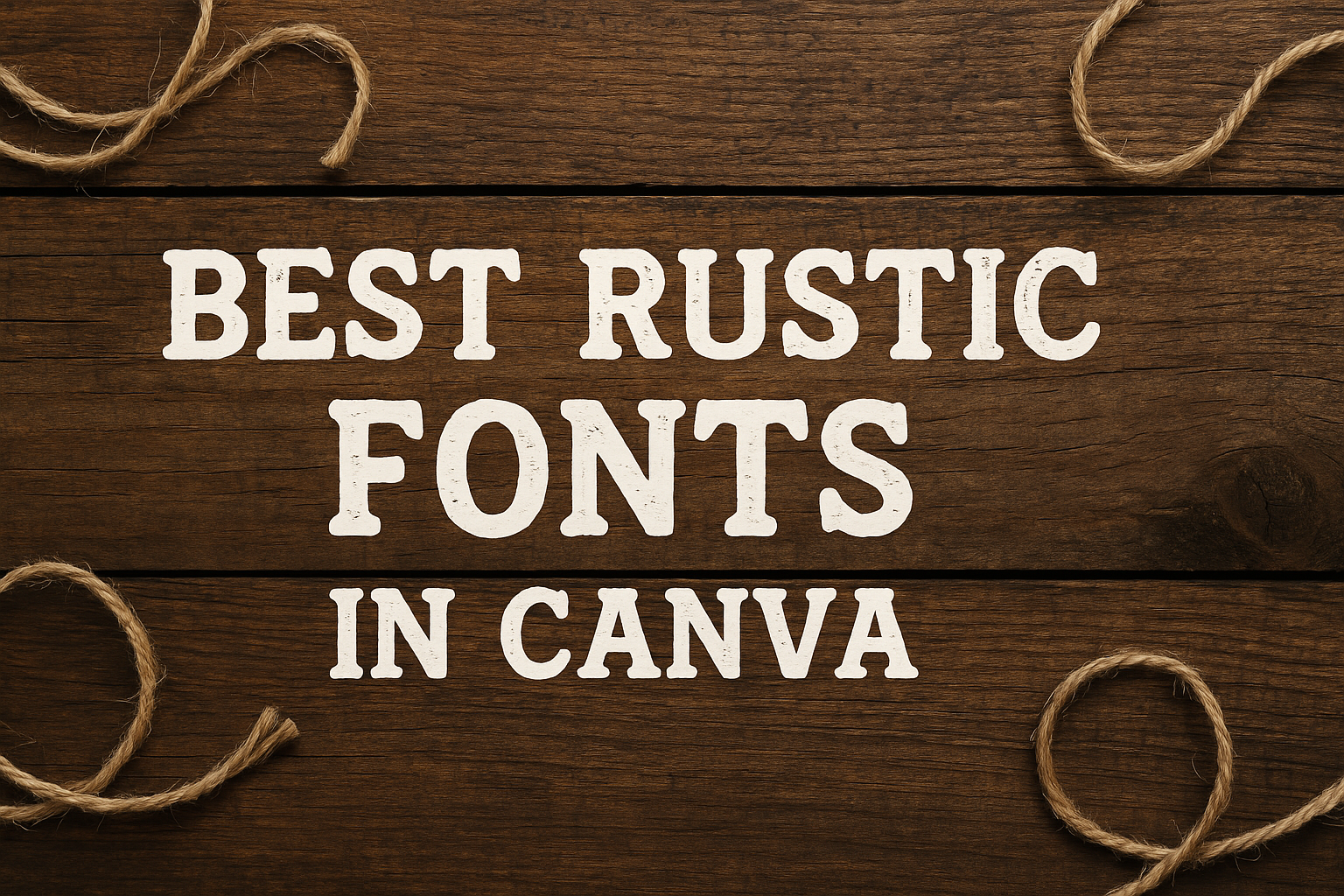
Rustic fonts bring a charming, handcrafted feel to any design project. These fonts are perfect for nature-inspired themes, creating a cozy and welcoming atmosphere.
Whether design enthusiasts are looking for something for wedding invitations or farmhouse-style decor, rustic fonts can add a touch of personality and warmth.
Canva offers a wide range of rustic fonts that cater to different styles and preferences.
For example, Bowl is a popular choice with its rounded edges and minimalist sans-serif style, giving it a nostalgic yet approachable look. For those who prefer a slightly rougher texture, fonts like Chamomile provide a comforting and gentle aesthetic.
Choosing the right rustic font can make any project feel more personal and unique. Designers love these fonts because they evoke feelings of warmth and familiarity, making the audience connect more with the design.
Rustic fonts can transform even the simplest of projects into something memorable and engaging.
What Are Rustic Fonts?
Rustic fonts bring a natural, rugged charm to designs. Drawing inspiration from rural aesthetics, these fonts often feature handcrafted elements and simple design.
They work well in vintage-themed projects, giving them a warm, homey feel.
Defining Rustic Typography
Rustic typography encompasses fonts that evoke a sense of the countryside. These fonts often have a rough texture or imperfect lines that mimic hand-drawn styles.
Whether serif or sans-serif, rustic fonts focus on simplicity and readability. Styles can range from bold and chunky to thin and delicate. They are typically used in designs that aim to appear organic and grounded, like invitations for barn weddings or menus for farm-to-table restaurants.
The key is to balance the rugged aspects with clear, readable text, making them versatile for various creative projects.
History and Inspiration
The roots of rustic fonts lie in traditional craftsmanship and rural life. Historically, signage and printed materials in rural areas used hand-etched or manually crafted lettering.
These styles carry elements from the past, celebrating the imperfections and character of handmade work. Designers often draw inspiration from the weathered look of old wood, metal signage, and vintage farm equipment.
By embracing these influences, rustic fonts offer a connection to the past, yet remain popular in modern design. This nostalgic touch makes them perfect for projects that want to communicate warmth, authenticity, and a touch of nostalgia.
Why Choose Rustic Fonts for Your Design?
Rustic fonts bring a special charm to any design. These fonts often have a handcrafted and natural feel, making them perfect for projects that want to convey warmth and friendliness.
They usually feature rough textures, uneven lines, or decorative elements. This helps to give them a homemade look, often making text feel inviting.
Rustic fonts are great for weddings, farmhouse decor, or vintage designs. They work well both in print and digital formats.
For those looking to add a touch of countryside elegance, using rustic fonts can instantly elevate the visual impact of the project. Fonts like “Rasputin” bring an ornate style with intricate details, ideal for a vintage look.
Rustic fonts stand out and make text more memorable. When used in marketing materials, they can create an approachable vibe, helping to connect with audiences on a personal level.
Finding Rustic Fonts in Canva
Finding the perfect rustic fonts in Canva can make a huge difference in the look and feel of your design. By exploring the platform’s interface effectively and utilizing the search and filter features, users can access a variety of stylistic options.
Navigating the Canva Interface
The Canva interface is designed with user-friendliness in mind.
When searching for fonts, users should start by opening a new or existing project. On the left-hand side of the workspace, the sidebar menu provides access to various elements including text options.
To find fonts, select the “Text” tab. This opens a panel with numerous font choices. Users can scroll through popular font categories, easily accessible through this menu.
Familiarity with this layout helps users transition smoothly between different font styles. For rustic fonts, exploring under specific categories like “Sans Serif” or “Script” can lead to exciting finds.
While navigating, users may notice font previews that display how each style looks in real-time.
Using Canva’s Search and Filter Features
To refine the search for rustic fonts, Canva’s search bar is a powerful tool.
By simply typing in keywords such as “rustic,” “vintage,” or “handwritten,” users can quickly locate relevant font styles. This focused approach saves time and ensures more accurate results.
Additionally, the filter options are incredibly useful.
Users can filter fonts by characteristics such as popularity, style, or even by language support. Adjusting these filters allows for a more tailored search experience.
Strategic use of search and filter tools enables users to discover fonts like “Bowl” or “Chamomile,” which are popular for their rustic charm. These features make finding the right font a seamless process for both beginners and seasoned designers.
Top Rustic Fonts in Canva
Canva offers a variety of rustic fonts perfect for creating designs with a natural or vintage feel. These fonts range from elegant to bold and handwritten, providing options for any project that needs a touch of charm and authenticity.
Elegant Rustic Options
Elegant rustic fonts add a touch of class and sophistication to designs. One such font is Bowl, known for its minimalist style and rounded edges, giving it a friendly look.
Another notable mention is Chamomile, which is soft and soothing, much like the tea it’s named after. Yellowtail is another font that brings elegance with its lively script look, perfect for designs aiming to communicate spontaneity and joy.
These fonts are ideal for invites or posters where a refined but relaxed look is desired. They blend well with light backgrounds and simple graphics to maintain a clean appearance.
Bold and Sturdy Picks
For those seeking fonts that make a strong statement, bold rustic options are the way to go.
Fonts like Lumberjack and Brixton are perfect for when you want to combine strength with rustic charm. These fonts pair well with natural imagery and vintage-inspired designs, enhancing their bold presence.
Bowl is also versatile, with its thick, blocky appearance making it a solid choice for impactful headlines. These fonts work best on larger designs like banners, providing high visibility and ensuring the message stands out.
Handwritten Rustic Styles
Handwritten rustic fonts bring a more personal and intimate vibe to any project. These styles are perfect for creating a handmade feel and are great for personal notes or casual invitations.
Rasputin is an excellent choice here, offering a classic vintage look that feels genuine and heartfelt. Coming Soon is another fun option with exaggerated letterforms that show a playful side.
These fonts thrive in settings where creativity and a personal touch are essential. Their charm shines in projects with a warm or nostalgic theme.
Combining Rustic Fonts with Other Elements
When using rustic fonts in design projects, it’s essential to blend them with other elements to create a harmonious look. Pairing fonts wisely and adding relevant graphics or textures can elevate the rustic charm of any design.
Pairing Fonts Effectively
Combining rustic fonts with different types of fonts can create balance and richness in design.
For instance, pairing a rugged, distressed font with a clean serif or sans-serif font helps maintain readability while adding character.
It’s helpful to use contrast to make headlines stand out and keep supporting text simple. This balance improves the look of posters, invitations, or any visual project.
Using rustic fonts like Bowl for titles with a simpler font for body text can create an appealing mix.
Creating a style guide can assist designers in selecting fonts that visually complement each other, ensuring consistency across different design elements.
Adding Graphics and Textures
Incorporating graphics and textures alongside rustic fonts enhances the authentic, natural feel.
Textures such as wood grain or parchment backgrounds can provide a fitting backdrop that complements the font’s aesthetic.
Designs can also include earthy tones that bring a rustic theme together. Adding simple graphical elements like leaves or vintage icons can enhance the nostalgic vibe.
The key is to ensure that elements don’t overpower the text. Elements like those on Pttrns can be paired with elegant fonts to create a harmonious and engaging layout.
Using these techniques, designers can achieve a cohesive and visually appealing rustic design.
Utilizing Rustic Fonts in Various Projects
Rustic fonts offer a charming and earthy feel that can enhance many design projects. They are perfect for creating romantic wedding invitations, unique branding, and eye-catching event flyers.
Wedding Invitations
Rustic fonts can add a romantic and personal touch to wedding invitations. Fonts like “Chamomile” are gentle and soothing, reflecting the warm and intimate atmosphere of a wedding.
The hand-carved look of fonts like “Bowl” gives an authentic feel, ideal for outdoor or country-themed weddings.
Choosing the right color palette is important. Earthy tones like browns, greens, and creams complement rustic fonts beautifully. A well-chosen rustic font can enhance the design, making the invitation feel more personal and special.
Branding and Logo Design
For brands looking to project an authentic and down-to-earth image, rustic fonts can be a perfect choice. Fonts such as “Lumberjack” provide a bold and memorable presence that helps logos stand out.
“Kust,” with its minimalist and clean look, offers a retro-futuristic touch that can appeal to modern brands with a rustic vibe.
When using rustic fonts in logos, balance is key. Pairing these fonts with simple, complementary graphics can create a professional yet approachable brand image.
Companies with themes tied to nature, tradition, or craftsmanship can greatly benefit from this style.
Event Flyers and Posters
Event organizers can use rustic fonts to create a welcoming and warm vibe. Fonts like “Rasputin” are great for creating a vintage look that can draw attention.
Their distressed surfaces make them perfect for community fairs, farmers’ markets, or outdoor music festivals.
To enhance readability, it’s important to select the right size and spacing. Using contrasting colors against the rustic font can make the text pop, ensuring the message is clear to potential attendees. This helps in capturing the essence of the event and draws in the intended audience.
Tips for Maximizing Rustic Font Impact
Creating an impactful design with rustic fonts involves careful attention to font size, color, and layout. These elements help ensure the text is both visually striking and easy to read.
Font Size and Hierarchy
Font size plays a crucial role in drawing attention to specific text elements. Larger sizes are great for titles and headings, giving them a commanding presence. In contrast, smaller fonts are suitable for body text.
It’s important to maintain a clear hierarchy, so the viewer knows where to focus first. Using a mix of font sizes creates a dynamic look that guides the reader’s eye naturally.
Additionally, pairing rustic fonts with more straightforward, clean fonts can help maintain readability, especially in longer text blocks.
Consistent font sizing across similar elements like headings and subheadings can also lend a cohesive and polished appearance to the design.
Color and Contrast Considerations
Color and contrast can significantly impact the readability and aesthetic of rustic fonts.
Dark rustic fonts stand out against lighter backgrounds, making them easy to read. Conversely, light rustic fonts over dark backgrounds create a striking contrast. Colors should complement the rustic style; earth tones like browns, greens, and warm reds often work well.
Experimenting with subtle color gradients can add depth to the text without overwhelming the rustic feel. Using pops of accent colors sparingly can highlight essential words or phrases, increasing the focal points within the design without compromising its rustic vibe.
Spacing and Layout Techniques
Proper spacing and layout enhance the rustic charm and usability of design.
Adequate space between letters ensures readability, especially with distressed or intricate rustic fonts. Kerning adjustments can help balance the look and avoid cramped letters.
On the layout front, centering rustic fonts can create a traditional, balanced look. Alternatively, aligning text to the side can lend a more dynamic and modern feel.
Incorporating generous margins around text blocks can help focus attention and make the rustic design elements pop. Using rustic imagery or textured backgrounds can further emphasize the rustic theme and create a cohesive design.