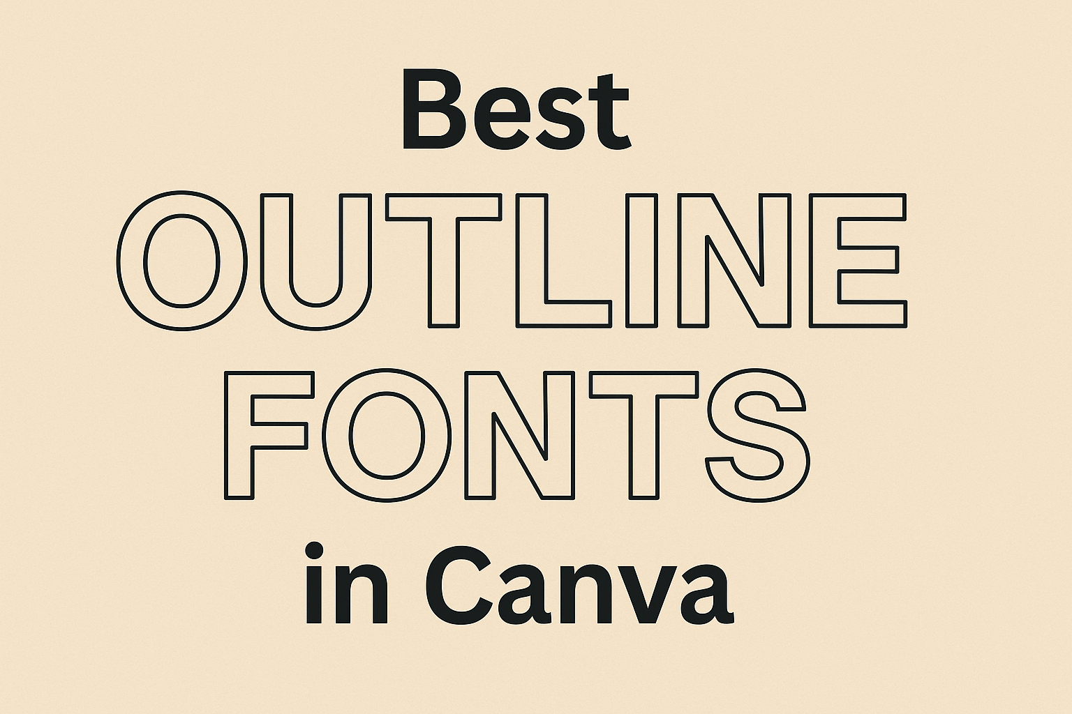
Outline fonts in Canva offer a stylish touch that can elevate any design project. From professional presentations to creative posters, these fonts add depth and personality.
Whether you’re crafting a modern look or something with a classic twist, outline fonts can meet diverse design needs. Choosing the best outline fonts in Canva can significantly enhance the visual impact of your projects.
Designers often seek fonts that not only complement their work but also stand out. Canva’s library includes a variety of outline fonts such as Montserrat Outline and ChunkFive, known for their sleek styles and bold statements.
Each font has its unique charm, providing options for everyone—be it for marketing materials, social media posts, or invitations.
Exploring outline fonts can open up new creative possibilities. Fonts like Metropolis and Blueberry have gained popularity for their versatility and elegant design.
Finding the perfect outline font means balancing aesthetics with functionality, ensuring the text is eye-catching while remaining easy to read.
Understanding Outline Fonts
Outline fonts are unique and stylish. They add a modern and artistic touch to any text. This section explores their definition, key characteristics, and the advantages they bring to design projects.
Definition and Characteristics
Outline fonts are created by using only the outer edges of each letter, leaving the inner part open. This style gives text a hollow look, which makes the letters stand out without being too bold or heavy.
These fonts can be found in various styles, including sans-serif and serif. Some designs have smooth lines, while others feature rough, hand-drawn effects.
The versatility of outline fonts makes them perfect for many design applications. They are often used in headings, logos, and posters. Their unique look allows them to grab attention while still being easy to read when used effectively.
Benefits of Using Outline Fonts
One of the main benefits of outline fonts is their ability to make text eye-catching without overwhelming the viewer. Because they focus on the edges, they create intriguing visual effects and can add depth to designs.
This makes them ideal for creative projects where a modern or artistic flair is desired.
Additionally, outline fonts can enhance readability. By highlighting the outer shape of each letter, they ensure that text remains clear against different backgrounds. This is particularly helpful in digital media, where contrast is key.
Moreover, their flexibility allows designers to customize them with different colors and textures, making them adaptable for various themes and purposes.
How to Access Outline Fonts in Canva
Getting outline fonts in Canva is simple and fun. First, users should log into their Canva account. On the main dashboard, they can start a new design project. Alternatively, they can open an existing one.
Next, users need to click on the Text tool from the side menu. This opens up a wide selection of font options.
To find outline fonts, they should use the search bar. Typing “outline” will display various font choices. Some popular ones include Kompot Display Outline and Arturo Outline.
After selecting a font, they can click on it to add it to their design. It’s easy to adjust the font size and color by using the toolbar at the top.
Here’s a quick list of benefits of using outline fonts in Canva:
- Versatile: Works well with many design styles.
- Stylish: Adds a unique touch to any project.
- Easy to Customize: Change colors, sizes, and more.
If users want a detailed look at some popular outline fonts, they can explore options like Brixton Outline or Kompot Display Outline. Both are known for their striking designs.
Using outline fonts can make any design stand out, offering a fresh and creative look that’s both professional and appealing. Accessing these fonts in Canva is straightforward, making the design experience enjoyable and hassle-free.
Top Outline Fonts on Canva
Outline fonts can add a unique touch to designs, making them stand out. In Canva, there are various options, catering to different needs ranging from modern to playful looks. Here, some popular and user-favorite outline fonts are highlighted.
Popular Choices
Montserrat Outline is a sleek and modern font that brings a contemporary flair to graphics. Its clean lines make it perfect for professional settings or any need for a polished look.
Neoneon provides a vibrant, neon-light effect ideal for nightlife promotions and energetic designs. This font works wonders for projects that aim to convey excitement and mood.
Both fonts can be used effectively in posters, logos, or event banners. They help draw attention and ensure that the text pops. For those wanting to explore more, Graphic Pie’s list of outline fonts is a useful resource.
User-Favorite Picks
ChunkFive stands out with its bold and impactful style. This makes it ideal for statements and eye-catching headlines. It’s a favorite for those wanting to make text the focal point of their design.
Sifonn Outline is loved for its geometric structure and minimalist appeal. It’s often chosen for modern and clean aesthetics, fitting well with minimalist designs or branding projects looking for a refined touch.
These fonts are cherished by users for their versatility and ability to blend into diverse projects efficiently. To explore more user-loved fonts, Canva Templates offers insights.
Using Outline Fonts Effectively
Outline fonts can make your designs stand out with a unique touch. When used well, these fonts bring flair and style to any creative project. Key considerations include how different fonts work together and how well your text can be read.
Combining Fonts
Mixing outline fonts with other font types can create balance and visual interest. For instance, pairing a bold outline font like ChunkFive with a simple sans-serif can make your message pop. This combination allows the outline font to draw attention, while the sans-serif font provides clarity.
Using different font weights can also enhance your design. A light outline font with a heavier regular font creates contrast. Ensure that the fonts complement each other in style. Keep a consistent theme that matches your brand or project’s mood. Testing combinations with short text samples can help find the perfect match.
Contrast and Legibility Tips
Ensuring your text is easy to read is crucial when using outline fonts. Choosing the right background color can make a big difference. Light backgrounds work well with darker outline fonts to maintain clarity. If the text blends with the background, adjust colors or add a shadow effect for better visibility.
The thickness of an outline font affects how it is perceived. Thicker outlines tend to be easier to read from a distance. For more delicate styles like Montserrat Outline, maintain simple layouts to prevent losing detail.
Finally, use outline fonts sparingly in longer text blocks. They are most effective in headings or short phrases where they grab attention without overwhelming the reader. This keeps your design clean and the text easy to process.
Design Inspiration
Outline fonts in Canva offer a unique and stylish way to enhance various design projects. These fonts can add a professional touch to social media graphics, create memorable event invitations, and elevate marketing materials.
Social Media Graphics
In the world of social media, standing out is key. Outline fonts are a great option to make graphics more eye-catching. They can help emphasize quotes, captions, or titles in posts. The clean lines of these fonts make a striking visual, enhancing the overall design.
For Instagram, try pairing outline fonts with vibrant backgrounds to catch viewers’ attention. Meanwhile, on Facebook or Twitter, these fonts can break up dense text and add personality to promotional posts. Their versatility makes them suitable for both playful and professional content.
Event Invitations
Making an event special starts with the invitation. Outline fonts can help create a sophisticated or fun vibe, depending on the event. They work well for birthday parties, weddings, or business gatherings. The mix of bold and hollow letters adds a modern twist to traditional designs.
For a wedding, consider using an outline font for the couple’s names paired with a cursive script for details. For a party, opt for bright colors with playful outlines to convey excitement. The flexibility of these fonts allows for endless creativity, ensuring the invitation matches the event’s theme perfectly.
Marketing Collaterals
Marketing materials need to be both informative and engaging. Outline fonts can make brochures, flyers, and posters more appealing. Their clear lines ensure that key information stands out without overwhelming the reader. This style can be particularly effective in headlines or callouts.
In a professional setting, outline fonts can give a sleek and modern look to presentations or reports, such as Arturo Outline. For promotional flyers, using an outline font can highlight special offers or services. This font style draws attention and can elevate the brand’s image, making marketing efforts more effective.
Customizing Outline Fonts
Customizing outline fonts in Canva allows users to create unique designs that stand out. By adjusting thickness, color, and effects, anyone can tailor their fonts to match personal style or branding needs.
Adjusting Thickness
Adjusting the thickness of outline fonts can dramatically change their appearance and impact. In Canva, users can modify the line weight of these fonts easily. This flexibility is particularly useful for designs that demand a bolder or more delicate touch.
For instance, increasing thickness can make text more prominent, which is great for titles or headlines. Conversely, reducing thickness might work better for subtle background text. Combining different thicknesses within one design can create a dynamic and layered look, catching the viewer’s eye.
Color and Effects
Color is a vital element when customizing outline fonts. Canva offers a wide array of colors to choose from, allowing for a tailored match to any design palette. Using contrasting colors with the text and the outline can make fonts pop and ensure readability.
Adding effects like shadows or gradients can further enhance these outlines. Effects can bring depth and dimension to the fonts, offering an extra level of creativity. Designers can experiment with various combinations of colors and effects to achieve a unique style that enhances their overall design aesthetic. With these tools, every project can become truly unique and visually appealing.
Practical Tips for Selection
Choosing the right outline font in Canva involves considering your brand’s identity and the specific needs of your project. It’s essential to align font choices with your brand to maintain a cohesive look and to match the type of project to the suitable style of font.
Brand Consistency
When selecting an outline font, it’s crucial to think about your brand’s personality. Fonts like Montserrat Outline and Arturo Outline are known for their sleek and sophisticated styles, making them suitable for modern brands.
A consistent font choice helps enhance recognizability. For instance, a tech brand may benefit from a clean and precise font, while a creative brand might opt for something more artistic. Evaluating the emotional impact of a font on your audience can also guide your decision. Paying attention to details like boldness and spacing can help maintain brand consistency across various platforms.
Project Type Considerations
Different projects call for different font styles.
For example, a corporate presentation would benefit from a font like Arturo Outline for its clean lines and professional appearance.
On the other hand, artistic projects might be better served by a hand-drawn or vintage look, such as Kompot Display Outline.
It’s important to assess what message you want to convey and choose a font that supports that goal.
Projects with a creative slant can experiment with more expressive fonts, while formal projects should stay with more traditional choices.
Customizing thickness or effects like the Splice Effect can also adapt a font to better suit the project’s needs.