When it comes to design, the right font can make a big difference. Monospaced fonts offer a unique, stylish look that is perfect for projects needing clarity and uniformity.
Some of the best monospaced fonts in Canva include options like Courier Prime and IBM Plex Mono, which enhance the visual appeal of any design.
Many designers are drawn to monospaced fonts because they can evoke a sense of nostalgia while also being modern and clean. Whether for a tech-themed project, a creative poster, or something in between, these fonts help convey messages effectively.
Exploring the variety of monospaced fonts available in Canva can inspire fresh ideas and unique designs.
For anyone looking to elevate their design game, understanding these fonts is essential. The right choice can transform an ordinary project into something special and memorable. From vintage vibes to sleek modern styles, monospaced fonts provide a versatile approach to typography that enhances creativity.
Understanding Monospaced Fonts
Monospaced fonts are unique and serve specific purposes in design, especially in coding and technical fields. They have distinct characteristics that make them practical for various applications.
Let’s dive into what defines these fonts and their historical background.
Definition and Characteristics
Monospaced fonts, also known as fixed-width fonts, are typefaces where each character takes up the same amount of horizontal space. This uniformity creates a tidy and organized appearance, which is beneficial for coding and tabular data.
Common characteristics of monospaced fonts include:
- Equal Width: Each letter, number, and symbol occupies the same width.
- Clear Differentiation: They enhance readability, making it easier to distinguish between similar characters, like ‘0’ (zero) and ‘O’ (capital o).
- Alignment: They are ideal for aligning text in code editors and spreadsheets.
By using monospaced fonts, designers can ensure a clean and professional look, especially in technical documents.
History of Monospaced Fonts
Monospaced fonts have a rich history that traces back to the early typesetting and typewriter era. The concept originated in the 19th century when typewriters were invented. Each letter was placed on a metal typebar, leading to the need for equal spacing.
Over time, these fonts became popular in programming and computer interfaces. They were essential for displaying code clearly, as programmers needed to ensure proper alignment for readability.
As digital technology advanced, monospaced fonts evolved. They became important in graphic design, especially in creating retro styles that mimic old typewriter aesthetics. Today, they remain widely used in coding environments, documentation, and even graphic design projects.
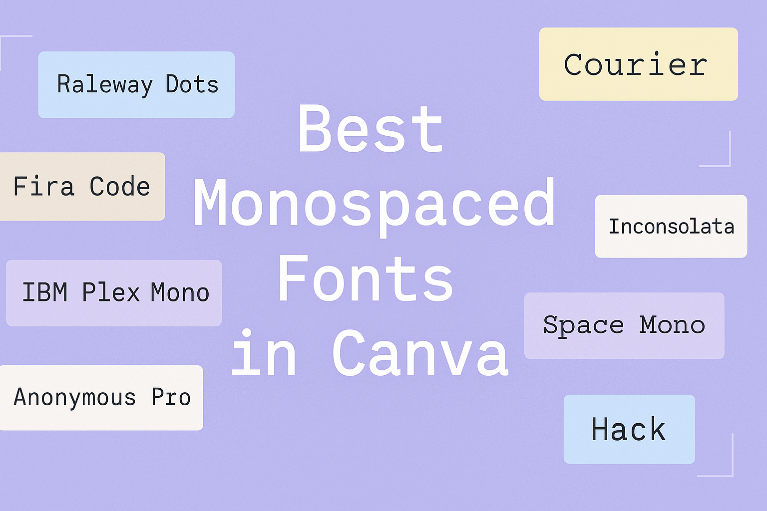
Top Monospaced Fonts in Canva
Monospaced fonts offer a unique style that ensures every character occupies the same amount of horizontal space. They are often favored for coding visuals and tech-related designs due to their clarity and uniformity. Here are three top options available in Canva.
Courier New
Courier New is a classic monospaced font that many people recognize. It has a traditional typewriter look, making it a popular choice for scripts, coding, and retro designs. The font features clear readability, which helps to highlight important textual content.
This font provides a sense of nostalgia and can evoke memories of early computing and typewriting. It works well for projects that require a vintage touch. For those wanting consistent spacing for drama scripts or coding projects, Courier New is a reliable option.
Lucida Console
Lucida Console stands out with its clean and modern appearance. This font is especially effective for projects that need a bit of style without sacrificing legibility. Its rounded edges and well-defined characters make it pleasant to read on screens.
Designed for clarity, Lucida Console is ideal for tech presentations or any design that involves coding. It balances professionalism and approachability, which adds to its attractiveness. This font is perfect for designs that aim to appear both sleek and easy to understand.
Source Code Pro
Source Code Pro is a versatile font with a modern flair. It has a bit more personality than other monospaced options, making it a popular choice among designers. The characters are well-balanced, ensuring that text remains easy to read.
This font works wonderfully in various tech-related designs, making it great for web projects and programming visuals. Its large character set provides flexibility for different languages and symbols. For users looking for a contemporary feel, Source Code Pro is a fantastic addition to any design toolkit.
How to Choose the Right Font
Selecting the right font is crucial for any design project. The chosen font can affect how the content is perceived, influencing both readability and aesthetic appeal. Keeping these factors in mind will help in making an informed decision.
Readability
Readability is essential when selecting a font. A font should be clear and easy to read at different sizes. Monospaced fonts like Courier Prime and Roboto Mono are great choices for enhancing legibility, especially in coding or technical designs.
When evaluating readability, consider the following factors:
- Font Size: Choose a size that is comfortable for the audience.
- Line Spacing: Adequate spacing can help in distinguishing lines of text, making it easier to read.
- Contrast: Ensure the font color contrasts well with the background. Dark text on a light background is often easiest to read.
By prioritizing readability, designers can create text that captures attention without straining the eyes.
Design Compatibility
Design compatibility is critical in choosing a font that aligns with the overall look and feel of a project. The font should complement other design elements, contributing to a cohesive appearance.
To achieve design compatibility, consider these points:
- Theme: Ensure the font matches the project’s theme. A playful font works well for casual designs, while a clean, modern typeface fits professional projects.
- Mixing Fonts: If using more than one font, choose complementary styles. A combination of a bold title font with a clean body font can create a pleasing effect.
- Visual Hierarchy: Use different font weights and sizes to create an effective visual structure. Important information should stand out for easy navigation.
By focusing on design compatibility, a project can convey its message effectively while looking polished and professional.
Applying Monospaced Fonts
Monospaced fonts are unique and can enhance design projects with their structured look. Understanding how to pair these fonts and where to effectively use them can make a big difference in visual communication.
Font Pairing Tips
When pairing monospaced fonts, it’s important to choose contrasting styles. For example, a bold sans-serif font can complement a monospaced option nicely. This contrast helps to establish a clear hierarchy in the design.
Here are a few tips for effective font pairing:
- Bold with Light: Combine a bold sans-serif font with a lighter monospaced font for headers and body text, respectively.
- Size Matters: Adjust the font sizes to enhance readability. Larger headings paired with smaller text can create a balanced look.
- Color Contrast: Use different colors to differentiate the fonts while ensuring they are still harmonious.
These strategies help maintain visual interest and clarity in designs.
Use Cases in Design
Monospaced fonts are great for specific projects, especially in tech and coding environments. They provide a clear and uniform layout that is easy to read.
Consider these use cases:
- Code Snippets: Use monospaced fonts in presentations or websites to display code. They mimic the traditional editor look, making it easier to understand.
- Tech Branding: Many tech companies use monospaced fonts in their branding materials. It conveys a modern and professional image.
- Minimalist Designs: For clean and straightforward visuals, monospaced fonts can simplify layouts, making casual reading easy.