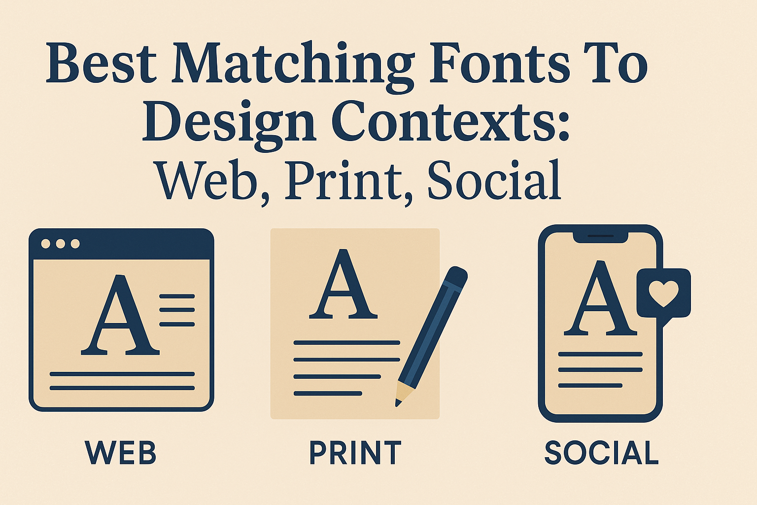
Choosing the right fonts for different design contexts like web, print, and social media is key to making any project look professional and clear. For example, sans serif fonts often work best online for easy reading, while classic serifs can add elegance to printed materials.
Designers know that pairing fonts carefully can boost a brand’s image and help messages stand out. Using bold, attention-grabbing fonts for headlines and simple, clean fonts for body text is a strategy that works across many contexts. Knowing which fonts fit web pages, printed flyers, or social posts can make all the difference in how the design connects with its audience.
Fonts aren’t just decoration—they speak for the brand’s personality and purpose. Whether it’s a crisp, modern font for a tech website or a warm, traditional typeface for print, matching the font to the context creates a clear and engaging experience for viewers. For ideas on perfect combinations, exploring tested pairings can be a great start.
Find more on font pairings for web and print at 30 Best Font Pairings for Web & Print.
Understanding Font Pairing and Design Contexts
Choosing the right fonts can shape how people understand and interact with a design. A well-chosen font combination improves clarity, sets the mood, and fits the specific platform where the design will appear.
What Is Font Pairing?
Font pairing means selecting two or more fonts that work well together in a design. It balances style and readability by combining different fonts for headings, body text, and other elements. Good font pairings often mix contrasting styles, like a serif font with a sans-serif, to create visual interest without confusing the reader.
A key part of font pairing is matching fonts that complement each other in weight, size, and mood. This helps create a clear hierarchy, guiding the viewer through the content smoothly. The goal is to make text easy to read and visually appealing at the same time.
Why Font Pairings Matter in Web, Print, and Social Media
Each design context brings unique challenges for font choices. In web design, fonts must be legible on screens of all sizes and load quickly. Sans-serif fonts often work best online because of their clean lines and simple shapes.
Print materials allow for more detailed fonts, like some serif styles, because resolutions are higher. Print also lets designers use subtle textures and fine details without losing clarity. For social media, fonts need to catch attention quickly and fit within limited space. Bold and readable fonts work well there.
Choosing the right font pairing for each context improves professionalism and the overall message. Proper typography ensures that content feels right at home whether it’s on paper, a website, or a social feed.
Principles of Effective Font Combinations
Effective font combinations follow several important rules:
- Contrast: Pair fonts with differences in weight or style to create clear separation between headings and body text.
- Harmony: Fonts should share some characteristics, like similar x-heights or stroke widths, to keep the design unified.
- Readability: Avoid overly decorative fonts for longer texts to keep reading comfortable.
- Limitations: Stick to two or three fonts to prevent a cluttered look.
- Hierarchy: Use size and weight changes to guide the reader through sections of content.
For more detail on how to pair fonts effectively, see How to Pair Fonts: Choosing, Combining, and Applying Fonts Across Contexts.
Font Matching Fundamentals: Types, Roles, and Contrast
Understanding font types, their roles, and how to balance contrast is essential for creating clear and attractive designs. Selecting the right fonts helps guide readers through the content while enhancing the design’s purpose and tone.
Serif, Sans Serif, Script, and Display Fonts Explained
Serif fonts have small lines or strokes at the ends of letters. They often look formal and traditional, making them great for print and long body text. Examples include Times New Roman and Libre Baskerville.
Sans serif fonts don’t have those extra strokes, giving them a clean and modern look. They work well for digital screens because they improve readability, like Open Sans or Source Sans Pro.
Script fonts mimic handwriting and add personality or elegance. They are best used sparingly, often for invitations or decorative headings.
Display fonts are bold and eye-catching, perfect for headlines or titles. They add character but can be hard to read in long text, so use them mainly for emphasis.
Hierarchy and Role Assignment for Matching Fonts
Fonts serve different roles, like headings, subheadings, or body text. Assigning these roles clearly helps readers know where to focus.
Headings often use bold or display fonts to stand out. Body text usually relies on readable serif or sans serif fonts for comfort.
Subheadings create a bridge between headings and body text. Using a slightly different font style or weight helps set them apart without clutter.
Limiting a design to two or three fonts keeps it clean and cohesive. Mixing too many fonts can confuse the reader and weaken the message.
Balancing Contrast and Harmony in Font Combos
Contrast in font pairing means using different styles to create visual interest and clarity. For example, pairing a serif with a sans serif creates natural contrast while staying balanced.
Harmony happens when fonts share similar features like stroke thickness or x-height, which keeps the design unified.
Strong contrast without harmony can feel chaotic, while harmony without contrast may seem dull.
Good font combos balance both, guiding the eye smoothly through the text and supporting the design’s goal.
Top Matching Fonts for Web Design Projects
Choosing the right fonts can make a big difference in how visitors read and interact with a website. Fonts need to be clear, comfortable, and reflect the tone of the brand. Combining fonts carefully helps create a pleasant and effective user experience.
Best Web Font Pairings for Readability and UX
For web design, readability is key. Fonts like Open Sans and Roboto are popular choices because they are clean and easy to read, especially in body text. Pairing a sans serif font like Open Sans with a serif font such as Lora creates contrast without clashing.
Designers often use no more than two or three fonts on a site for simplicity. For example, Roboto Bold can be used for headers while Roboto Regular works well for the body. This helps maintain a consistent and comfortable reading flow.
Proper size and spacing, called kerning and leading, also impact how easy text is to read on screens. Pairings such as Montserrat with Nunito balance modern style and readability well.
Popular Google Fonts for Web: Examples and Combos
Google Fonts offers many reliable fonts designed for screen use. Poppins and Quicksand are geometric sans serif fonts that give a fresh, modern look. Poppins often pairs well with more classic fonts like Lora or Nunito for body text.
Lato is another versatile font, often paired with Montserrat or Roboto for a clean, professional design. These combos work for blogs, portfolios, and business sites.
Popular pairings include:
| Header Font | Body Font | Usage Example |
|---|---|---|
| Montserrat | Open Sans | Corporate websites |
| Poppins | Lora | Creative agencies |
| Roboto | Nunito | Tech and startup blogs |
These combinations are trusted because they balance style and function, making websites easier to read and visually engaging.
For more ideas about font pairing in web design, visit 30 Best Font Pairings & Combinations For Web Design – Elementor.
Best Font Pairings for Print Design
Choosing the right fonts for print focuses on elegance, clarity, and balance. The goal is to combine styles that complement each other and enhance the reader’s experience. Effective pairings draw attention without compromising legibility.
Classic and Elegant Font Combos for Print
Classic serif fonts like Times New Roman, Libre Baskerville, and Cormorant Garamond bring a timeless feel to printed materials. When paired with a clean sans serif or a bold display font, they create a refined look. For example, Libre Baskerville works well with Futura to mix classic and modern styles.
Fonts like PT Serif and Cardo offer warmth and tradition, making them great for formal documents or invitations. For bold headings, Abril Fatface pairs nicely with serif body text, providing both impact and readability. Keeping these combos simple, usually two fonts, avoids clutter and maintains elegance.
Readability and Impact in Printed Materials
For clear, readable print, choosing fonts with balanced proportions is key. EB Garamond is easy on the eyes for body text, especially in books or reports. To keep this sharp, it pairs well with Archivo Narrow or bold options like Futura Bold for headlines.
Impactful print uses strong contrasts. Heavy fonts like Abril Fatface or Futura Bold draw attention for titles, while softer serifs provide comfortable reading for paragraphs. Combining different weights within the same family, such as PT Serif light and PT Serif bold, also creates variety without clutter. This approach helps printed pieces stay professional and user-friendly.
For more detailed pairing examples, see the guide on best font pairings for print & web.
Effective Font Matches for Social Media Graphics
Fonts for social media need to catch attention quickly while remaining easy to read on small screens. Pairings that mix bold, clear lettering with stylish elements work best for engagement and clarity.
Fonts That Stand Out in Visual-First Social Content
Strong, simple fonts like Bebas Neue, Anton, and Oswald are great for headlines and key messages. Their bold styles make text easy to read while standing out in busy feeds. These fonts work well when paired with more neutral fonts for body text.
For example, Bebas Neue can headline a graphic with Archivo Black supporting smaller text. This combo balances style and readability. Using all-caps fonts like Impact also adds emphasis but should be paired with something softer to avoid overwhelming the viewer.
Trendy Script and Display Fonts for Engagement
Scripts like Dancing Script and Great Vibes add personality and flair. They work well for quotes, invitations, or special announcements where a friendly, personal tone is desired.
Sacramento offers a simpler script option that pairs well with block fonts like Anton or Oswald.
Display fonts such as Yeseva One are eye-catching and elegant but should be used sparingly to avoid clutter. Combining a script or display font with a bold sans serif creates dynamic contrast that draws viewers in without losing clarity.
Effective font pairing on social media balances boldness with personality to boost engagement and readability. For curated ideas, see the list of best font pairings for social media graphics.
Popular Font Pairing Examples and Inspiration
Choosing the right font pairings can boost readability and set the right tone across different design needs. Some combinations work well across web, print, and social media, while others suit specific brand identities or creative projects.
Modern and Creative Pairings for Multiple Contexts
Modern designs often mix clean, geometric fonts with stylish serifs for contrast. For example, Raleway paired with Merriweather blends a sleek sans serif with a classic serif. This combo works great in web design and social posts for a fresh but readable look.
Another strong pairing is Playfair Display with Source Sans Pro. The elegant style of Playfair Display fits well for headings, while Source Sans Pro keeps body text simple and clear.
For casual, approachable projects, Nunito Sans pairs nicely with Josefin Sans. Both are sans serifs but offer different weights and styles, creating a friendly feel that suits social media and informal branding.
Professional and Versatile Matches for Branding
Professional branding needs fonts that project trust and clarity. Merriweather combined with Merriweather Sans achieves this by balancing a serif’s authority with a clean sans serif for body copy. This pairing works well in reports, websites, and print materials where stability matters.
The Roboto Condensed with Hind combo is another reliable choice. Both fonts are strong, modern, and easy to read, making them ideal for tech companies and corporate branding.
For brands looking for a subtle, elegant twist, Josefin Sans with Playfair Display gives a refined but versatile appeal. It’s used often in fashion and creative agencies, offering a polished but approachable look.