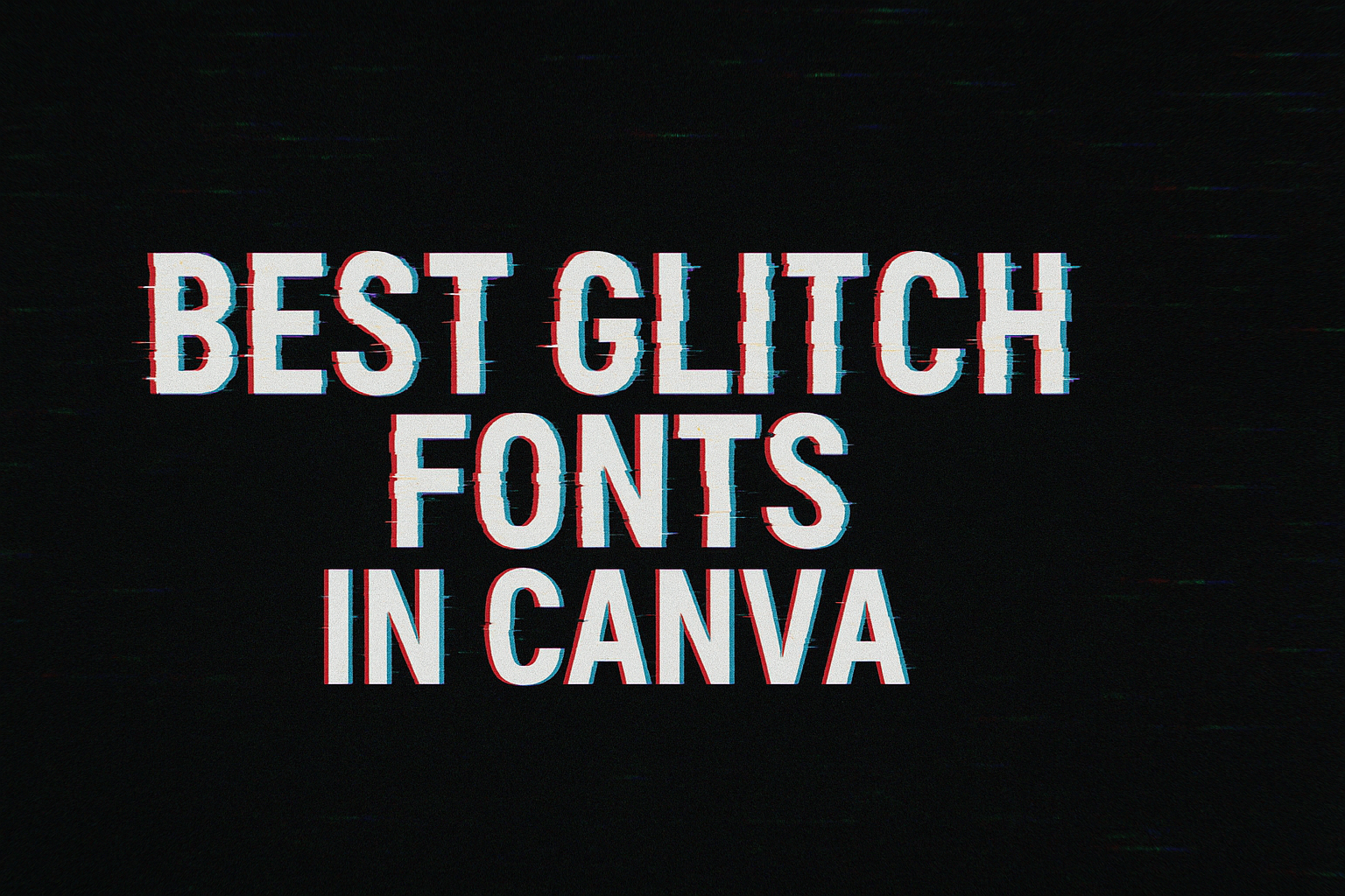
Creating striking designs often means standing out with unique fonts.
Canva, a popular design platform, offers a range of options that can transform any visual project. Among these options, glitch fonts have become a favorite for adding that modern, digital twist to text.
One of the best glitch fonts in Canva is Kare Gradient, known for its bold design and gradient colors. This makes it perfect for eye-catching headlines and posters.
Another notable font is Mokoto Glitch, which gives a sense of movement and speed with its digital effects. Its playful appearance makes it especially popular with younger audiences looking for something trendy and fresh.
The availability of such dynamic and visually appealing fonts allows designers to experiment and add personality to their work.
Those interested in exploring this distinctive style can check out various fonts available on Canva. They can quickly breathe new life into their projects by choosing fonts that best match their creative vision.
Glitch fonts offer a perfect way to push boundaries and create something memorable.
What Are Glitch Fonts?
Glitch fonts have a unique style that looks like a digital error or bug. This gives them a cool and modern look, making them popular in various designs.
These fonts often have irregular lines and distorted edges. Some might even feature a rough texture to mimic a malfunctioning computer display. This unique appearance gives designs a futuristic, digital vibe.
Glitch fonts are versatile and can be used in many projects. They are great for gaming brands, sci-fi themes, posters, and headlines. The bold and striking look helps them stand out.
Some popular glitch fonts in Canva include:
- Mokoto Glitch: Known for its digital effects and futuristic look.
- Kare Gradient: Features bold letters with gradient colors, perfect for creative projects.
The creativity in glitch fonts makes them a favorite among designers. They add energy to any design, catching the eye of the viewer with their unique style.
Why Use Glitch Fonts in Canva?
Glitch fonts are popular for designers looking to add a unique edge to their projects. They bring a futuristic feel to designs with their distorted and unconventional appearance. These fonts can make any project stand out by capturing attention easily.
Creativity Boost
Using glitch fonts can encourage creativity. Designers can experiment with different styles and combinations, offering endless possibilities for unique creations.
Attention-Grabbing
Glitch fonts can quickly draw the viewer’s eye. The unusual design elements make them ideal for advertisements or posters where grabbing attention is key.
Modern Aesthetic
These fonts often convey a modern and rebellious vibe. They break away from traditional typography, allowing designers to give their work a more avant-garde look.
Versatility in Use
Designers can incorporate glitch fonts into various projects, from social media posts to album covers. Their adaptable nature makes them suitable for numerous design contexts.
Popular Choices
Fonts like the Mokoto Glitch are frequently used for their digital glitch effect. This style offers flexibility and room for creative additions.
Creating a Mood
Designers can use glitch fonts to create a specific atmosphere or mood in their work. The effects can range from playful to eerie, depending on the context.
Glitch fonts in Canva provide a perfect opportunity for designers to step out of the traditional design box and explore new dynamics.
How to Access Glitch Fonts in Canva
Accessing glitch fonts in Canva is easy and adds a fun twist to any design. Here’s how anyone can find them.
-
Log In to Canva: Begin by logging into Canva. If they don’t have an account, they can create one for free.
-
Create a New Design: Click on the “Create a Design” button. They can choose the type of project they want, like a poster or social media post.
-
Open the Text Tab: On the left side panel, they should click the “Text” tab to add new text elements.
Next, they can select a text box and check the font menu. They will find a search bar there.
-
Search for Glitch Fonts: In the fonts list, type “glitch.” This will bring up a selection of fonts related to this style. Options like Mokoto Glitch 2 provide a digital and futuristic look.
-
Experiment and Customize: After selecting a glitch font, they can adjust the size and color. It’s fun to try different effects and see what looks best for their design.
-
Save and Share: Once they are happy with their creation, they can hit the “Download” button or share it directly on social media.
These steps make it simple to add a creative, glitchy touch to any project.
Top Canva Glitch Fonts
Glitch fonts in Canva offer a unique style, echoing the look of malfunctioning screens or digital noise. They add a futuristic and edgy vibe to designs.
VHS Glitch
VHS Glitch is a nod to the old-school video era, bringing a sense of nostalgia to digital designs. This font mimics the fuzzy and distorted look seen in malfunctioning VHS tapes.
Designers love it for projects that need a retro feel with a touch of chaos. It’s perfect for posters and social media graphics aiming to stand out with a quirky yet stylish choice.
The combination of staticky lines and distorted shapes adds character and uniqueness, drawing attention and invoking a sense of nostalgia for classic video tech.
Pixelated Panic
Pixelated Panic jumps straight from old video games into modern design. This font creates an impression with its blocky and uneven characters that simulate pixel art.
It fits anywhere a digital or vintage vibe is needed. Users often find this font ideal for projects targeting younger audiences who enjoy gaming visuals or designs requiring a nostalgic tone.
Offering both readability and style, Pixelated Panic combines fun with functionality, capturing the joy and simplicity of early digital graphics.
Digital Disarray
Digital Disarray brings a sense of confusion and excitement to typography. Its design, full of splintered lines and fragmented letters, captures the feel of a digital mishap.
This font is favored by those looking to give their projects an edgy, tech-driven look. They enjoy how it adds a hint of futuristic chaos to flyers, album covers, and advertisements.
With its fragmented style, it draws viewers in, making them curious about the message hidden within the tangled text.
Corrupted Cut
Corrupted Cut stands out with its dramatic split-lines through each letter, giving the effect of a screen that’s glitching out. This font is perfect for those who want to add a digital twist to their designs.
It works well in projects like event posters or artistic presentations where creativity and innovation take center stage. The striking appearance not only captures attention but also enhances the messaging with its futuristic appeal—a trick savvy designers use to engage tech-savvy audiences.
Retro Malfunction
Retro Malfunction pays homage to classic video graphics, offering a playful yet impactful style. Its combination of structured and distorted elements makes it great for themed events or products.
People use it to evoke a sense of fun and nostalgia while maintaining a modern edge. Suitable for both print and digital media, Retro Malfunction combines form and distortion in a way that’s both familiar and novel—making it a favorite among designers wanting to blend past aesthetics with present trends.
Tips for Using Glitch Fonts Effectively
Glitch fonts can add a unique and modern touch to your designs. To use them effectively, consider how they pair with the background, their color contrast, the balance they strike with simplicity, and their legibility. Each of these factors plays a role in how impactful your design will be.
Pairing With Backgrounds
When using glitch fonts, background selection is crucial. These fonts naturally have a busy and intricate style, so the backdrop should not compete for attention.
Solid or gradient backgrounds tend to work well. It helps to test different backgrounds to see which one complements the glitch effect without overwhelming it.
Simplicity in the background allows the font to stand out while maintaining a clear focus on the text.
Another tip is to avoid using complex patterns or detailed images behind glitch fonts. These elements can distract from the message.
By applying minimal backgrounds, you enhance the visual impact, ensuring that the text remains the central focus. Adapting the opacity of the background can also enhance the overall design for improved readability.
Contrasting Colors
Contrast is key when working with glitch fonts. Using contrasting colors ensures that the text is readable and visually striking.
It’s important to select colors that highlight the glitch effect without clashing.
Bright colors against a dark background or vice-versa can create a dramatic effect. It draws attention to the text while maintaining clarity.
Experimentation is important to find the right contrast that makes the design pop.
Color schemes like neon on black or pastel on dark gray can elevate the font’s aesthetic. Be mindful of color blindness and accessibility by ensuring sufficient contrast.
Tools and guides are available online to check contrast ratios for better accessibility.
Balance with Simplicity
Balancing glitch fonts with simplicity means letting the fonts shine without clutter or distraction. These fonts often have complex details; thus, surrounding elements should be kept minimal.
Using a simple layout with glitch fonts allows the textual effects to get noticed. Try to limit additional design elements and focus on clear, simple composition.
This approach helps in maintaining an aesthetic that is bold but not overwhelming.
White space can be used effectively to give these fonts room to breathe. By not overloading the design with elements, viewers can appreciate the unique style of glitch fonts.
Simple elements create a balanced and harmonious design, keeping everything cohesive.
Legibility Over Style
While glitch fonts are trendy, legibility should not be compromised. It’s essential to ensure the text can be read easily, even when styled in a glitch format.
Prioritize font size and spacing to improve readability.
Adjusting these elements ensures the text remains understandable, especially when the font itself is complex.
Choosing the right glitch font that offers a balance between style and legibility is key.
Testing the text at different sizes and distances can help determine the ideal setup.
Viewers should grasp the message quickly; thus, adjusting opacity, boldness, or removing extra effects on smaller text can enhance clarity.
This consideration makes glitch fonts both stylish and functional in any design.
Customizing Glitch Fonts in Canva
Customizing glitch fonts in Canva is a fun and creative process.
Start by choosing a font like Mokoto Glitch 2 or Kare Gradient, popular choices for their digital, futuristic looks. These fonts can often add a unique, edgy feel to your designs.
To customize, users can adjust the color scheme. Glitch fonts typically look great with bright, contrasting colors.
For a more dynamic appearance, try using gradient colors, which can be easily applied through Canva’s color tools.
Text effects can enhance glitch fonts further. Adding a shadow or glow creates depth, making the text pop.
Experimenting with transparency and adjusting the letter spacing can also produce interesting results.
For more customization, layering effects like blurred backgrounds or adding extra glitch elements could help achieve a more authentic glitch vibe.
Users can drag and drop additional design elements from Canva’s library to complement the text.
Canva’s user-friendly interface makes all these adjustments simple with its drag-and-drop features.
Whether creating a poster, social media graphic, or a logo, these options offer plenty of room for creativity.
Exploring tutorials, such as the one on creating glitch text effects, can provide additional tips and tricks.
With these customization options, any design can stand out with a distinctive glitch style.
Design Inspiration
Designers can use glitch fonts to add a unique twist to their projects. Whether creating eye-catching social media graphics or edgy music album covers, these fonts bring a modern and digital edge to any design. Here are some inspirational ideas for using glitch fonts in creative designs.
Social Media Graphics
Glitch fonts can make social media graphics stand out in busy newsfeeds. These fonts add a digital, tech-savvy feel to posts, appealing especially to younger audiences.
For a futuristic vibe, designers can pair glitch fonts with high-contrast colors and images.
Using bold glitch typography draws viewers’ eyes. It’s perfect for announcing sales, new products, or events.
Designers can experiment with different styles, like layering multiple glitch fonts, to create depth and interest in their graphics.
Event Flyers
For event flyers, glitch fonts offer a dynamic and exciting look. They can convey energy and movement, perfect for concerts, tech expos, or dance parties.
The irregular lines and distorted edges of these fonts add a sense of urgency and excitement.
Designers should consider using glitch fonts for headlines to quickly grab attention. Pairing these fonts with bright, contrasting colors can make the flyer even more impactful.
Using a glitch font for taglines or key information ensures the text is both informative and visually intriguing.
Music Album Covers
Glitch fonts bring a modern and edgy aesthetic to music album covers. They can help reflect the music’s mood, especially for electronic, indie, or alternative genres.
Digital effects and textured lines create a sense of movement, like waves of sound.
Albums with a futuristic or abstract theme benefit from glitch fonts. They can be paired with digital artwork or abstract imagery to create a cohesive visual identity.
Using glitch fonts for the album title adds an intriguing element that draws attention on streaming platforms and in stores.
YouTube Thumbnails
Glitch fonts make YouTube thumbnails more clickable by adding an eye-catching element. Viewers can be drawn in by the unique and edgy appearance, which stands out among other video options.
The digital effects in glitch fonts resonate well with tech, gaming, and music content.
Designers can use glitch fonts for titles or attention-grabbing phrases. They can combine them with vibrant colors and dynamic layouts for added impact.
Creating a professional and engaging thumbnail increases the likelihood of viewers clicking to watch the video.
Best Practices for Glitch Font Typography
Glitch fonts can add an exciting edge to any design. Whether used in posters, websites, or advertisements, they create a futuristic and digital vibe that catches the eye.
Choose Readable Fonts
While it may be tempting to go all-out with distortion, readability should not be sacrificed. Designs should still communicate the message effectively.
Choose glitch fonts like Mokoto Glitch 2 that balance style and readability.
Consistent Style
Maintaining a consistent style across a project is crucial. Combining too many different glitch fonts can result in a cluttered look.
Stick to one or two types for a cohesive design. The Son of a Glitch font, for example, could be paired with other structured fonts for balance.
Use in Headers and Logos
Glitch fonts can make headers and logos pop. Their unique appearance draws attention without overwhelming smaller text elements.
Fonts like Kare Gradient are great for this purpose, adding a modern touch.
Color and Contrast
Color choice can enhance the glitch effect. High contrast makes the text stand out, while gradient fills add depth.
Experimenting with colors alongside fonts like Pixel Glitch can yield striking results.
Limited Usage
Restraint is key. Overusing glitch fonts can diminish their impact.
It’s best to reserve them for highlights or key visual moments in a design. Using them sparingly ensures the effect remains special and attention-grabbing.
Potential Drawbacks of Overusing Glitch Fonts
Glitch fonts can bring a vibrant, unique touch to designs, but there are some potential drawbacks to using them too much.
Visual Overload: Constant use of glitch effects can lead to visual confusion. The distorted and dynamic nature might overwhelm viewers, making the text difficult to read. This can detract from the main message.
Loss of Clarity: Important details can get lost in the visual noise if glitch fonts are used excessively. In professional settings, clear communication is crucial and might be hampered by the chaotic look of glitches.
Limited Use Cases: While glitch fonts work great in digital art and sci-fi themes, they aren’t suitable for every project. Formal documents or minimalist designs benefit from more classic fonts.
Brand Consistency: Overuse might lead to inconsistency in brand image. A brand using too many different styles can appear unfocused.
Alternatives to Glitch Fonts
Looking for something different than glitch fonts? No worries! There are plenty of creative fonts to explore.
1. Retro Fonts:
Retro fonts bring a vintage vibe. They’re great for projects needing a nostalgic touch.
2. Handwritten Fonts:
Handwritten fonts add a personal feel. Perfect for invitations or thank-you notes.
3. Bold Display Fonts:
Bold display fonts stand out in any design. They are excellent for grabbing attention on posters or headlines.
4. Minimalist Sans-Serif Fonts:
For a clean and modern look, go for sans-serif fonts. They have a simple style that’s easy to read.
Here are some popular options:
| Font Style | Example |
|---|---|
| Retro | Pacifico |
| Handwritten | Amatic SC |
| Bold Display | Bebas Neue |
| Minimalist Sans-Serif | Lato |
5. Decorative Fonts:
Decorative fonts add flair with unique shapes and styles. They are often used for logos or special projects.
Trying different font styles can totally change the feel of a design. Whether it’s a playful handwritten font or a sleek minimalist one, the right choice adds the perfect touch to any project.