Exploring the world of design, especially with Canva, opens up endless possibilities for creativity.
Choosing the right fonts can bring your projects to life, adding personality and flair.
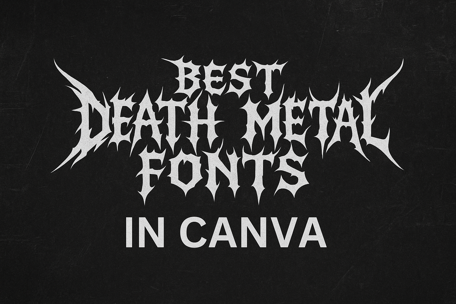
Death metal fonts are a perfect choice for projects that need a bold, edgy, and hardcore vibe. Whether designing a music album cover or a Halloween poster, these fonts can set the tone just right.
Canva offers a diverse selection of death metal fonts that can elevate any project. From their intricate designs to their unique styles, these fonts capture the essence of the death metal genre.
Designers will find them useful not just for music projects but also for any creative work that requires a powerful impact.
Fonts like the ones you’ll find on FontSpace show the versatility and uniqueness these styles can bring. They can change the way your audience perceives your work by adding an unforgettable touch.
It’s exciting to think about how these fonts can transform an ordinary design into something truly captivating and fierce.
Exploring Canva’s Font Library
Canva’s font library offers a wide range of options, including death metal and apocalyptic styles. Accessing and navigating these fonts can enhance your design projects significantly.
This guide explains how to find and select the perfect font for any project.
How to Access Fonts in Canva
Accessing Canva’s fonts is straightforward.
Users can begin by logging into their Canva account. Once in the design editor, they can click on the text icon on the left panel to explore various font choices.
There is a search bar available for users who know the specific font name they wish to use.
Canva also categorizes fonts according to style, like handwriting, serif, or sans-serif, making it easier for users to find what they need.
To apply a font, one can simply select the desired text box, and a pop-up will appear, allowing users to choose from the available options. Some fonts are premium, requiring a paid subscription, but many are free.
Tips for Navigating Canva’s Font Selection
Navigating Canva’s font selection requires a few simple tricks.
Users should make the most of the filter options. They can filter by language and check mark favorites for easy future access.
It’s also useful to consider size and readability based on the intended use of the design.
While exploring the selection, users can experiment with different font pairings to see what works best for their project.
For example, pairing a bold display font like Rubik Beastly with a simple font could create a striking contrast. Additionally, checking fonts for commercial use rights is important for those using the design for business purposes.
Essentials of Death Metal Font Aesthetics
Death metal fonts create a striking visual impact with their bold and heavy structure. These fonts are often characterized by limited legibility due to their decorative nature.
The right font choice can dramatically influence a design’s appeal by conveying the intense aesthetic typical of death metal.
Characteristics of Death Metal Typography
Death metal fonts are known for their bold and heavy design elements. The fonts typically feature thick strokes and strong contrasts, which make the lettering pop against a background. This creates a dynamic and powerful look, often seen in music-related designs.
These fonts can also have intricate and artistic elements that make them visually interesting but sometimes challenging to read.
The aesthetic is often described as intense and aggressive. Many death metal fonts include sharp edges, exaggerated curves, and sometimes even thorny or spiky details. These features align with the intense nature of the music they represent.
The Impact of Font Choice on Design
Choosing the correct death metal font is crucial for a design’s success. Fonts need to reflect the tone and energy of the content.
For example, a death metal band poster should have fonts that mirror the raw energy of the music. Incorporating fonts like those listed in Best Death Metal Fonts in Canva can make designs resonate with fans.
By selecting the right font, designers can effectively communicate mood and style. A poorly chosen font could make the design less impactful or even confusing to viewers. In contrast, a carefully selected font enhances readability and draws attention to key elements.
Top Death Metal Fonts in Canva
Death metal fonts in Canva stand out because of their bold and intense designs that mimic the fierce nature of metal music. These fonts are perfect for creating album covers, posters, and other designs with a dark edge.
This section explores the most popular and emerging fonts that are perfect for any death metal design project.
Most Popular Death Metal Fonts
Some of the most popular death metal fonts in Canva are known for their sharp, gothic, and bold characteristics. These fonts include styles that bring high impact to any design. A few timeless choices are:
-
Ghoulish Font: This font features sharp edges and distorted shapes. It’s widely used for its haunting appearance.
-
Vampire Vibes: Its gothic twists make it a favorite for those looking to add a traditional metal vibe.
-
Beast Mode: Known for bold strokes and intense Gothic influence.
These fonts are often chosen for their strong visual appeal and the fearsome energy they convey. Their notoriety comes from a combination of style and adaptability, making them key choices in design projects related to death metal themes.
New and Noteworthy Fonts
Emerging fonts are adding fresh energy to death metal designs. Recent additions offer unique styles that blend traditional and modern influences. Noteworthy options include:
-
Dark Dominion: Stands out with its modern twist on classic blackletter design.
-
Necronix: Combines vintage metal aesthetics with a futuristic edge.
-
Void Wraith: Features innovative details that enhance its intimidating presence.
These fonts are gaining attention in the design community for their creative takes on standard metal font features. They are perfect for designers looking to experiment with styles that are both edgy and current.
Using Fonts Effectively in Your Designs
When creating eye-catching designs, choosing the right fonts is crucial. Combining different fonts can enhance the overall look and feel, while balancing text with imagery ensures clarity and impact.
Pairing Fonts for Maximum Impact
Selecting the right combination of fonts can make a design stand out. Pairing fonts involves choosing styles that complement each other.
For instance, a bold, heavy font might catch the eye when paired with a lighter, more readable typeface. This contrast helps in creating a dynamic visual experience.
Consider context when pairing. A dramatic death metal font could pair well with a simple sans-serif font for readability on a poster.
Mix and match styles to create a unique identity while maintaining harmony.
Balance is key. Avoid using too many fonts in one design; two or three is usually enough. This keeps the design cohesive and prevents it from becoming overwhelming. Consistency in font pairing helps in brand recognition and conveys clear messaging.
Balancing Text with Imagery
Balancing text and images is essential in design. Text should enhance, not overpower, the imagery.
For instance, when using a bold death metal font, ensure it doesn’t overshadow the visual elements of a design. This balance helps in maintaining attention on both the text and the images.
Alignment is crucial. Placing text in a way that complements the flow of the imagery can make a significant difference.
For instance, text aligned to follow the image lines can guide the viewer’s eye smoothly across the design.
Remember to keep white space. Allowing space around text and images gives the design room to breathe, making it easier to absorb.
This technique prevents clutter, ensuring the message is clear and striking.
Typography Best Practices
When working with death metal fonts in Canva, it’s crucial to consider licensing and usage rights, as well as maintaining readability and accessibility. These elements ensure your designs are both effective and compliant.
Font Licensing and Usage Rights
Before using any font, it’s important to check its licensing and usage rights. Fonts can come with various restrictions depending on their creators.
Some may be free for personal use, while others require a purchase for commercial projects. It is essential to read the terms that accompany each font to avoid legal issues.
To find licensed fonts in Canva, look for those labeled as free for commercial use or with appropriate end-user licensing agreements.
For instance, 1001 Fonts offers free fonts, but require reviewing terms of use.
Ensuring proper licensing not only protects from legal trouble but also supports font designers.
Maintaining Readability and Accessibility
While death metal fonts are known for their bold and edgy designs, it is important to keep readability in mind.
These fonts often feature elaborate designs that can be difficult to read. Using them in moderation or in larger sizes can improve readability.
Consider pairing a complex death metal font with a simpler font to ensure text remains accessible. This approach enhances the overall design without sacrificing clarity.
Additionally, tools like Canva provide options to adjust letter spacing and contrast, ensuring text is legible and stands out in the final product.
Ensuring accessibility in design is key to reaching a wider audience.
Customizing Fonts in Canva
Customizing fonts in Canva allows users to fully express their creative vision. By altering colors and sizes, and adding effects, designs can be tailored to fit any project perfectly.
Altering Font Colors and Sizes
Changing font colors in Canva is straightforward.
Users can click on the text they want to modify, and a color panel will appear. This panel offers a wide range of color options, including custom hues.
By experimenting with different colors, users can achieve the perfect look that matches their design’s theme or mood.
Adjusting the font size is just as simple.
Users can select the text box and drag the corners to resize, or input a specific size for precision.
Combining size variations with different colors can create a hierarchy in the text that guides the viewer’s eye, enhancing the overall impact of the design.
This flexibility in customization helps meet the specific needs of various projects, from posters to social media posts.
Adding Effects to Fonts
Canva provides several text effects to enhance the visual appeal of fonts.
Users can apply shadows, which add depth and make text stand out.
The “Effects” button in Canva’s toolbar is where these features can be explored.
Other effects, like glows or outlines, offer additional dimensions to text, giving it an intriguing appearance.
These effects can be adjusted for transparency, blur, and color, letting users fine-tune to their liking.
With these options, text can be made more dynamic and engaging, fitting any creative vision.
These tools allow users to transform basic text into a captivating element of their design, making it easier to convey the desired message or style.