The world of graphic design thrives on conveying emotion through visuals, and font choice plays a pivotal role in creating the right atmosphere. When it comes to depicting a dystopian or apocalyptic scenario, fonts that carry a sense of decay, destruction, or eerie beauty are in high demand. Canva offers a plethora of font options that designers can use to evoke the perfect end-of-the-world vibe in their projects.
Apocalyptic fonts in Canva range from the grungy and worn to the sharp and mechanical, each bringing a unique flavor to the table. They are an ideal fit for projects like event posters for themed parties, book covers for science fiction and horror genres, or branding for games that immerse players in post-apocalyptic worlds. These fonts, with their distinct edgy look, help creators set the tone for content that’s meant to stand out and grip the audience with a sense of thrilling foreboding.
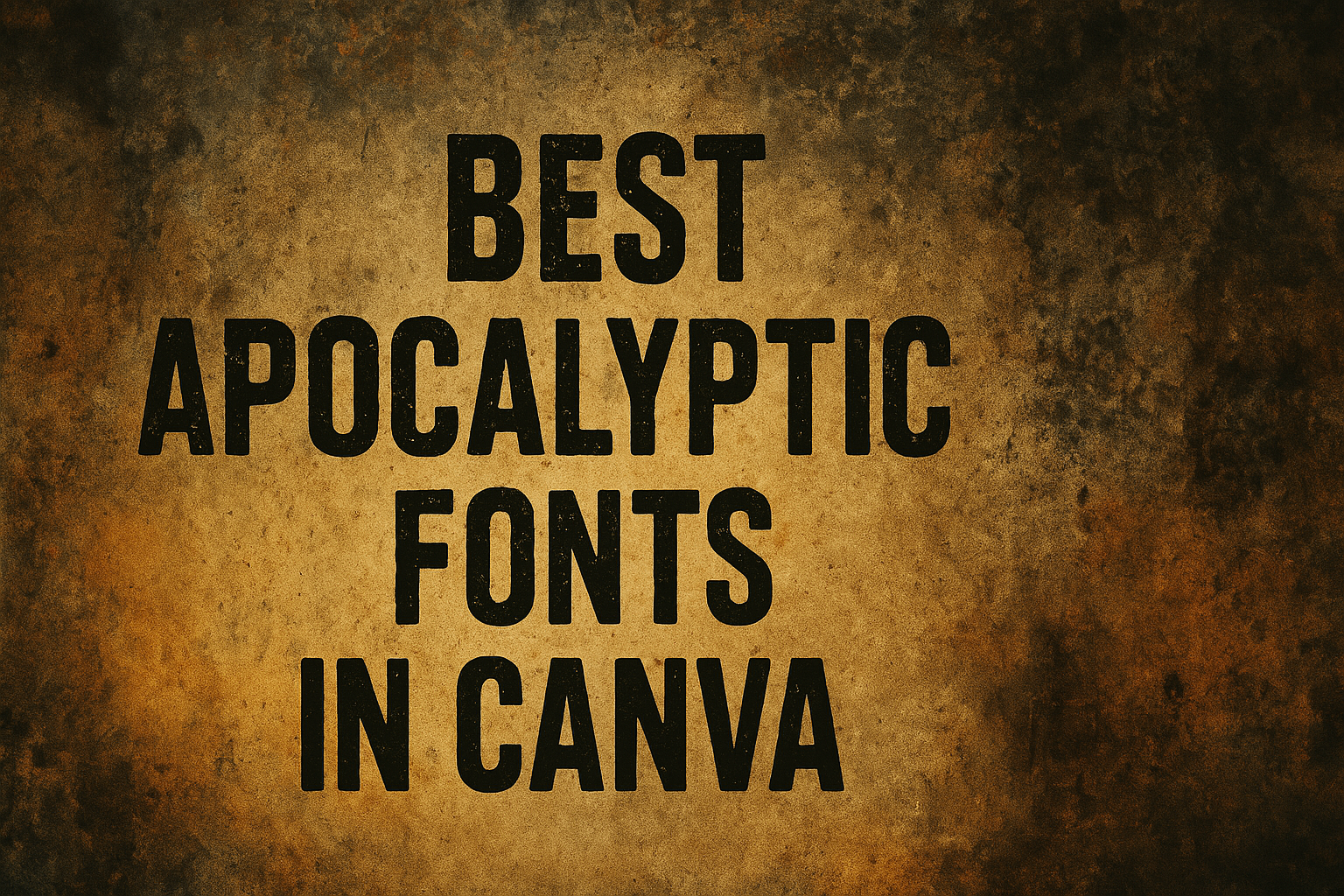
What Are Apocalyptic Fonts?
Apocalyptic fonts are typefaces that embody the essence of a world in decline or aftermath of a cataclysmic event. They capture the rawness of survival and desolation in their design.
Defining Characteristics of Apocalyptic Fonts
Apocalyptic fonts often possess a rugged and irregular appearance, reflecting the chaotic and harsh nature of their namesake scenarios. Key features include:
- Distressed Edges: Many apocalyptic fonts feature rough, eroded contours that simulate wear and deterioration.
- Irregular Shapes: Characters may have unconventional structures to suggest a break from order and stability.
- Bold Weight: These fonts are frequently bold or heavy to convey a sense of impact and immediacy.
Historical Context of Apocalyptic Design
The apocalyptic aesthetic is rooted in cultural expressions of dystopian futures and societal collapses. Historical influences include:
- Literature and Film: These fonts often draw inspiration from classic dystopian works and movies, embodying the tension and despair depicted in such narratives.
- Video Games and Media: They also reference the visual styles found in post-apocalyptic video games and media, translating these themes into typographic form.
Why Use Apocalyptic Fonts in Canva?
Apocalyptic fonts in Canva offer a distinct style that can instantly set the tone for a design. They are impactful tools for creators looking to convey a narrative of dystopian or post-apocalyptic scenarios.
Creating a Striking Visual Impact
Apocalyptic fonts have a commanding presence that grabs attention. They often incorporate irregularities and degradation to mimic the wear and tear of a world in decay. This bold typography can make headlines stand out and create a memorable impression on viewers.
Conveying a Post-Apocalyptic Theme
Post-apocalyptic themes often require a specific ambiance that can be effectively communicated through font choice. Apocalyptic fonts provide visual cues that align with stories of survival, dystopia, and chaos. By choosing the right font, designers ensure that the text itself tells part of the story, enhancing the overall thematic expression of the design.
Trends in Apocalyptic Graphic Design
Apocalyptic graphic design leverages trends towards stark, rugged aesthetics that reflect a society on the brink of collapse. These fonts often embody a raw energy that resonates with current design movements, making them a popular choice for projects aiming to be culturally relevant. They provide a gateway for designers to connect with audiences through shared understandings of apocalyptic symbolism.
Top Apocalyptic Fonts in Canva
When creating apocalyptic-themed content in Canva, the right font is crucial to conveying that sense of dystopian dread and desolation. The following fonts are some of the best options that Canva offers to give your projects a genuinely apocalyptic feel.
Baron Neue
Baron Neue offers a modern twist on classic typefaces. It’s sharp and precise, making it excellent for titles that need to stand out amidst chaotic design elements often found in apocalyptic visuals.
Frostbite
With a chilling touch, Frostbite encapsulates the cold and harsh environment of a world in disarray. Its jagged edges and irregular letterforms resemble the fragmented society of a post-apocalyptic setting.
Rogue
Rogue stands out with its handcrafted appearance. This font looks rugged and survivalist, mirroring the improvised nature of post-cataclysmic life.
After Disaster
The After Disaster font brings a ravaged, worn-down look to any text. It’s as if the letters themselves have survived a cataclysm, perfect for representing the remnants of a crumbled civilization.
Wasteland
Wasteland is raw and gritty. This font reflects the barren and unyielding landscape of an apocalyptic world where only the tough and resilient survive.
Necropolis
Finally, Necropolis has a gothic feel that’s right at home in dark, desolate future scenarios. It evokes the eerie silence of cities long deserted and the mysteries that might lurk within.
How to Access Apocalyptic Fonts in Canva
Canva offers a variety of fonts that suit apocalyptic-themed designs. To utilize these fonts, one needs to know where to find them and how to apply them to their designs.
Navigating the Canva Interface
Users start by logging into their Canva account. The main dashboard presents different design options. They should select a design type or open an existing project to get to the editing screen. Here, the fonts can be applied to text elements.
Finding Fonts in the Canva Library
Within the editor, they will find the text toolbar at the top. They can click on the font dropdown menu to see the list of available fonts. Canva categorizes fonts by style, making it easier to narrow down choices. A user looking for apocalyptic fonts should look for names or descriptions that suggest a gritty, dark, or dystopian style. They might encounter names like “Dark Flame” and “Vandalism”, which convey a feeling of chaos and decay suitable for end-of-the-world scenarios.
Incorporating Apocalyptic Fonts Into Your Designs
When they select apocalyptic fonts for their designs, designers should consider how these fonts interact with backgrounds, combine with other typefaces, and adapt through color and size modifications.
Pairing with Backgrounds
Apocalyptic fonts thrive against backgrounds that complement their dystopian aesthetic. A distressed or grunge background can amplify the font’s impact, creating a cohesive design. For lighter fonts like Dark Flame, a dark, textured background will make the text pop, while heavier fonts such as Fatal Darkness benefit from simpler backdrops to maintain readability.
Font Combination Tips
Combining fonts requires balance; a bold apocalyptic headliner pairs well with a clean, sans-serif font for body text. For instance, juxtaposing Fatal Darkness with a font like Arial or Roboto keeps the focus on the main message without overwhelming the viewer. Designers should limit themselves to two or three fonts to avoid a cluttered appearance.
Customizing Font Colors and Sizes
Color choice can dramatically alter the mood of apocalyptic fonts. Stark whites or bright reds convey urgency, while muted tones suggest decay. Designers should adjust font sizes to guide the viewer’s eye; larger sizes for key messages and smaller sizes for secondary information. They can use Canva’s font size slider to ensure text is proportionate to the design’s elements.
Best Practices for Apocalyptic Font Usage
Selecting the right apocalyptic font in Canva necessitates a balance between visual impact and legibility. It’s imperative to ensure that the typographic choices enhance the thematic elements of the design.
Considering Readability
Apocalyptic fonts must remain readable across different mediums. Designers should opt for fonts that maintain legibility even when scaled down. Bold, angular fonts without ornamentation are often more readable and thus, a go-to choice for this genre.
Balancing Design Elements
A design that incorporates apocalyptic fonts should not overwhelm the viewer. They should employ a hierarchy where the font acts as a focal point while the other elements support the overall message. Italic or lighter weight fonts can be used for body text to complement the boldness of the apocalyptic headline fonts.
Understanding the Message
Each font carries a unique connotation. Designers must choose fonts that align with the intended message of the apocalypse genre, whether it conveys destruction, survival, or a dystopian future. Using font characteristics such as irregular edges or rough textures can effectively convey a sense of decay or disarray typical of apocalyptic settings.
Examples of Apocalyptic Fonts in Media
In media, apocalyptic fonts are frequently used to set the tone for a dystopian or post-apocalyptic setting. They convey a sense of urgency and decay that’s crucial for the genre.
Movie Posters
Apocalyptic fonts can be seen in movie posters where their rugged and eroded styles immediately signal the genre of the film. For instance, the font “Anarchy Brothers” could be used on the poster of a movie similar to Mad Max: Fury Road to evoke a sense of chaos and rebellion. The film World War Z might opt for a font like “Zombies Reborn” to underscore the themes of revival and horror.
Book Covers
On book covers, they often give readers a visual cue about the content within. The Road by Cormac McCarthy, with its themes of desolation and survival, could be represented by “Dark Flame” for its ashy aesthetic. Similarly, a title like “Histeria” would be fitting for a cover of a novel like Station Eleven by Emily St. John Mandel, highlighting the societal collapse and historical madness in the narrative.
Video Game Artwork
In video game artwork, fonts such as “Megaton” or “DROWNING” might be used for titles like Fallout or Bioshock to emphasize ruin and submersion in their respective underwater and nuclear fallout settings. These fonts add to the immersive experience by reflecting the game world’s environment through typography.
Tips for Choosing the Right Apocalyptic Font
When selecting an apocalyptic font for a project in Canva, one must consider tone, audience, and versatility to ensure the font enhances the project’s theme.
Determining Your Project’s Tone
The tone of a project dictates the font choice; a darker, dystopian project may benefit from fonts like Dark Flame or Fatal Darkness, which evoke a sense of decay and unease. For a more intense, dramatic feel, Dark Mage offers a thematically resonant choice that’s legible and impactful.
Audience Appropriateness
Fonts must resonate with the intended audience without alienating them. A bold and daring font such as Earthen Parasite might captivate an audience looking for boldness and a high-impact visual, while maintaining legibility for wider appeal.
Adaptability Across Media
A versatile apocalyptic font should maintain its character and legibility whether used in digital media or print. When evaluating fonts, designers should consider how the font transitions across various platforms, from game graphics to film posters, ensuring consistency and adaptability.