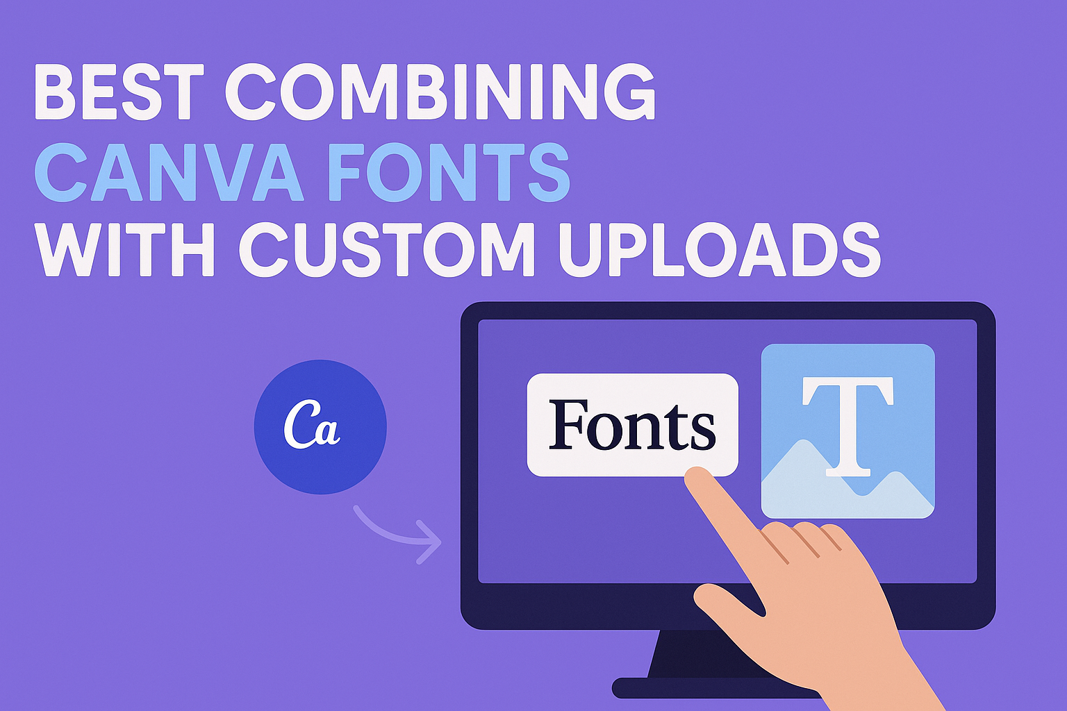
Combining Canva’s built-in fonts with custom uploads allows designers to create unique, balanced designs that stand out. The best way to combine these fonts is to pair contrasting styles, like a clean sans-serif from Canva with an elegant script uploaded as a custom font. This mix improves readability and adds personality, making any project look polished and professional.
Using custom fonts alongside Canva’s vast font library gives more control over branding and style. When done right, it helps highlight important text while keeping the overall design consistent and easy to read.
Understanding Canva Font Combinations
Choosing the right fonts in Canva is about more than just picking what looks nice. It involves balancing style, readability, and how the fonts work together to guide the reader’s eye. Effective font pairings create harmony, avoid confusion, and support the message being shared.
What Makes an Effective Font Pairing
Effective font pairing combines contrast and compatibility. Usually, pairing a serif with a sans serif font works well because their differences create balance. For example, a bold, geometric font can be paired with a softer, more traditional serif to bring out clarity and interest.
The fonts should also support the tone of the design—formal fonts for resumes or professional content, playful fonts for creative projects. Consistency matters too; mixing too many fonts can make a design look messy. Sticking to two or three fonts helps keep it clean but engaging.
Common Challenges in Font Pairing
One common challenge is picking fonts that clash instead of complement. Fonts that are too similar can blur the hierarchy, making text confusing. On the other hand, fonts that are too different can feel jarring and disrupt the flow of reading.
Another issue is using fonts that don’t match the purpose of the design. For instance, a casual, decorative font might not work well in a formal report. Also, poor spacing or font size choice can hurt readability, even when fonts themselves pair well.
Role of Visual Hierarchy in Font Selection
Visual hierarchy controls how viewers move through text. It helps emphasize important points and guide readers smoothly. Best Canva font combinations use size, weight, and style differences to create this flow.
For example, a large, bold font grabs attention as a headline, while a smaller, simpler font serves for body text. Italics or light weights can highlight subheadings without overwhelming the design. Visual hierarchy ensures font pairings do more than look good—they make the design easier to understand.
Popular Font Styles in Canva
Choosing the right font style can shape the look and feel of a design. Some fonts add a classic touch, while others make a design look modern and clean. Understanding these styles helps when mixing Canva’s fonts with custom uploads.
Serif Fonts in Canva
Serif fonts have small lines or strokes at the ends of letters. These details give text a traditional and formal look. Serif fonts work well for projects that want to feel trustworthy, like books, invitations, or professional reports.
In Canva, popular serif fonts combine elegance with readability. They are great for headings or body text where clarity and style matter. When pairing serif fonts with custom uploads, contrast is important—mixing a serif font with a clean sans-serif can balance classic and modern vibes.
Sans-Serif Fonts and Their Uses
Sans-serif fonts do not have the small strokes at the ends of letters. This makes them look sleek and modern. They are widely used for digital content, like websites, social media, and marketing materials. Canva offers many sans-serif fonts that fit a variety of styles, from bold headlines to simple body text.
Sans-serif fonts are known for easy readability on screens. They also pair well with almost any custom font because of their simple shapes. Designers often use sans-serif fonts to create a clean, straightforward look that keeps the focus on the message.
Minimalist Fonts for Clean Designs
Minimalist fonts focus on simplicity and clarity. These fonts avoid extra decoration and have smooth, straightforward lines. They are perfect for designs that want a neat and modern feel without distractions.
Canva’s minimalist fonts often blend well with custom uploads that have more personality or artistic flair. Using minimalist fonts for body text or subtitles helps keep designs balanced and readable. This style suits branding that aims for professionalism and a clutter-free look.
How to Add Custom Fonts to Canva
Adding custom fonts to Canva lets users keep their designs consistent with their brand style. They can upload different font files and organize them easily. This process requires specific steps and features available in Canva.
Uploading Fonts with Canva Pro
To add custom fonts, users must have a Canva Pro subscription. The free version does not support font uploads. Once subscribed, they can upload fonts in formats like TTF, OTF, or WOFF.
The upload starts by opening the Brand Kit in Canva. From there, users click the “Upload a font” button. After selecting the font file on their device, they confirm the upload. The new font then becomes available in their design projects.
It’s important to check that the font file is not corrupted and has the right license for use. Canva Pro offers unlimited font uploads, which helps maintain brand consistency across all designs.
Using Brand Kit for Font Management
The Brand Kit is where users manage all their fonts, logos, and colors. It keeps brand elements organized and easy to access. After uploading custom fonts, users can quickly apply them in any design.
The kit allows users to upload multiple font styles, such as bold or italic versions, for a complete font family. Fonts uploaded via Brand Kit automatically appear in font dropdown menus while editing text.
Users can switch between different brands if managing more than one. This feature ensures all templates and projects use the correct fonts without having to upload repeatedly. The Brand Kit simplifies keeping fonts consistent across all Canva designs.
More details on using this feature are available in guides like the one on adding fonts to Canva.
Combining Canva Fonts with Custom Uploads
Combining Canva’s built-in fonts with custom uploaded fonts can bring unique style and brand consistency to designs. The key is to make sure these fonts work well together visually and support the message clearly.
Tips for Harmonizing Built-In and Uploaded Fonts
Choosing fonts that complement each other is essential when mixing Canva fonts with custom uploads. Look for differences in style, such as pairing a clean sans-serif with a decorative script. This contrast helps each font stand out without clashing.
Consider font weight and size carefully. Use bold weights for headlines and lighter ones for body text to keep balance. Check that the fonts have similar x-heights or letter spacing to maintain flow.
Experiment with spacing and alignment. Adjust line height and letter spacing to create smooth reading experiences. Keep readability as a priority, especially when combining decorative custom fonts with simpler Canva fonts.
Creating Consistent Visual Hierarchy
Visual hierarchy guides the viewer’s eye and helps organize information. When combining Canva font combinations with custom fonts, assign roles to each font early on. For example, use one font for headings, another for subheadings, and a different one for body text.
Use size and style changes to improve clarity. Large fonts work well for titles, while smaller, simpler fonts fit for paragraphs. Consistent use of color and weight enhances the hierarchy and makes the design easier to scan.
Keep spacing between text elements consistent. Uneven spacing can confuse the hierarchy and weaken the design’s impact. Using Canva’s grid and alignment tools can simplify this process and maintain structure.
Avoiding Common Pitfalls
One common mistake is choosing fonts that are too similar in style. This can make your design look cluttered or confusing. Avoid pairing two scripts or two heavy fonts together unless they have clear differences in spacing or size.
Another pitfall is overloading the design with too many fonts. Stick to two or three fonts to keep the look clean. Combining too many fonts, especially custom uploads, can distract and break brand consistency.
Watch out for readability issues with custom fonts. Some uploaded fonts may look great in headlines but be hard to read in body text. Always test font combinations in different sizes and on multiple devices to ensure clarity and legibility.
For a guide on font pairing ideas within Canva, check out this list of 23 Best Canva Font Combinations.
Standout Canva Font Combinations
Creating eye-catching designs means finding the right balance between fonts. Mixing clean, readable fonts with more decorative ones helps keep designs clear and engaging. Custom font uploads add unique flair when paired thoughtfully with popular Canva fonts.
Julius Sans One Pairings
Julius Sans One is a tall, elegant sans-serif font. It works well for headlines or titles because it grabs attention without feeling heavy. When combined with softer, more rounded fonts like Pinyon Script or handwritten styles, it creates a nice contrast.
For a clean design, pair Julius Sans One with light or regular weights of classic serif fonts. This combination balances modern and traditional looks. Because Julius Sans One has a sleek shape, it blends easily with custom uploads that are simple but unique.
Pinyon Script Mixes
Pinyon Script has a flowing, elegant style that mimics calligraphy. It stands out best in small doses, like subtitles or invites. Pairing it with a clean, simple font prevents the text from becoming hard to read.
It pairs well with minimalist fonts like Julius Sans One or other neat sans-serifs. For custom uploads, fonts that are geometric or have straight lines complement Pinyon’s curves well. This mix adds personality without overwhelming the design, making it perfect for wedding invites or classy social media graphics.
Minimalist Combos with Uploaded Fonts
Minimalist fonts keep designs clean and easy to read. They often feature simple lines with little extra detail. When uploading custom fonts, it helps to match these with popular Canva basics like Julius Sans One.
Using only one or two fonts in different weights is an effective trick. Custom uploaded fonts with subtle stylistic choices can add uniqueness without clutter. For example, a thin monospaced font can pair nicely with a bold Julius Sans One headline. Keeping combinations simple but striking works well for presentations, portfolios, or business cards.
Best Practices for Typography with Custom Uploads
Using custom fonts in Canva offers great flexibility, but it also comes with important choices that affect how a design looks and feels. Careful font selection and application help maintain a strong brand identity and keep designs clear and engaging.
Maintaining Brand Consistency
To keep a brand consistent, it’s important to use the same custom fonts across all designs. This includes social media posts, presentations, and marketing materials. Uploading fonts to Canva Pro’s Brand Kit makes this simple, letting users access their custom fonts anytime.
Using consistent font styles—same weights, sizes, and spacing—helps build a recognizable look. It’s best to limit the number of fonts in one project, usually two or three, to avoid confusion. Combining a custom font with Canva’s built-in fonts can also add variety without breaking the brand feel.
Optimizing Readability Across Devices
Fonts that look good on a screen might not work well everywhere. It is key to pick fonts that stay clear on both small phones and large monitors. Avoid overly decorative fonts for body text since they can blur at smaller sizes.
Heavier weights or larger sizes improve readability on mobile devices. Line spacing and letter spacing adjustments can also make text easier to read on varied screens.
Creative Ways to Enhance Designs
Using custom fonts creatively can make designs stand out. Pairing a bold custom font for headings with a simple sans serif from Canva’s library creates contrast and hierarchy.
Playing with font weight and styles (like italic or light) within the same font family adds interest without clutter. Adding effects like color contrast or text placement over images can emphasize key messages.