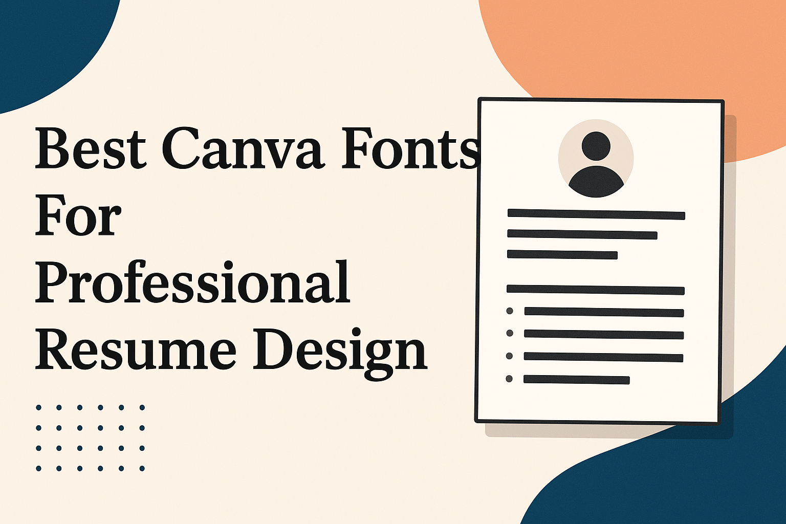
Choosing the right font for a resume can make a big difference in how professional and easy to read it looks. The best Canva fonts for a professional resume combine clarity with style, helping your resume stand out without being distracting. Using the right font ensures that a hiring manager can quickly scan your experience and skills.
A resume should look clean and polished, and Canva offers many fonts that fit this need perfectly. From classic serif fonts like Garamond to modern sans-serifs like Lato, each font brings a unique touch while keeping your resume readable. Picking a good font can help create a positive first impression before the interview even starts.
Why Font Choice Matters in Resume Design
Choosing the right font goes beyond just making a resume look nice. It affects how the resume is perceived and whether key information is easy to find and read. The right typography can make a resume look polished and professional, helping a candidate stand out in a stack of applications.
First Impressions and Professionalism
A font sets the tone before anyone reads the details. It gives an immediate sense of professionalism or lack of it. Using well-designed, clean fonts like Garamond, Helvetica, or Calibri in Canva shows attention to detail and respect for the reader’s time.
Fonts that feel outdated or too casual can hurt a candidate’s chances. For example, using Comic Sans or Brush Script creates a less serious impression. Professional fonts suggest the person behind the resume understands industry standards and has good graphic design sense.
Choosing a polished font also aligns with job industry expectations. Fields like finance or law favor classic serif fonts. Creative roles might allow more modern sans-serif options. Matching font style to profession helps make a strong, positive impact.
Readability and Scannability
Recruiters often spend just seconds scanning a resume. Fonts need to be easy to read quickly. Clear letter shapes and proper spacing are key to keeping the text legible on both screens and printed copies.
Fonts like Cambria and Georgia were designed for on-screen clarity, which is crucial for digital resumes. Sans-serif fonts such as Lato and Gill Sans also provide clean lines that reduce eye strain. Using these fonts in Canva ensures information is accessible and not lost in cluttered design.
Avoiding overly decorative or script fonts improves scannability. Constant spacing and consistent font size help. Good typography guides the reader’s eye naturally through key sections like contact info, skills, and experience, making it easier to find what matters most.
Key Qualities of the Best Canva Fonts for Resumes
Choosing the right font for a resume means balancing style with function. The best fonts make the information clear and easy to scan while keeping a professional look. Factors like readability on different devices, a clear hierarchy of text, and suitability for both screen and print all play a role.
Legibility Across Formats
Legibility is the top priority for resume fonts. The font style must be easy to read in various sizes and on different screens. A clean font with simple shapes helps avoid reader fatigue.
Fonts like Calibri, Cambria, and Garamond stand out because they maintain clarity at smaller sizes, around 10 to 12 points, which is ideal for fitting content without crowding. Proper line spacing also improves legibility by giving each line enough room to breathe.
When a font is hard to read on-screen or in print, it risks losing the recruiter’s attention within seconds. The best Canva fonts ensure that the text remains sharp and clear, whether the resume is viewed on a phone, computer, or printed copy.
Font Consistency and Hierarchy
Consistency in font use organizes the resume and guides the reader’s eye. Using one or two fonts strategically can separate section headings from body text without confusion.
A common practice is to pair a serif font for headings with a sans-serif font for body text. This contrast creates a clear hierarchy, making the resume easier to navigate. For example, using Garamond for titles and Lato for content keeps the design both professional and modern.
Font size also signals importance. Headings should be larger (14-16 pt) while body text stays within 10-12 pt. Consistent use of bold or italics further highlights key points like job titles or skills without overwhelming the design.
Web-Safe and Print-Friendly Fonts
Resume fonts must look good both digitally and in print. Some fonts display well on web platforms but lose quality when printed on paper.
Canva offers many web-safe fonts like Georgia, Helvetica, and Constantia, which perform consistently across formats. These fonts are widely supported on various devices and printers, reducing the risk of formatting issues.
Choosing print-friendly fonts means avoiding overly thin or decorative styles that can blur or break when printed. A solid, well-built font like Cambria balances elegance with durability.
Sticking to these fonts ensures the resume is professional and avoids technical glitches during hiring processes, whether viewed on-screen or handed out in person.
Top Serif Font Choices for Professional Resumes
Serif fonts are known for their classic, polished look, making them popular for professional resumes. They help improve readability and add a touch of elegance without distracting from the content. The following fonts offer balance, style, and clarity, each with qualities that suit different resume needs.
Garamond
Garamond is a timeless serif font with a classic style that has been around for centuries. It is known for its elegant and slightly thin letterforms, which give a polished and professional feel to any resume. Garamond is often chosen because it fits more text on a page without sacrificing readability, which is helpful when condensing a resume. Compared to the overused Times New Roman, Garamond looks fresher and more sophisticated, helping a resume stand out subtly. This font works well for industries valuing tradition or creativity, like publishing or design.
Merriweather
Merriweather is a modern serif font designed specifically for screen readability, making it ideal for digital resumes. It has thicker strokes and open letter shapes, which improve legibility on computers and mobile devices. Merriweather has a friendly yet formal appearance, balancing approachability and professionalism. This font suits candidates who want a resume that looks great both printed and on the screen. Its versatility makes it a solid choice across various job fields, especially where clarity and style matter.
Georgia
Georgia is a serif font created to ensure clear reading on screens without losing its professional look when printed. It features thicker strokes than Times New Roman, which makes it easier to read at smaller sizes. This font gives a classic, trustworthy impression without feeling outdated. Georgia is a good alternative to Times New Roman because it stands out visually while maintaining familiarity and readability. People in fields like business, education, or law often favor this font for its balance of tradition and modernity.
Bodoni
Bodoni is a serif font known for its strong contrast between thick and thin strokes, offering a more stylish and upscale look. It is less commonly used for large blocks of text because its thin parts can be hard to read at small sizes. However, Bodoni shines when used in headings or name sections on a resume, adding flair and personality. This font is a good pick for creative industries such as fashion or marketing, where a bold but elegant statement is a plus. Bodoni gives a resume a unique touch without sacrificing professionalism.
Leading Sans Serif Fonts Available in Canva
Choosing the right sans serif font in Canva can make a resume look clean, modern, and easy to read. Some fonts stand out because of their balance between style and professionalism. These fonts offer versatility for headings, body text, and different resume sections without losing clarity.
Lato
Lato is a popular sans serif font known for its semi-rounded details and stable structure. It brings a balance of warmth and professionalism, which helps make a resume inviting but still formal.
Its clear letterforms improve readability, especially for longer sections like work experience or skills. The font’s wide variety of weights—from light to bold—lets users highlight important parts without changing the overall look.
Lato compares well to classics like Arial or Calibri but feels a bit more modern. It’s great for resumes that aim to be straightforward with a touch of personality.
Montserrat
Montserrat draws inspiration from urban signage, giving it a geometric yet human feel. This font is excellent for resume headings because it grabs attention without feeling too flashy.
Its clean lines make it easy to pair with simpler fonts like Open Sans or Inter for body text. Montserrat’s wide range of styles allows clear hierarchy in your resume layout, helping important sections stand out.
Compared to Helvetica or Avenir, Montserrat feels fresh and current, suitable for creative and business fields alike. It works best when used sparingly, especially in titles or name headers.
Open Sans
Open Sans is well-loved for its neutrality and high legibility. It fits perfectly on resumes that need to look polished and accessible across all screen sizes and print formats.
Because it was originally designed for digital use, Open Sans offers smooth letter shapes that reduce eye strain. It pairs well with more decorative sans serifs like Montserrat or Nunito and rivals standards like Roboto in versatility.
Many choose Open Sans for its simple, professional look when they want a font that doesn’t distract but supports clear communication throughout the resume.
Inter
Inter is a newer sans serif font designed specifically for screen reading. Its tall x-height and open apertures increase readability in smaller text, which is helpful for detailed resume sections.
It blends geometric and humanist styles, sharing traits with fonts like Varela Round and Zico Sans. Inter’s clean design feels professional but approachable, making it a strong choice for tech resumes or modern industries.
Its multiple weights allow easy emphasis on section headers versus body text, and its consistency helps create a polished, uniform appearance throughout the resume document.
Creative and Display Fonts: Use With Care
Creative and display fonts can add personality to a resume, but they need to be chosen carefully. Overusing them or picking the wrong style can make a resume look unprofessional. Using these fonts in small doses or for specific purposes makes the resume stand out without distracting from the content.
When to Use Display and Decorative Fonts
Display and decorative fonts are best used for headings or section titles in a resume. They should not be used for the main body text because they can be hard to read and may look too casual. Script fonts, for example, can add a stylish touch but risk lowering clarity.
Fonts like Comic Sans and Papyrus are generally avoided in resumes because they seem informal or outdated. Instead, creative fonts need to balance style with professionalism. Using strong decorative fonts like Black Mango in small amounts can help highlight key areas without overwhelming the design.
Examples of Canva Decorative Fonts
Canva offers many decorative fonts suitable for limited use in resumes. Some popular display fonts include Black Mango, which has a bold and elegant look, and other artistic scripts that add flair but keep readability in mind.
Fonts like Poppins and Montserrat are good for combining with decorative ones because they keep the body text simple and clear. It’s best to pair a single decorative or display font with a clean, professional font to keep the overall layout easy to scan. This helps ensure the resume feels polished and sharp.
For a subtle creative touch, avoid heavily stylized fonts and focus on those with clean lines and balanced spacing.
How to Pair Fonts for a Cohesive Resume
Choosing the right fonts together can make a resume look clean and easy to read. It helps highlight important sections without making the design feel cluttered or confusing. Good font pairing balances style with professionalism to keep the reader’s attention.
Best Font Pairing Techniques
The key to pairing fonts is to choose ones that contrast but don’t clash. For example, pairing a simple sans-serif font for body text with a serif font for headings can add visual interest and guide the reader’s eye. They should have different weights or styles but similar spacing to keep everything balanced.
Using no more than two fonts helps maintain focus and prevents the resume from looking messy. One font can be used for headings and names, while the other is for descriptions and details. Also, matching font sizes and line spacing keeps the layout neat and easy to follow.
Sample Font Pairing Recommendations
A popular pairing is Montserrat for headers with Open Sans for body text. Montserrat’s bold style contrasts well with Open Sans’s clean lines. Another good pair is Merriweather with Lato; Merriweather’s classic serif texture works nicely with Lato’s modern sans-serif look.
For a simple but elegant feel, try Playfair Display with Roboto. Playfair Display offers a formal tone for titles, while Roboto remains clear and legible for the main text.
For more ideas, see this guide on Best Canva Font Pairings.
Formatting Tips for Professional Resume Typography
Good resume typography uses the right font size, proper spacing, and clean alignment. These details help the resume look organized and easy to read.
Font Size Recommendations
Choosing the right font size is key for clarity. The main text should be between 10 and 12 points. This size is easy to read on most screens and printed pages.
For headings, a slightly larger size works best. Using 14 to 16 points helps section titles stand out and guides the reader’s eye. The applicant’s name at the top should usually be the biggest, around 16 to 18 points.
It’s important not to go too small or too large. Fonts smaller than 10 points can strain the eyes, while fonts larger than 18 points may look unprofessional. Keeping font sizes consistent throughout the resume also helps maintain a clean look.
Line Spacing for Readability
Line spacing impacts how comfortable the text is to read. Using single spacing or 1.15 spacing is common on resumes. This keeps the text compact but not crowded.
Too little space between lines makes the resume look messy and hard to scan. On the other hand, too much spacing wastes space and may stretch content over more pages.
A balanced line spacing helps separate different sections and points clearly. It also works well with a clean font like Arial or Calibri, which are popular for professional resumes.
Alignment and Margins
Left alignment is the best choice for resume text. It creates a straight edge that is easy to follow and looks neat. Avoid centered or justified text because these can disrupt the flow and make reading harder.
Margins should be set at about 0.5 to 1 inch on all sides. Narrow margins let the applicant fit more information without cramping the text. Margins that are too wide can leave too much white space, making the resume appear sparse.
These simple layout choices give the resume a professional feel and help keep information organized for recruiters.
Choosing Fonts for Different Industries
Picking the right font depends on the field a person is applying to. The font should match the industry’s style and the company’s culture. It needs to show professionalism but also fit the kind of work they do.
Corporate and Business Resumes
In corporate settings, fonts must look clean and formal. Fonts like Montserrat and Calibri are popular because they are easy to read and give a neat, professional feel. This suits industries like finance, law, or consulting, where corporate branding is strict.
Avoid overly decorative fonts; simplicity helps the resume look polished. The font size should be balanced—not too big or too small—to keep the document tidy. Clear spacing and uniform alignment also boost the professional appearance of a business resume.
Creative Industries
For creative jobs like graphic design, advertising, or media, fonts can show more personality but should still be easy to read. Fonts such as Garamond and Raleway have unique styles that express creativity without hurting professionalism.
They might mix two fonts to highlight sections, like combining a serif with a sans-serif. This adds interest without making the resume hard to scan. Using bold or italic styles sparingly can help emphasize skills and work samples while keeping the design fresh.
Tech and Digital Roles
Tech resumes need fonts that signal clarity and modernity. Fonts like Roboto and Ubuntu work well here because they have a digital-friendly feel. They’re clean and straightforward, which suits coding, software, and IT fields.
Using fonts that align with a tech company’s corporate branding is key. A minimalist font with good spacing makes technical details easier to read. Avoid fonts that look too decorative or traditional since those don’t match the fast-paced, innovative nature of tech jobs.
Education and Nonprofits
Resumes for education and nonprofit roles benefit from fonts that feel warm yet professional. Fonts like Georgia and Open Sans offer a friendly tone but maintain seriousness.
These sectors value clear communication, so readability is crucial. Fonts should not be too flashy or casual. Instead, a balanced, trustworthy look helps convey commitment and empathy, which are important values for these fields.
For more font options tailored to resumes, see the best Canva fonts for resumes.
Using Canva Pro and Google Fonts for Your Resume
Choosing the right fonts can help make a resume look clean and professional. Using premium fonts or expanding your options with free resources can improve the style and readability of a resume. Both Canva Pro and Google Fonts offer useful tools for this.
Benefits of Canva Pro Fonts
Canva Pro gives access to hundreds of high-quality fonts not available in the free version. These fonts are carefully designed to be clear and professional, which helps resumes stand out without being too flashy.
With Canva Pro, users also get better font pairing suggestions. This helps keep resumes consistent by matching the right heading and body fonts. Plus, Pro fonts usually include a wider range of weights and styles, making it easy to highlight important sections like job titles or skills.
Because Canva Pro fonts are built into the platform, users avoid issues with missing fonts when sharing or printing. This keeps the resume looking just as intended on all devices.
Integrating Google Fonts with Canva
Google Fonts is a free resource with a large collection of fonts that work well for professional resumes. Many of these fonts can be used in Canva by selecting them from its font menu, as Canva includes popular Google Fonts by default.
To add fonts not already in Canva, users can upload them through Canva Pro’s brand kit feature. This way, unique or favorite Google Fonts can be part of the resume design while keeping it consistent.
Important Google Fonts for resumes include Lato, Montserrat, and Roboto. These fonts balance readability with a clean look and are widely supported. Using Google Fonts expands the choices without requiring extra cost.
For more on the best fonts to use in Canva resumes, visit this guide on best resume fonts in Canva.