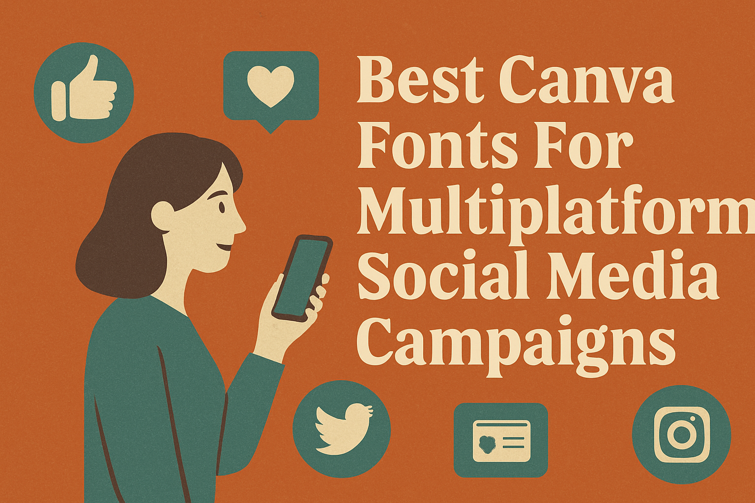
Choosing the right Canva fonts for multiplatform social media campaigns is key to making your graphics clear and engaging across all channels. The best fonts combine readability with style, like clean sans-serifs or elegant script options, to grab attention without overwhelming viewers.
Using fonts that work well together helps create a consistent brand look whether the content appears on Instagram, Facebook, or Twitter. Pairing fonts like Helvetica Now with a softer script or combining bold and light styles can make posts stand out while keeping the message easy to read.
Selecting fonts with strong visual contrast and harmony boosts your campaign’s impact and makes it easier for your audience to connect with your content. For examples of great font combos, see the best Canva font pairings for social media.
Why Choosing The Right Canva Fonts Matters For Social Media
Picking the right Canva fonts can shape how people see a brand and how they feel about content. Fonts affect not only how easy it is to read but also how a message connects emotionally. This makes font choice a key part of social media graphics.
Impact On Engagement And Branding
Fonts help capture attention quickly, which is crucial on crowded social media feeds. Bold or unique fonts can make text stand out and invite viewers to stop and read.
A consistent font style supports brand identity. When a brand uses the same fonts across platforms, it becomes easier for followers to recognize and trust it.
Fonts also influence emotions. For example, playful fonts fit casual brands, while strong, clean fonts evoke professionalism. This alignment boosts how well the audience connects with the content.
Readability Across Platforms
Social media platforms display content differently. Fonts that look great on a desktop may be hard to read on mobile phones, where most users scroll.
Choosing simple, clean fonts improves readability everywhere. Sans-serif fonts like Roboto or Montserrat work well because they stay clear in small sizes.
Readability helps the message get across faster. If text is hard to read, people are less likely to engage or remember the content.
Mood And Personality Conveyed By Typography
Typography sets the tone before words are even read. Script fonts can feel personal or elegant, while block fonts feel bold and direct.
Matching font style to the content mood matters. For serious messages, a classic serif font works better. For fun or creative posts, handwritten or quirky fonts bring out personality.
Fonts also reinforce brand voice through mood. For example, a wellness brand might use soft, rounded fonts to feel calming and friendly.
For more details on fonts that work well on multiple platforms, check this guide on the best Canva fonts for social media graphics.
Top Canva Fonts For Standout Social Media Campaigns
Choosing fonts that combine style and clarity is key for social media success. The right font grabs attention, boosts readability, and fits the brand’s mood. These fonts balance all that and are easy to use across multiple platforms.
Montserrat
Montserrat is a popular choice for social media because it’s clean and modern. It uses straight lines and geometric shapes, making text look sharp on both desktop and mobile screens. This font works well for headlines or short messages due to its strong presence.
Its versatility is a big plus. Montserrat pairs nicely with many other fonts, so designers can use it for titles while keeping body text simple. Brands wanting a fresh, professional look often choose Montserrat because it conveys confidence without being too formal.
Poppins
Poppins stands out with its rounded edges and balanced letter forms. It has a friendly, approachable vibe, which can make social media content feel more inviting. This font is great for brands targeting younger audiences or those seeking a modern but warm style.
It also supports many weights, from thin to bold, giving flexibility in emphasis and hierarchy. Poppins reads well in smaller sizes, which is important for social media posts seen on mobile devices. Designers often use it for body text and subheadings alongside a bolder headline font.
Nunito Sans
Nunito Sans is known for its smooth curves and excellent readability. The font has a slightly softer look than Montserrat or Poppins but still maintains a clean and professional feel. This makes Nunito Sans a solid all-around choice for brands wanting a balance between friendliness and clarity.
Because it is easy to read on screens of all sizes, Nunito Sans works well for longer text like captions or detailed posts. It pairs well with more decorative fonts, allowing creators to mix styles without losing harmony. Its simplicity helps keep the focus on the message.
Premium Picks: Best Canva Pro Fonts For Branding
Choosing the right font can give a brand a unique voice and make it stand out. These fonts offer a mix of style, readability, and personality, perfect for creating a strong identity across multiple social media platforms.
Yeseva One
Yeseva One is a serif font with an elegant and classic style. It has high contrast between thick and thin strokes, which adds a touch of sophistication. This makes it ideal for luxury brands or anything that wants to appear refined.
Its smooth curves and clear letter shapes help it stay readable even at smaller sizes. Brands that want to feel trustworthy and professional often choose Yeseva One for headlines, logos, and social posts. It’s a Canva Pro font, so it gives access to a polished look without needing external design tools.
Lovelo
Lovelo is a bold, geometric sans-serif font. Its thick lines and wide letter spacing create a clean, modern appearance. This font works well for brands that want to feel strong and confident.
It stands out in social media headers and logos because of its simplicity and impact. Lovelo’s sharp edges give a sense of seriousness but with an approachable look. This font is excellent when brand messages need to be clear and loud.
Gistesy
Gistesy is a playful, hand-drawn font with a casual vibe. Its irregular shapes and organic feel are great for brands wanting a fun and friendly personality. It works well for lifestyle, creative, or small business branding.
This Canva Pro font adds a personal touch, making designs feel unique and welcoming. It’s perfect for captions, invitations, or social graphics that aim to connect emotionally. Gistesy helps brands appear accessible without losing professionalism.
Creative Fonts For Unique Campaign Styles
Creative fonts add personality and style to social media campaigns. They help brands stand out with distinctive looks while keeping messages clear. These fonts balance artistic flair with easy readability, making them perfect for unique campaign themes.
Carelia
Carelia is a soft, elegant script font that feels warm and inviting. Its smooth curves make it ideal for brands that want a personal, handcrafted look. This font works well on Instagram stories or posts focused on lifestyle and wellness because it adds a gentle, friendly vibe.
Carelia’s light strokes keep it clean but still artistic. It pairs nicely with simple sans-serif fonts for body text, helping headlines shine without overwhelming the design. It’s perfect for campaigns that need to feel approachable yet stylish.
Boston Angel
Boston Angel offers a bold, vintage flavor. It has a distinct retro look with sharp edges and tall letters that catch attention fast. Brands in fashion or music often use it to create a strong visual identity on social platforms like Facebook and Twitter.
This font works best in uppercase or large sizes to keep its impact clear. Pairing Boston Angel with minimalist fonts for captions ensures the message stays readable. It fits campaigns that want energetic, edgy styles without losing professionalism.
Lovelace
Lovelace is a classic serif font with a modern twist. Its delicate serifs and balanced letter shapes give a touch of sophistication. It suits brands aiming for a refined yet friendly feel on platforms like LinkedIn or Pinterest.
The font shines in headlines and quotes where elegance is key. Lovelace pairs well with clean sans-serif fonts that complement its timeless style. This font fits perfectly in campaigns promoting products or services that emphasize quality and trust.
Moontime
Moontime is a playful display font with whimsical curves and unusual details. It grabs attention with its artistic flair and great personality. This font is excellent for brands in creative industries or campaigns targeting younger audiences on TikTok and Instagram.
Its unique letter forms make designs feel fun and fresh, but it should be used sparingly in headers rather than body text. Combining Moontime with straightforward sans-serif fonts helps keep messages clear without dulling its charm. It’s ideal for campaigns that want to add a quirky, cheerful touch.
Playful And Expressive Fonts For Social Media Graphics
Playful and expressive fonts bring energy and personality to social media graphics. They can help brands stand out by adding charm and emotion to posts. These fonts work well for casual, fun, or lively content that aims to engage viewers quickly.
Cosmopolitan
Cosmopolitan is a vibrant font with a modern, stylish feel. Its clean lines combined with playful curves make it perfect for brands that want a youthful yet polished look. It works especially well in headers or short quotes where impact is key.
This font balances readability with flair, so viewers can enjoy the personality without struggling to read. It also adds a trendy vibe to fashion, lifestyle, or creative posts. Using Cosmopolitan in bright colors can make social media graphics pop.
Rumba
Rumba is a bold and expressive font that grabs immediate attention. Its thick strokes and slightly rounded edges give it a friendly, approachable character. This makes Rumba ideal for brands that want their messages to feel lively and welcoming.
Because of its strong presence, Rumba works great for calls to action or announcements on social media. It pairs well with simpler fonts to keep designs balanced. Rumba’s playful style suits fun campaigns or product launches aimed at younger audiences.
Apricots
Apricots is a soft script font with a hand-drawn feel. It adds an elegant, whimsical touch to social media graphics, making posts feel personal and creative. This font is great for romantic, artistic, or heartfelt content.
Its fluid lines create a warm atmosphere without sacrificing clarity. Apricots looks best in medium sizes, like quotes or taglines, where its detail can shine. Combining Apricots with clean sans-serif fonts helps maintain readability and style harmony.
Canva Font Combinations And Pairings For Maximum Impact
Choosing the right fonts can make a social media campaign stand out. Some combinations improve readability, while others add a modern feel. Knowing how to pair fonts well helps create designs that get noticed and read easily.
Classic Pairings For Readability
Classic font combinations often mix a serif with a sans-serif. This contrast helps the viewer quickly see the difference between headings and body text. For example, a font like Montserrat combined with Georgia offers clean lines and easy reading.
Using classic pairings ensures that text remains clear across different devices, from phones to desktops. It’s best to keep the body font simple and the heading font bold or stylish but not overpowering. This balance works well for brands wanting a timeless, trustworthy look.
Trendy Mixes For Modern Appeal
Modern font pairings lean toward mixing unique scripts or decorative fonts with sleek, minimal ones. For instance, pairing a script font like The Artist Script with a solid sans-serif such as Impact creates a fresh, eye-catching style.
These combinations work great for brands targeting younger audiences or trendy markets. They add personality but should still maintain readability, especially on small screens. It’s smart to use decorative fonts mainly in titles or highlights, not long paragraphs.
Tips For Combining Fonts In Canva
In Canva, picking fonts that contrast in weight and style helps create hierarchy. Using one bold font for headings and a simple one for body text guides the viewer’s eye naturally.
Avoid pairing fonts that look too similar; they can make the design feel cluttered. Canva font combinations like Tan Mon Cheri + The Artist Script or Impact + Dream Avenue show how contrast adds interest and clarity.
Keep font sizes appropriate, so the design works well on both mobile and desktop platforms.