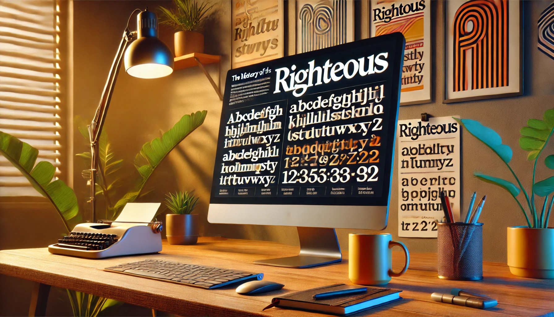
The Righteous font has a captivating backstory that blends art and typography with a touch of history. Originating from inspiration drawn from the art deco posters of Hungarian artist Robert Berény, this font stands out with its geometric style and retro-futuristic vibe. Its design features both uppercase and lowercase letters, making it versatile and flexible …
Lindsey Becker
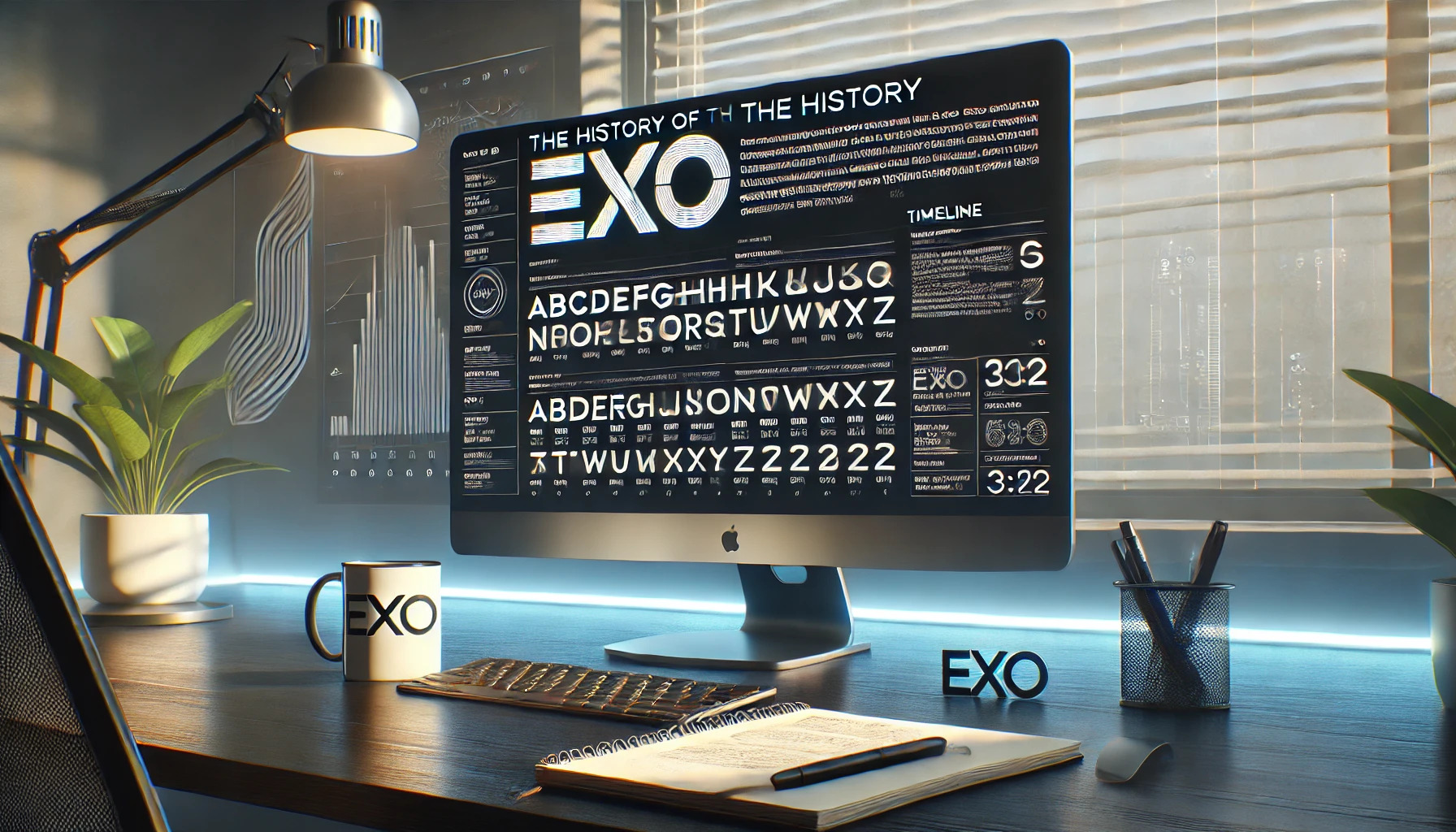
Exo has made its mark as a versatile and modern geometric sans serif font, offering an impressive array of 9 weights each with true italic versions. This remarkable range makes it suitable for both display and text use, catering to a variety of design needs. Exo was first launched on Kickstarter in 2011 and later …
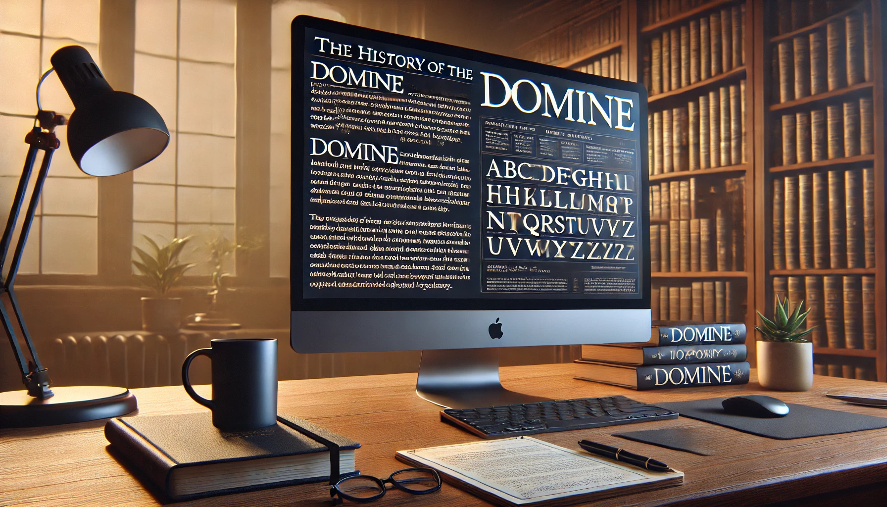
Domine is a typeface that captures the elegance of classic serifs while blending modern readability. Created by Pablo Impallari, it was specifically designed to work well on digital screens, making it ideal for online content. Domine is perfect for sites where reading is the main activity, like newspaper or magazine websites. The font shines at …
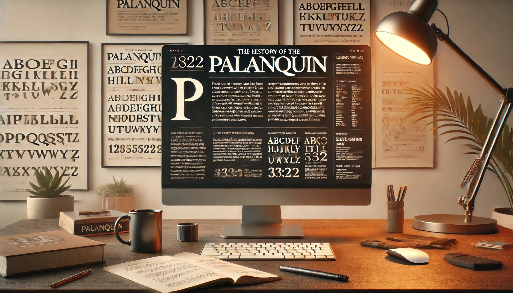
Palanquin is a uniquely crafted text type family that integrates both Latin and Devanagari scripts. It’s designed by Pria Ravichandran to fit the digital age, with a style that suits a variety of modern uses. This makes it a favorite for those who appreciate clean and versatile design. The typeface offers seven text weights and …
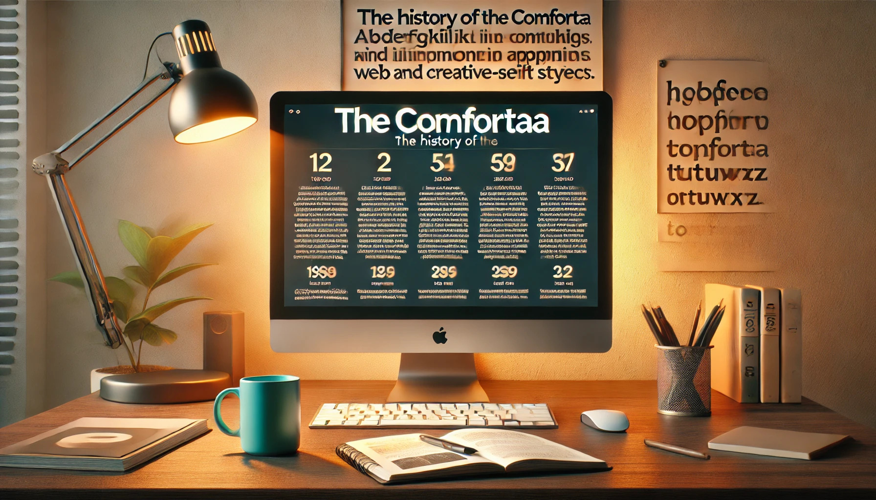
Comfortaa is a font that combines modern design with a touch of playfulness. Created by Johan Aakerlund, Comfortaa is well-known for its rounded geometric shapes and elegant style. This makes it perfect for headlines and large text where readability and design matter. People love Comfortaa for its versatility in both personal and commercial projects. Its …
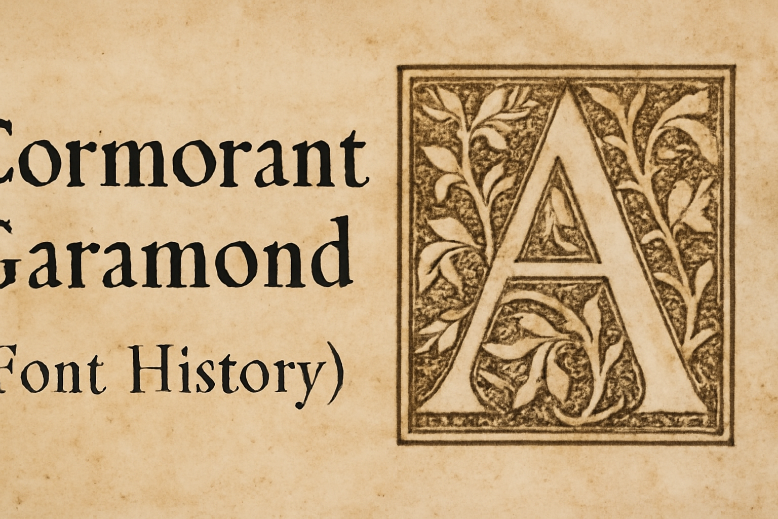
Cormorant Garamond is a font that has captured the imagination of designers worldwide. Rooted in the elegant styles of Claude Garamond, it stands out with its smooth curves and sharp serifs. This font has become a favorite for those seeking a classic look with a modern twist. Designed by Christian Thalmann, Cormorant Garamond draws inspiration …
Karla has become a prominent name in the world of typography since it was first released in 2012. This unique sans-serif typeface blends geometric and humanist elements, making it a versatile choice for various projects. Created by Jonathan Pinhorn, Karla quickly gained popularity for its clean and modern design. Karla’s design features have expanded over …
Manrope is a modern sans-serif font family that has captured the attention of designers since its creation. The font was first designed by Mikhail Sharanda in 2018. Manrope combines sleek design with functionality, making it an excellent choice for various design projects. The font family has seven weights, ranging from ExtraLight to ExtraBold, giving designers …
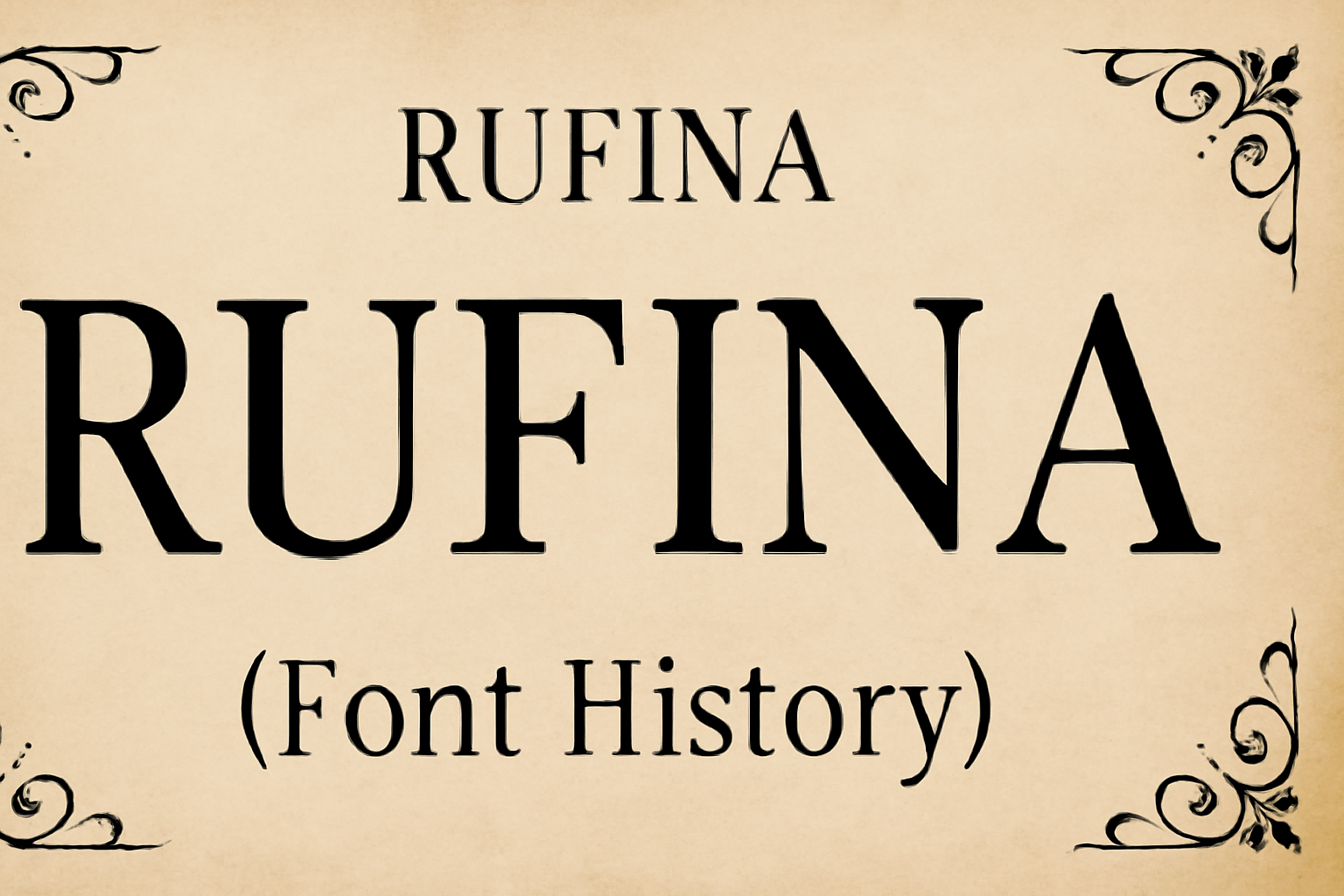
Exploring the world of fonts can reveal fascinating stories, and Rufina is a notable example. Rufina is a serif typeface characterized by its elegance, simplicity, and high contrast. Designed by Martín Sommaruga, it brings together the classic influences of Bodoni with a modern twist. Each stroke in Rufina tells a story of sophistication and delicacy. …
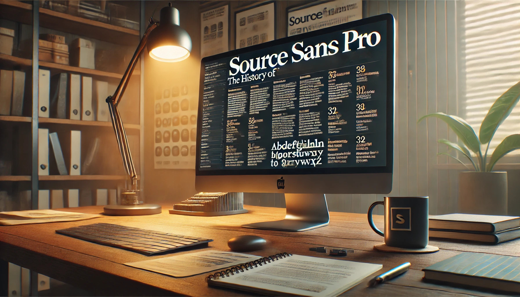
Source Sans Pro is a font with an interesting story. Created by Paul D. Hunt, this sans serif typeface was the first open-source project from Adobe. Its design takes inspiration from classic American type styles, making it both modern and versatile. This font is especially prized for its clarity and readability in user interfaces. It …