Choosing the right font is key to making a franchise brand stand out and feel consistent across all locations. The best Canva fonts for franchise branding systems combine readability, personality, and versatility to create a strong visual identity. This helps customers recognize the brand instantly, whether it’s online or in-store.
A good font not only looks great but also communicates the brand’s tone—whether it’s playful, professional, or modern. Using well-chosen fonts across marketing materials, logos, and packaging keeps everything unified and easy to follow. This article will share top Canva fonts that work well for different types of franchises like food, tech, and delivery services to help build a clear and attractive brand.
Foundations of Canva Fonts for Franchise Branding
Choosing the right fonts is a key part of creating a strong franchise brand. It helps keep the brand looking consistent and professional across all locations. Using Canva’s font options wisely can simplify the process and keep your brand identity clear.
The Importance of Font Choice in Franchise Branding
Font choice affects how customers see and remember a brand. A clear, readable font helps people easily understand messages. It also sets the tone—whether the brand feels friendly, serious, or modern.
Consistent fonts across all franchise locations build trust and recognition. When customers see the same fonts on signs, menus, and ads, they instantly connect with the brand. Font style supports the brand personality and makes a franchise look more unified.
Understanding Canva’s Font Library
Canva offers hundreds of fonts, giving businesses many options to find the right style. The library includes serif, sans serif, script, and display fonts, each with different moods and uses. For example, serif fonts can feel classic; sans serif fonts often look clean and modern.
Using Canva fonts lets franchises create consistent branding without needing advanced design skills. The variety in fonts means franchises can mix styles for headings, body text, and logos while staying cohesive.
License Types: Canva Free vs Canva Pro
Canva Free has a large collection of fonts available for any user. These fonts are sufficient for many brands but have some limitations in variety and commercial use rights.
Canva Pro users get access to premium fonts and extended licenses. This means they can use fonts for brand logos, merchandise, and marketing materials without restrictions. Pro also offers font uploading, so franchises can maintain exact brand fonts if needed.
Key Considerations for Consistent Franchise Typography
To keep franchise branding tight, it’s important to limit font choices. Usually, using 2-3 fonts works best: one for headings, one for body text, and optionally one for accents or logos.
Fonts must be easy to read across different platforms and sizes. A font that looks good on a large sign might not be clear on small mobile screens or printed materials. Testing fonts in various uses helps avoid problems.
Pairing fonts with matching styles is essential. For example, combining a bold sans serif heading with a simple serif body text often creates a balanced look. Consistency in font weights, letter spacing, and color also supports uniform branding.
Detailed font guidelines keep all franchise locations on the same page and avoid brand confusion.
Learn more about choosing and pairing fonts from this best Canva fonts guide for franchises.
Essential Criteria for Franchise Font Selection
Choosing the right font for a franchise is a careful balance. It needs to work well in many places, look the same everywhere, and match the brand’s personality. Each decision affects how customers see the business across locations and marketing materials.
Readability and Accessibility for Multi-Location Brands
A franchise font must be easy to read in all sizes and settings. Fonts that are clear on screens, print, and signage help people quickly understand the message. For example, simple sans-serif fonts often perform well because they avoid extra details that can blur at small sizes.
Accessibility is also crucial. The font should be legible for people with vision issues or reading difficulties. This means avoiding overly decorative styles or very thin lines. Consistent font weight and spacing improve readability, which benefits customers at every franchise location.
Visual Consistency Across Marketing Materials
Typography needs to work smoothly across all franchise marketing tools—like menus, websites, ads, and uniforms. Using the same font family keeps the brand consistent no matter where a customer sees it. It also makes creating new materials easier and faster.
Franchise systems often pair fonts to create hierarchy (like bold for headlines, regular for body text). These pairs should have clear differences but still feel like part of the same family. Ensuring the font looks the same in print and digital formats prevents a disjointed brand image.
Brand Personality and Target Audience Fit
The font should match the brand’s personality and appeal to its customers. A tech franchise may use sleek, modern fonts to signal innovation. A family-focused restaurant might pick friendly, curved fonts that feel warm and welcoming.
Understanding the target audience guides font choice. Fonts convey emotions too—bold fonts show strength, script fonts show elegance, and minimal fonts suggest simplicity. When franchise branding aligns font style with customer expectations, it connects better and builds trust.
For more on choosing fonts that fit franchise branding, explore the detailed tips on how to choose fonts within your Canva Brand Kit.
Top Canva Fonts Ideal for Franchise Branding
Choosing the right fonts for franchise branding helps create a consistent and professional look across all locations. The fonts should be clear, versatile, and easy to read on signs, websites, and marketing materials. The following fonts are popular choices for their balance of style and practicality.
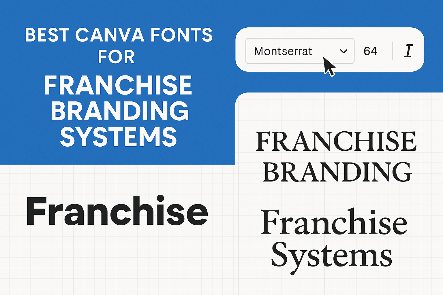
Montserrat
Montserrat is a clean, geometric sans-serif font that works well for modern brands. Its uniform stroke width and strong letter shapes make it highly readable at all sizes. This quality is important for franchises since the font needs to look good on everything from small labels to large billboards.
The font’s style feels both professional and approachable, which helps build trust with customers. Montserrat pairs well with other sans-serifs or even serif fonts for headings and body text, giving flexibility in design. It’s often used on logos, website headers, and menus in franchise materials.
Josefin Sans
Josefin Sans has an elegant, vintage vibe with a slightly geometric feel. It’s known for its light and airy look with tall x-heights and open letter spacing. This makes it unique and memorable while still keeping readability strong.
This font suits franchises aiming for a stylish yet friendly brand image. It works especially well in upscale or creative industries, adding personality without sacrificing clarity. Josefin Sans can be paired smoothly with serif fonts or heavier sans-serifs to balance its delicate strokes.
DM Serif Display
DM Serif Display is a serif font with a modern twist, combining classic elegance with contemporary style. It features thin, stylish strokes and smooth curves that create a sense of sophistication. It is best used for headlines or logos rather than body text because of its decorative flair.
This font works great for franchises wanting to highlight luxury or tradition in their branding. It pairs well with clean sans-serif fonts like Montserrat, adding contrast and depth. DM Serif Display helps convey professionalism and refinement in marketing materials.
For those seeking the best Canva fonts for clear communication and strong brand identity, these three are solid choices in franchise branding.
More details on best Canva fonts can guide further selection.
Canva Serif, Sans-Serif, and Specialty Fonts for Franchises
Franchise branding needs fonts that are clear and flexible across many uses. Choosing the right fonts helps keep a consistent look while adding style where needed. This balance supports strong recognition and visual appeal in all franchise materials.
Best Sans-Serif Fonts for Modern Brand Consistency
Sans-serif fonts in Canva like Montserrat and Lato work well for franchises wanting a clean, modern look. They offer easy readability on screens and print, which is vital for logos, websites, and signage.
Fonts like Poppins and Josefin Sans add personality without losing professionalism. Using no more than two sans-serif fonts keeps design simple and consistent.
For softer, friendly vibes, fonts such as Marykate or Canva Student bring a playful yet neat touch. These fonts suit franchises that want to appear approachable but still reliable.
Serif Fonts for a Classic Franchise Look
Serif fonts are perfect for franchises aiming for tradition and trustworthiness. Canva fonts like Playfair Display and DM Serif Display offer elegance and readability in headings and body text.
Fonts such as Boston Angel and Golden add warmth without sacrificing clarity. These serif styles help convey a sense of heritage and professionalism.
Brands can pair serif fonts with simple sans-serifs for balance. This makes designs look stable and memorable across menus, brochures, and formal communications.
Display, Script, and Cursive Fonts for Accent Use
Display, script, and cursive fonts in Canva give franchises creative flair. Use fonts like Lilita One and Candice sparingly for logos or special promotions to catch attention.
Script fonts such as Best Light and Sunday work well for accents, adding elegance without overpowering the brand voice.
Handwriting fonts like Carelia and Malibu create a personal feel but should be limited to avoid clutter. These styles work best to highlight, not dominate, franchise branding materials.
Building Effective Canva Font Pairings for Franchise Systems
Choosing the right font combinations helps franchise brands stay consistent and clear across all locations. Balancing style with readability creates a strong identity. Effective font pairings also guide viewers through the message easily.
Popular Canva Font Pairing Examples
Some font pairings work well for many franchise systems because they mix modern and classic styles. For example, Montserrat & Open Sans is a popular combo. Montserrat’s bold geometric style grabs attention in headlines, while Open Sans keeps body text simple and easy to read.
Another good option is Poppins & Lora. Poppins offers a friendly, rounded look for titles. Lora adds a traditional serif that works well with long paragraphs. These pairs support clear brand messaging without clutter or confusion.
Using tried-and-tested Canva font pairings like these saves time and makes franchise materials look professional and inviting.
Balancing Hierarchy: Headings, Subheadings, and Body Text
Proper hierarchy helps readers understand what to focus on first. Franchise branding should use bold, larger fonts for headings to grab attention. Subheadings use a slightly smaller or lighter font to guide the reader logically through content.
Body text needs to be readable and clean. Canva font combinations that pair a distinct headline font, like Acherus Grotesque, with a neutral, easy-to-read body font work best. This combination keeps text organized and prevents visual overwhelm.
Spacing and size matter too. Enough line spacing between paragraphs and clear contrast against backgrounds improve clarity. This ensures each part of the text has a defined role and supports smooth reading.
How to Create Custom Font Combinations
When creating custom Canva font pairings for franchises, balance contrast and harmony. Start by choosing one strong font for headlines (bold or decorative) and one simpler font for body text.
Mixing font families—such as pairing a sans serif headline with a serif body—adds interest without losing coherence. Test how fonts look at different sizes to maintain legibility across all materials.
Limiting font choices to two or three helps keep designs consistent and professional. Adding a script or display font can add personality but should be used sparingly, such as in logos or accents.
Planning custom font pairings with these principles builds a clear and attractive brand identity across all franchise platforms. For more detailed font pairing ideas, brands can explore best Canva font pairings for brands and small businesses.
Genre-Based Font Selection: Minimalist, Retro, and Vintage Brand Styles
Choosing the right font style for a franchise brand can shape how customers see the business. Some fonts create a clean, modern look, while others add a nostalgic or playful feel. Picking fonts that match the brand’s personality helps keep the design consistent and memorable.
Minimalist Fonts for Clean, Scalable Branding
Minimalist fonts are great for franchises that want a simple and professional appearance. These fonts use clean lines and clear shapes, making them easy to read at any size. This quality is important for logos, signage, and digital use where clarity matters.
Fonts like New Sun Playful and Apricots offer fresh, minimal looks with a touch of personality. They keep the focus on the message without being distracting. Minimalist fonts work well when paired with a strong brand color scheme and allow for flexible use across various marketing materials.
Retro & Vintage Fonts for Timeless Appeal
Retro and vintage fonts bring warmth and nostalgia, which can make a franchise brand stand out by connecting emotionally with customers. Fonts like Blueberry and Funtastic evoke styles from past decades, creating a sense of history and reliability.
These fonts often have unique details, such as decorative strokes or aged textures, that add character. They fit well with brands in food, fashion, or hospitality where a classic vibe feels welcoming and authentic.
Retro and vintage fonts are often best used for logos, headlines, or special promotions. Combining them with minimalist fonts can balance the old with the new, ensuring the design remains clear but with personality.
Playful and Handwritten Fonts for Youthful Brands
Handwritten and playful fonts give a franchise a friendly and informal look. They work well for brands targeting younger customers or those wanting to appear creative and approachable. Fonts like KG Primary and Feel Free Playful bring energy and a personal touch to branding.
These fonts are often casual, with rounded shapes and flowing lines that feel warm and inviting. They are great for social media, children’s products, or service brands focusing on fun and connection.
While playful fonts add charm, they should be used carefully to keep readability high. Pairing these with cleaner fonts ensures the brand stays professional but still feels lively and fresh.
Tips for Managing Canva Fonts Across Franchise Locations
Keeping font use consistent across franchise locations helps protect the brand’s look and feel. Setting clear rules, sharing font resources, and considering premium font upgrades all play a role in strong, unified branding.
Establishing Font Guidelines and Systems
A clear font guideline document is essential. It should list the exact fonts to use for headings, body text, and special elements. It should also specify font sizes, weights, and when to use bold or italics.
This guide helps franchisees stay on brand and avoid messy or mismatched designs. A simple style guide or chart can make it easy to follow. Using fonts that are easy to read on all platforms, like Montserrat or Oswald, is key.
Keeping these rules simple and accessible encourages consistent use. Ideally, the guide is updated regularly and shared digitally for easy access.
Sharing Font Kits With Franchisees
Using Canva Pro, the franchise can upload and manage a shared font kit inside the Brand Kit feature. This lets franchisees access approved fonts quickly and easily, keeping everyone aligned.
Uploading fonts requires a proper license, usually a Desktop License, to cover design usage. Confirming this avoids legal issues and ensures smooth font sharing.
Regular communication about updates or new fonts keeps everyone on the same page. Bundling fonts into a neat, downloadable package makes it easy for all franchise locations to install and use them correctly.
Upgrading to Premium Fonts for Enhanced Brand Identity
Premium fonts can give a franchise a unique edge. They often offer better design options, more weights, and special features that free fonts lack.
Upgrading to premium fonts through Canva Pro can improve brand appeal but needs careful planning. Franchise leaders should weigh costs and benefits, choosing fonts that truly fit their brand personality and values.
Premium fonts are best when used selectively—for example, in logos or headlines—while simpler, free fonts suit body text. This keeps designs both striking and readable, helping the brand stand out without losing clarity.
Premium font options can be integrated right into Canva Brand Kits, making it easier for franchisees to use them correctly across all materials.
See more about managing fonts and Canva Pro features for franchises at the best Canva fonts for franchises.