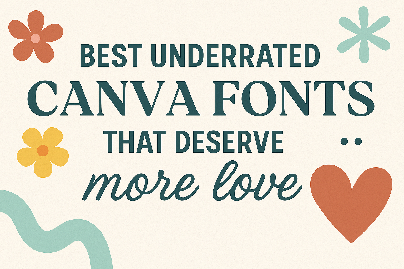
Many Canva users tend to stick with popular fonts, but there are plenty of great underrated options that can make designs stand out in a unique way. These fonts offer fresh styles that add personality without being overused.
These lesser-known fonts often combine well with popular styles, offering new font pairings that feel both modern and original. They can be perfect for branding, presentations, or any design that needs a subtle but memorable look. Exploring these fonts gives users a chance to create something that feels personal and different.
What Are Underrated Canva Fonts?
Underrated Canva fonts are those hidden gems within Canva’s extensive library. They often go unnoticed despite having strong design qualities. These fonts may offer unique style, great readability, or perfect vibes but get less attention than popular choices.
Designers sometimes miss these fonts because they’re overshadowed by trendy or heavily promoted options. Often, underrated fonts bring fresh energy and can make any design stand out when used thoughtfully.
Definition and Criteria
Underrated Canva fonts are typefaces that are available in Canva but are not widely used or recognized. They might have limited popularity but still offer quality design features. These fonts often combine good readability, versatility, and aesthetic appeal.
The criteria for defining an underrated font include low usage in public designs and social media, lack of mentions in popular design blogs, and unique features not found in trendy fonts. Some may be free to use, while others need Canva Pro. Their lesser-known status doesn’t mean they lack value but that they haven’t reached their full potential.
Why Great Fonts Are Often Overlooked
Great fonts in Canva can be overlooked because of trends and branding habits. Many users stick to common fonts they know, ignoring other options. Popular fonts get more clicks, placing lesser-known fonts in the shadows.
Also, Canva often highlights newer or premium fonts, so free, underrated fonts may get less spotlight. Another reason is designers may fear experimenting, fearing less tested fonts won’t look professional. This limits discovery of fonts that could add unique charm or personality to projects.
How Underrated Fonts Can Elevate Designs
Underrated fonts can give designs a fresh, original look where standard fonts feel tired. Using less common fonts helps projects stand out on social media or in marketing materials.
They can also better fit specific moods, whether playful, elegant, or modern, depending on the font style. For example, a stylish calligraphy font rarely used can add warmth to invitations or personal branding. Mixing underrated fonts with popular ones can create balanced, interesting layouts that catch attention more effectively.
For more ideas on standout Canva fonts, see the collection of underrated Canva fonts that deserve more love.
Top Underrated Canva Fonts You Should Try
Some Canva fonts are great but don’t get the attention they deserve. These fonts add personality and style without being overused. They work well for branding, social media, and creative projects.
Mak
Mak is a clean, modern sans-serif font that feels fresh yet simple. It is easy to read on both screens and print, making it a smart choice for body text and headlines. Its balanced design blends professionalism with friendliness, helping brands look approachable but serious.
This font shines in digital content and minimalist designs. It works well when paired with script or handwritten fonts to add contrast. Mak is perfect for those wanting a sleek style without the stiff feel of more common fonts.
Gellatio
Gellatio is a fun, playful font with curvy letters that give a hand-crafted vibe. Its unique style makes it a good pick for social media posts or kids’ projects where a casual, friendly look is needed.
Because Gellatio has a cheerful personality, it’s best used in short texts like titles or captions. It pairs nicely with simple sans-serif fonts like Mak to keep designs balanced. This font stands out in Canva for its charm and versatility.
Signature
Signature font mimics elegant handwriting. It adds a personal, stylish touch to branding and invitations. This font in Canva works well for logos, headers, and any design that needs a warm, creative feel.
The font is smooth and flowing but still easy to read. Its style can lift a plain design, making it look polished and unique. For those who want a classy but approachable font, Signature offers an underrated option worth trying.
Hidden Gems Among Elegant Canva Fonts
Choosing the right elegant font can give design projects a polished and timeless feel. Some fonts stand out not just for their beauty but also for their versatility in professional settings. Knowing how to pair these fonts can boost branding efforts effectively and create a consistent, classy look.
Playfair Display
Playfair Display is a serif font that mixes classic style with a modern twist. It features thick and thin strokes that give text a sophisticated, high-contrast look. This font works well for headlines, logos, and invitations where an elegant but readable style is important.
Its design draws inspiration from the transitional and Didone styles, making it suitable for luxury brands or editorial layouts. Playfair Display pairs well with simple sans-serif fonts to maintain balance and readability in a design. For users looking for an elegant Canva font that stands out but stays professional, Playfair Display is a reliable choice.
Pairing Elegant Fonts for Professional Branding
When creating professional branding, picking matching fonts is key. Combining a serif font like Playfair Display with a clean sans-serif font often works well. This mix offers contrast without overwhelming the viewer.
For example, using a simple sans-serif for body text alongside an elegant serif headline can improve legibility. Colors and spacing also matter—plenty of white space keeps the design airy and refined. Brands aiming for a modern, luxurious vibe often use font pairs like Playfair Display with fonts such as Montserrat or Lato.
Understanding font pairing helps maintain a consistent and polished brand image across marketing materials and social media graphics. For more on underrated Canva fonts, check out detailed guides on the best secret fonts in Canva.
Underrated Handwritten Fonts in Canva
Handwritten fonts in Canva bring a personal and creative touch that many overlook. These fonts often have unique styles that make designs stand out while fitting various needs, from casual notes to formal branding.
Unique Features of Handwritten Fonts
Many handwritten fonts in Canva mimic real handwriting styles, such as signatures or brush strokes. For example, fonts like Gellatio offer smooth, flowing lines that feel natural and friendly. Others, like Signature, replicate the look of a personal autograph, which can add authenticity to branding.
These fonts vary in formality, ranging from elegant scripts to playful, casual designs. This variety helps users select fonts that feel genuine but remain easy to read. Handwritten fonts often feature uneven baselines and varied stroke widths, mimicking how people write by hand. This gives designs a dynamic, personal appearance.
Versatile Uses for Personal and Business Projects
Handwritten Canva fonts work well for both personal and business projects. Small businesses can use them for logos, social media graphics, and invitations to create a warm, approachable brand image. Signature-style fonts work great for personal branding, adding a unique and professional touch.
On the personal side, these fonts brighten invitations, greeting cards, and creative projects. They are used in resumes or book titles to add personality. Their adaptability makes them ideal across digital platforms and print, offering versatility without sacrificing style or readability. For a fresh, authentic look, handwritten fonts remain an excellent choice.
For more on handwritten fonts in Canva, you can visit the best handwriting Canva fonts guide.
Bold and Readable Fonts That Deserve More Love
Some fonts combine strong visual impact with clear readability, making them perfect for headlines and bold statements. These fonts work well in Canva designs where drawing attention without losing clarity is key.
League Spartan
League Spartan is a bold, geometric sans-serif font that balances tradition and modern style. Its clean lines and consistent weight make it highly legible, even at smaller sizes.
It’s often used for headlines, posters, and branding where clarity is important but a clean, professional look is still desired. The font’s sharp edges give it a confident presence without feeling too heavy or overwhelming.
Because it’s free and easy to use in Canva, it’s a smart pick for designers who want a bold font that stands out but remains easy to read in a variety of projects.
Anton
Anton is another strong, bold font with high visibility. It features a very tight letter spacing and thick strokes that make text pop on screen or print.
What makes Anton unique is its simplicity paired with impact. It’s perfect for clear, eye-catching headlines, especially in digital ads or social media graphics created with Canva.
Its boldness holds well against busy backgrounds, ensuring that messages stay readable and grab attention effectively. Anton suits anyone needing a font that’s both bold and straightforward.
Sans-Serif Fonts That Are Often Overlooked
Sans-serif fonts are popular for their clean and modern look, but some great options do not get as much attention. These fonts offer readability and style while standing out quietly in design projects. Two fonts that fit this are Open Sans and Josefin Sans.
Open Sans
Open Sans is a very readable font with a friendly feel. It has simple curves and open letter shapes, making it easy to read on screens of all sizes. Designers often use it for websites, apps, and other digital media because it looks clean without being too plain.
The font includes many weights, from light to bold, giving flexibility for headings, body text, and accents. It works well in both small and large text, keeping clarity throughout. Open Sans is also popular because it supports many languages, making it useful for international projects.
Josefin Sans
Josefin Sans has a unique style inspired by 1920s geometric design. It features tall, narrow letters with an elegant but modern vibe. This font is perfect for projects that want a touch of vintage charm without losing a clean look.
Josefin Sans shines in titles, logos, and branding where a bit of personality is needed. It is less common in body text because its thin strokes can be harder to read at very small sizes. Yet, its distinctive style makes it a good choice for standout designs in Canva and other tools.
For more details about underrated free fonts including these, see 14 Underrated Google Sans Serif Fonts That Are Free.